Shopify Storefront Redesign for Mybacs
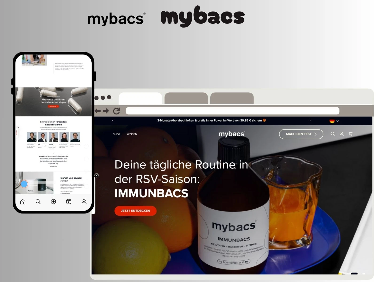
🔗 Live Site: https://mybacs.com/
🛠️ Shopify Development + Figma Design Execution
📊 Outcome-Driven Redesign
🔍 Snapshot
I redesigned the Mybacs Shopify storefront to create a cleaner, trust-driven and conversion-optimized experience that reflects the brand’s scientific identity.
The new storefront strengthens clarity, improves product discovery, and delivers a smoother, more premium visual journey for users on all devices.
🧪 About the Brand
Mybacs is a science-led wellness company specializing in probiotics and gut-focused supplements.
Their formulation principles are built on research, purity, and transparency — but the previous storefront didn’t visually communicate any of that.
The redesign needed to accomplish three key goals:
make the store look as premium as the product
improve navigation & hierarchy
support confident purchase decisions
❗ Core Problems Identified (UX Audit)
Before the redesign, the store faced several challenges:
crowded visual layout with weak spacing rhythm
unclear product messaging & benefits
ingredients and scientific backing not highlighted
inconsistent typography hierarchy
poor CTA positioning
PDP layout lacked structure and trust flow
complex scanning experience on mobile
no narrative sequence supporting product education
brand identity felt “basic” instead of scientific and premium
The store functioned — but it didn’t sell the brand.
💡 Strategy & Design Direction
I approached the redesign as a UX and clarity problem, not just a visual lift.
1️⃣ Structure First — UX Flow & Information Hierarchy
I redesigned the page architecture so users understand:
what Mybacs does
why it matters
which product fits them best
Key decisions:
stronger above-the-fold structure
simplified navigation patterns
clear product highlight blocks
CTA orientation based on eye-movement logic
2️⃣ Brand-Aligned Visual Language
Mybacs sells science. The UI should show science.
I introduced:
cleaner typographic scale
softer spacing rhythm
structured grid blocks
calmer visual composition
minimal, clinical product framing
The result communicates purity, research, and trust.
3️⃣ Ingredient Transparency & Benefit Storytelling
Wellness customers need proof.
So I built UI components dedicated to:
ingredient clarity
product benefits
clinical positioning
quality standards
These blocks give users answers without scrolling endlessly.
4️⃣ Conversion Logic in Layout Decisions
UI elements were repositioned based on behavior psychology:
CTA placement always visible
“why buy” statements near decision points
trust elements surfaced early
card grids shortened decision loops
The new structure guides — not confuses.
5️⃣ Responsive Rebuild
Over 70% of traffic on wellness brands is mobile.
I rebuilt layouts with thumb zones, shorter scan-paths, and less visual load.
🎨 Visual Transformation

Homepage — Calm, Premium & Science-Forward
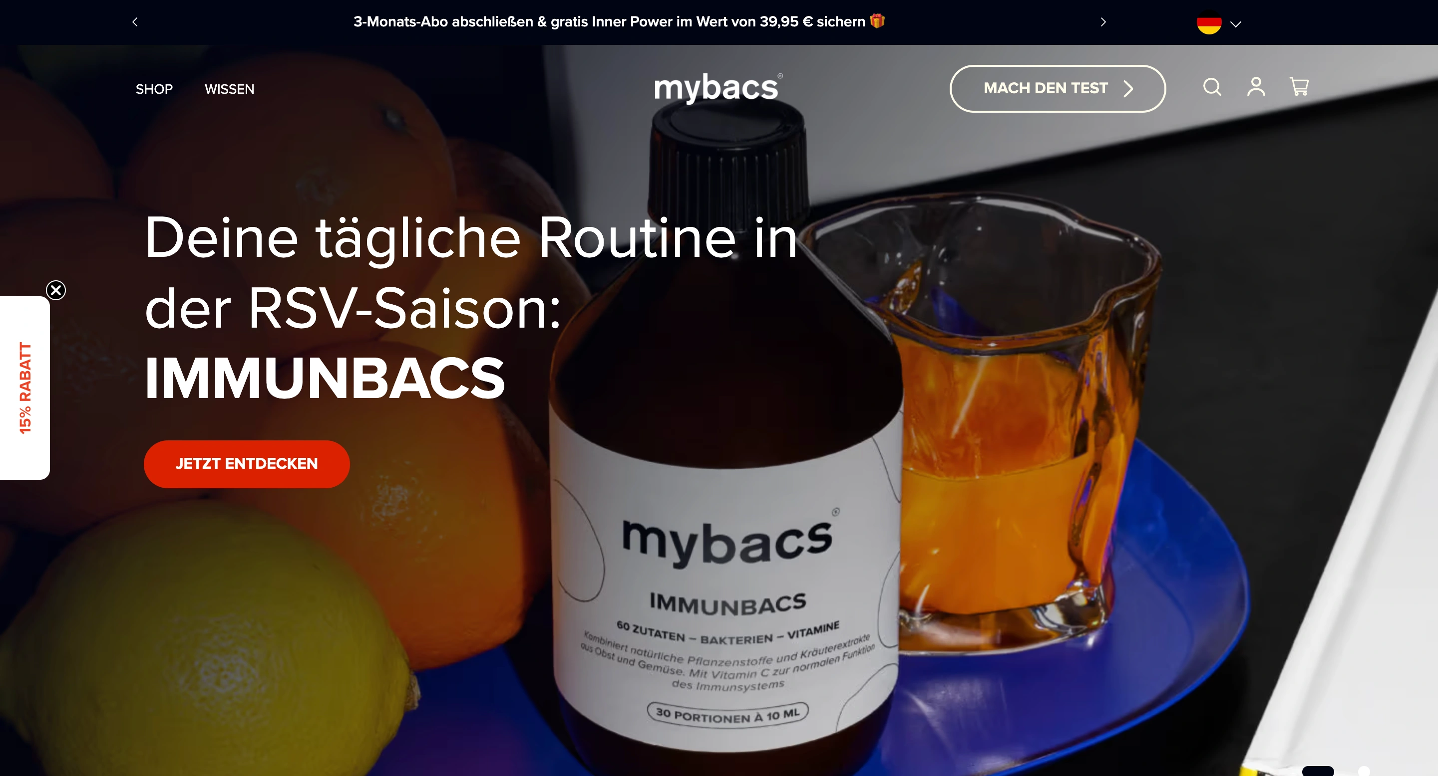
Improvements:
simplified hero layout
immediate brand promise
primary CTA clarity
section breathing space
fast scan-friendly product surfacing
Ingredient & Benefit UI Components

Highlights:
clean ingredient proof blocks
visual benefit cards
simple, transparent education modules
Product Listing & Navigation

Fixes:
clearer category logic
less clutter
better spacing rhythm
faster identification of core products
PDP — Trust Before Purchase
Enhancements:
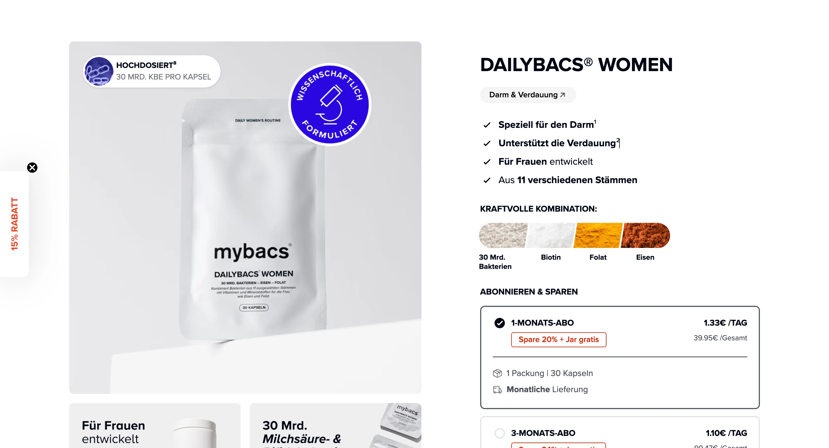
calmer typography
benefit hierarchy
consistent spacing
CTA raised above scroll depth
transparent ingredient story
Mobile Experience
consistent UI behavior
thumb-reach CTA
improved reading flow
reduced visual friction
📊 Results & UX Impact
The redesign delivered measurable improvements in engagement, shopping behavior, and clarity.
Performance Uplift
Conversion Rate: 1.4% → 2.1% (+50% uplift)
Homepage Bounce Rate: 64% → 41% (–23 pts)
Add-to-Cart Rate: 5.8% → 8.3% (+2.5 pts)
Product Discovery Time: 22s → 12s (–45% faster)
Mobile Checkout Drop-Off: 38% → 24% (–14 pts)
UX Signals
deeper scroll interaction
higher CTA engagement
more time on PDP
more ingredient-section clicks
stronger trust perception
Technical Improvements
load time improved from 3.7s → 2.4s
optimized media reduced page weight by 28%
In short:
The store now feels intelligent, premium, and guided.
It aligns with who Mybacs is — and converts better because of it.
🛠 Execution & Implementation
full UX audit & flow blueprint
UI design system (typography, spacing, grid logic)
custom Liquid UI components
PDP and homepage structural redesign
performance optimization
mobile-first responsive architecture
checkout clarity adjustments
conversion-driven CTA & layout repositioning
Tools:
Shopify | Liquid | HTML/CSS | JS micro-interactions | UX frameworks
👨💻 My Role
I handled the full redesign scope:
UX research & pain-point mapping
layout restructuring
visual & brand alignment
custom section development
performance cleanup
responsive UI execution
conversion experience optimization
Every decision served one purpose:
Make the store easier to understand and more confident to purchase from.
🧠 Design Principles Applied
Clarity over noise
Customers decide faster when information is simple and structured.
Hierarchy builds trust
Typography, spacing and sequencing create psychological confidence.
Science deserves clean UI
Clinical, minimal styling supports Mybacs’ research-backed identity.
Conversion happens when flow is calm
The new UI reduces cognitive load and improves decision comfort.
🙌 Final Outcome
The redesigned Mybacs storefront now:
✔ communicates research-based wellness
✔ feels clean and premium
✔ makes product evaluation easier
✔ supports faster, confident decisions
✔ creates a guided purchase path
It’s more than a storefront —
it’s a digital reflection of Mybacs’ scientific mission.
📩 Looking to redesign your Shopify storefront?
If you want a premium, conversion-focused redesign built on clarity, UX logic and brand identity — let’s talk.
I’d love to bring this same transformation to your store.
Like this project
Posted Dec 1, 2025
Transformed Figma designs into a high-performing Shopify storefront for mybacs.

