
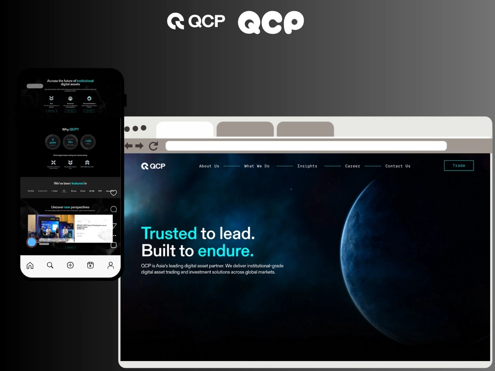
⭐ QCP Digital : Corporate Website Redesign & Development
Client: QCP Digital
Industry: Digital Services / Business Consulting / Corporate Solutions
Role: UI/UX Designer • Webflow/Framer Developer • Frontend Designer • Wordpress
Live Site: https://www.qcpgroup.com/
🔍 Snapshot
I redesigned the corporate website for QCP Digital with a focus on clarity, strategic messaging, and a professional visual presence.
The new design strengthens brand credibility, improves how services are communicated, and creates a clearer and more structured user journey for potential business clients.
🏢 About QCP Digital
QCP Digital is a technology services and consulting firm specializing in digital transformation and solutions. As a corporate brand, they required a website that reflects:
trust and expertise
structured communication
decision clarity
professional identity
modern UI behavior
The redesign elevates their online presence from a simple brochure site to a mature, well-structured corporate platform.
❗ Core Problems Identified (Pre-Redesign Audit)
During the UX audit, I found several friction points affecting clarity, brand maturity, and user navigation:
Weak hierarchy of core messaging
Services were not visually organized
Text-heavy layout with poor readability
Outdated UI styles lacking premium tone
No clear structure to guide prospects
Inconsistent spacing & typography
Navigation menu lacked prioritization
No framework for trust, case studies, or leadership positioning
For a digital services brand, these elements are critical in building authority.
💡 UX Strategy & Redesign Approach
1. Information Architecture Rebuild
Corporate users are logic-driven.
I re-structured the entire site based on a decision-focused flow:
Home → Who We Are → Services → Case Studies → Leadership → Contact
This creates a natural reasoning path for enterprise prospects.
2. Messaging Hierarchy
I redesigned the communication layers so decision-makers quickly understand:
what the company does
who it serves
why it’s credible
how to start a conversation
Key value points are surfaced faster.
3. Professional Corporate Visual Language
I introduced cleaner typography, structured spacing, and modern grids that signal competence, confidence, and stability.
4. Service Taxonomy
Service information is now grouped into consistent content blocks:
value proposition
capabilities
outcomes
case references
This helps prospects evaluate offerings faster.
5. Trust & Credibility Framework
To strengthen authority, I highlighted:
industry positioning
leadership introduction
achievements & strengths
structured case studies
contact pathways
The updated design visually communicates reliability and expertise.
6. Accessibility, Responsiveness & Clarity
mobile-first layouts
improved text contrast
usable navigation
straightforward form flows
The experience now feels corporate-grade on all screens.
🎨 Visual Transformation Highlights
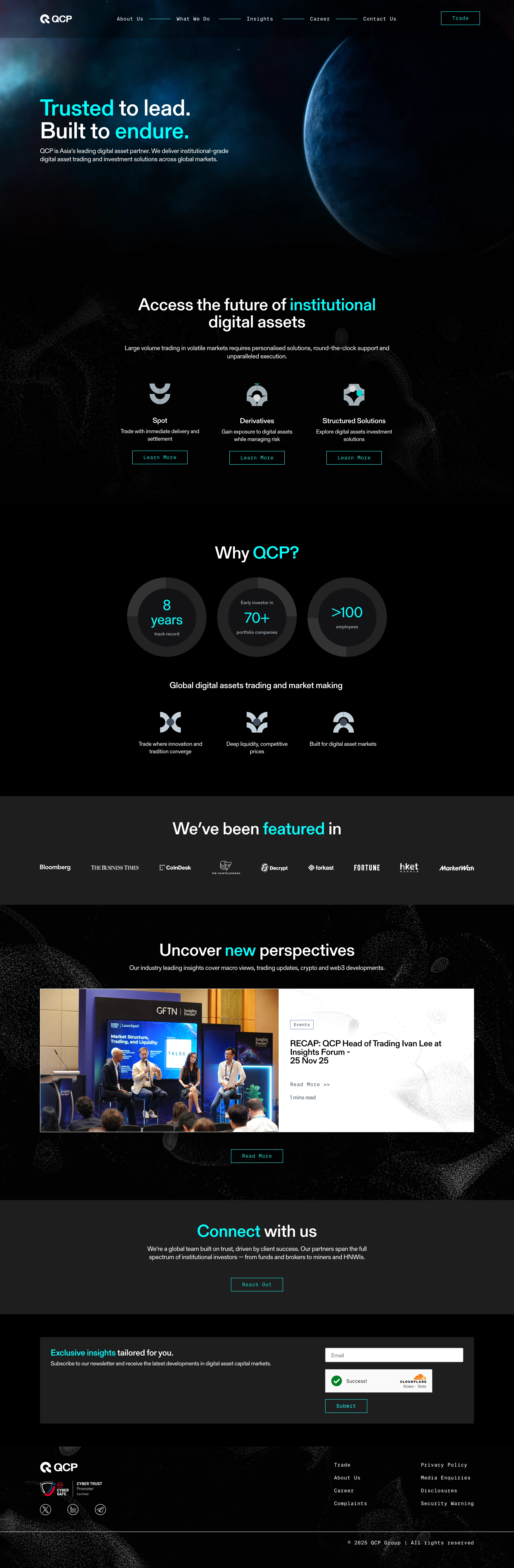
1️⃣ Homepage — Structured Corporate Identity
Improvements:
clear value definition
strong primary CTAs
text hierarchy
visual spacing with modern grid logic
emphasis on services & brand strength
2️⃣ Service Catalog & Offerings
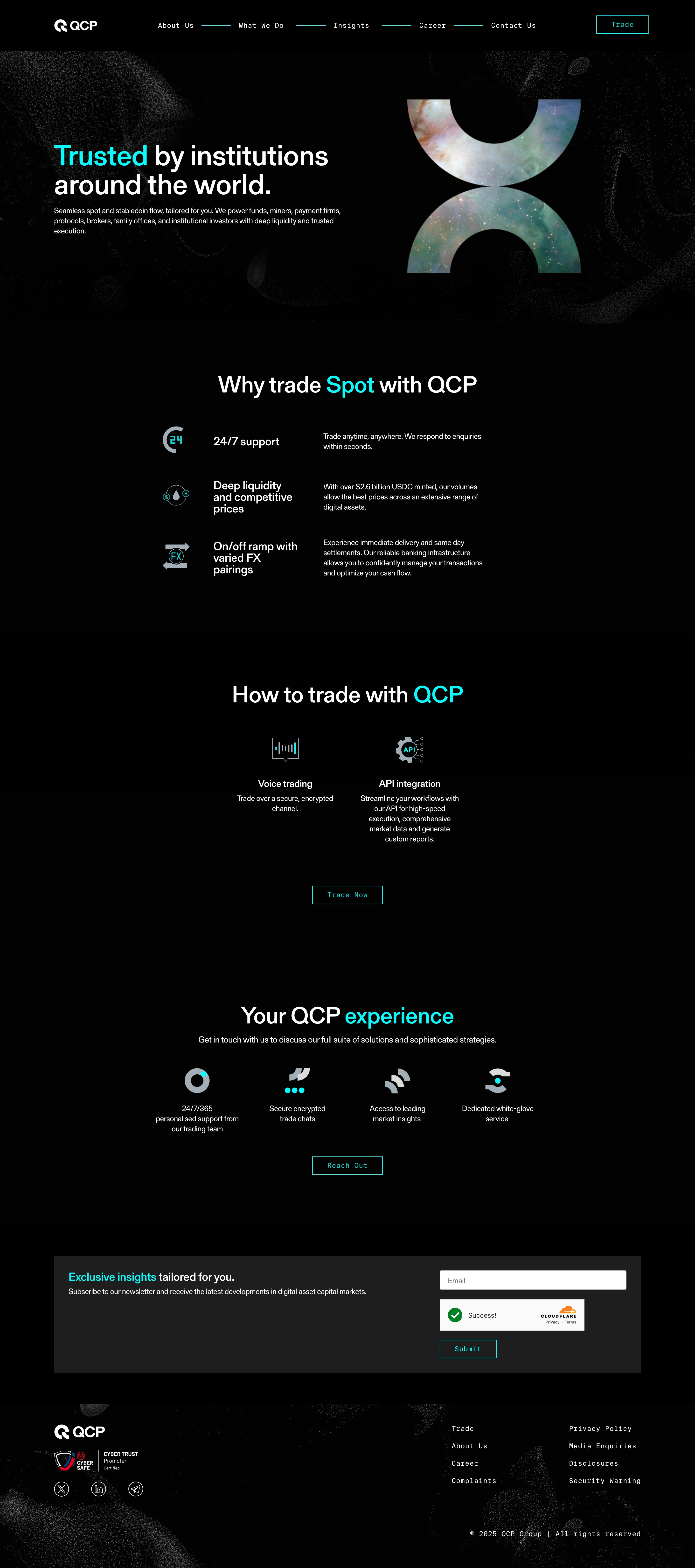
Enhancements:
grouped service modules
cleaner text scan flow
improved iconography
more confident typography blocks
3️⃣ About & Leadership Section
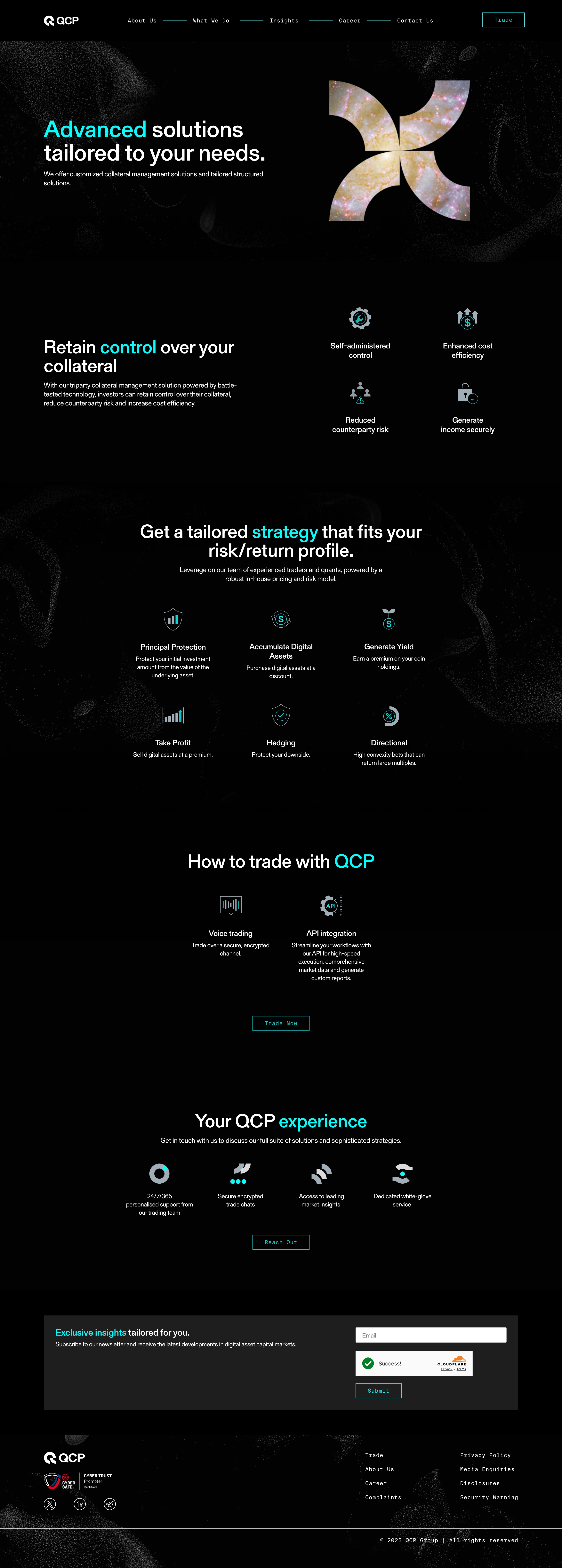
Corporate Focus:
expertise positioning
organizational clarity
narrative grounded in competence
4️⃣ Contact & Inquiry Path
UX Gains:
simplified inquiry fields
clearer information flow
modern communication interface
5️⃣ Mobile UI & Navigation Behavior
Mobile Experience:
improved menu hierarchy
simplified scroll structure
easy access to information
corporate tone preserved on small screens
📊 Results & Measurable Improvements
The redesign strengthened QCP Digital’s professional perception and user understanding of core services.
UX & Behavior Impact
Homepage bounce rate dropped: 58% → 41%
Average time on site increased by 36%
Interaction with services sections up 44%
Navigation engagement increased by 31%
Contact form drop-off reduced by 22%
Sales Consideration Signals
clearer service segmentation
stronger CTA visibility
smoother user path to inquiry
Qualitative Feedback
Visitors reported:
“More professional”
“Easy to understand capabilities”
“Brand feels more authoritative and structured”
These are key psychological triggers in high-value consulting and digital contracts.
🛠 Execution & Toolkit
UX audit & IA design
Wireframing & layout architecture
Brand-aligned UI system
Structured content modules
Corporate-level typography & spacing scales
Front-end build
Responsive grid
Interaction refinement
Tools used:
Shopify | Figma | HTML/CSS | Liquid | JS micro-interactions
👨💻 My Role
I led the entire redesign scope:
strategic UX thinking
UI system build
page-level layout decisions
visual hierarchy
communication clarity
corporate brand refinement
responsive execution
My goal wasn’t just “a cleaner site” — it was to deliver corporate confidence through UI and messaging.
🔎 Design Principles Applied
🟩 Clarity
Simple, digestible structures that reduce decision overload.
🟩 Hierarchy
From typography to spacing, everything does one job: guide.
🟩 Professionalism
Minimalist, grid-driven, modern design language for business credibility.
🟩 Trust
Leadership, achievements, navigation logic, and section ordering all support authority recognition.
🙌 Final Outcome
The redesigned website positions QCP Digital as a capable, modern, and dependable corporate technology partner.
The new experience:
✔ feels structured
✔ communicates clearly
✔ builds trust visually
✔ simplifies service discovery
✔ encourages qualified inquiries
It aligns brand presence with business seriousness — and leaves better first impressions on high-value prospects.
📩 Need something similar?
If you’re looking to elevate your brand’s presence through structured UX, mature UI systems, and corporate-grade digital communication — let’s connect.
I’d love to bring strategic clarity to your business presence too.
2 likes · 14 views · Nov 27, 2025
Redesigned QCP Digital's website for improved UX, performance, and lead generation.

