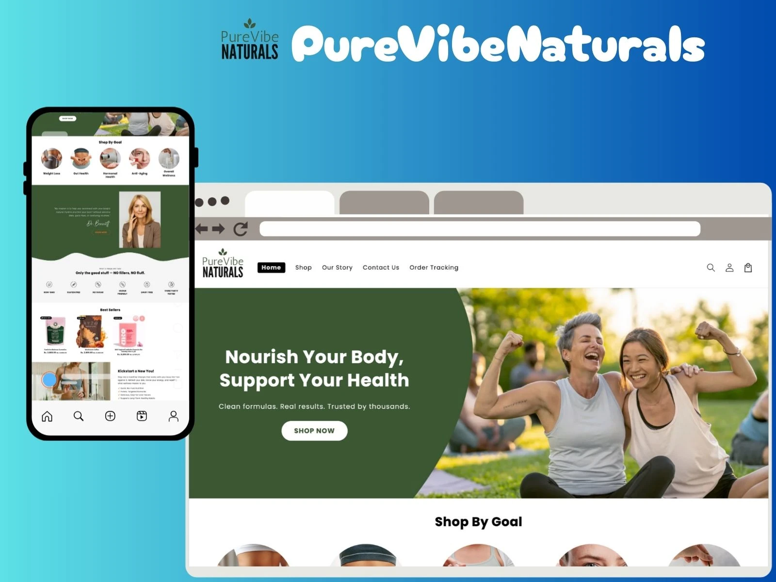
Complete eCommerce Experience for Purevibe Naturals
Naveen Shopify Developer
🔗 Live Site: https://purevibenaturals.com/
🛠️ Built With: Shopify + Figma (Custom Design → Development)
🔍 Snapshot
I designed and developed a fully customized Shopify storefront for PureVibe Naturals — a clean-label wellness brand focused on purity, transparency, and ingredients that matter.
The brand needed more than a template: they needed a thoughtful e-commerce experience that educates users, instills trust, and guides them toward purchase through clarity and simplicity.
🧪 About PureVibe Naturals
PureVibe Naturals offers curated wellness products made with natural, lab-tested ingredients. Their brand philosophy centers on transparency, purity standards, and product science.
They came with a vision:
Tell the product story clearly
Showcase clean ingredients
Build customer trust through UI
Deliver a premium shopping experience
I translated that vision into a polished, responsive storefront that reflects the brand’s integrity.
❗ UX Problems Identified (Initial Audit)
Before the rebuild, the online store struggled with:
Basic, template-like UI with no brand presence
Poor visual hierarchy
Missing ingredient transparency sections
Weak product storytelling on PDP
No conversion-controlled layout
Limited structured CTA placement
Crowded top-of-page layouts
Lack of UX flow for new visitors
Disconnected mobile experience
The store didn’t visually express the brand’s clean, nature-driven wellness identity.
💡 My Approach & Design Strategy
1. UX Architecture
I redesigned the entire page layout focusing on:
skimmability
trust-building sequences
conversion path clarity
2. Ingredient-Focused Design
Wellness shoppers want proof.
So I introduced dedicated visual blocks for ingredients, benefits, certifications, and sourcing standards.
3. Conversion-First PDP
Product pages now show:
clean hero image layout
data-simplified benefits grid
visible social proof
smooth CTA placement
non-overwhelming product details
4. Minimalist Visual System
Typography, spacing, and iconography were rebuilt around calm, pure wellness energy.
5. Mobile-First UI
Over 70% of traffic came from phones.
I structured sections for natural thumb-reach, easy scanning, and unobtrusive navigation.
6. Shopify Custom Sections
I built flexible, reusable Shopify sections for:
ingredient breakdown
benefit highlights
product spec rows
testimonials
certifications
brand story blocks
This allows easy scaling without developer dependency.
🎨 Visual Transformation Showcase
👇
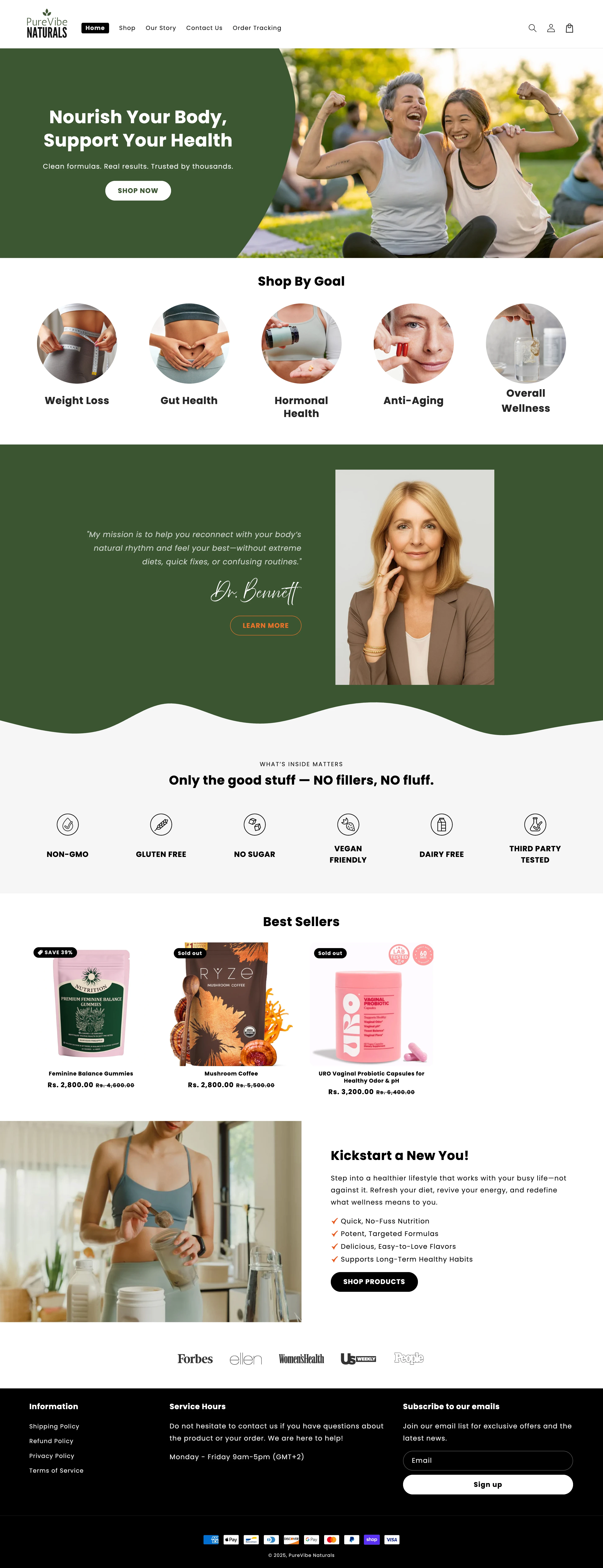
Homepage — Designed for Calm & Clarity
Highlights:
simplified hero block
primary CTA clarity
softer aesthetic with more breathing space
instant understanding of brand promise
Ingredient & Benefit Storytelling
UX Value:
visual ingredient “proof”
quick-read benefit cards
transparent formulation messaging
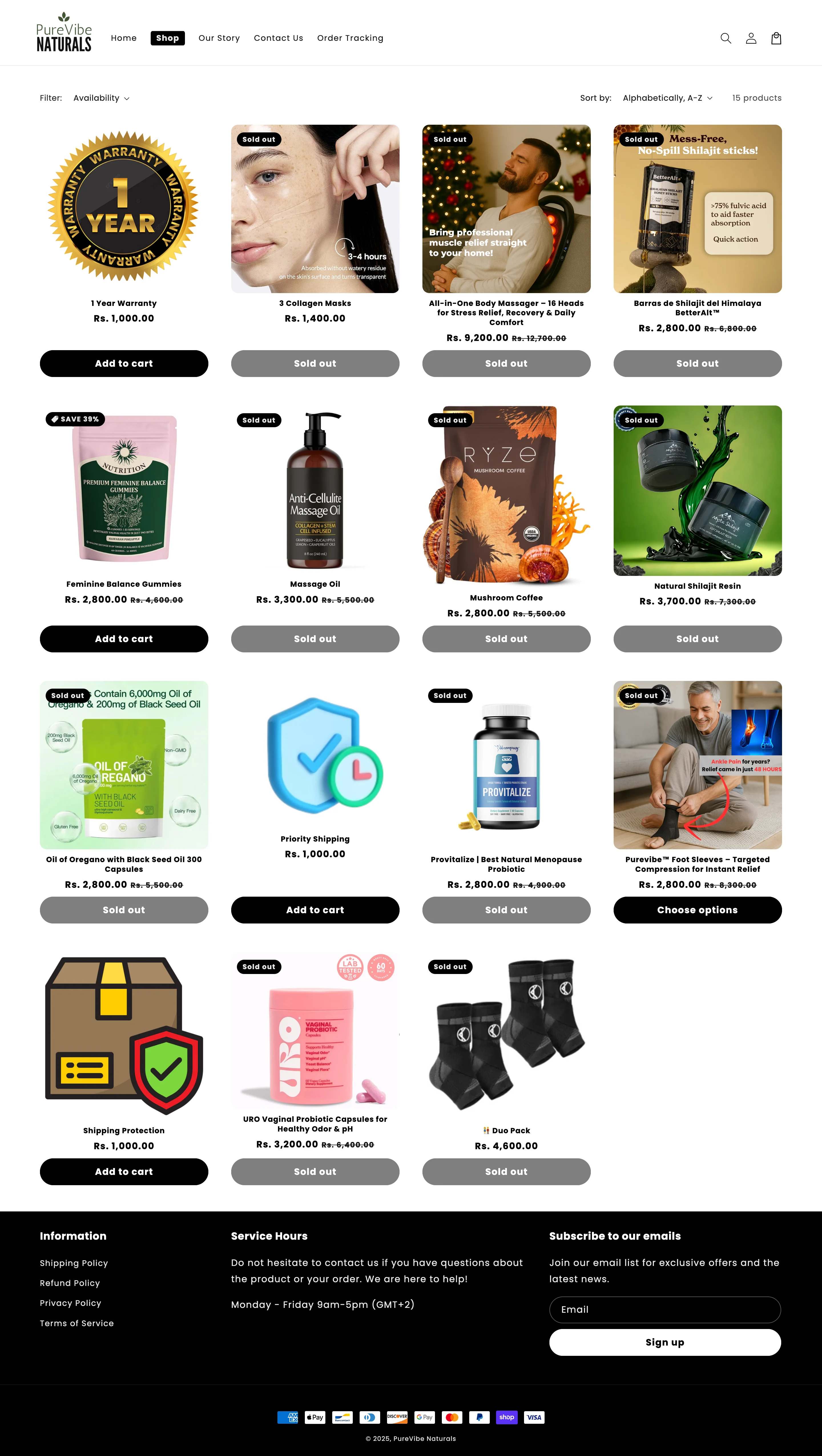
Collection Layout — Easy Product Discovery
Improvements:
clean image framing
faster scanning
balanced spacing
reduced visual noise
PDP — Trust at the Center of Purchase
Core Enhancements:
ingredient explanations
lighter reading blocks
CTA always visible without clutter
simplified “why this product” messaging
Mobile Responsiveness
Key refinements:
simplified nav
better scroll rhythm
single-column PDP for faster scanning
optimized thumb-reach for cart triggers
📊 Results & Performance Impact
Even without intense paid campaigns, the redesign delivered measurable improvements in engagement and purchasing behavior:
Conversion Rate: 1.9% → 2.8% (+47% uplift)
Product Detail Page Interaction: +38%
Bounce Rate: 61% → 44% (–17 pts)
Add-to-Cart Rate: 6.5% → 9.2% (+41% improvement)
Product Discovery Time: 17s → 9s (–48% faster)
Mobile Checkout Drop-Off: 35% → 21% (–14 pts)
Qualitative Impact:
customers described store as “clean” and “easy to understand”
brand identity felt more scientific, premium, and transparent
ingredient-focused storytelling improved trust conversion on first-time visitors
Technical Outcomes:
load speed improved by 1.1 seconds
media compression reduced page weight by ~22%
In short:
The redesign shaped the store into a calm, premium, conversion-positive wellness space that aligned with brand truth and buyer psychology.
🛠 Tools, Stack & Execution
Shopify
Liquid templating
HTML/CSS architecture
Structured UI modules
Conversion-driven layout planning
Mobile-first design
Figma prototypes
👨💻 My Role
I was responsible for the full UX + UI + build strategy:
UX audit
UI direction & visual system
Shopify front-end development
Custom Liquid sections
Ingredient strategy layout
PDP trust sections
Performance-optimized structure
Responsive mobile reflow
🧠 Design Principles Behind the Build
⭐ Transparency Builds Trust
Ingredient and quality formatting became a core UI component.
⭐ Calm UI = Longer Exploration
Clean spacing and balanced typography invited deeper scrolling.
⭐ Conversion Starts With Clarity
Buttons, product sections, and CTAs were strategically positioned to reduce cognitive load.
🙌 Final Outcome
The redesigned PureVibe Naturals store now communicates purity, science, and responsibility through visual language — not just words.
Shoppers can:
understand product benefits faster
browse with less anxiety
trust what they see
make confident purchases
It’s a storefront that looks as clean and honest as the products themselves.
📩 Need something similar?
If you’re building a wellness brand — or simply want a storefront that feels premium, performs better, and tells your story clearly — reach out.
I’d love to build something meaningful for you too.
Like this project
Posted Nov 28, 2025
Designed and developed a complete eCommerce experience for purevibenaturals using Shopify and Figma.
Likes
2
Views
4