HealthBar - RPG-style Apple Health companion

Yağmur Şimşek Sönmez

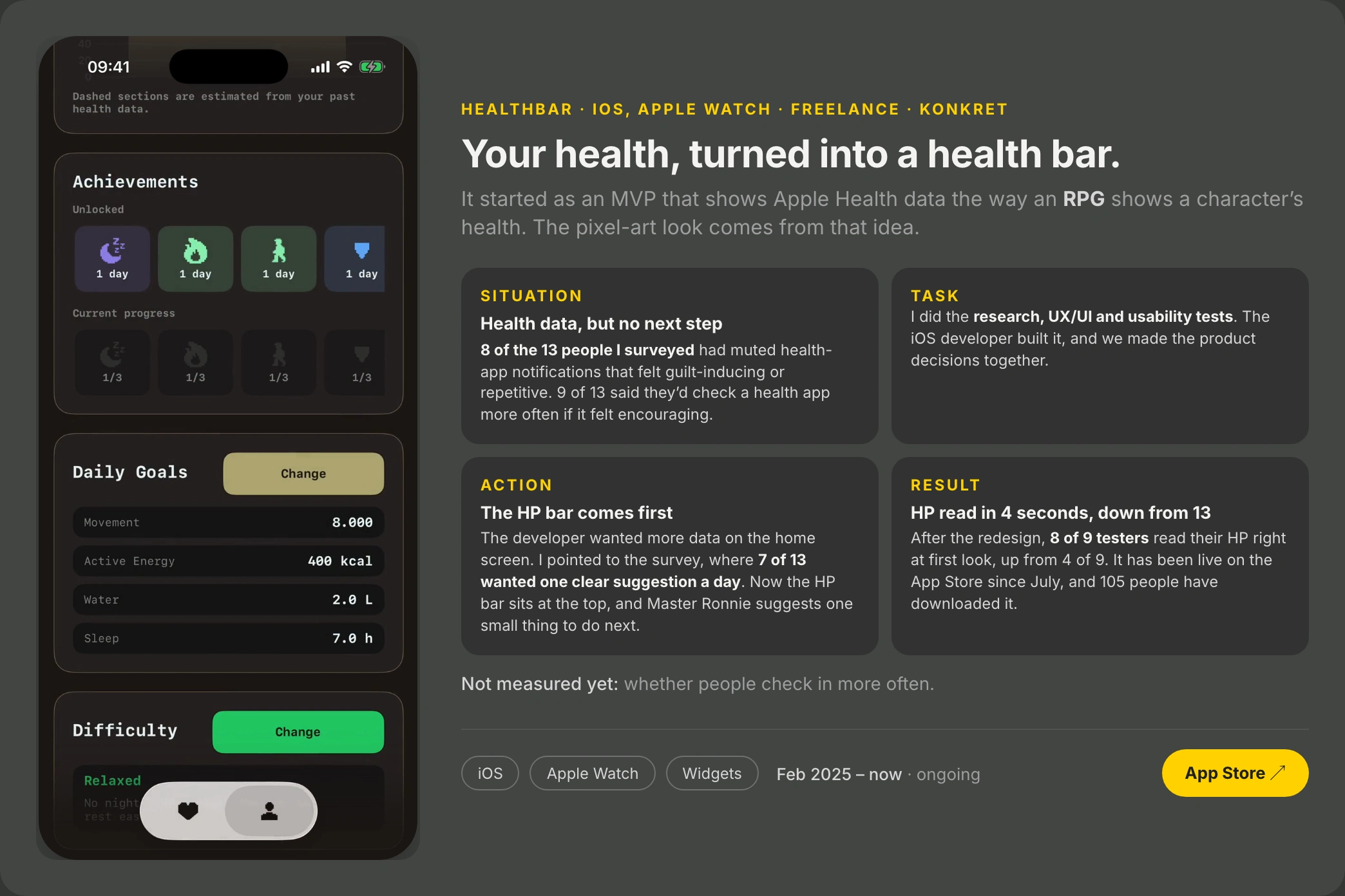
Health apps show you numbers, but they don't suggest a next step. HealthBar is an RPG-style companion for iOS, Apple Watch and widgets: it shows your Apple Health data the way a game shows a character's health. I did the research, UX/UI and usability tests. The iOS developer built it, and we made the product decisions together.
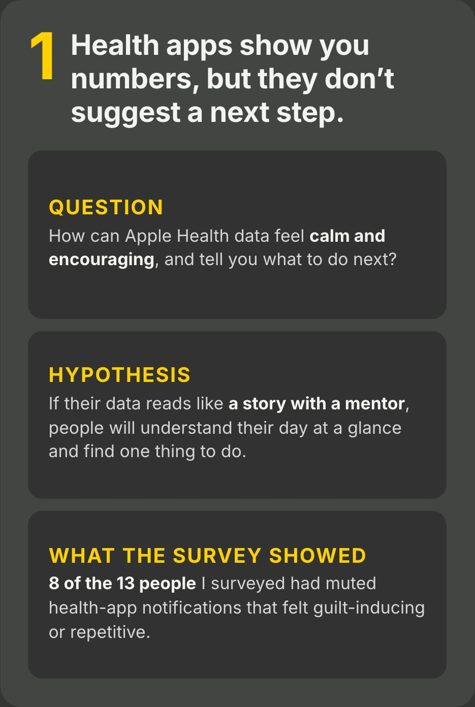
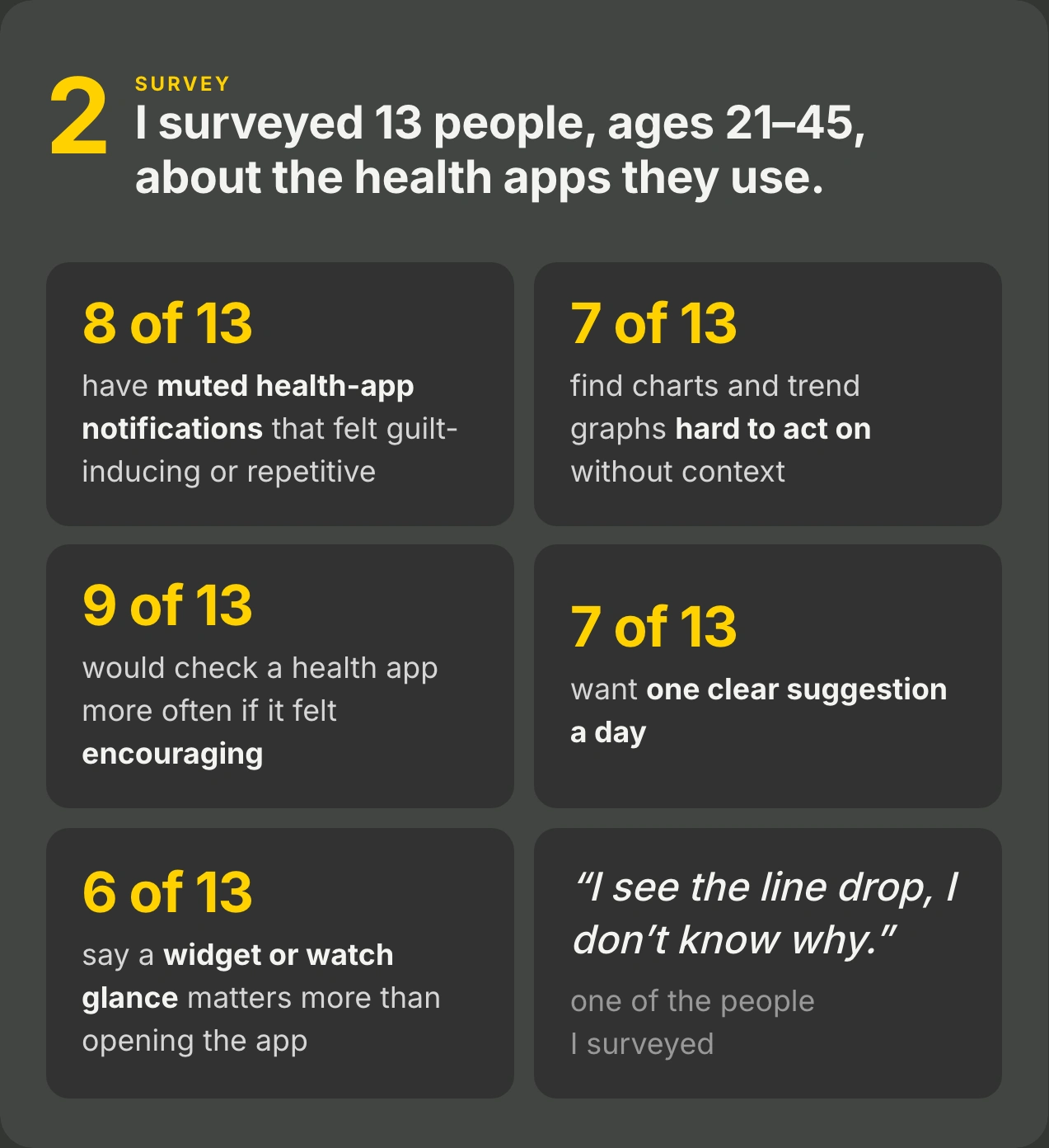
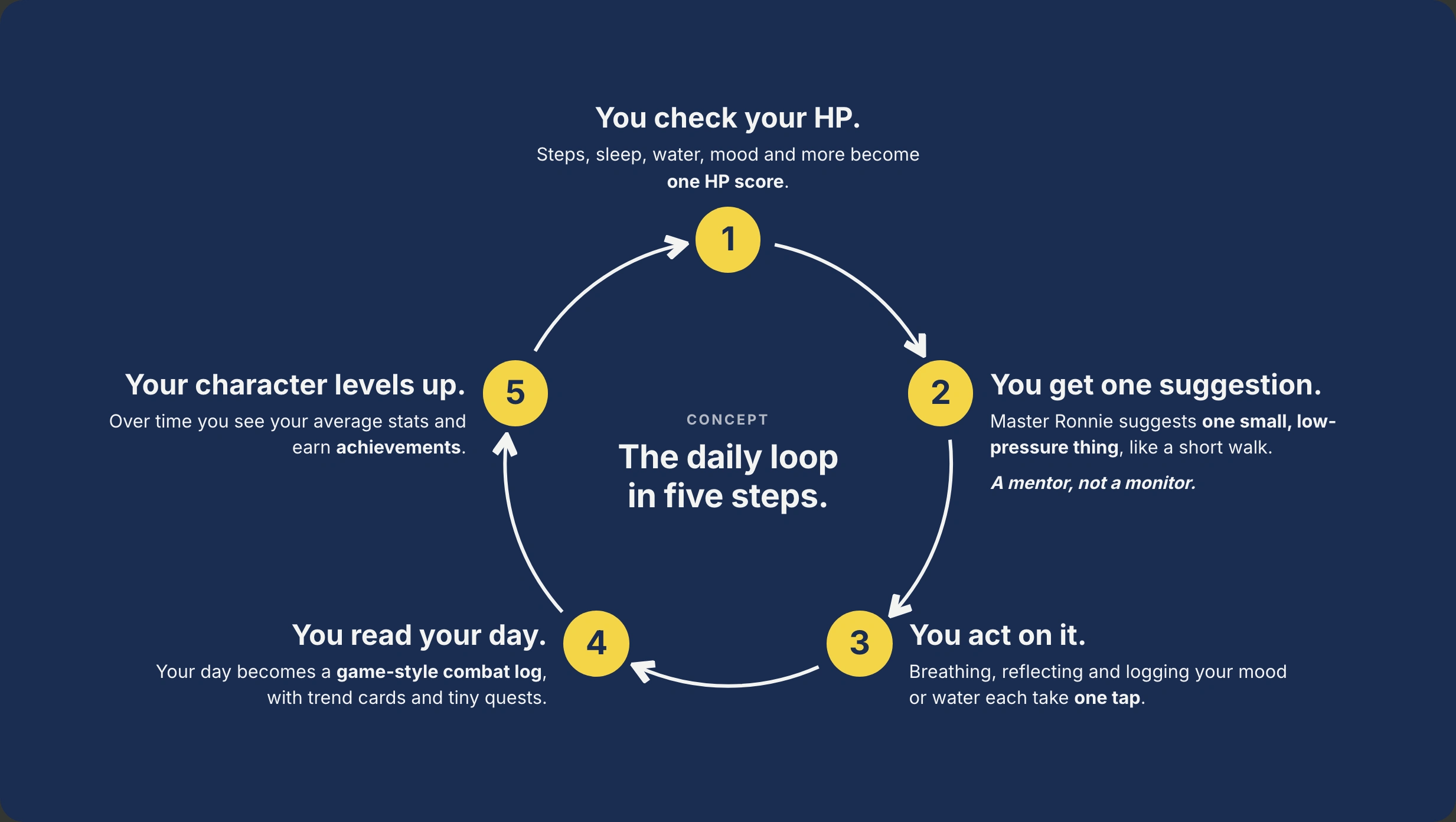
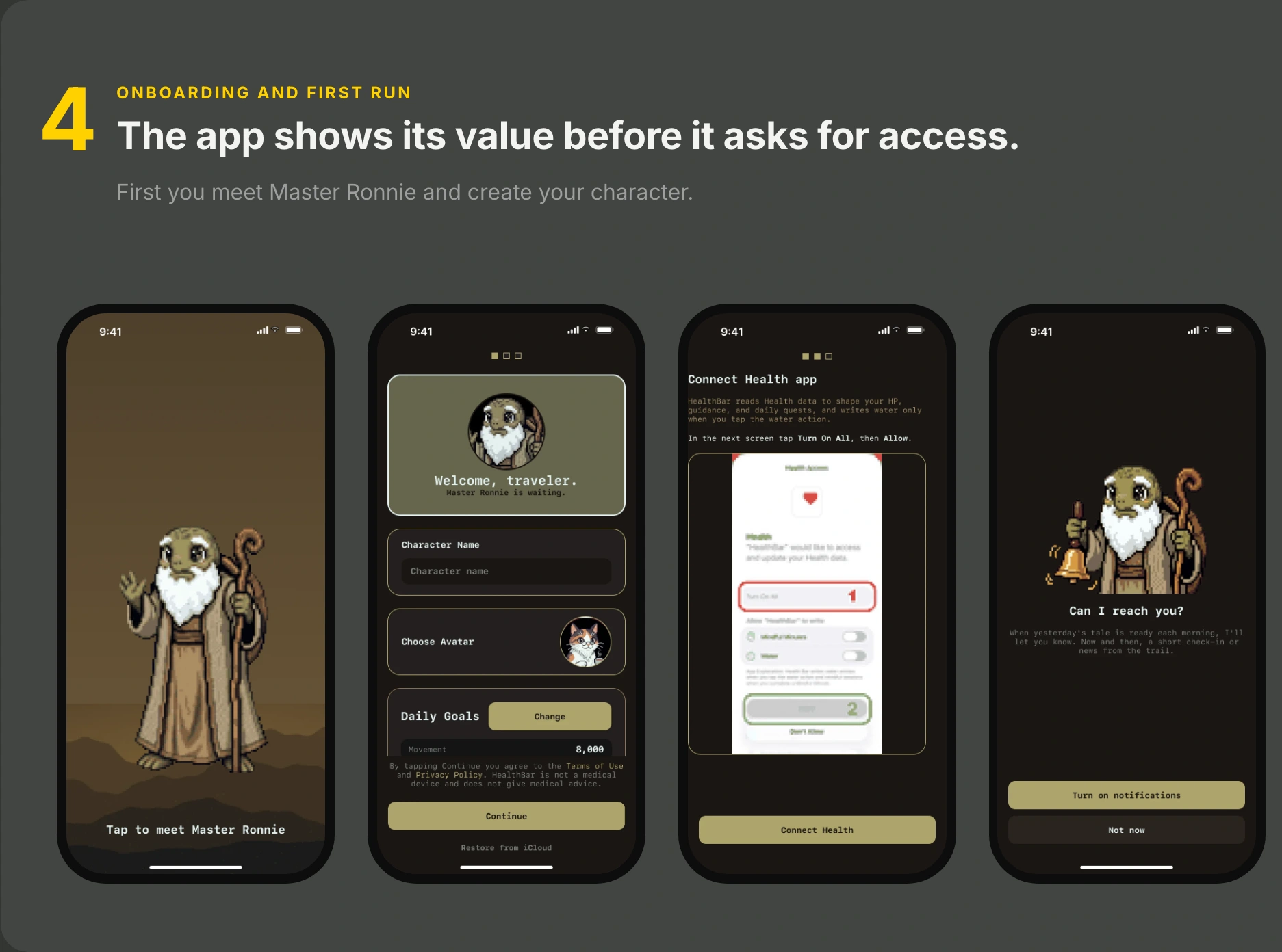
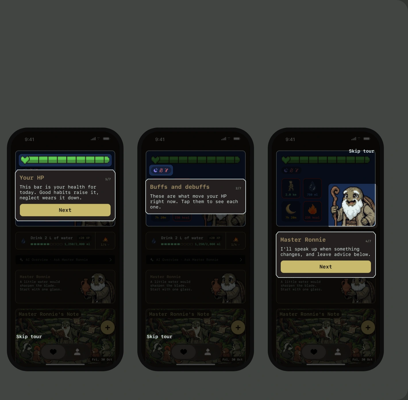
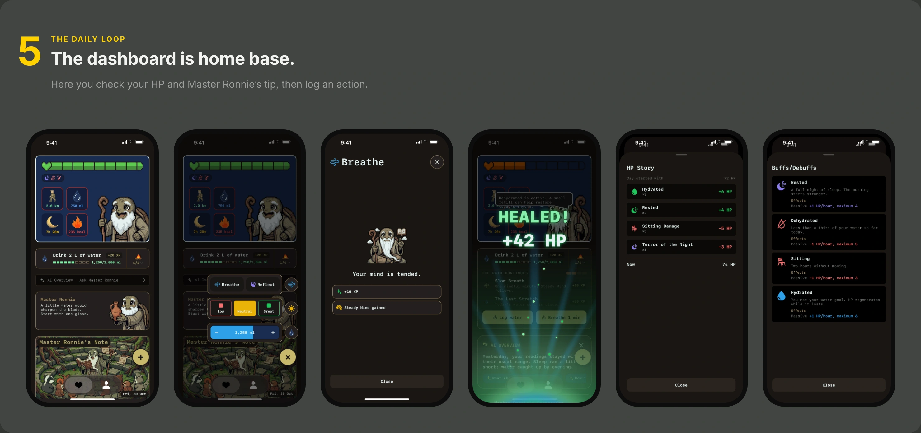
I surveyed 13 people. 8 of 13 had muted health-app notifications that felt guilt-inducing or repetitive, and 7 of 13 wanted one clear suggestion a day. In the daily loop you check your HP, Master Ronnie suggests one small thing, you act on it, and your character levels up over time.
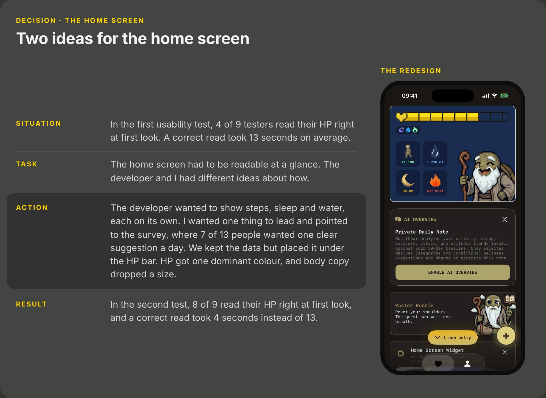
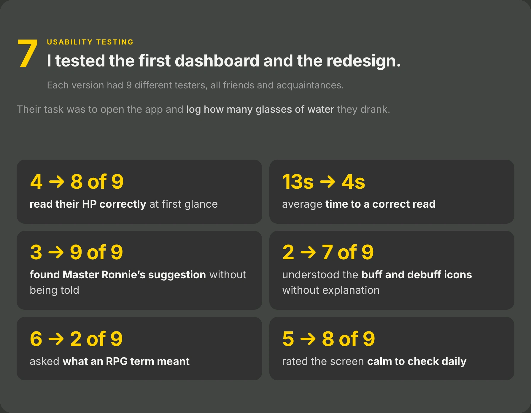
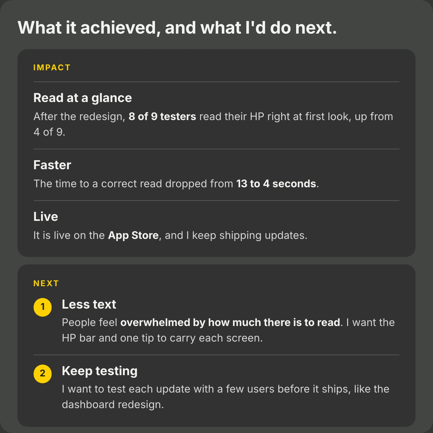
The home screen. The developer wanted to show steps, sleep and water, each on its own. I wanted one thing to lead and pointed to the survey. We kept the data under the HP bar. After the redesign, 8 of 9 testers read their HP right at first look, up from 4 of 9, and a correct read took 4 seconds instead of 13.
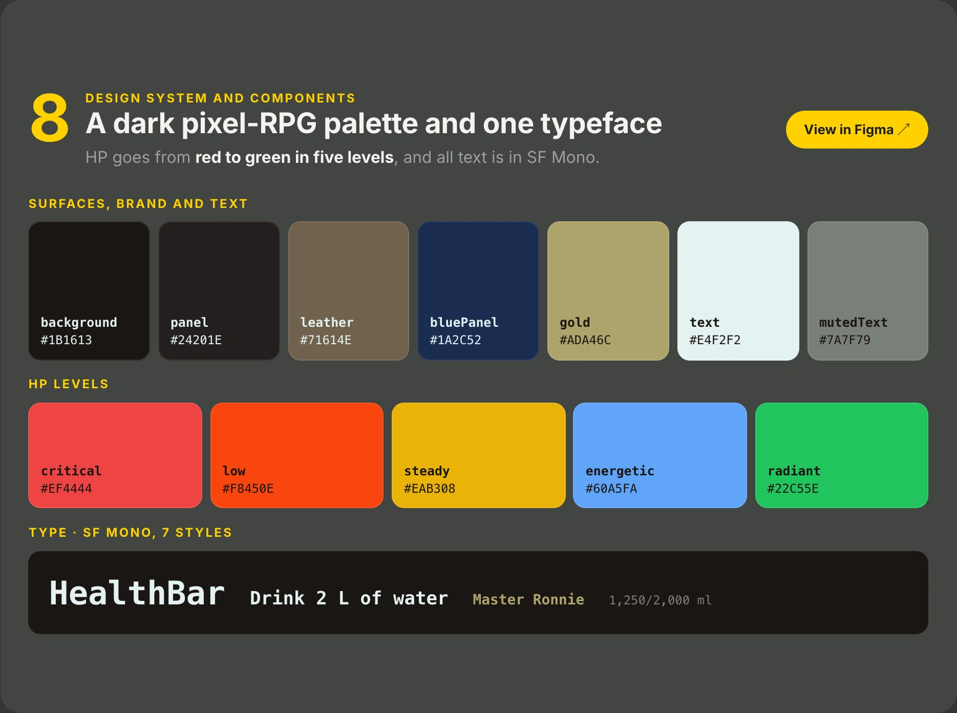
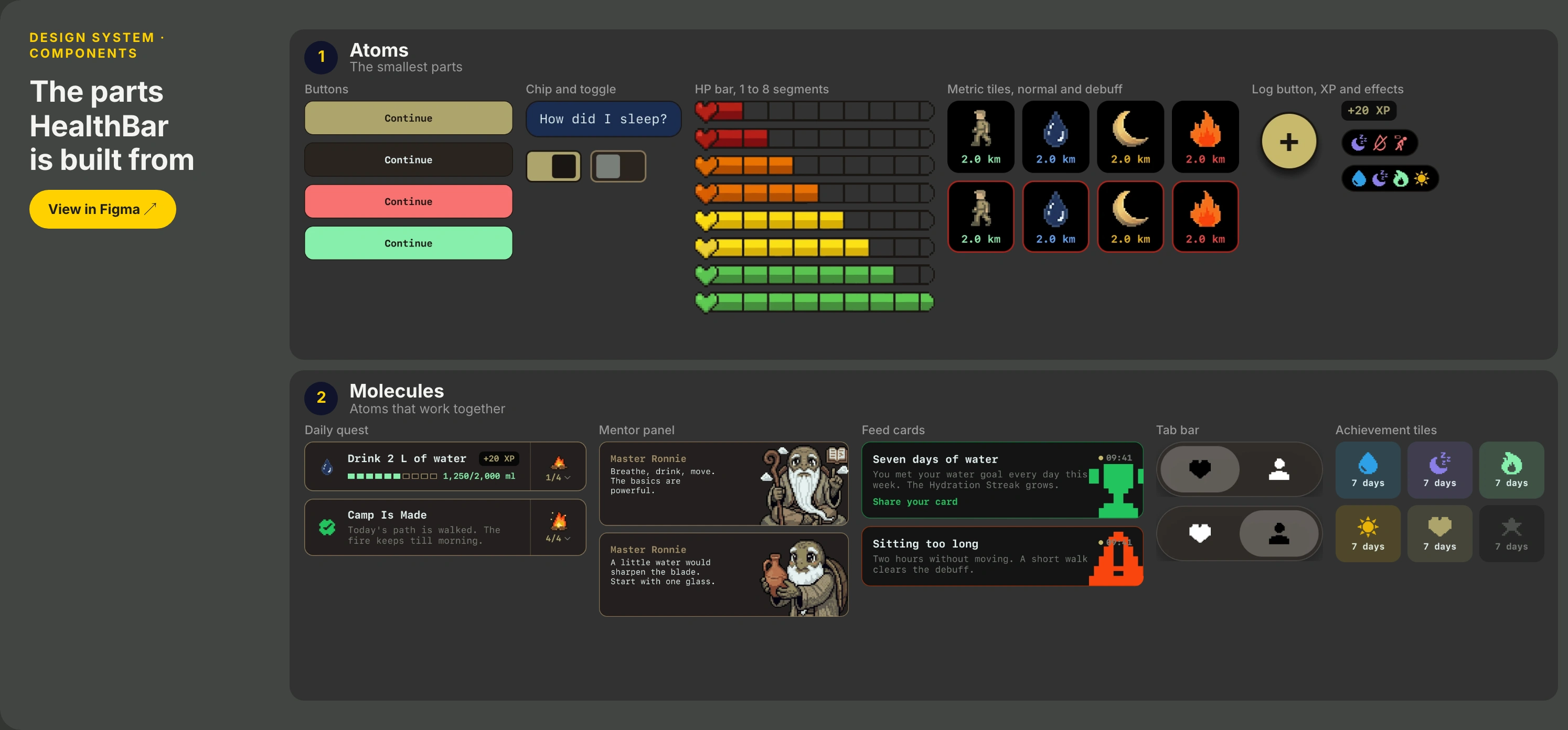
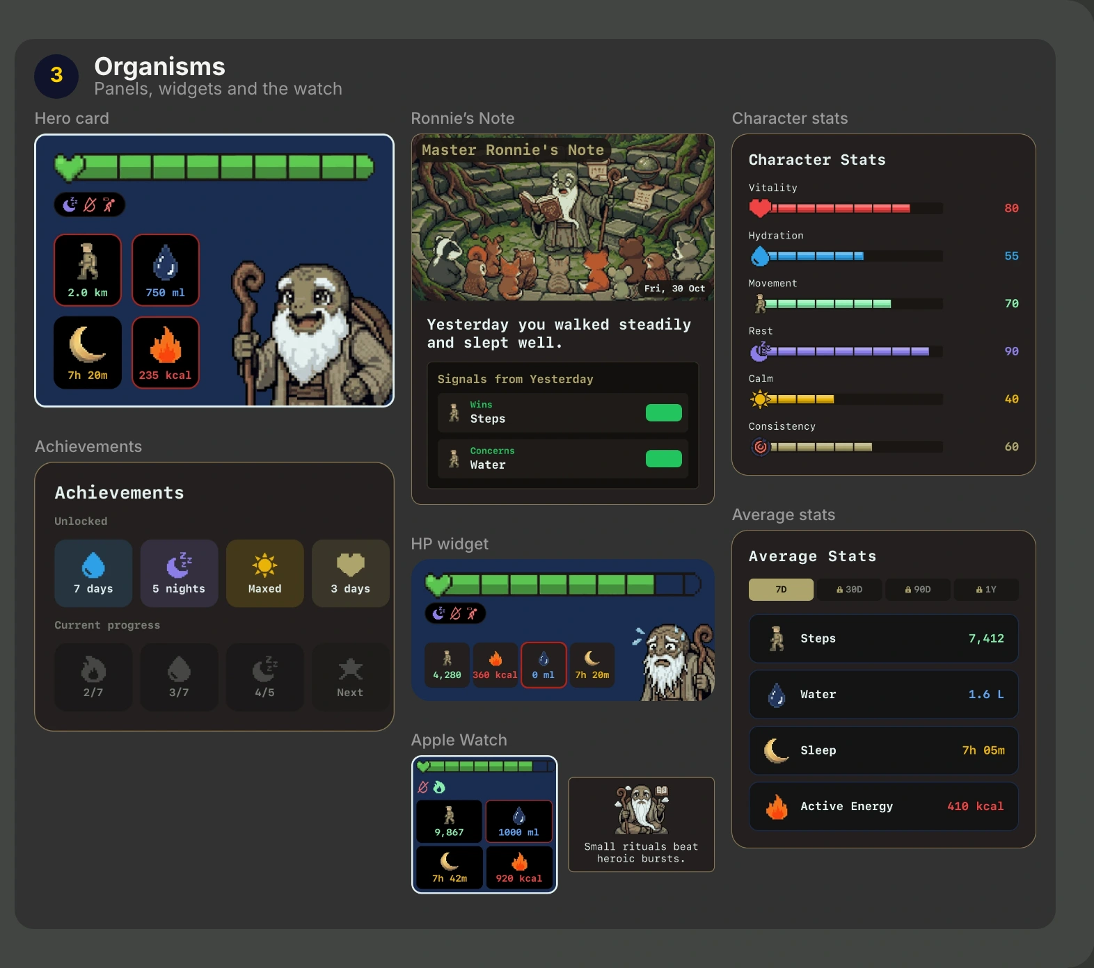
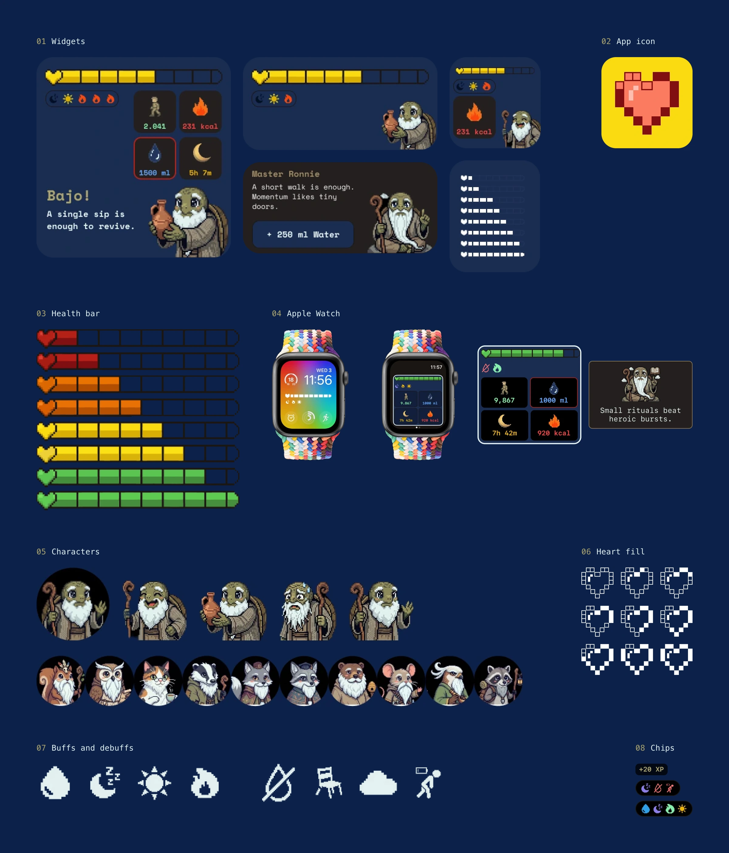
The design system: a dark pixel-RPG palette and one typeface. HP goes from red to green in five levels, all text is in SF Mono, and the components run from single buttons to the widgets and the Apple Watch.
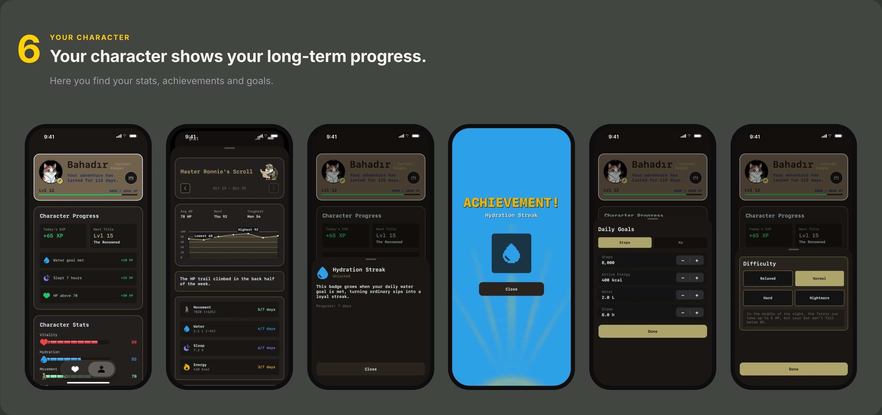
HealthBar has been live on the App Store since July, with 105 downloads. Not measured yet: whether people check in more often.
Like this project
Posted Nov 6, 2026
End-to-end UX/UI for an iOS and Apple Watch app, from a 13-person survey to the App Store. Dashboard comprehension went from 44% to 89%.
Likes
0
Views
0