Feature Product - The Shade Finder
Context
What will you do if you, or your wife or any female (who you know) buys a makeup foundation online but when it arrives, it is not matching with the skin tone?
You'll simply register to return the product and maybe also leave a bad review of your experience on the platform.
Now just imagine being on the other side of this story and loosing thousands of users because of this problem.
Crazy rise in Return to Order (RTO) as more and more users were buying makeup foundations in confusion gave rise to one of the most intense product briefing meet i've ever attended to. The Product team at Client's end was feeling sad (about the already lost revenue) and hopeless in coming up with solution.
After checking all the parameters even including help desk, the call concluded with the demand of something proprietary which can solve this problem within 4 weeks timeline.
Thus, after tons of brain-storming, ideations and gossips, MyGlamm's proprietary Product - The Shade Finder came into existence (or was it?)
Project/Problem: Redesigning the whole user experience in the buying journey for users
who buys or likes to buy combo deal or bundled products.
Timeline: 3 Weeks (15 working days)
Role: UX Researcher, UX Designer, UI Designer
Chosen Design Process: Double diamond Approach
UX Research -> Sketches (filtering the optimum options) -> Wire-framing (filtering the optimum options) -> Low Fidelity Prototype -> User Testing -> Analysis and patterning
-> Iteration in the wireframes -> Retest -> User Interface Design -> High Fidelity Prototype
-> Adaptations -> Tech Handover
Glimpses of UX Research
Persona & Sentiment Mapping (it helps in understanding core of the user)

Persona & Sentiment Mapping
I wanted to form a deeper understanding of our users' goals, needs, experiences, and behaviours. So, I created a few personas for our user segments. They were based on user interviews and surveys, and we kept updating them throughout the project as we gathered more data. I used these personas whenever we wanted to step out of ourselves and reconsider our initial ideas.
These Personas helped us to stay focused on our Users.
It acted as the Fundamental structure when ideating on the solution.
Personas Not only included their basic details but Motivations & Pain Points.
I referred to these personas constantly during the whole process of this Feature Build-Up.
User Journey Mapping (always helps in minimising extra steps)

User Journey Mapping
With the Feature goal in mind, i made sure that our users reach experience the whole flow without any hiccups. So, i sketched a current-state user journey map, to identify opportunities for improvement. We identified few unnecessary steps and potential drop off points in the flow. By eliminating these from the new design, we ended up with a much faster and simple to use experience that contributed to overall good usability testing score.
I articulated the most probable traffic source from where our users will land on our feature and through those sources, I made sure the joining points should be seamless and users should have no problem in coming in or going back of the feature.
The Below user flow is the fined tuned version which I got after eliminating the unnecessary steps to make it easy for users.
This User flow chart helped me to focus on the this feature's important steps which otherwise could've have gone the other way.
Initial Sketches (Foundations in setting up the UX)
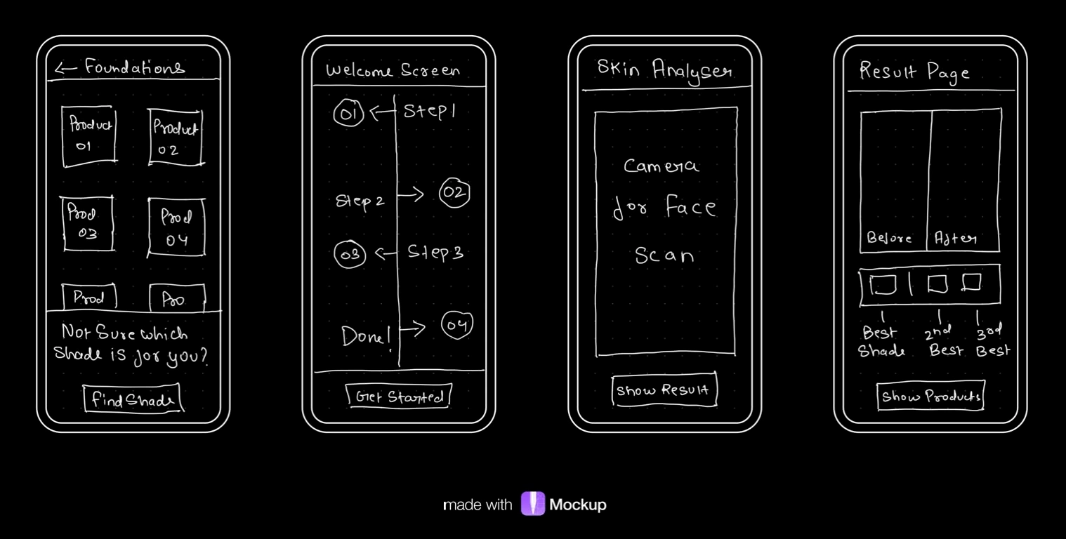
Few sketches in laying the foundational journey of the user throughout the product
I began the design process with low-fidelity sketches and wireframes to accelerate decision-making through visualization without losing time. My sketches were based on the market study, the feature goal, and the heuristic evaluation. They each pointed to the fact that there were few distractions in the flow. I came back to the sketches throughout the entire design process to make sure that i don’t lose sight of our primary goals and ideas.
The Main Purpose of rough sketching is to see the ideas at least take some form and it eases the brainstorming process to me.
Apart from the core feature screen, I also drew how the user will reach it from the very initial nudge point.
These sketches are few of the rough doodles I did to know what it will take a user to reach from point A to point B without hassle.
I was trying to include only one primary CTAs to not give user too much distractions to drop off.
These Sketches helped me move forward to Low fi and Wireframes.
Wire-frames (Only the most optimum one lives)
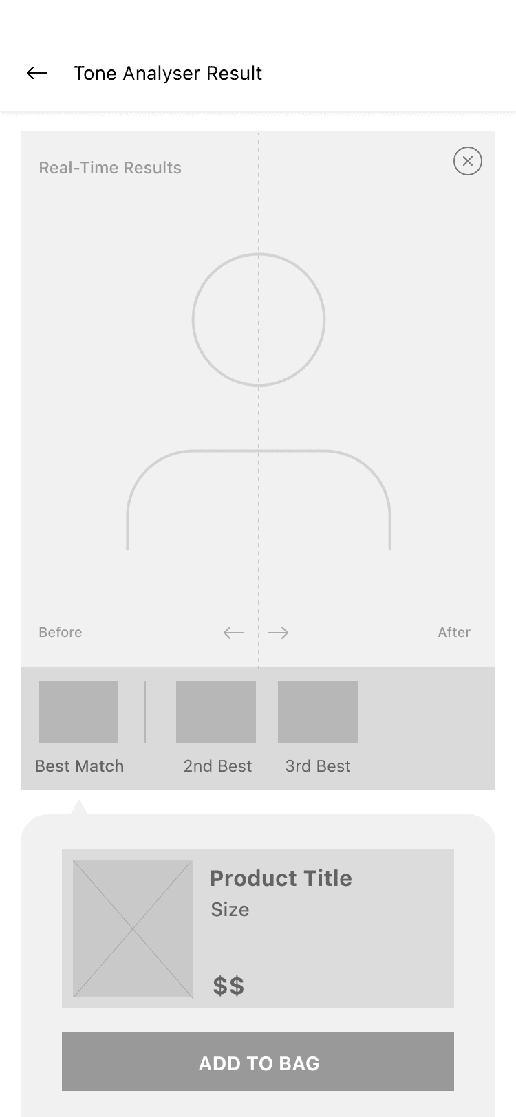
Chosen Wire-frame from many
Using Figma, I translated my first sketches into low-fidelity wireframes. At this stage, the wireframes were defined enough for some user testing. Based on few quick tests, I’ve made a few alternations and moved on to creating high-fidelity Wireframes. Then, I improved them in High fidelity by adding a few relevant stock images and copies provided by the marketing team.
During the process of Wire-framing my rough sketches, I noticed initially I ideated two separate screens for results and recommended products, but when working on these wireframes, I realised that I can eliminate unnecessary step and can make both screens into one for better user experience.
I used Figma primarily for Wire-framing and Prototyping.
Later on completion of this project, I realised the initial idea and the final UI had many difference and elimination of unnecessary steps which made the feature simple to use and visually appealing.
User Interface (some colors, some interactions and lots of iterations!)
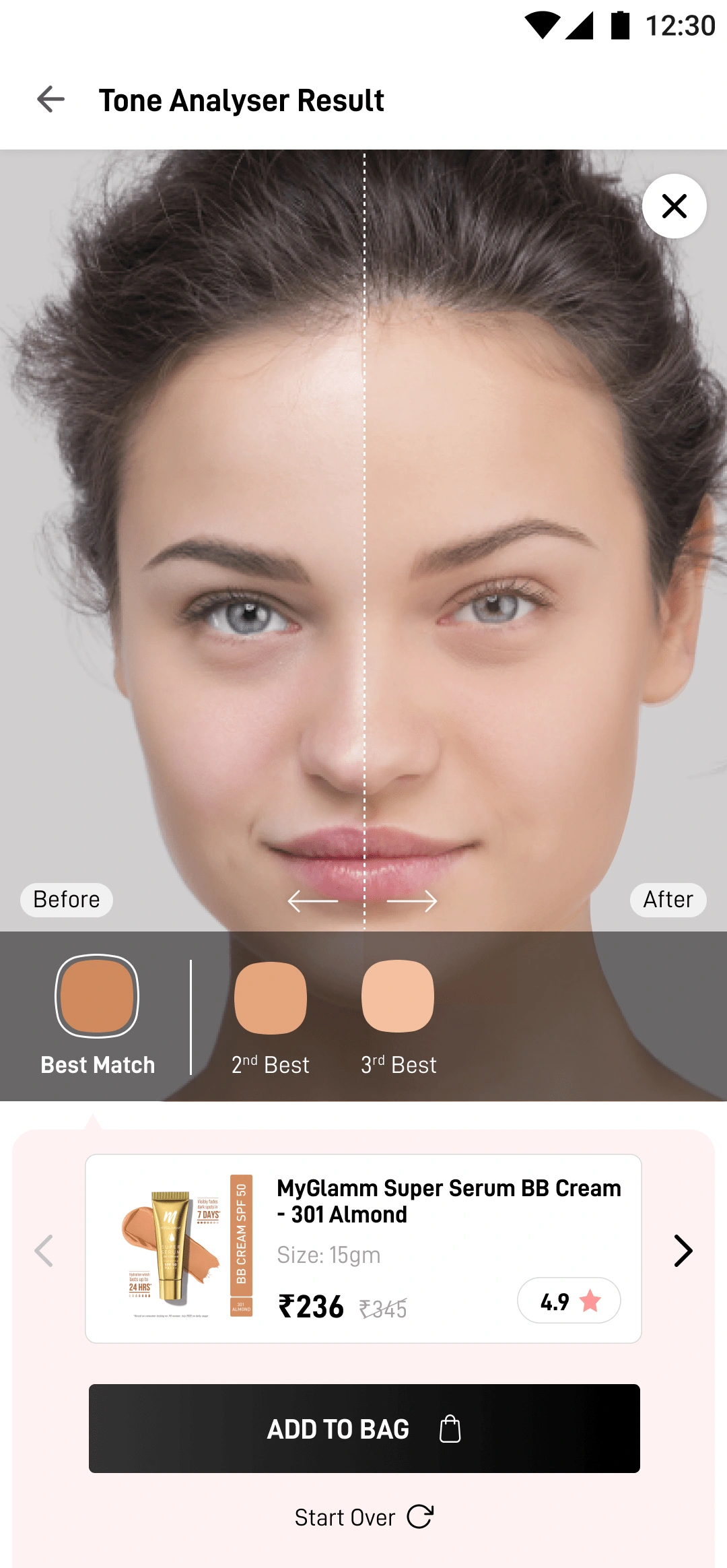
Shade Finder working in Real time
Once the usability issues were resolved, I moved on to design the final screens in Figma. My goal was to create a visually nice yet within the branding of the organisation UI which should speak for itself.
I had to use the Brand colours, fonts already defined by the management and also their product catalogue.
The Final UI design was made and adapted for Mobile Web, Android and iOS platforms.
For Easing the development part, I delivered this whole project into Zeplin adaptations which helps developer and the management to ease the production cycle.
I learned few more elements were added and removed when we were doing final testing and the screen which you're seeing on right is the final UI version of the Shade Finder Feature Result Page.
Bonus: Comparison between My designed & Lakme's similar product
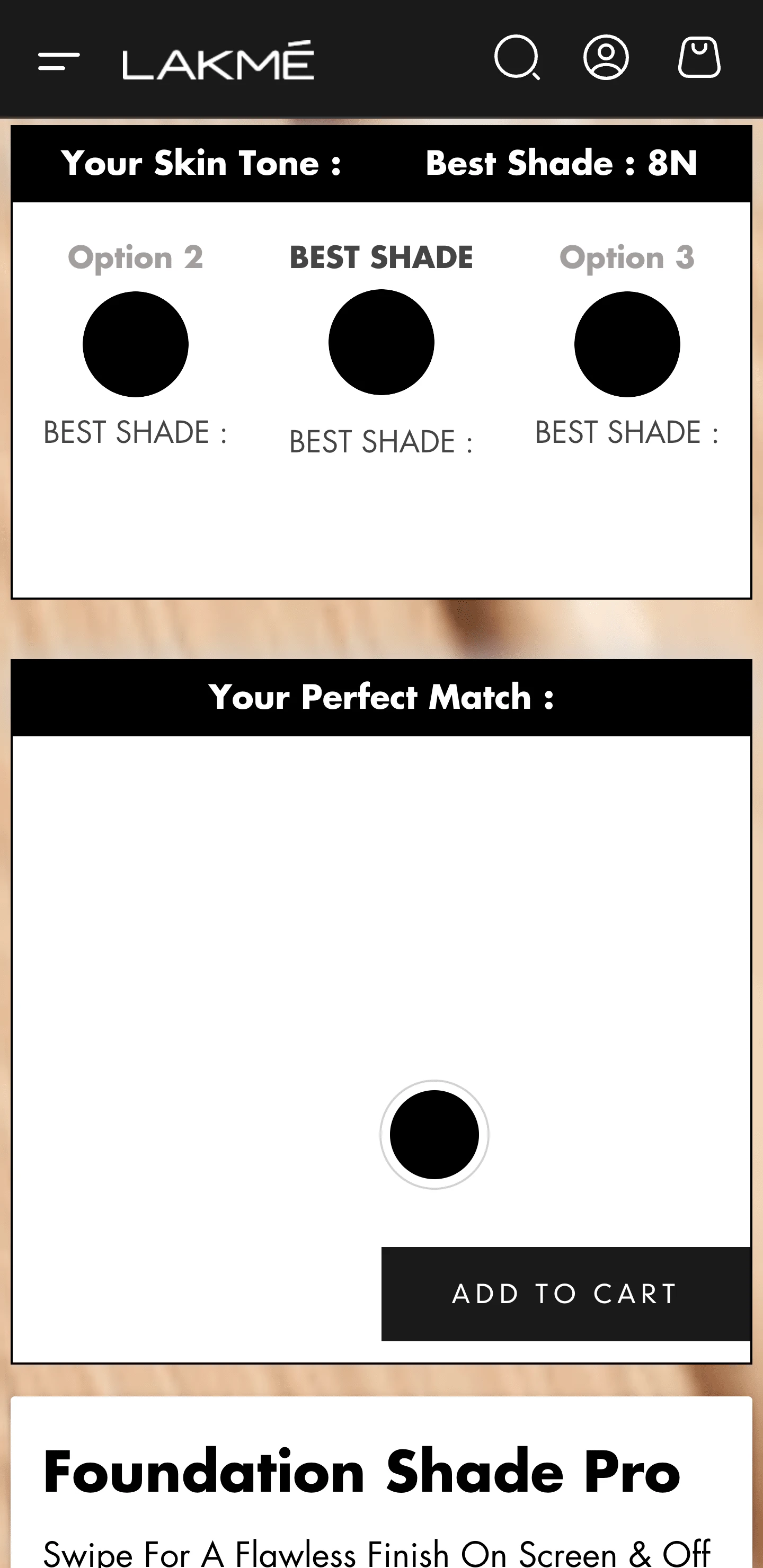
Similar product from Lakme (One of competitors of client)
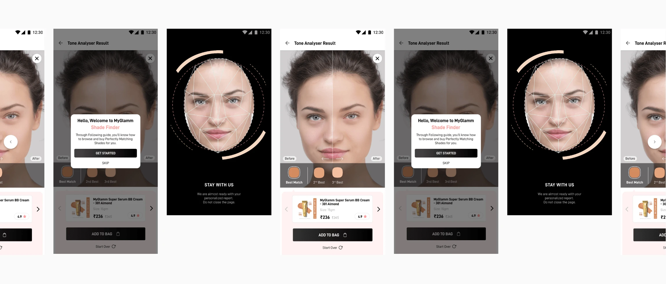
Product Tour Carousel
Key takeaways (everyday is a learning!)
While working on this Project, I realized that new features require certain core fundamentals of the User Experience, which I've learned throughout my career. This Project may be new to the user but she doesn't have to feel it that way. The UX should be as per her early interactions with our or similar platforms i.e satisfying Jakob's Law of UX.
Later when eliminating unnecessary screens and distractions, I followed Hick's Law where I intended not to give too many options to choose from and kept on taking users from Point A to Point B thus making the overall usability super smooth and hazel free.
Like this project
Posted Sep 14, 2023
Crazy rise in Return to Order (RTO) as more and more users were buying makeup foundations in confusion gave rise to one of the most stellar digital product.


