The crazy case of combo products in eCom
Imagine you're running one of the world's biggest eCom and saw 8% drop in conversion due to an UX problem.
Explore how this project talks about the same tension!
This was the intensity when this project came for solution.
Context:
Back in 2022, where the Chief Product Officer (CPO) at MyGlamm, introduced us with analarming rate of drop off in the users when they were trying to buy combo deals or bundled products from the marketplace. First it was few easy to avoid tech issue but it all boiled down to the root cause which was a clear User Experience problem throughout the buying journey of combo products.
Problem we thought initially (eventually we understood that we were just scratching the surface)
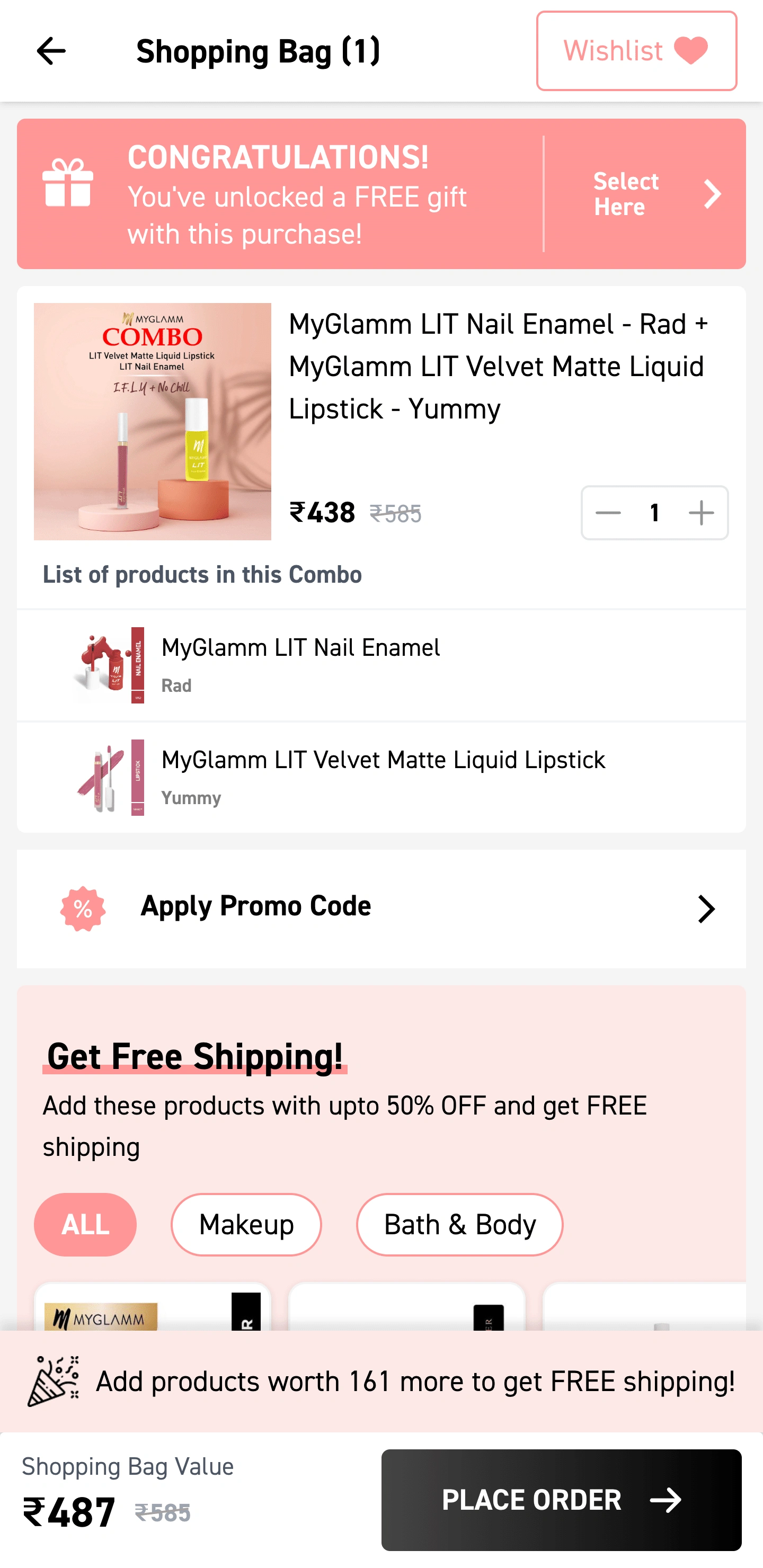
Old UI which we thought to solve quickly
The real problem?
Although the old interface was having some major issues, but the real problem was -
The designers at MyGlamm didn't work their way from "basic" or "core" and simply copy
pasted the similar user experience of Individual products for the combo deals as well.
The main deal was in understanding the very "why" a user would buy a combo deal and
then the "what" do they expect in the buying journey.
So, it all began from the very "Whys"
Project/Problem: Redesigning the whole user experience in the buying journey for users
who buys or likes to buy combo deal or bundled products.
Timeline: 3 Weeks (15 working days)
Role: UX Researcher, UX Designer, UI Designer
Chosen Design Process: Double diamond (building the pyramid from the very bottom)
UX Research -> Sketches (filtering the optimum options) -> Wire-framing (filtering the optimum options) -> Low Fidelity Prototype -> User Testing -> Analysis and patterning
-> Iteration in the wireframes -> Retest -> User Interface Design -> High Fidelity Prototype
-> Adaptations -> Tech Handover
Glimpses from the UX Research
Persona & Sentiment Mapping (Stepping stone in understanding the "whys")

Persona & Sentiment mapping
I wanted to form a deeper understanding of our users' goals, needs, experiences, and behaviors. So, I created 4 personas for our user segments. They were based on user interviews and surveys, and we kept updating them throughout the project as we gathered more data. We used these personas whenever we wanted to step out of ourselves and reconsider our initial ideas.
These Personas helped us to stay focused on our Users.
It acted as the Fundamental structure when ideating on the solution.
Personas Not only included their basic details but Motivations & Pain Points.
I referred to these personas constantly during the whole process of UX design.
User Journey Mapping (To eliminate the unnecessary steps in the buying journey)

User Journey Mapping
With the business goal in mind, I made sure that our users reach the checkout screen without any hiccups. So, I sketched a current-state user journey map, to identify opportunities for improvement. I identified 2 unnecessary steps and potential drop off points in the flow. By eliminating these from the new design, we ended up with a much faster checkout experience that contributed to conversion rates.
I articulated the most probable traffic source from where our users were landing on our platform which was: Social media, Direct search, and app downloads.
The Below user flow is the ideal and quickest user flow from the entry to the checkout process from which I was given the challenge to solve the user dropout rate from the Cart to the payment page in the case of combo products.
This User flow chart helped me in mapping out the other near scenarios while making solutions from the cart to the payment page.
Initial Sketches (To lay the foundation of UX elements)
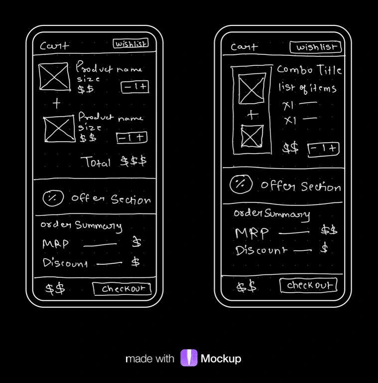
One of the shortlisted sketches
I began the design process with low-fidelity sketches and wireframes to accelerate decision-making through visualisation without losing time. My sketches were based on the initial user interviews, the business goal, and the heuristic evaluation. They each pointed to the fact that there were too many distractions in the flow. I came back to the sketches throughout the entire design process to make sure that I don’t lose sight of our primary goals and ideas.
The Main Purpose of rough sketching is to see the ideas at least take some form and it eases the brainstorming process for me.
Apart from the core problem, I also draw what's around the problem to never lose sight and presence.
These 2 sketches are two shortlisted ideas I came up with before making them into low fi and wireframe.
I love doodling on my iPad and I use mockup for drawing my sketches.
These Sketches helped me move forward to Low fi and Wireframes.
Wire-frame (Now the ship started looking in its form)
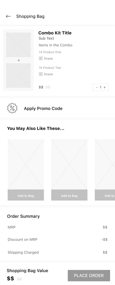
One of the shortlisted Wire-Frame
Using Figma, I translated my first sketches into low-fidelity wireframes. Then, I improved them by adding a few relevant stock images and copies provided by the marketing team. At this stage, the wireframes were defined enough for some user testing. Based on 4 tests, I’ve made a few alternations and moved on to creating high-fidelity prototypes.
During the process of Wireframing my rough sketches, I noticed few other elements which should be around the product cards and based on my finding I pushed the promo code section on top of Upsell Widget near the combo product cards for A/B testing.
I use Figma for Wireframing in Low and High both fidelities.
Later on demand of business team, I had to move promo code section after up-sell widget.
Redesigned User Interface (Some paint, some finishing & lots of iterations!)

Redesigned UI on Cart
Once the usability issues were resolved, I moved on to design the final screens in Figma. My goal was to create a visual identity that aligned with the brand’s values and message, which is: the “brand motto”. Also, I’ve checked the competition and taken a deep dive into my catalog of references for inspiration.
I had to use the Brand colors, and fonts already defined by the management, and also their product catalog.
The Final UI design was made and adapted for Mobile Web, Android, and iOS platforms.
For Easing the development part, I delivered this whole project into Zeplin adaptations which helps the developer and the management to ease the production cycle.
I learned that simply copy-pasting the UX of buying a single product is not enough for the Combo deals case and it has to be designed and solved separately for a smooth user experience.
03 Weeks | Tons of Wire-frames | 1 Happy Unicorn
Key takeaways (Every day is a learning!)
This Project not only came out as one more feather on my hat but gave me a revision of the very fundamental rule of UX which is There might be same-looking problems but there cannot be same-looking solutions for all. When it comes to Combo deals which are just one more or a few products bundled together, the whole buying journey cannot be the same as of single product.
Like this project
Posted Sep 14, 2023
Imagine you're running one of the world's biggest eCom and saw 8% drop in conversion due to an UX problem. Explore how this project talks about the same tension

