RUUT Brand Identity & Packaging Design
Aleksandra Zasłona
RUUT – Menstrual Disc Startup
Brand Identity & Packaging Design
Overview
RUUT is a new menstrual disc brand focused on redefining period care with comfort, sustainability, and transparency at its core. The founders approached me to develop a complete visual identity that would communicate their mission: to normalize conversations about menstrual health and make eco-friendly period care approachable and empowering.
Challenge
As a startup entering a highly competitive and stigmatized category, RUUT needed more than a logo — it needed a distinctive, modern brand identity that would build trust, stand out on shelves, and resonate with its target audience: women seeking sustainable alternatives without the usual “pink and flowery” clichés.
The key challenges included:
Creating a brand aesthetic that balances medical credibility with warmth and inclusivity.
Designing packaging that is functional, elegant, and visually aligned with modern wellness brands.
Developing a visual system adaptable across future products and digital touchpoints.
My Role
I worked as the brand designer responsible for:
Concept development and creative direction
Logo design and color palette creation
Packaging design and typography selection
Brand guidelines and mockups for product launch
Approach
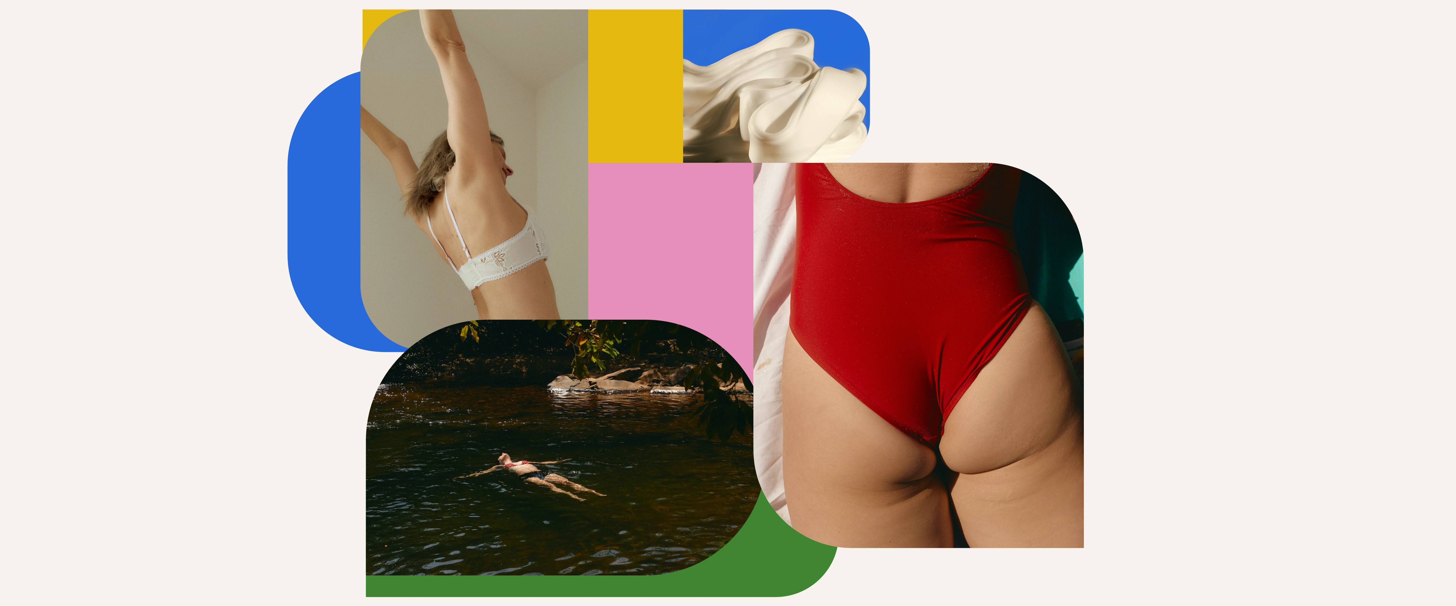
The design process began with strategic brand positioning. Through research into menstrual care trends and direct competitors, I identified a gap between sterile medical branding and overly feminine aesthetics. RUUT’s visual identity was built to bridge that gap — confident, minimal, and gender-inclusive.
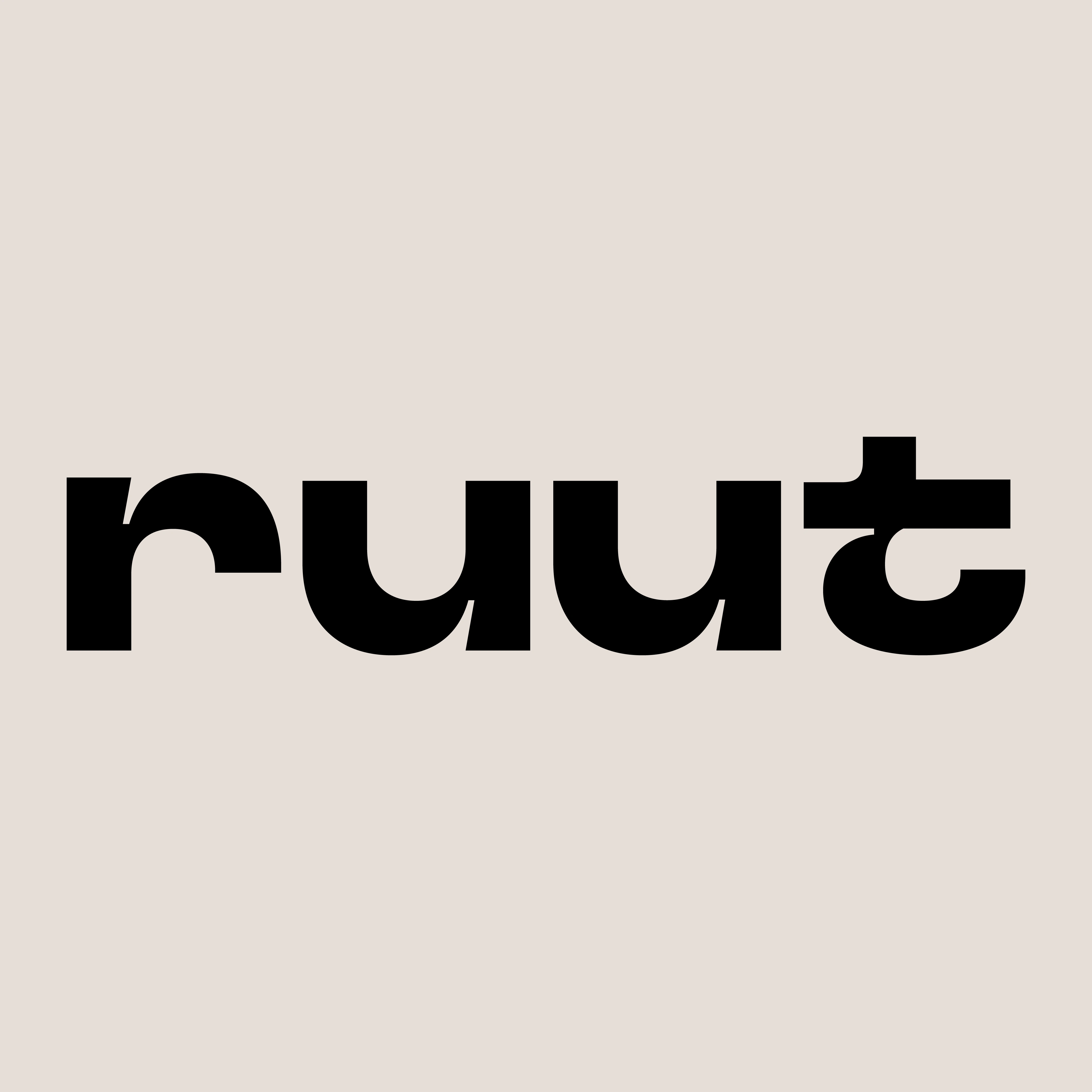
Logo Design:
The RUUT logo reflects both simplicity and strength. The rounded typography conveys comfort and approachability, while subtle geometric adjustments hint at modern innovation. The name “RUUT” itself inspired the visual metaphor of grounding — staying true to oneself and one’s body — which guided the overall aesthetic.
Color Palette & Typography:
A neutral color palette of earthy tones combined with a bold accent color evokes both calm and confidence. The typography system balances a clean sans serif for legibility with a humanist touch to keep the tone friendly and trustworthy.
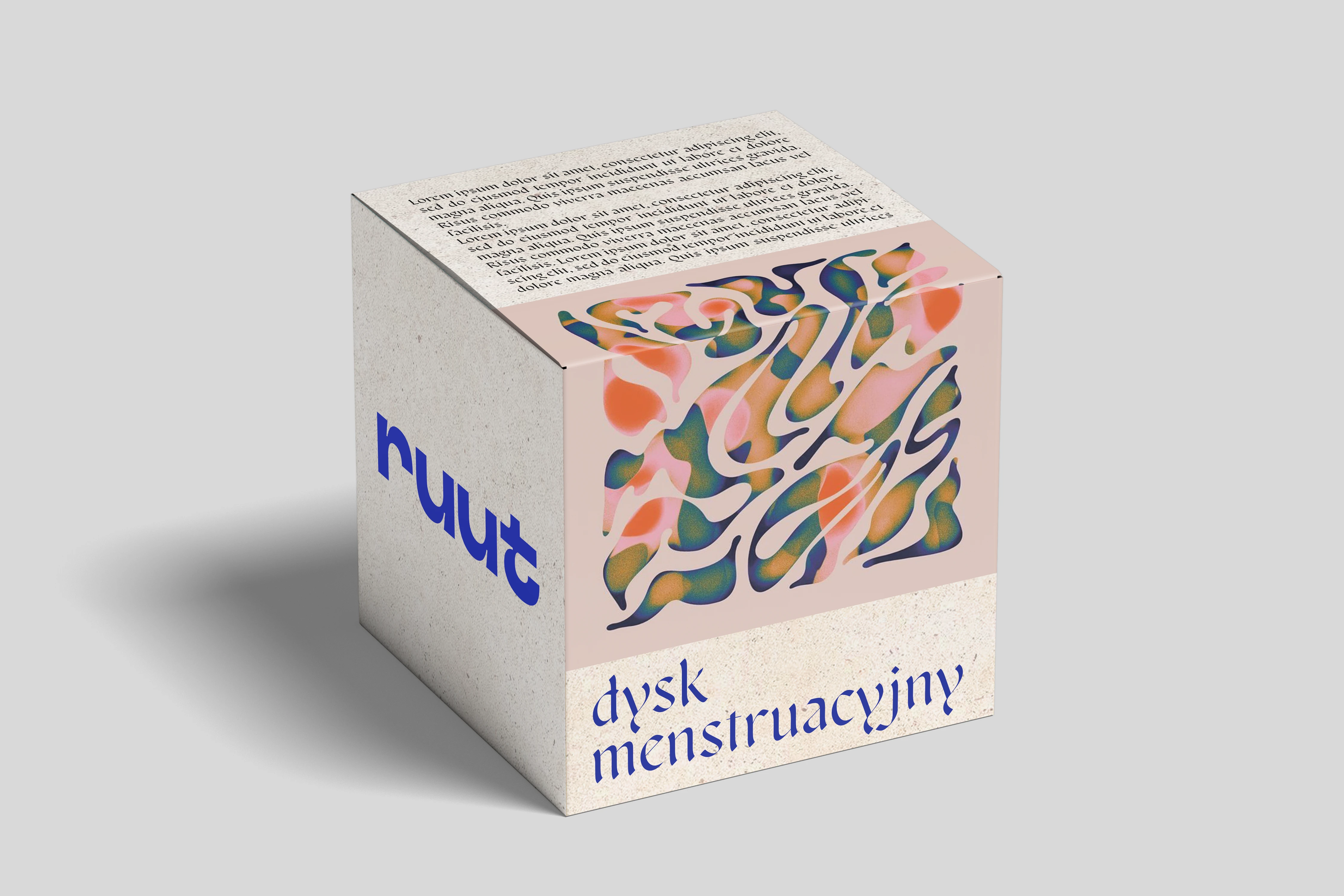
Packaging Design:
The packaging was designed to stand out in a discreet category. It features minimal graphic elements, clear product information, and soft color blocking that makes the product feel both high-end and accessible. The focus was on clarity, sustainability, and shelf appeal.
Results
RUUT launched successfully with strong early feedback from testers and first customers, who praised the modern, un-stereotypical design and premium unboxing experience. The visual identity now serves as the foundation for the brand’s digital presence and future product lines.
Deliverables
Logo & brand identity system
Color palette & typography guidelines
Packaging design (product box & inserts)
Digital & print mockups
Tools
Adobe Illustrator, Photoshop, InDesign
Like this project
Posted Nov 12, 2025
Developed RUUT's brand identity and packaging for a menstrual disc startup.