Branding & Launch for The Daily Grind

Crafting a Sustainable Identity: Branding & Launch for The Daily Grind
Client: The Daily Grind (Local Artisan Coffee Shop)
Core Service Focus: Logo & Branding
Supporting Services: Digital Consulting, Social Media Templates
1. The Challenge
The Daily Grind was preparing to open its doors in a saturated, highly loyal local coffee scene. The owners were committed to ethical sourcing and sustainable practices, but they lacked a cohesive visual identity that could articulate this commitment and stand out from larger chains. They required a professional, memorable brand system and a basic launch strategy to convert curious passersby into loyal customers.

Project Moodboard
2. The Strategy (Our Approach)
Our objective was to create a warm, accessible, and high-trust identity that resonated with environmentally conscious urban professionals.
Deep-Dive Workshop: We started with a session to solidify core values (Honesty, Craft, Community) and define the brand persona.
Visual Direction: Developed a vision board focused on natural textures, warm lighting, and hand-drawn elements to ensure a grounded, authentic feel.
Logo System Development: Focused on versatility—creating a primary logo for the storefront and a simple mark for quick applications (like stamping lids).
Digital Launch Assets: Provided templates and guidance (Consulting) for their initial social media presence to ensure the brand voice and visual were immediately consistent.
3. The Solution: A Cohesive Visual Ecosystem

Logo System
I designed a full-scale brand identity that was both timeless and reflective of the shop's modern values.
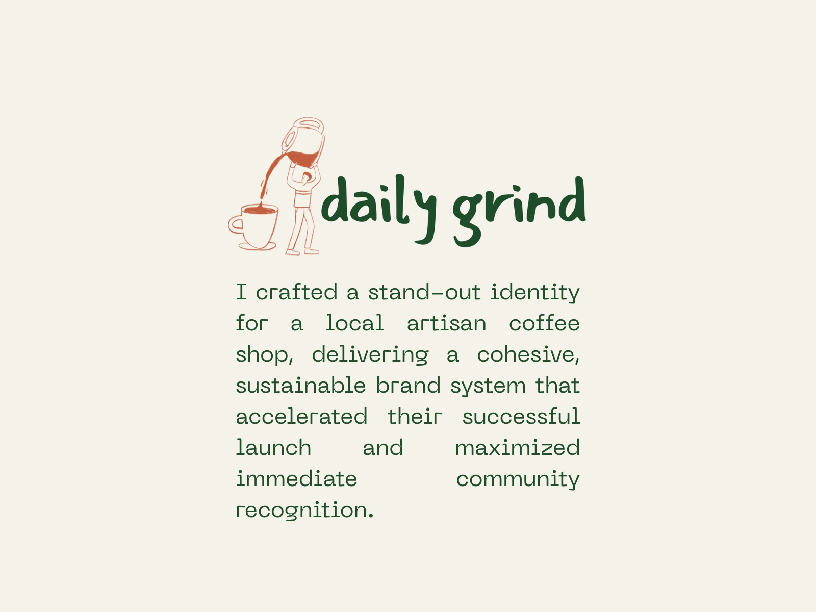
Logo & Mark: The primary logo utilized a classic, yet approachable, serif typeface paired with a simple, hand-drawn coffee bean or leaf icon. The Brand Mark was designed to work effectively at small sizes on sleeves and loyalty cards.
Color Palette: We opted for a "Sustainable Earth" palette featuring a rich Forest Green (for trust and nature), a warm Burnt Orange (for energy and comfort), and a sophisticated Cream as the dominant background color.
Typography: A combination of a robust, slightly distressed serif font for headlines (to evoke craft) and a clean, highly legible sans-serif for body copy and menus (for clarity).
4. Brand in Action & Digital Extension
The true test of a brand is its application. We ensured the new identity translated seamlessly across all customer touchpoints:
Packaging: Designed the logo to fit perfectly on recyclable cups and paper bags.
Digital Presence: Created 5 core Social Media Post Templates (Social Media Manager support) for promotions, opening hours, and sourcing stories, ensuring immediate visual consistency from Day 1.


5. The Results
The Daily Grind launched with a polished and professional presence, allowing them to focus entirely on their product.
Immediate Positive Feedback: Customers frequently complimented the unique branding, helping the shop quickly build word-of-mouth recognition.
Cohesive Launch: The brand system simplified all subsequent marketing efforts, ensuring that every post and sign felt intentional and on-brand, leading to a 35% higher social media engagement rate than local competitors in the first month.
Like this project
Posted Nov 13, 2025
Developed a cohesive brand identity and launch strategy for The Daily Grind, enhancing their market presence and customer engagement.

