
Client: Volare Nutrition
Product: Supplements (FLOCUS™, Creatine + L-Glutamine, Perfect Shaker, two bundles)
Platform: Shopify store; redesign delivered as an HTML motion prototype
Role: Design, motion, front-end build
Year: 2026
The Setup
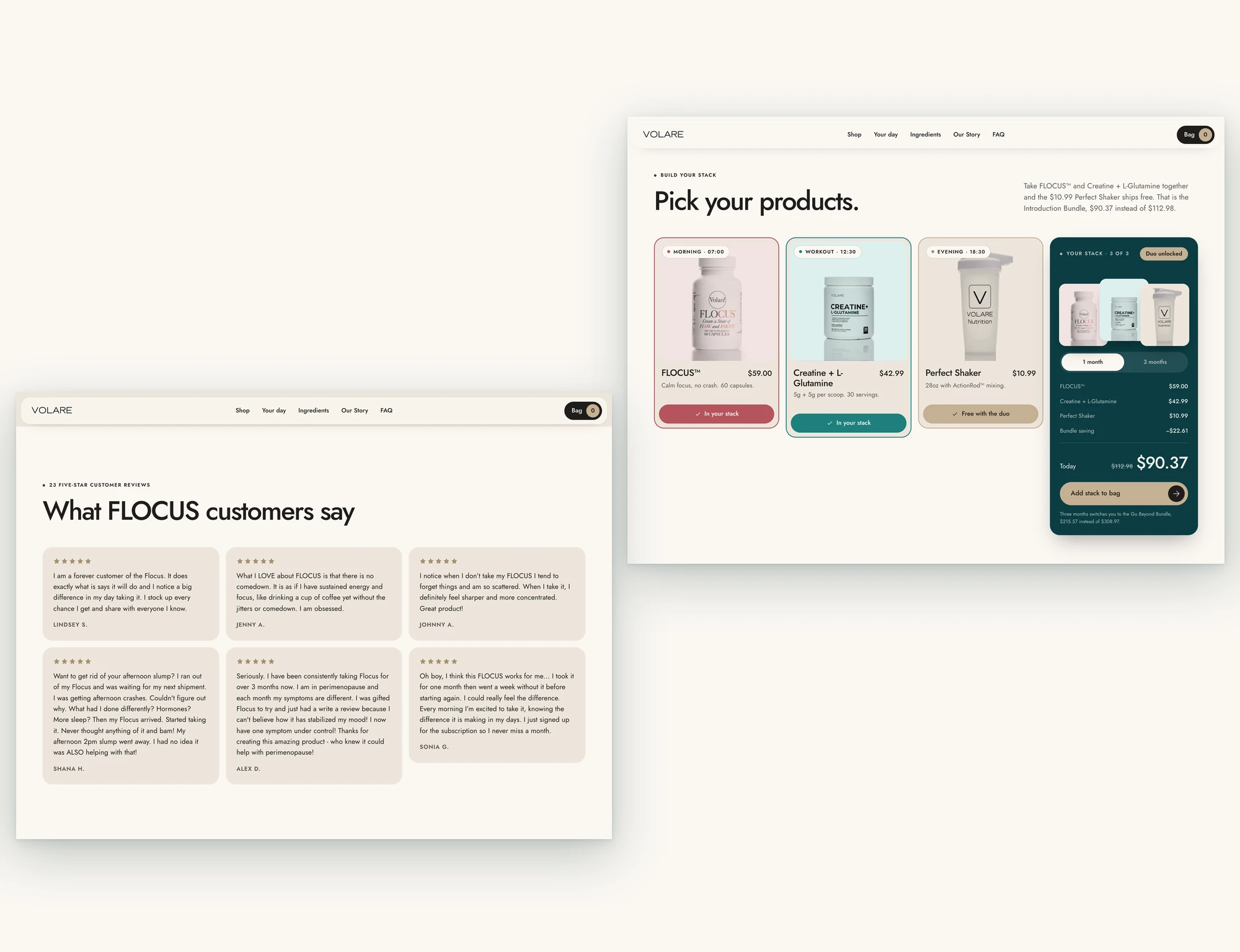
Volare Nutrition sells five products on Shopify: FLOCUS™ ($59), a nootropic and adaptogen capsule; Creatine + L-Glutamine ($42.99), 5g of each per scoop; a $10.99 shaker; and two bundles at $90.37 and $215.57. It was founded by Gina Aliotti, the 2008 Arnold Classic figure champion, and her business partner Lisa. Its two supplement pages carry 23 and 22 five-star reviews.
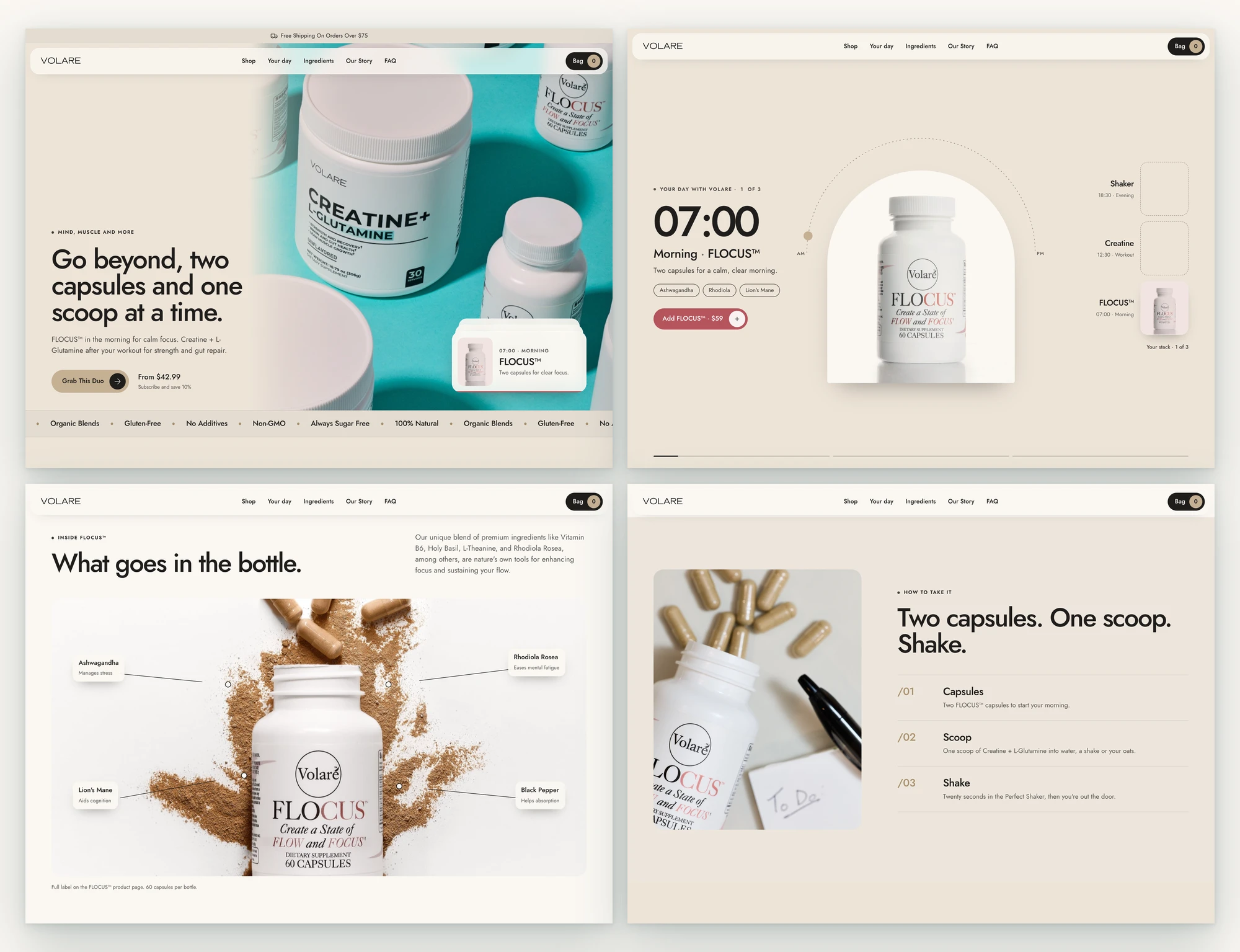
The products had a clear daily rhythm: capsules in the morning, a scoop after training, the shaker all day. The website didn't show that rhythm. It was a stock Shopify theme with a photo hero, a product grid and a set of image sliders.
The Tension
The routine was simple. The storefront wasn't.
The buyer is mostly a woman over 35 who wants focus, strength and calmer stress, and is deciding whether two supplements are worth a monthly subscription. At capture, the homepage hero had no headline, just a photo and a "Grab This Duo" button. The ashwagandha study figures and the creatine benefits sat inside SVG artwork, where search engines and screen readers can't read them. The Our Story copy was in the page code, but only its title showed in the browser.
The best offer on the site, the Introduction Bundle with a free shaker, was a tile in a tab. Nothing explained why the two products belong together.
The Decision
The obvious move was a cleaner theme with bigger photos. I went a different direction: I organised the store around a day, so the bundle explains itself before anyone sees a price.
The layout and motion system follow a reference the client picked, the Grove supplements Framer template, matched section by section. Every word, price, product and photo is Volare's.
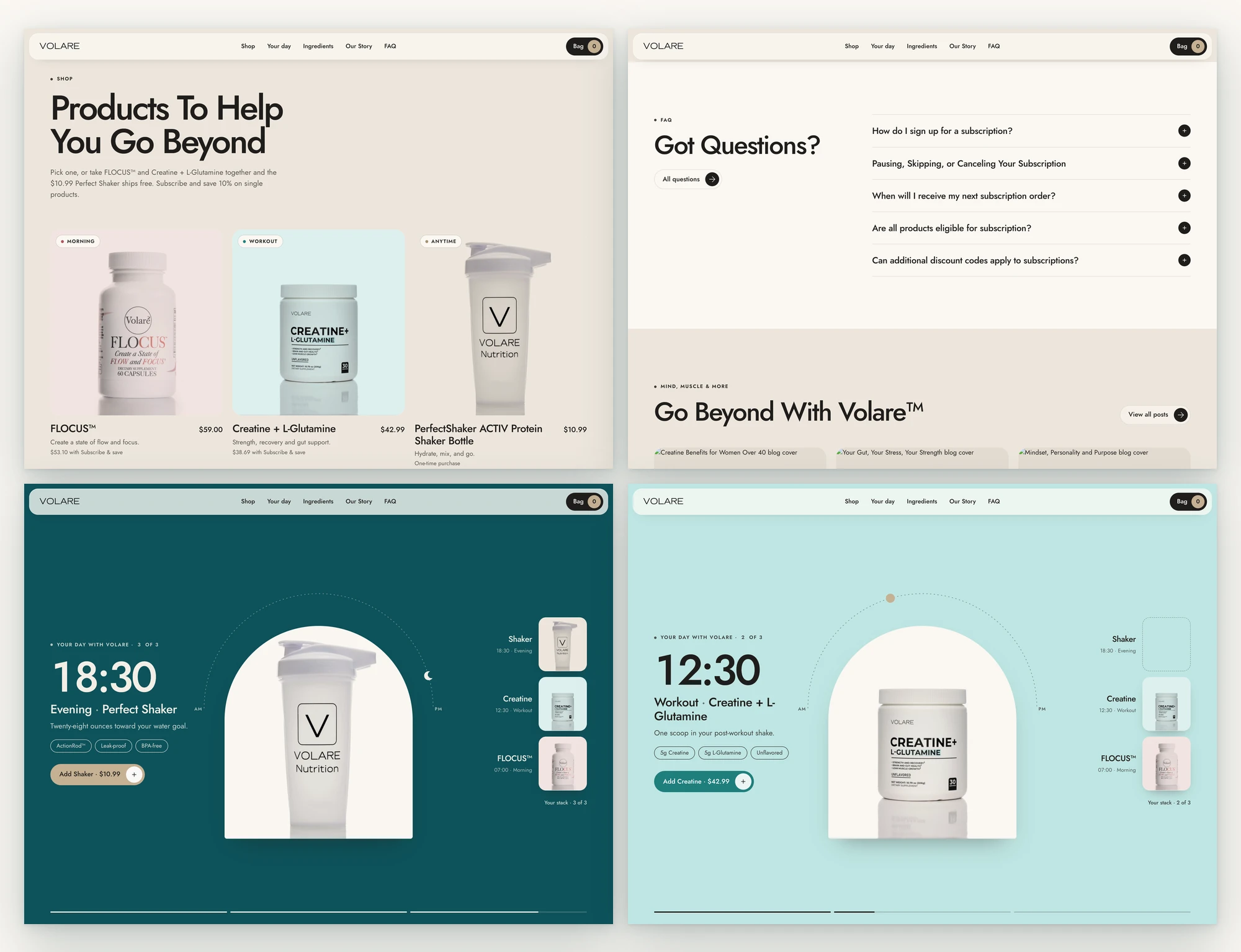
One pinned scene carries the pitch. As you scroll, a clock runs from 07:00 to 18:30, the background moves from sand to aqua to Volare's teal, and a sun becomes a moon. FLOCUS™, then Creatine + L-Glutamine, then the shaker drop into "Your stack".
The bundle builder does the maths in public. Pick FLOCUS™ and Creatine and a "Duo unlocked" badge pops, the shaker turns free and the total counts down to $90.37. Switch to three months and it becomes the Go Beyond Bundle at $215.57. These are the store's real prices.
No claim I couldn't source. Dosing comes from Volare's labels and reviews ("two capsules", "one scoop post-workout"). Stats come from their own copy: 5g, 5g, 44% in a 64-person ashwagandha study. Reviews are quoted word for word.
Studio photos treated as cut-outs. Volare had white-background packshots and almost no lifestyle photography, so each product sits on a tinted tile, giving the cut-out look without editing a single photo.
The brand's own colours, not the template's. Grove's greens became Volare's sand (#E4DCD2), tan (#C5B093) and deep teal (#0D525A). Its typeface became Jost, Volare's body font.
The Build
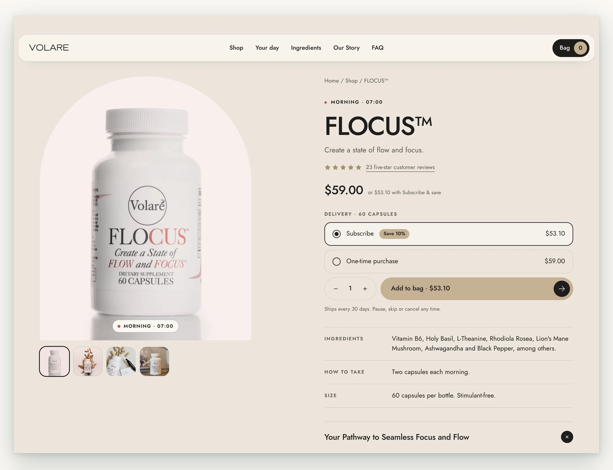
Pages | 5: homepage (13 sections plus announcement bar and marquee), shop, 3 product pages generated from one template
Motion | Pinned day scene on GSAP ScrollTrigger (scrubbed clock, colour and arc, stepped product swaps); cycling hero card; stack builder with drop, pop and price count-up; ingredient leader lines that draw in; 23 scroll reveals on the homepage; 11 keyframe animations
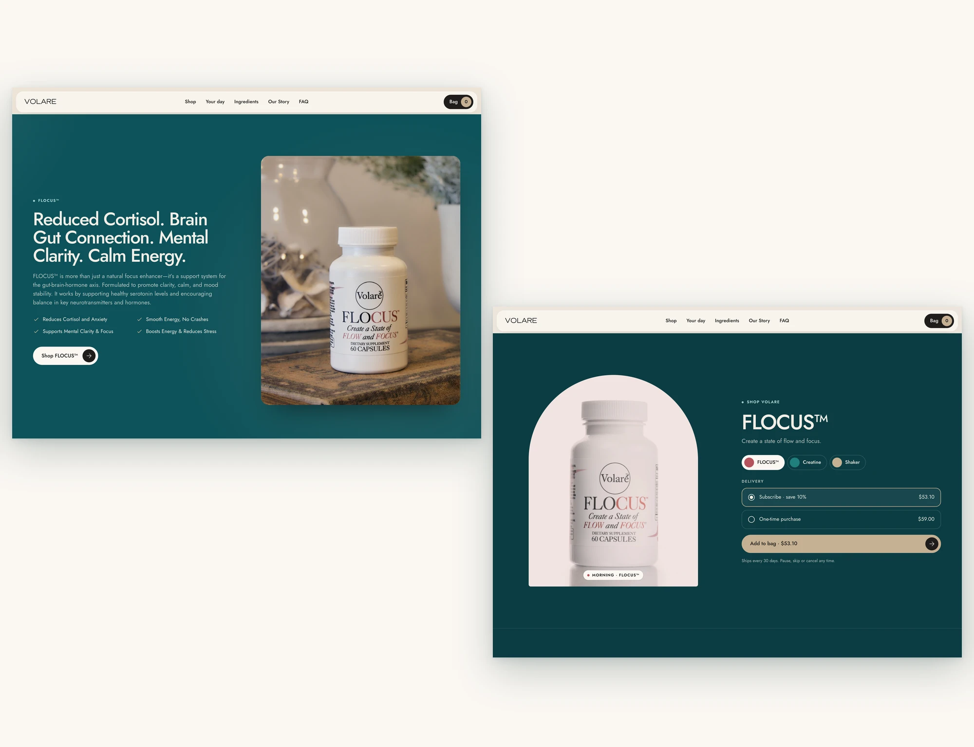
Commerce logic | Bundle pricing ($90.37 / $215.57), subscribe-and-save 10% ($53.10 / $38.69), quantity, bag drawer with a $75 free-shipping counter
Image weight | 6.1 MB of client originals → 1.5 MB (76% lighter), 13 web images
Page code | Homepage 91 KB of HTML (23 KB gzipped), single file; GSAP + ScrollTrigger on the homepage only; product pages 69–74 KB with no library
Accessibility | Reduced-motion branch (the day scene becomes three static cards and the timers stop), content in the HTML without JavaScript, keyboard tabs, bag drawer with focus trap and Esc, labelled controls
Quality gates | House linter: 0 defects across 5 pages; copy check 6/100, 2/100 and 3/100 (under 20 ships); no horizontal scroll at 375px on any page; Lighthouse not yet run
The Impact
A first-time visitor now learns the routine in one scroll: what to take at 07:00, what to take after training, and why the two cost less together. The bundle is the natural next step, not a hidden tab.
Before this project, the homepage was a photo, a grid and a set of sliders. After it, the homepage tells a story with a price at the end, and each product page carries Volare's full description, six verbatim reviews and the same bundle builder.
The hardest part wasn't the motion. It was mapping a template built for three time-of-day jars onto a brand with two supplements and a shaker, without inventing a single dosing claim to make the story fit.
The site isn't live yet, so I haven't added launch metrics. Once it ships, the numbers to track are Introduction Bundle share of orders, subscription opt-in rate, homepage add-to-bag rate and mobile scroll depth through the day scene.
The Takeaway
Supplement stores sell products; customers buy routines.
Show the routine first, and the bundle prices itself.
0 likes · 0 views · Nov 17, 2026
A first-time visitor now learns the routine in one scroll: what to take at 07:00, what to take after training, and why the two cost less together.


