Senior UX UI Designer
Adrian Stoian
Verified
📋 Task
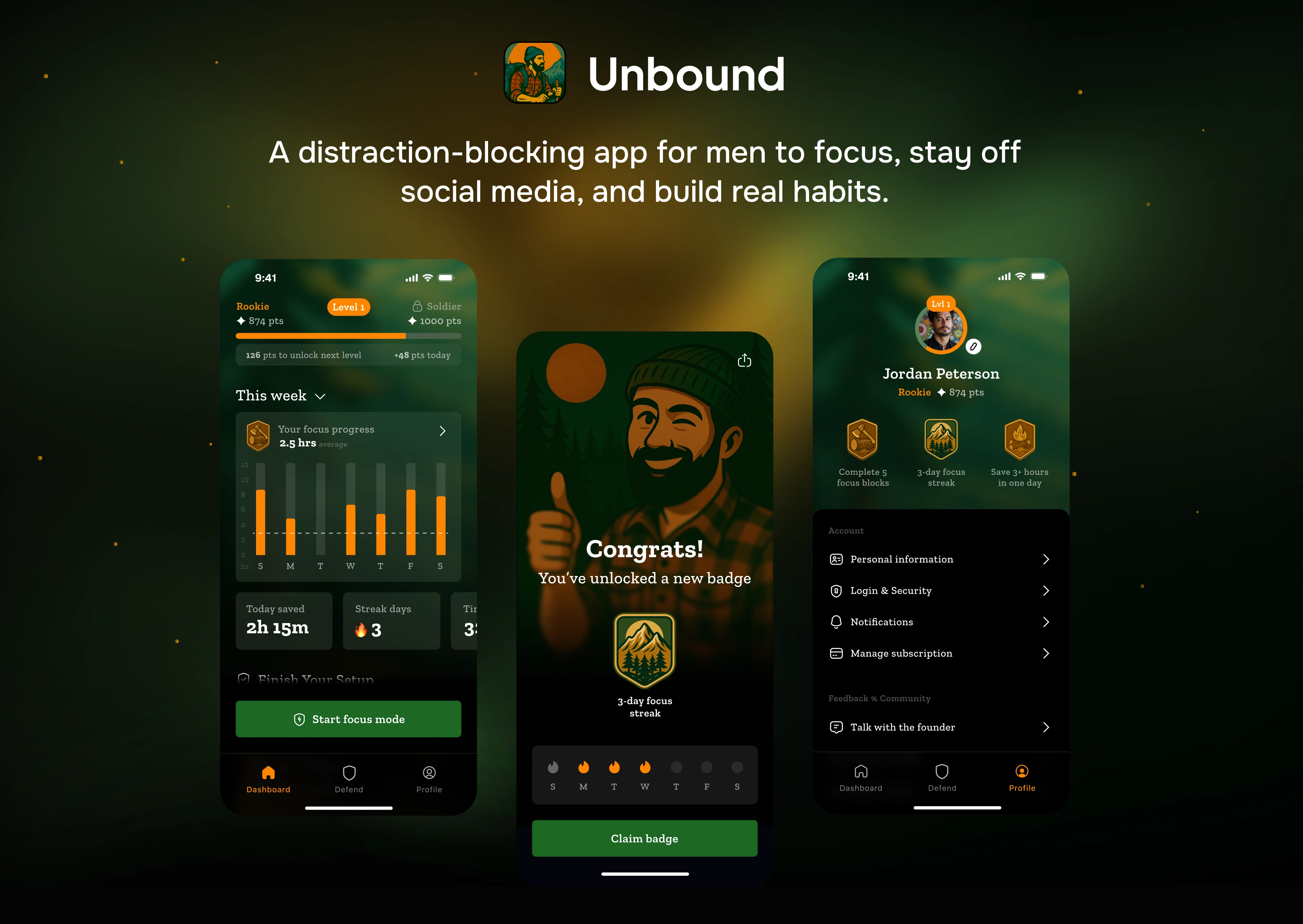
Design and develop Unbound, a mobile app that helps men reclaim their time and focus by breaking free from distractions such as social media, porn, and endless scrolling. The goal was to create not just a productivity tool, but a movement — an empowering, story-driven experience that motivates users through powerful visuals, group activities, and focus tracking.
📌 Challenges
1. Creating a Storytelling-Driven Onboarding
Balancing inspirational storytelling with practical setup steps, so users feel motivated but also guided into the
app smoothly.
2. Designing for Multiple Iterations
The project went through many visual and functional iterations (illustrations, flows, copy). The challenge was to keep coherence and consistency while evolving the design.
3. Building a Masculine but Supportive Tone
Crafting visuals and language that resonate with men without becoming cliché, cheesy, or overly aggressive.
4. Making Complex Flows Feel Simple
With onboarding, focus sessions, scheduling, community stats, and rewards, the risk was overwhelming users. The challenge was to streamline flows so everything felt lightweight and intuitive.
👨🏻💻 How we build Unbound?
We started with an audit of the existing Unbound app to uncover pain points and improvement areas. From there, we studied competitors, mapped user flows, and tested wireframes. Through multiple design iterations, we refined clarity, motivation, and usability, evolving Unbound into a sharper and more user-focused experience.
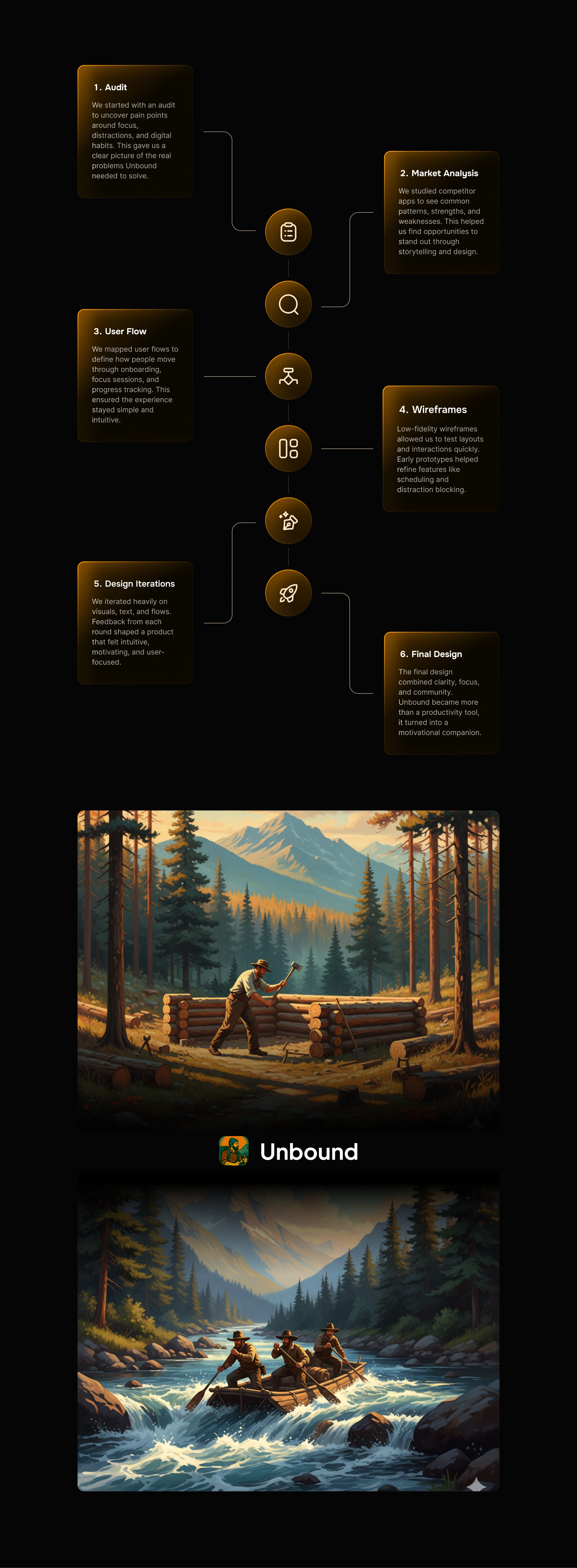
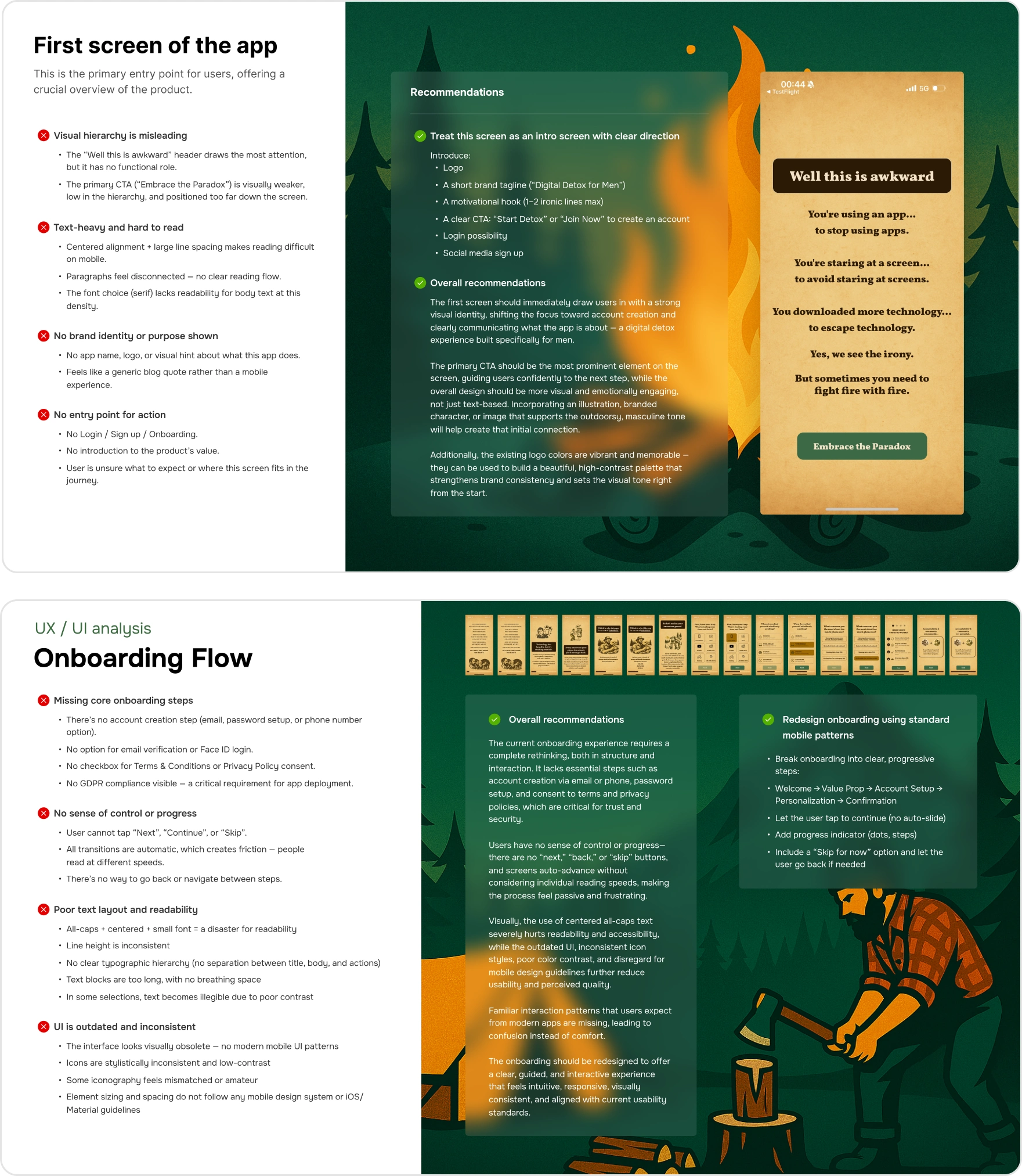
📋 Audit
We analyzed the existing Unbound app and identified key UX and UI issues, such as navigation challenges, unclear flows, and visual inconsistencies. These insights gave us a clear foundation to guide improvements in both usability and design.
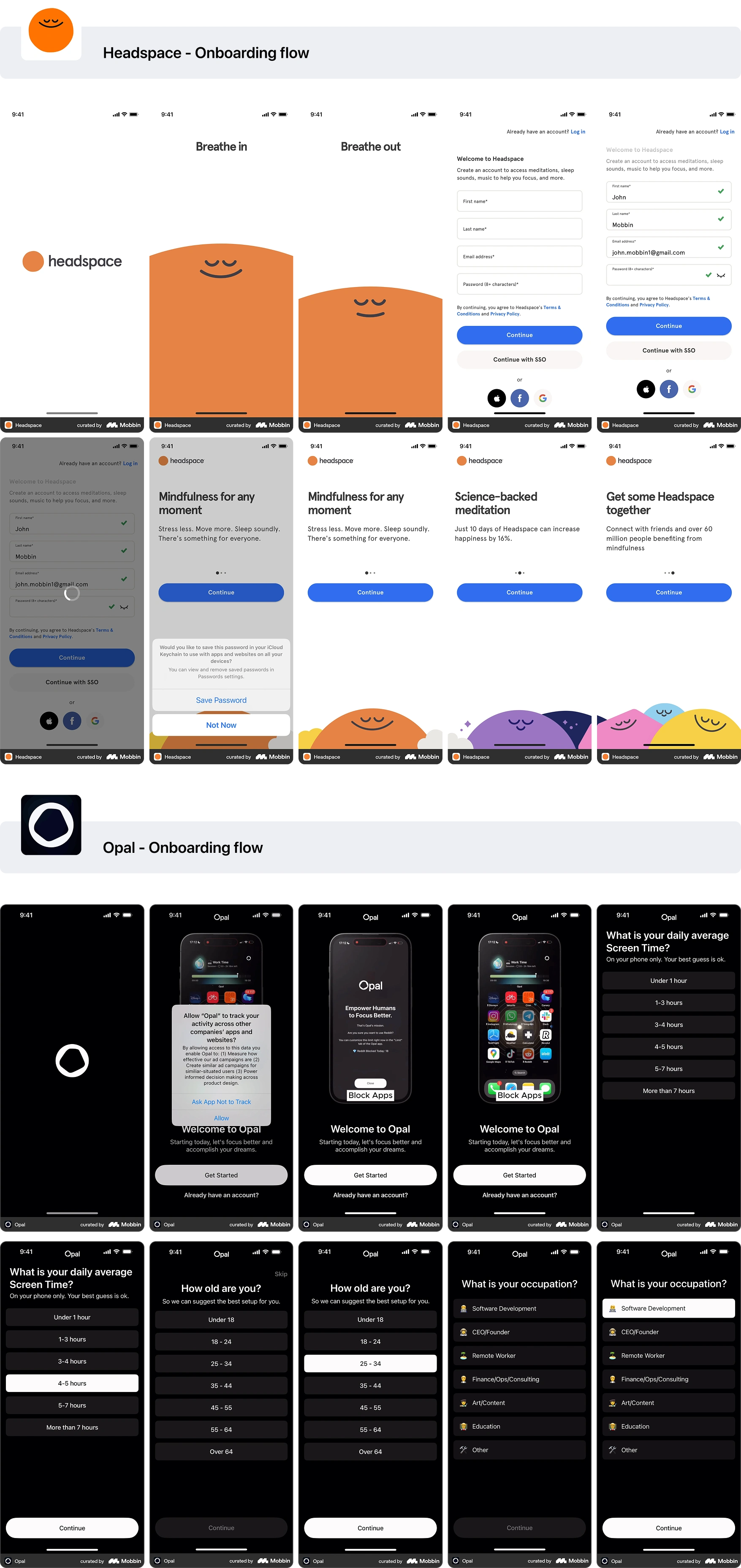
🔎 Market Analysis
We conducted a competitor analysis to understand how similar apps approach focus, productivity, and habit-building. By studying their strengths and weaknesses, we identified opportunities for Unbound to differentiate itself with a more engaging experience, stronger visuals, and a clear value proposition.
🗺️ User Flow
We mapped the complete user journey to ensure a smooth and intuitive experience, from onboarding to daily focus sessions. The flow helped us spot friction points early, define key interactions, and design clear paths that guide users toward building consistency and achieving their goals.
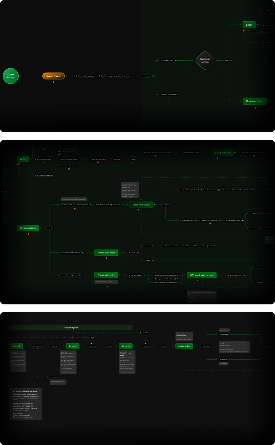
📑 Wireframes
We created low-fidelity wireframes to translate the user flow into clear screen structures. This step allowed us to test layouts, content hierarchy, and navigation before moving into visuals. Through multiple iterations, we refined the wireframes to balance functionality, clarity, and a strong foundation for the upcoming UI design.
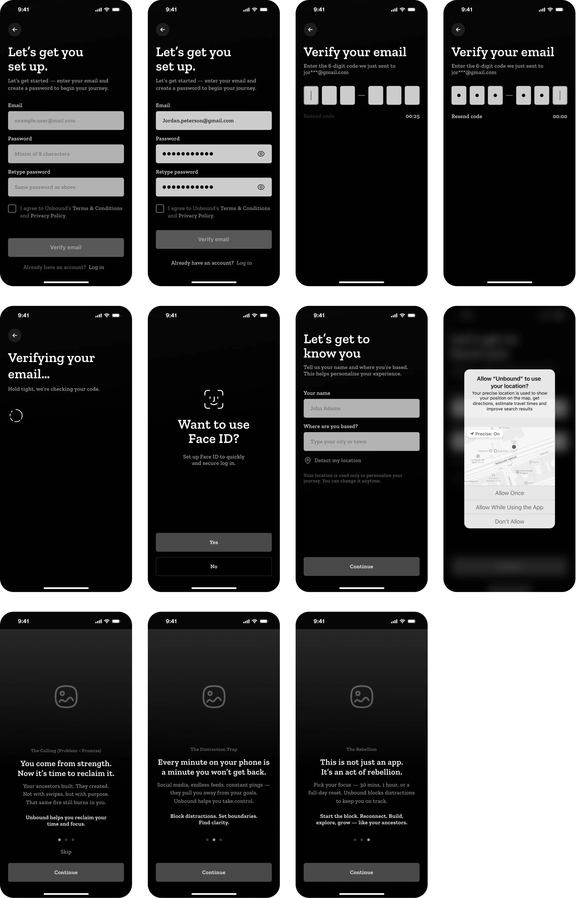
⚡️ Design Iterations
Throughout the design phase, we went through multiple iterations to refine both the visuals and user experience. Starting from initial concepts, we tested different styles, layouts, and interaction patterns. Each round of feedback helped us improve clarity, usability, and alignment with the brand’s identity. This iterative process ensured that the final design was both functional and visually engaging.
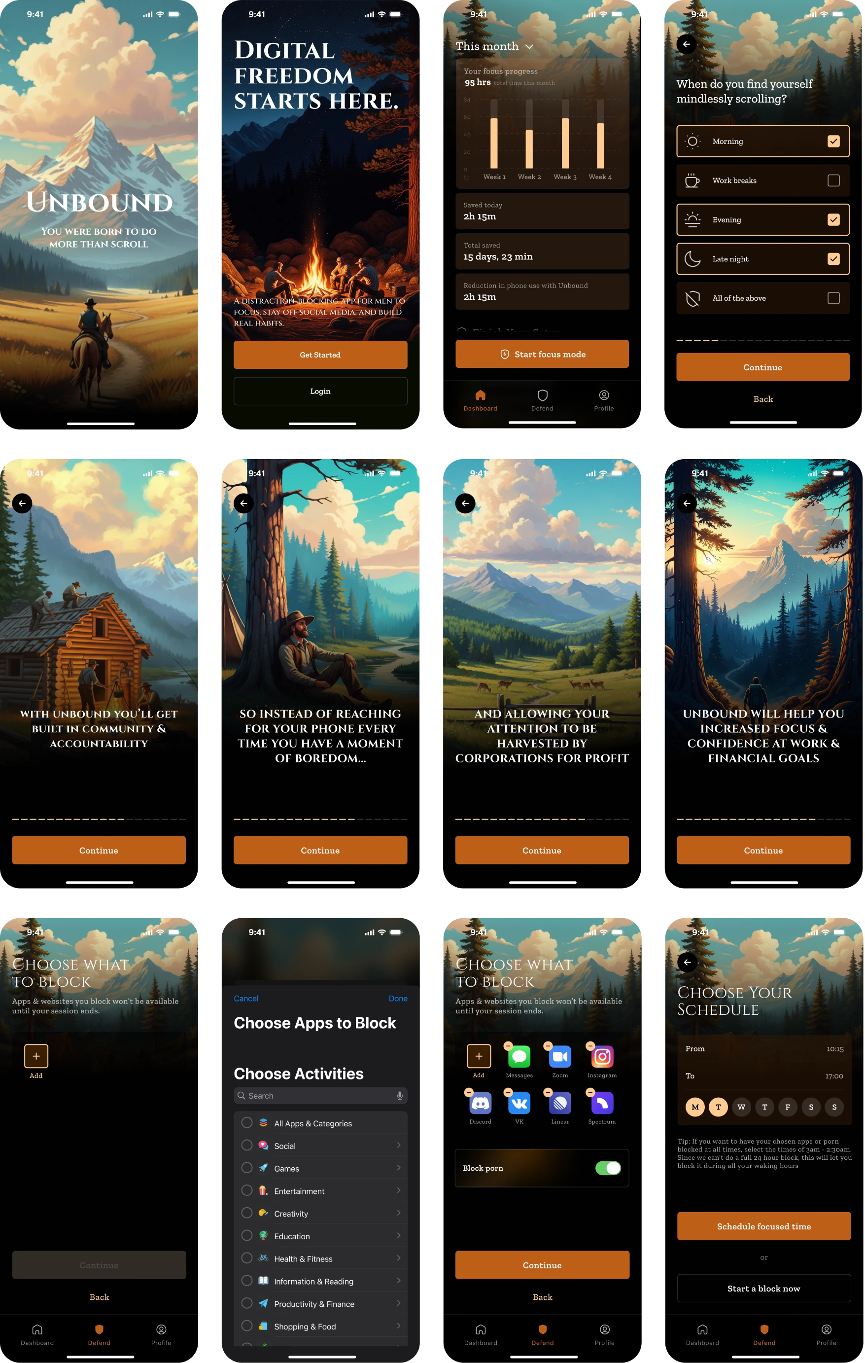
Version 1
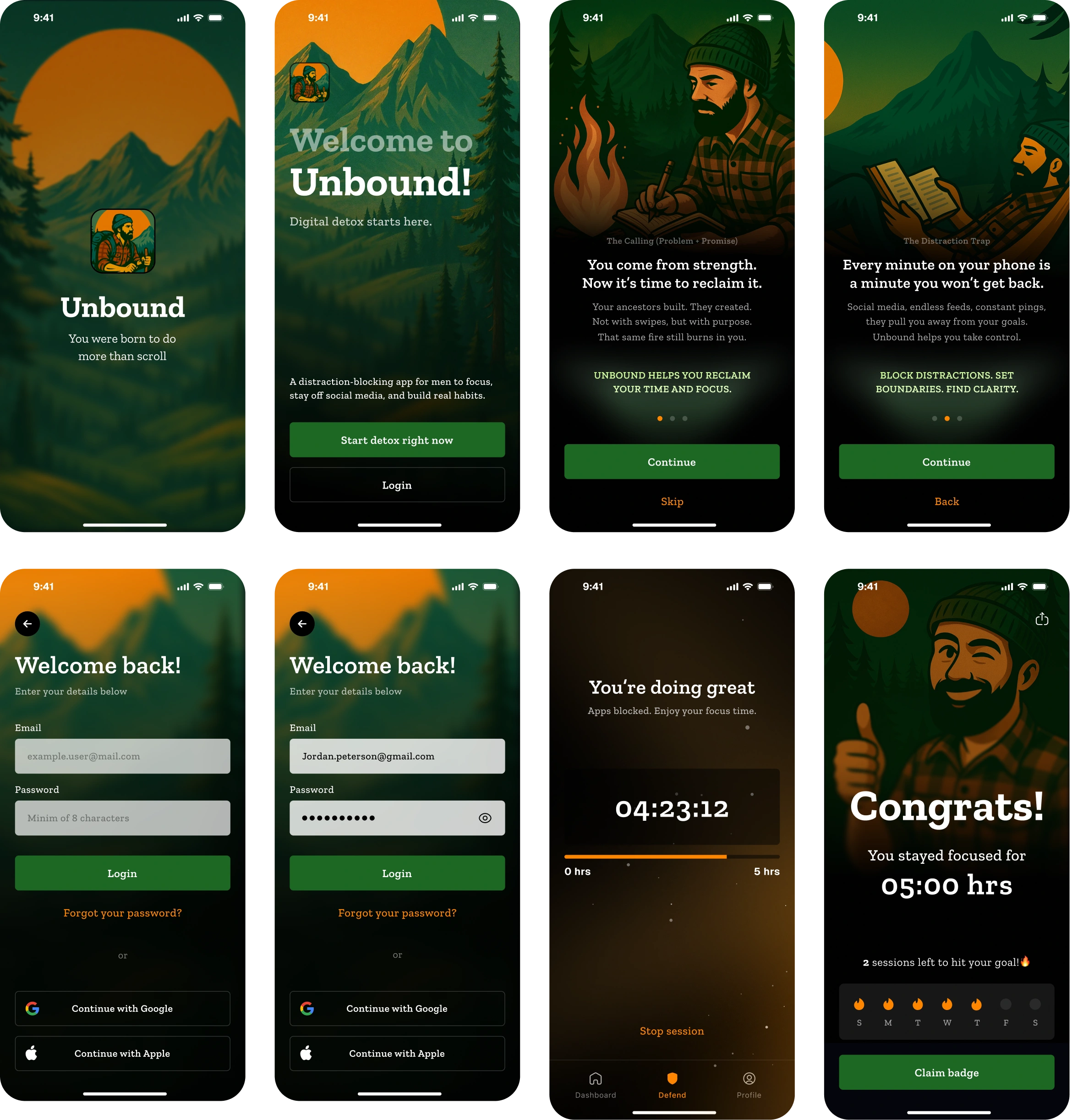
Version 2
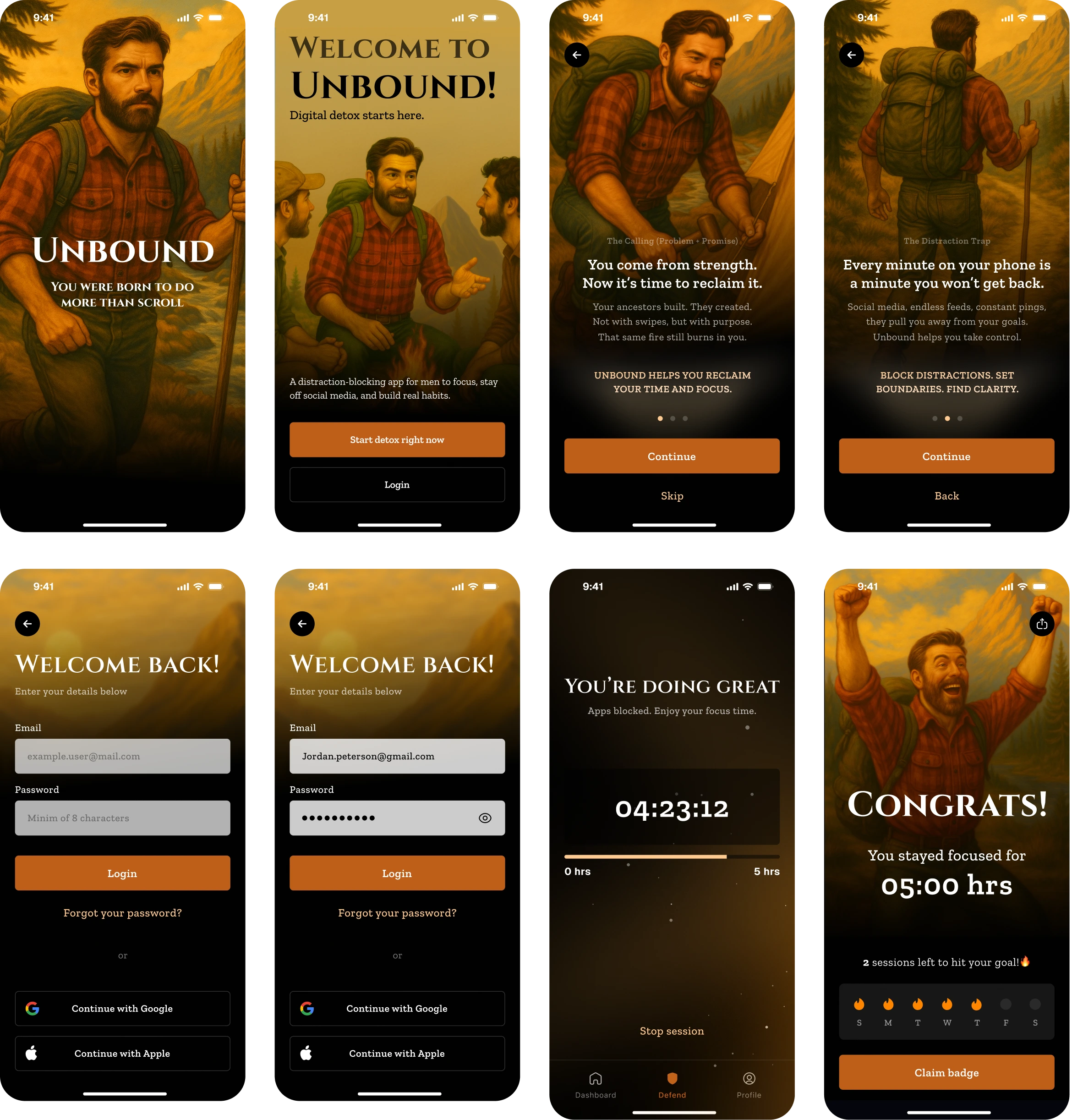
Version 3
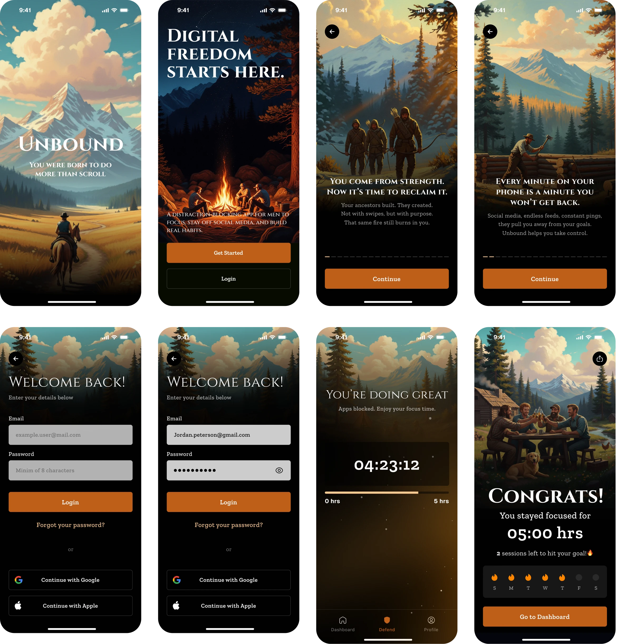
🚀 Final Design
The final design brings together all research insights, user flows, and client feedback into a cohesive product. It balances functionality with a clean visual style, ensuring an intuitive user experience. Every screen reflects the iterative process — refined, consistent, and ready for implementation.
📚 Lessons Learned
1. Iteration Leads to Clarity
Multiple design rounds, each with client feedback, helped refine the product from a simple concept into a polished experience. Iterating on visuals, flows, and copy made the app stronger with every step.
2. Storytelling Builds Connection
Using hiking-inspired illustrations created a relatable narrative for users. This approach turned abstract ideas about focus and distraction into a concrete, motivational journey.
3. Balancing Guidance and Freedom
Through onboarding flows and interactive questions, we learned to guide users without overwhelming them. Giving structured options while leaving room for personalization improved engagement.
4. Visual Consistency Creates Trust
Keeping a coherent visual system across icons, illustrations, and UI ensured users felt comfortable and confident as they moved through the app.
5. Data Makes the Impact Tangible
Turning focus hours and streaks into clear stats and community benchmarks showed users the real value of their effort, motivating them to keep going.
6. Group Activities Strengthen Motivation
Shifting from individual to group-focused imagery and features highlighted the power of accountability and community, which resonated strongly with the target audience.
Like this project
Posted Sep 13, 2025
Designed Unbound, a mobile app to help men focus by reducing distractions.
Likes
3
Views
51
Timeline
Mar 4, 2025 - Ongoing
Clients
Kelektiv