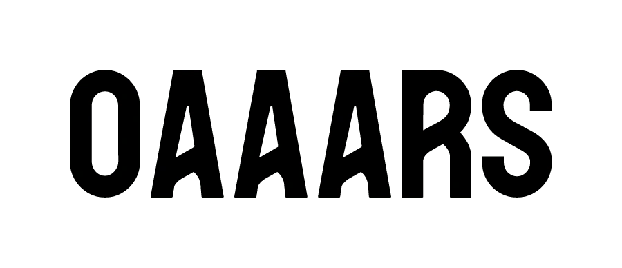
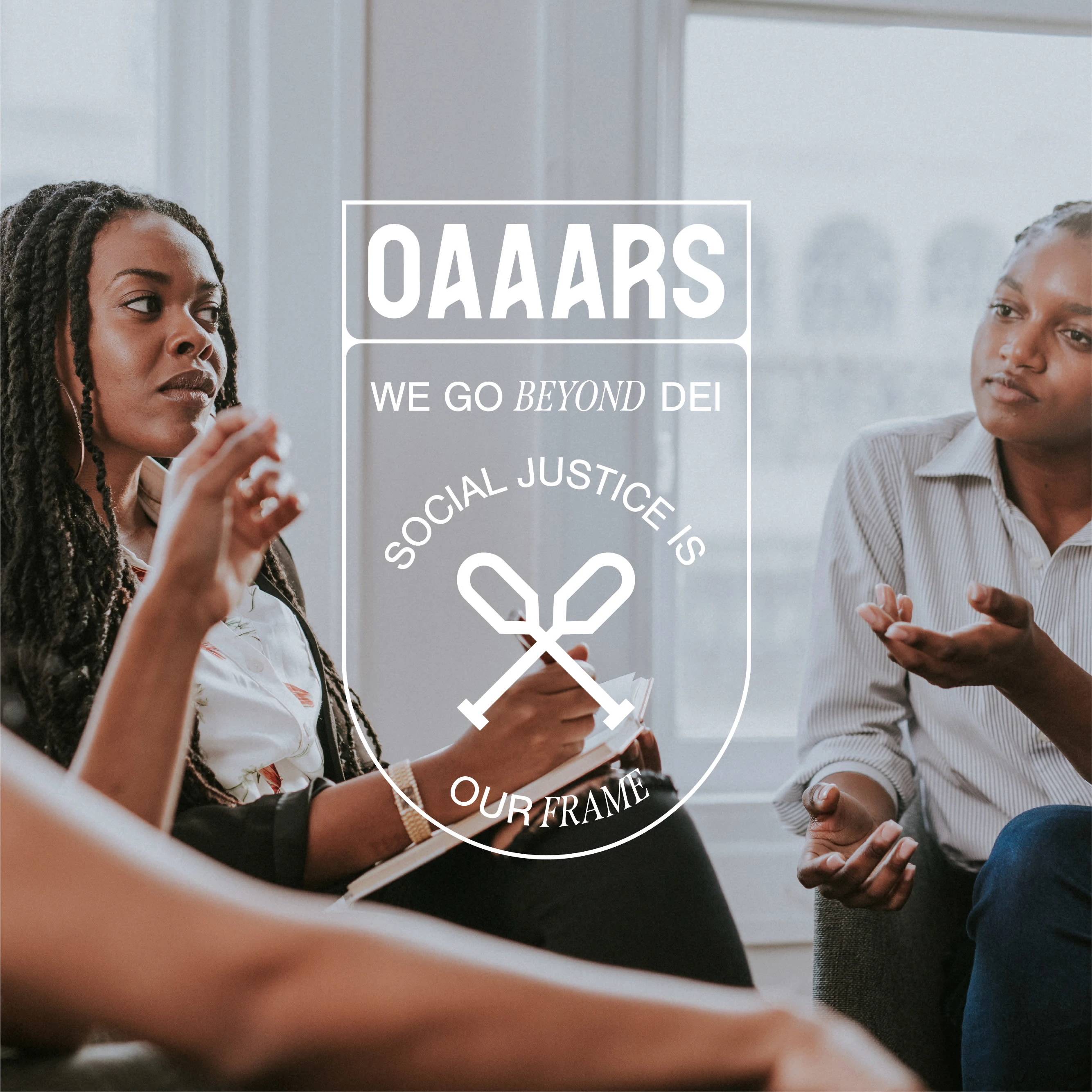
OAAARS
Farah Aqrabawi
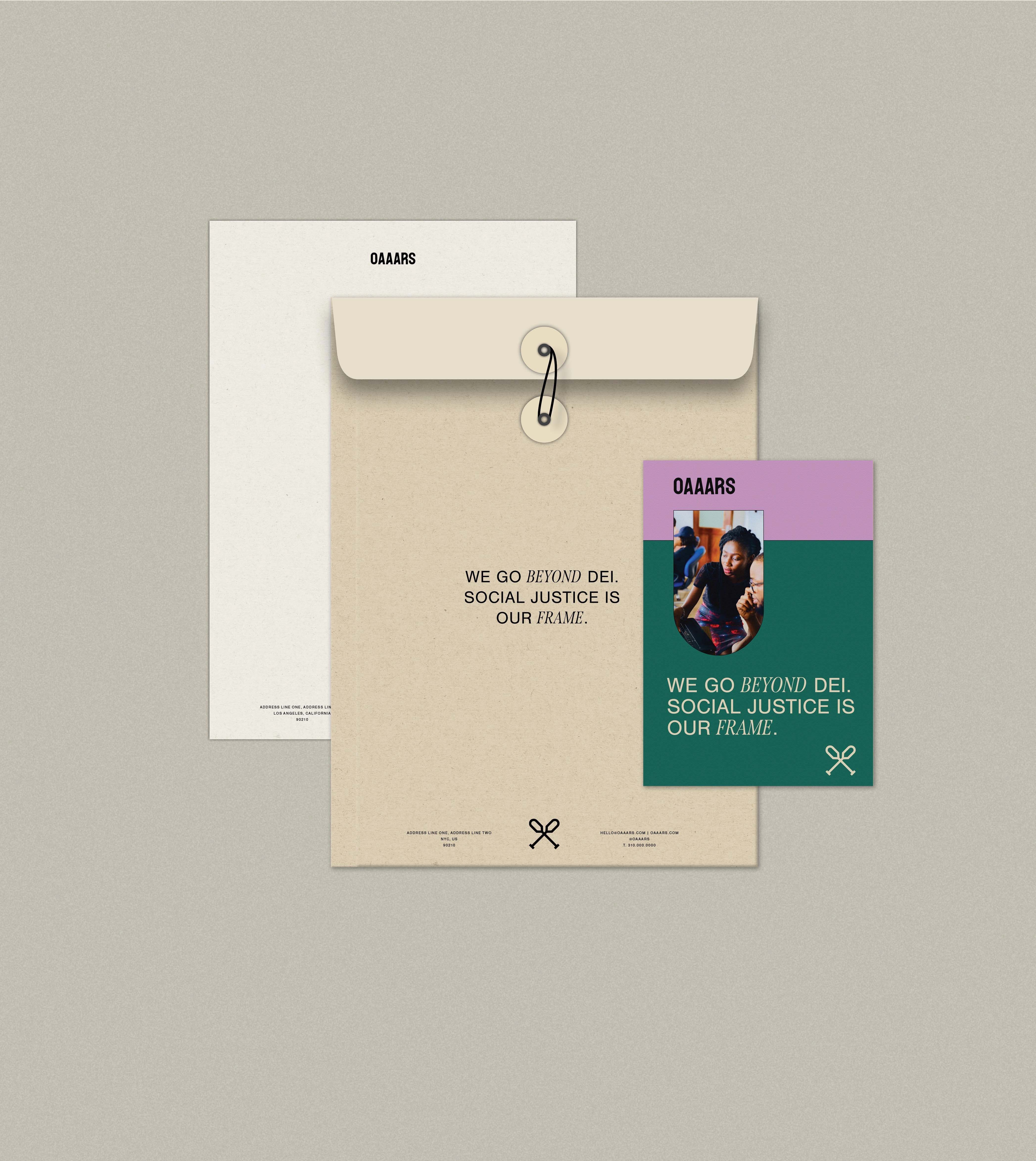
"We go Beyond DEI. Social Justice is Our Frame."
The Client
OAAARS is a people of the global majority-led consultancy that provides social justice-centered training and education to create safer and inclusive work environments while cultivating change agents in the workplace and beyond.
OAAARS is an acronym that stands for Organizer Activist Artist Advocate Referral System.
Founder's Story
Simone Gamble is a community organizer, youth worker, educator from NYC. They are currently the founder of OAAARS. They got into this work with OAAARS because they wanted to make sure that people of color, especially Black people had spaces at work where their identities were seen, honored, centered and given equitable access to all they needed to thrive. They wanted OAAARS to be a response to the silence that happens in workplaces when it comes to issues of social justice and other DEI related issues and to provide the training on how to transform workplaces led by change makers themselves. All of OAAARS consultants identify as community organizers, activists, artists, and advocates.
The Objective
OAAARS aims to create a welcoming community of socially-conscious individuals and needed communication as empowering as their powerful vision.
The Solution
Rebrand all communication to be understood by the large age range of socially-conscious individuals. Since OAAARS seeks to create workspaces that are not dismissive to the sociopolitical issues, the movement of paddling through murky waters resonates with OAAARS main objective. The use of bold effective designs, visually reinforces OAAARS message through bold typeface that evokes this richness.
We are excited that the design we created speaks to the dynamic, communal, and bold nature that OAAARS represents.
Logo Design Concept
Primary Logo
For Simone, the difficulty to learn the skill of paddling growing up and as one paddles through murky waters resonates with OAAARS main objective of guiding folks through difficult conversations. The primary logo is a logotype that adopts a bold typeface to evoke the richness of OAAARS mission. The slanted crossbar of the letters A and R resemble the movement of paddling oars through murky waters which resonates with OAAARS mission.
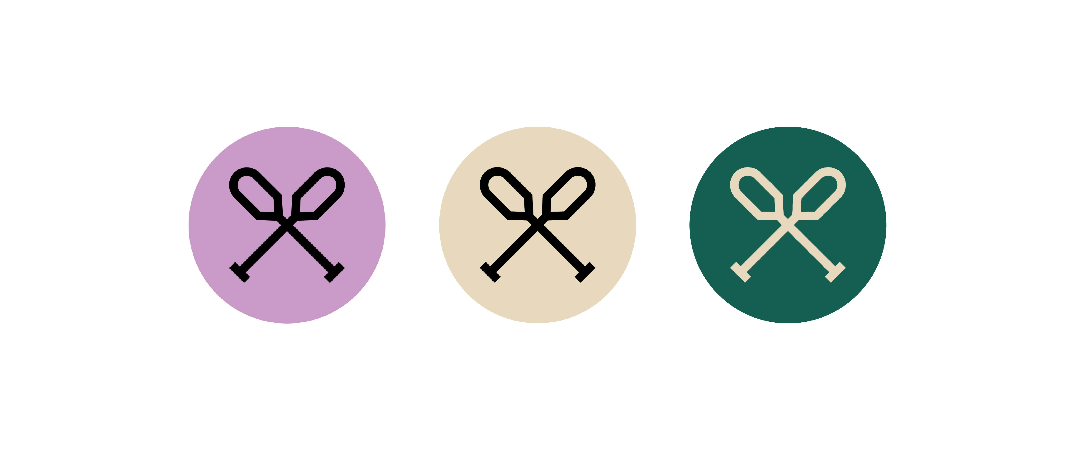
Logo Mark
Camping has been a huge part of Simone’s life. The use of the paddles in the logomark ties with the concept of canoeing and the use of oars as the tool to guide the canoe. This logomark resembles the shape of oars, that is essential for the founder's story behind creating OAAARS.
This is the experience of many marginalized folks at work. From this lack, I created OAAARS.
Simone Gamble (they,them) - Founder of OAAARS
Secondary Logo indicating Tagline
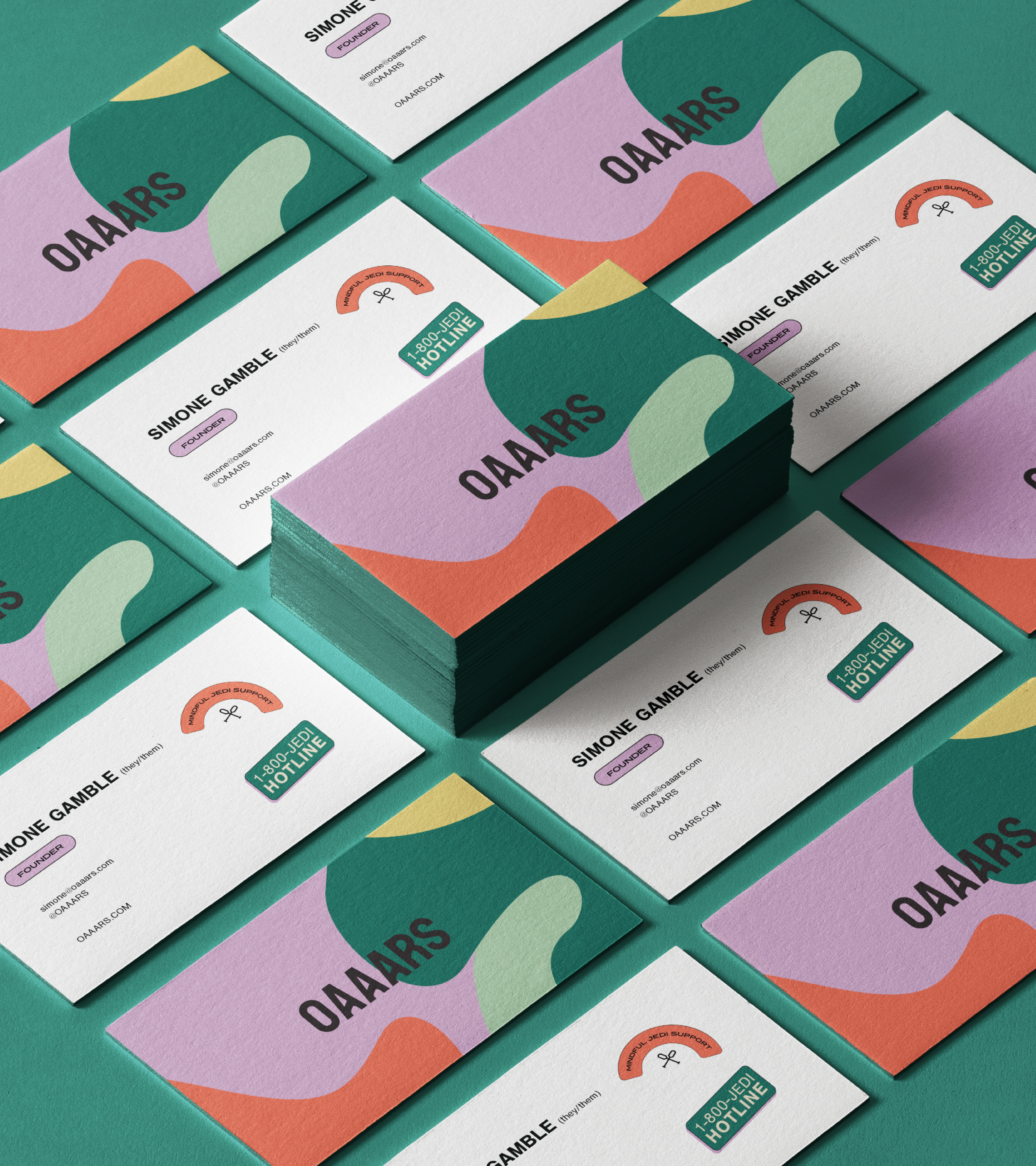
Business Card Design
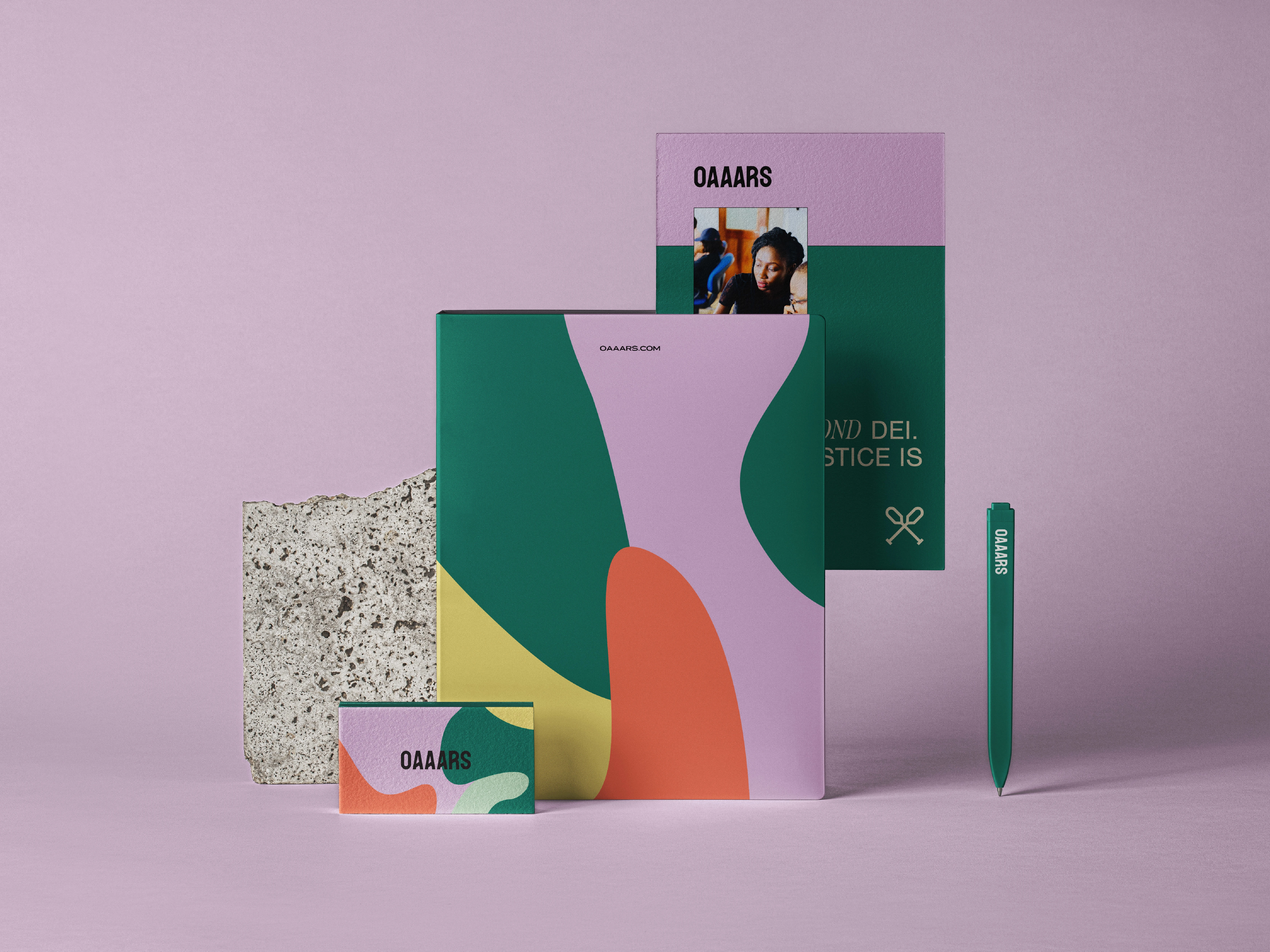
Stationery Design
Workshop Training Materials
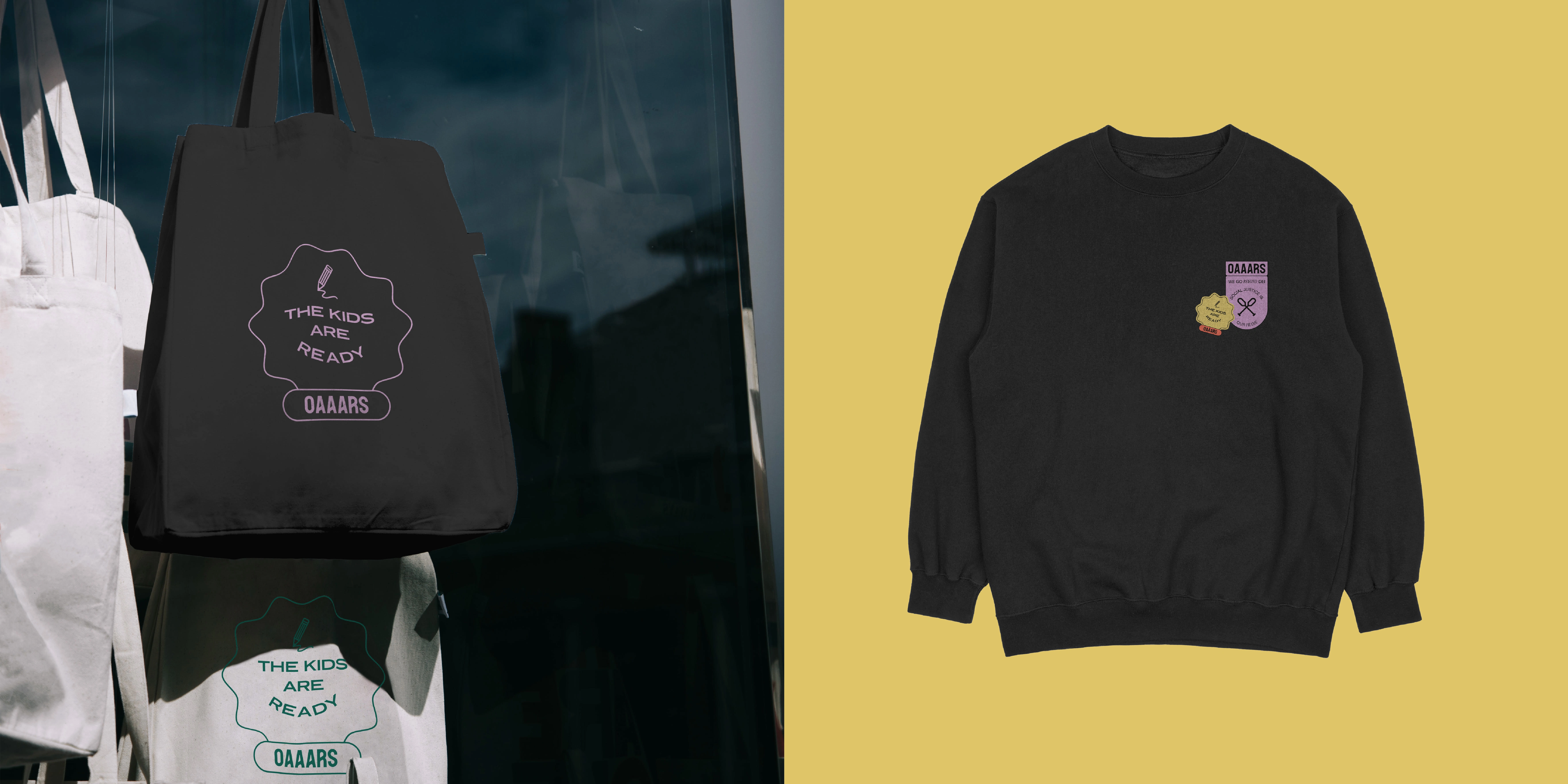
Merch Design for "The Kids are Ready" Fundraiser Campaign
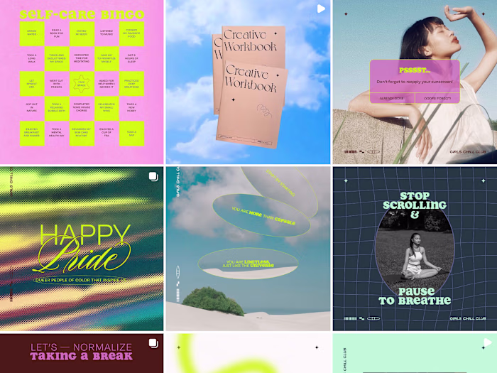
Social Media Post Designs + Content Calendar Management
The rebrand takes shape in the social media content planning and post design found on instagram, @oaaars since 2020 until present.
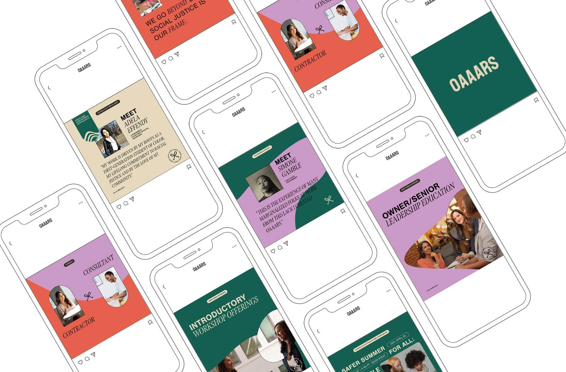
Post Designs for Social Media Content Planning, more can be found @oaaars on instagram
Check out OAAARS Instagram account to view all posts designed by me:
Stickers
Custom stickers designed for use as additional brand elements, digitally or printed.
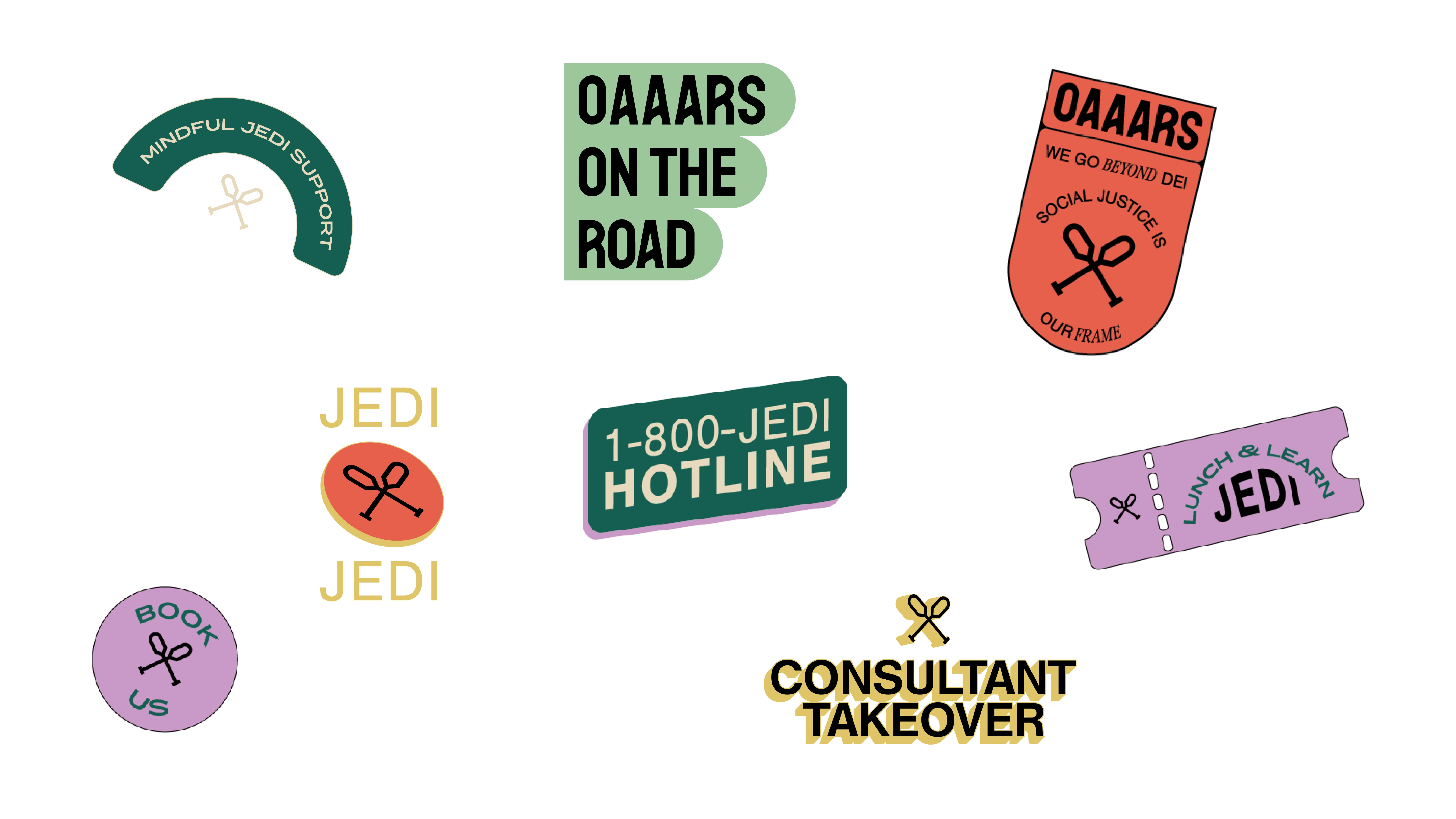
Designed Custom IG Stickers for OAAARS Instagram Account
Visit oaaars.com to check out their services!
The new updated website 2023 is designed by the amazing team of Monforte Studio.
Like this project
Posted Jun 9, 2021
Visual identity and branding of POC-led consultancy that offers social-justice centered training to create safer & inclusive workplaces.