Purefit: Nothing added

Will Derman



Purefit sells one thing: a trainer's full attention. One trainer, one client, and nobody else in the room. No class, no app, no template.
The name already makes the argument. Pure means nothing added, so the identity adds nothing either: two typefaces, one accent colour, no gradients.
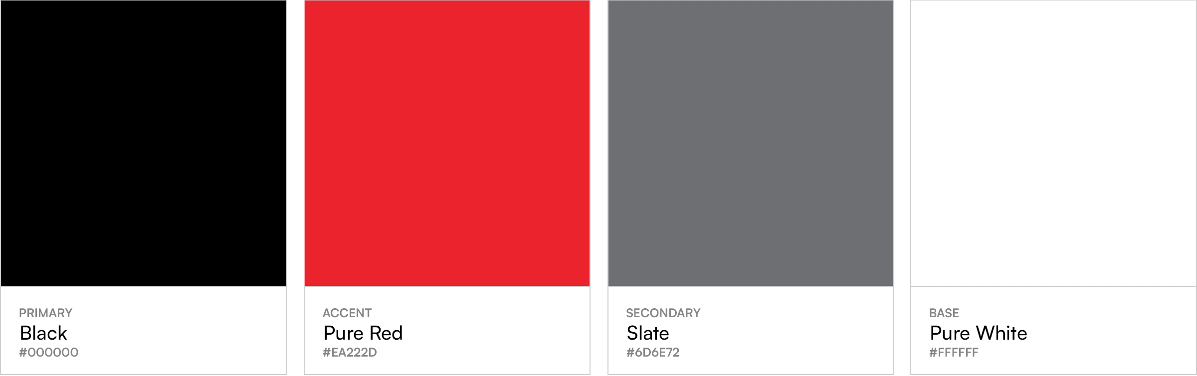
One red, and only one. Black and slate carry everything else, so the red lands wherever it appears: the ring, and the dot on the i.
The wordmark leans forward and stays light, sure of itself without raising its voice. The monogram sets one letter inside one ring, which is the service in a single shape: one person, all of the attention.
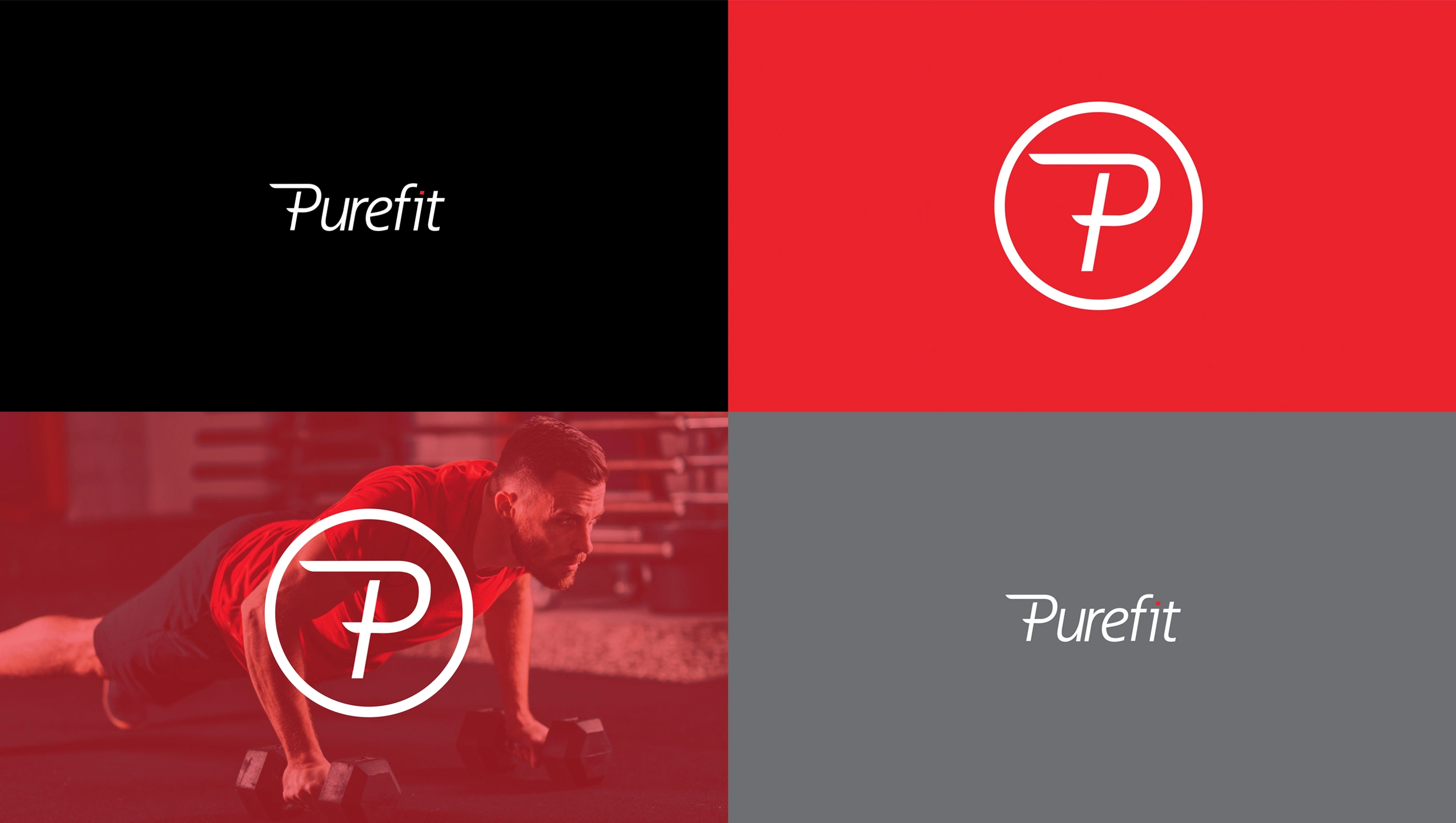
The wordmark and the monogram each work alone, reversed out of black, red, slate or a red-toned photograph.
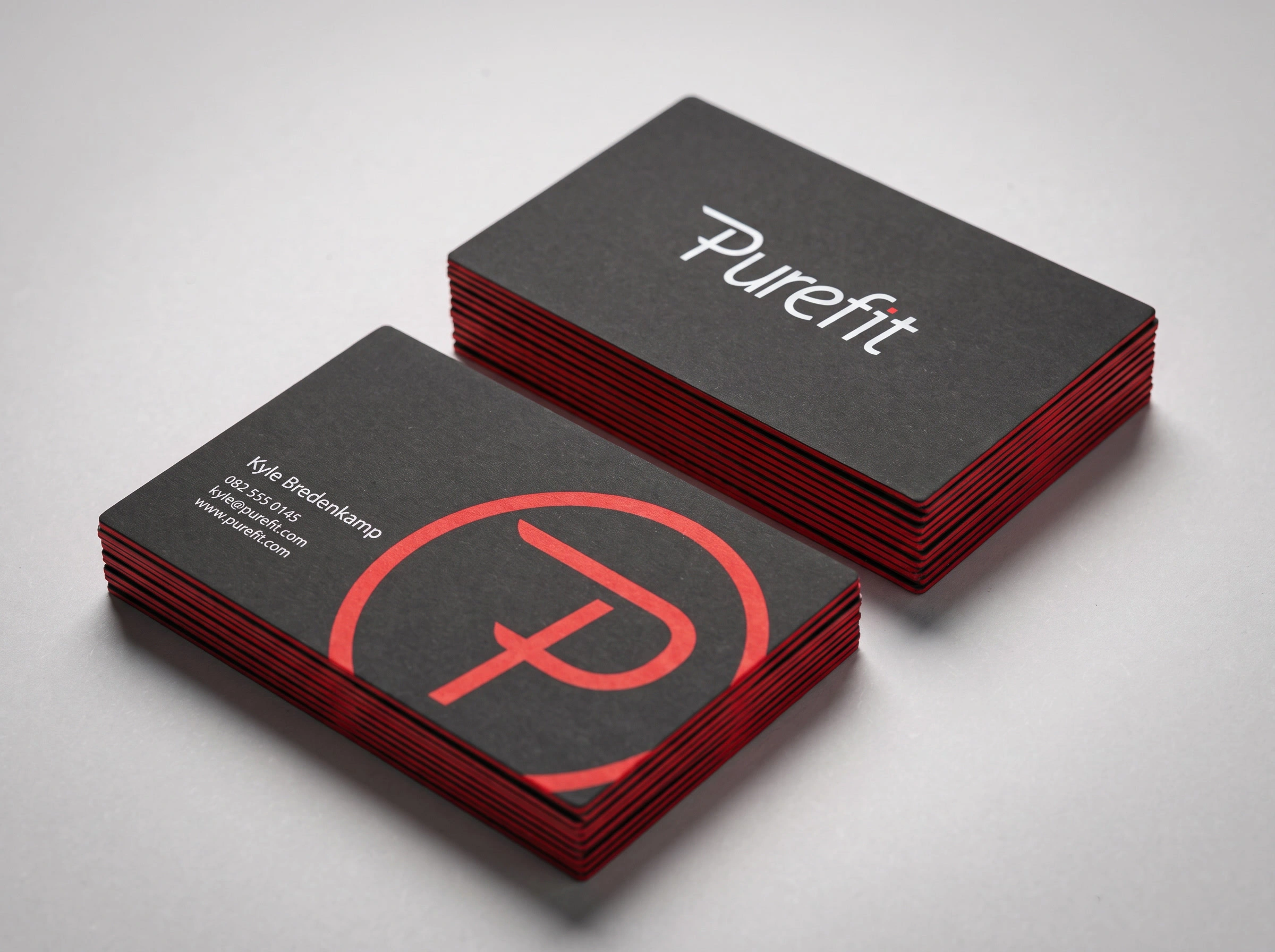
The cards are black with red edges, so the accent shows even in a stack.
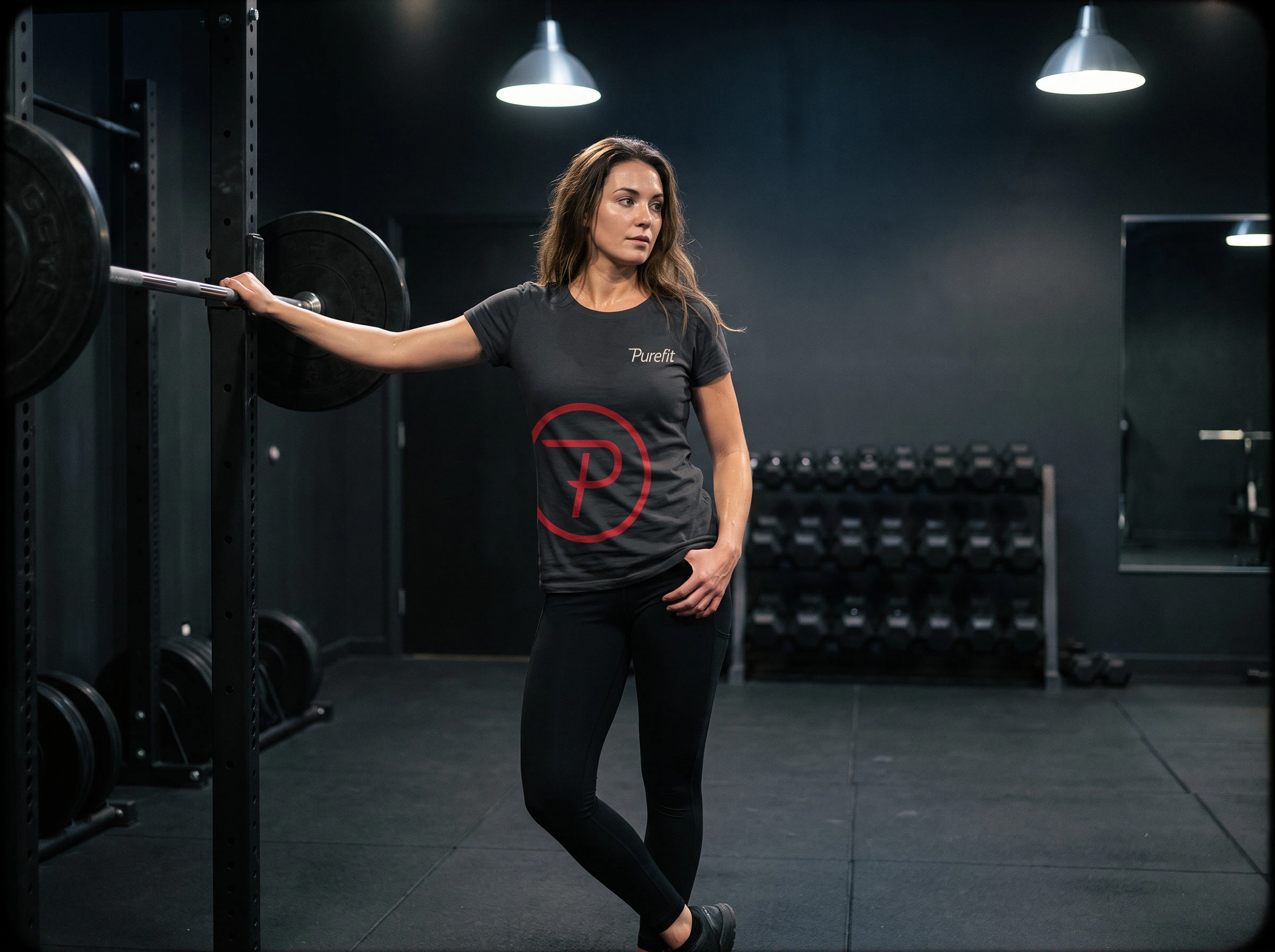
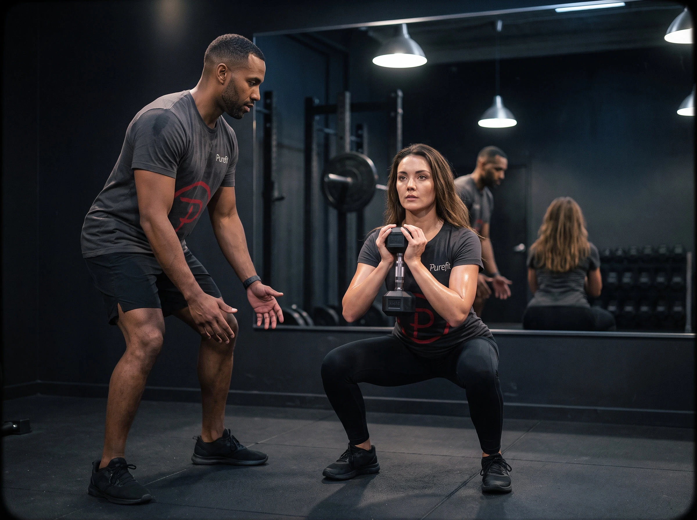
On the kit, the monogram goes large and the wordmark small. Nobody else in the room, and nothing else on the shirt.
Like this project
Posted Sep 26, 2026
Logo and brand identity for Purefit, a one-to-one personal training service: an oblique wordmark, a circled P, and one red on black.