ETERNITY IN MIND

Mayank Gambhir


ETERNITY IN MIND
A clothing label built by Malik Tuck around a simple idea: what you make should outlast the season it was made in. Starting with t-shirts, with caps and hoodies planned for the future, the brand needed an identity that could grow with the range without losing its character.
Malik had the philosophy worked out and nothing to carry it. I built the identity and packaging system that took it into the physical world.
Most founders arrive with a category and a mood board. Malik arrived with a philosophy and a square.
The philosophy was already there: living with intention, making things that mean something, carrying eternity in mind. The square was in the brief too, and Malik was attached to it.
SERVICES:
BRAND IDENTITY & PACKAGING
INDUSTRY:
FASHION
YEAR:
2026
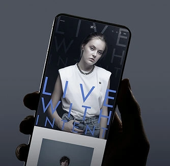
THE SQUARE
The strongest thing in a brief is usually the thing worth testing hardest.
So the first thing I did was try to take it out.
Not to talk Malik out of it. To find out whether the brand held up without it. If an identity only works because of one shape, the shape is carrying the brand rather than the other way round.
Take it away, and if what's left still feels like
Eternity in Mind, the square stops being a default and becomes a decision.

THE MARK
Structure is the easy half. Awareness is the hard one.
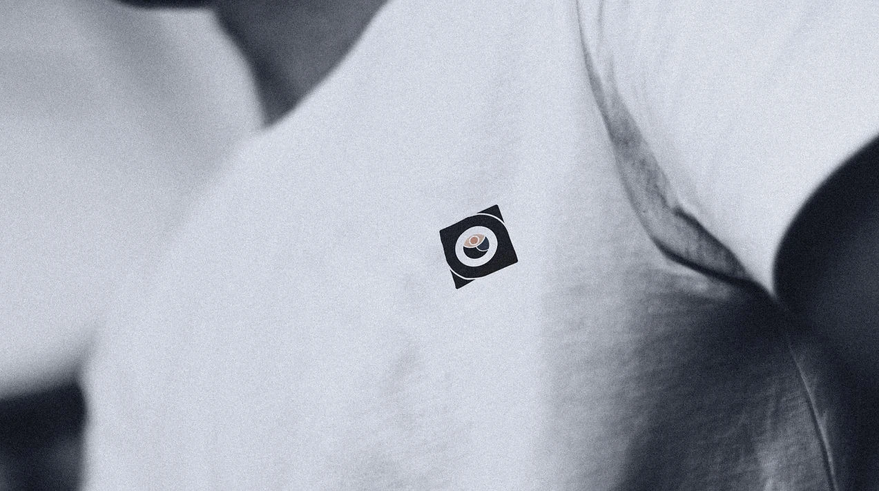
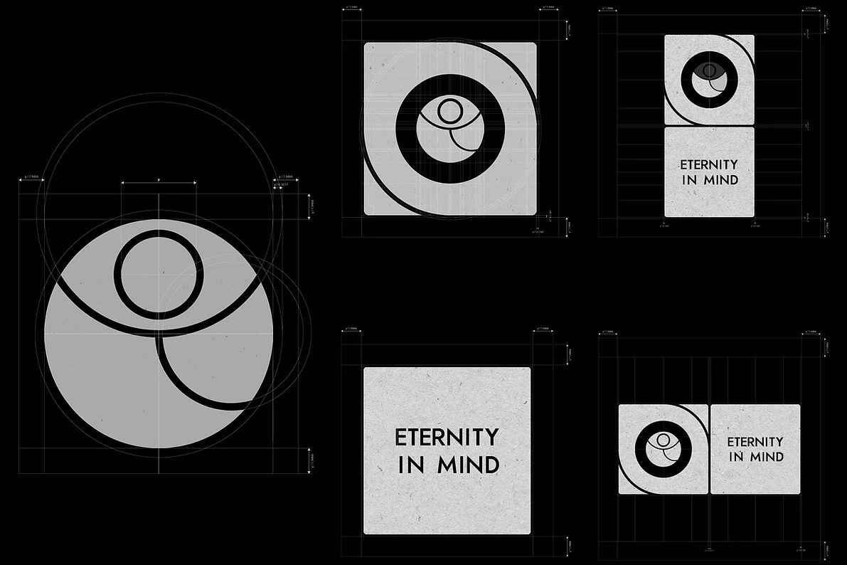
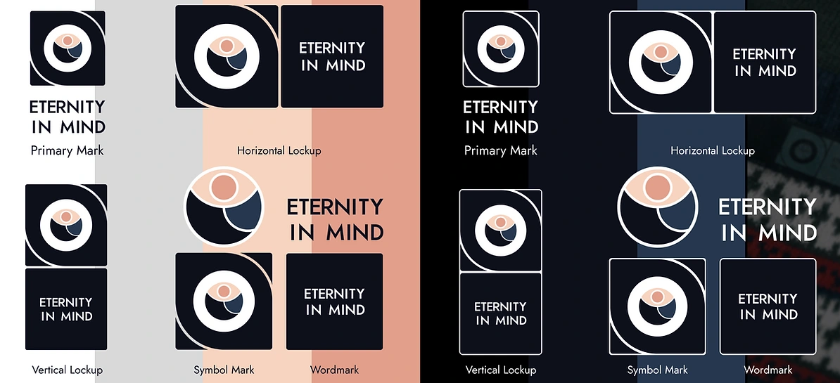
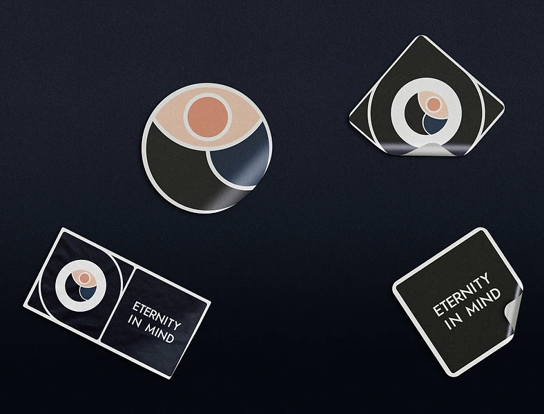
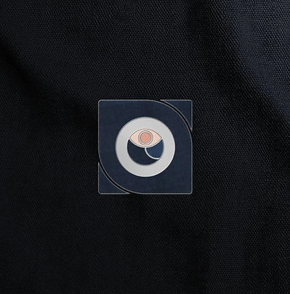
The final mark holds the square and the eye together.
The square is structure, the discipline of making something properly and the frame the brand works inside. The eye is awareness, noticing and paying attention, the part of the philosophy that's about how you move through a day rather than what you produce at the end of it.
Neither carries the brand alone. A square on its own is a container. An eye on its own belongs to a wellness app.

THE MARK
Structure is the easy half. Awareness is the hard one.
The final mark holds the square and the eye together.
The square is structure, the discipline of making something properly and the frame the brand works inside. The eye is awareness, noticing and paying attention, the part of the philosophy that's about how you move through a day rather than what you produce at the end of it.
Neither carries the brand alone. A square on its own is a container. An eye on its own belongs to a wellness app.
THE SYSTEM
Everything should feel like it came from the same place.
With the core identity established, the system needed to hold together wherever the brand showed up.
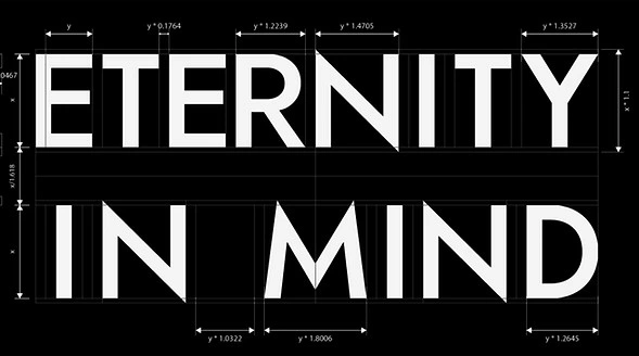
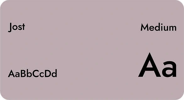
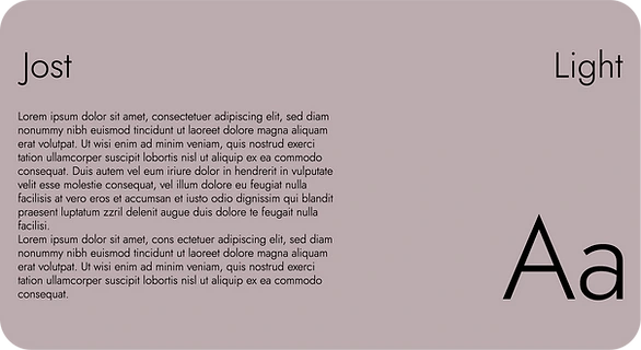
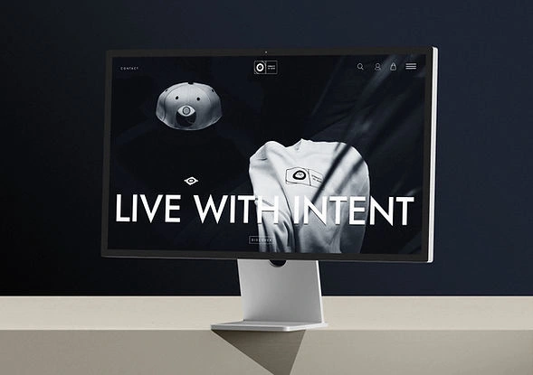
The primary and supporting marks give it flexibility, while the visual language keeps the expression consistent without making every application feel the same.
INTO THE PHYSICAL WORLD
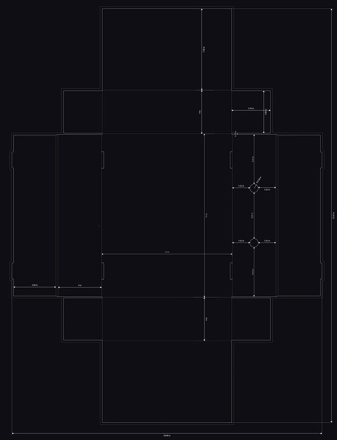
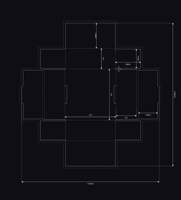
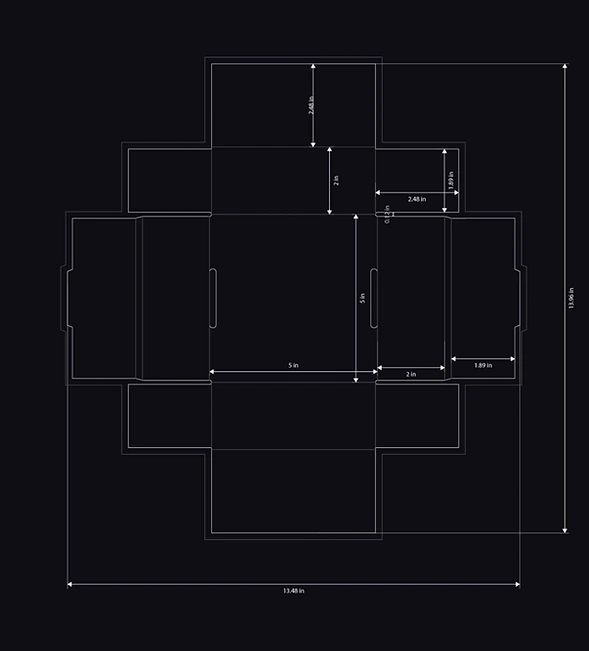
The identity was designed to be felt as much as seen.
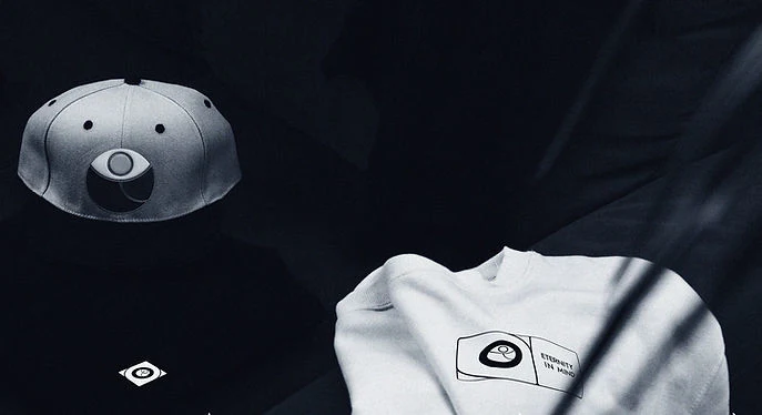
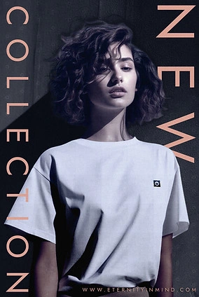
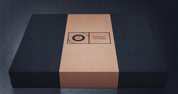
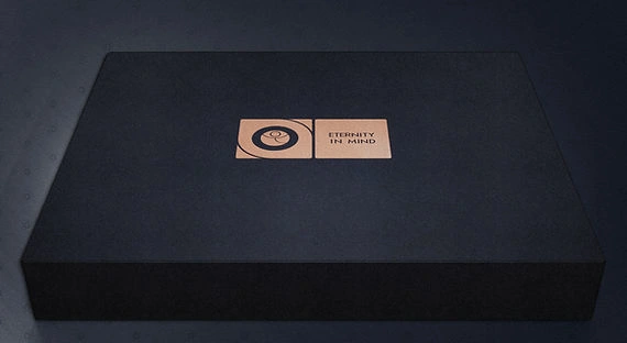
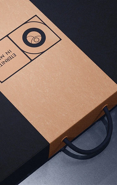
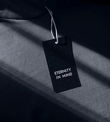
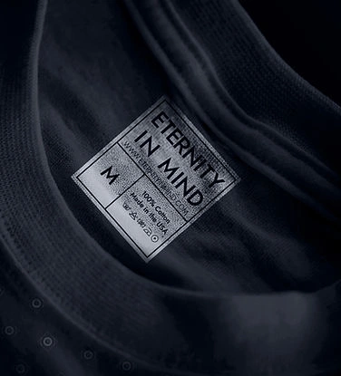
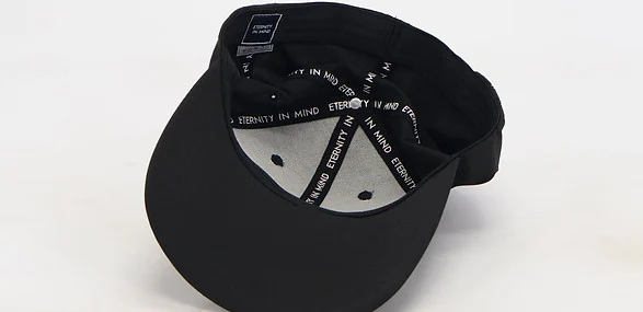
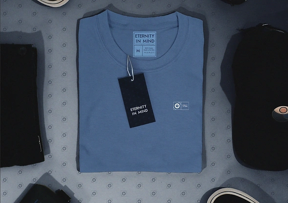
The same geometry, marks and patterns move into packaging, tags and apparel, keeping the structure consistent while allowing each application to behave differently.
The box and sleeve system was designed to scale across the range, so a single product and a larger order still feel like the same brand.
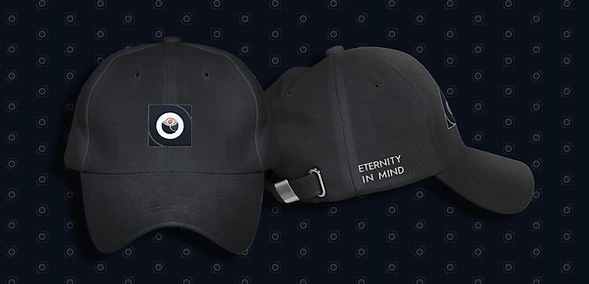
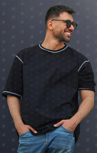
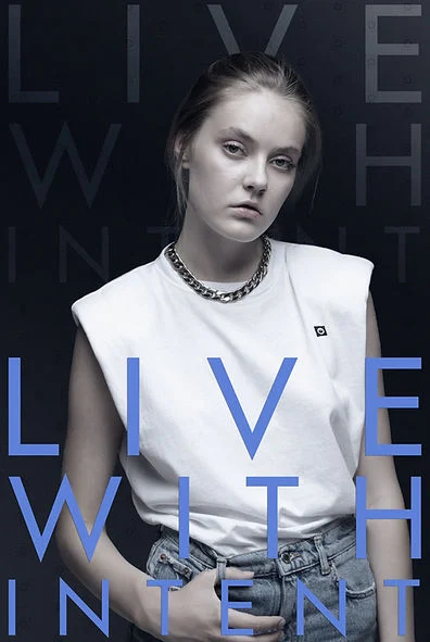
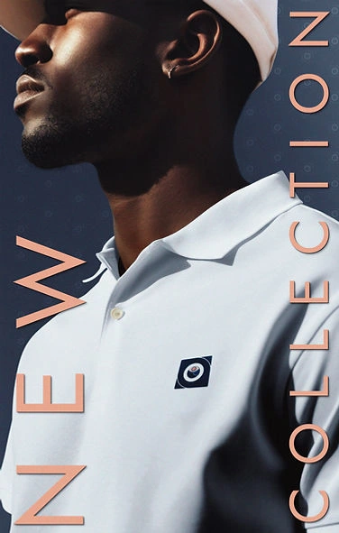
BUILT TO GROW
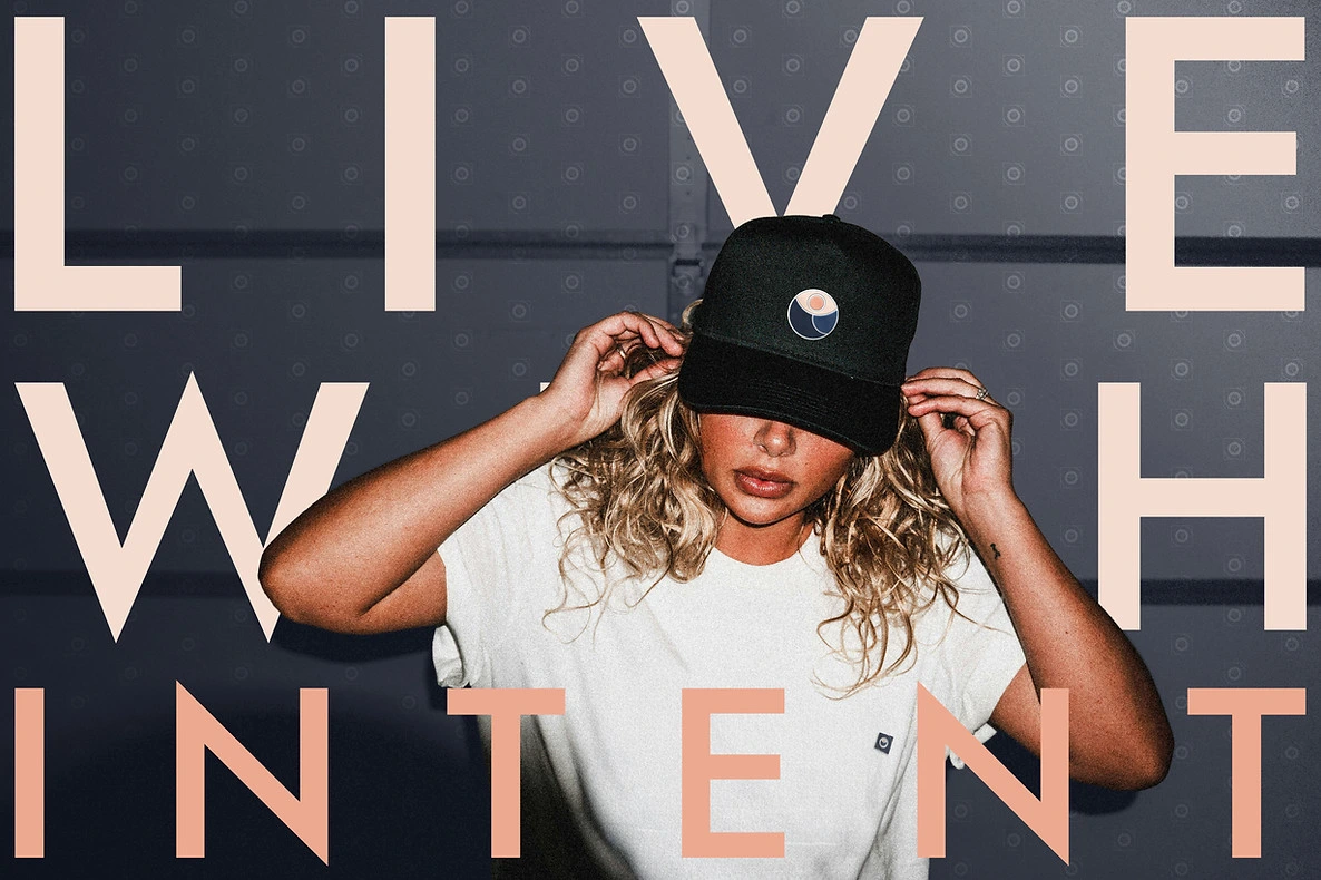
A system Malik can extend as the range grows, without redrawing the identity or having to rethink what the brand is every time it enters a new touchpoint.
Like what you see? Thinking about working together?
Drop me a line here . I’m always up for a chat - especially with people who are passionate about what they do.
"Mayank has been exceptional to work with.
He’s organized, detail‑driven, and consistently delivers clean, intentional design that matches the vision every time. His professionalism, clarity, and commitment to quality make the entire process smooth. He doesn’t just complete work, he elevates it. I’m genuinely grateful for his contribution and highly recommend him. The type of person you don't want to share with anyone!"
Malik Tuck
(Founder, Eternity in Mind)
Like this project
Posted Sep 29, 2026
Designed the identity and packaging system for clothing label Eternity in Mind,