NEONOMAD

Mayank Gambhir
Future Has No Borders
NeoNomad is a self-initiated identity concept built around a simple idea: travel is no longer always something people leave home to do.
Remote work has made it possible to live, work and move between places without having to belong to just one. I wanted to build a brand for that kind of traveller, and explore what their gear, digital tools and everyday life might look like as one system.
DISCIPLINE:
BRAND IDENTITY · CUSTOM TYPEFACE · PACKAGING · MARKETING CAMPAIGN
SECTOR:
TRAVEL & LIFESTYLE GEAR
YEAR:
2025


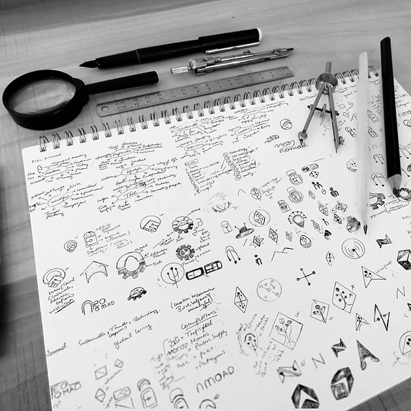
THE IDEA
Travel isn't always about getting away.
Most travel brands are built around the idea of escape. A trip, a destination, a few days away.
NeoNomad starts from somewhere else.
For some people, moving between places isn't a break from everyday life. It is everyday life.
That became the foundation for the identity: a brand that feels equally comfortable on a backpack, inside a digital product or somewhere unfamiliar.
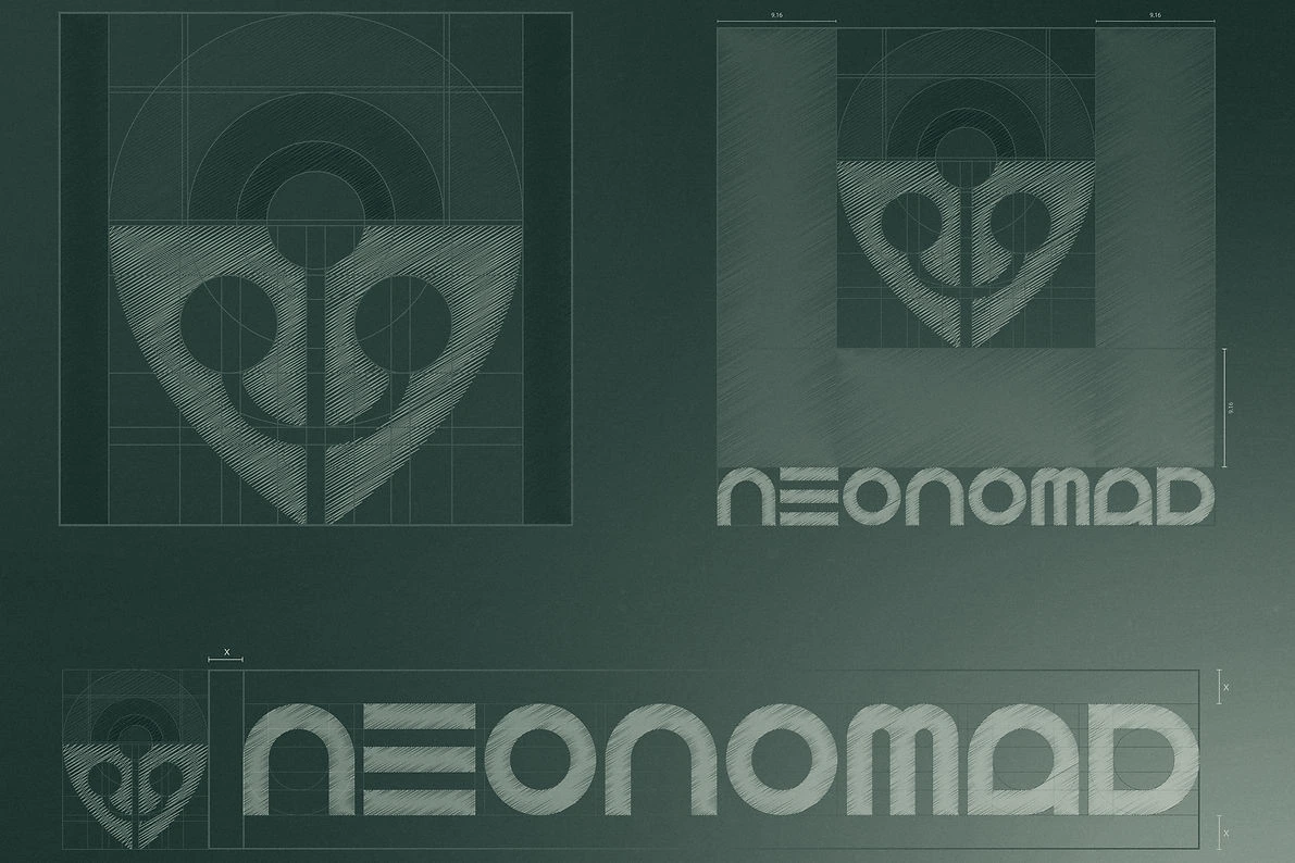
THE IDENTITY
Built for the physical and the digital.
The identity brings together a geometric foundation with warmer, more tactile elements.
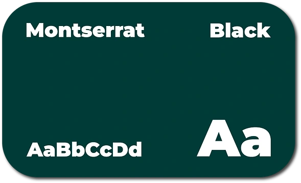
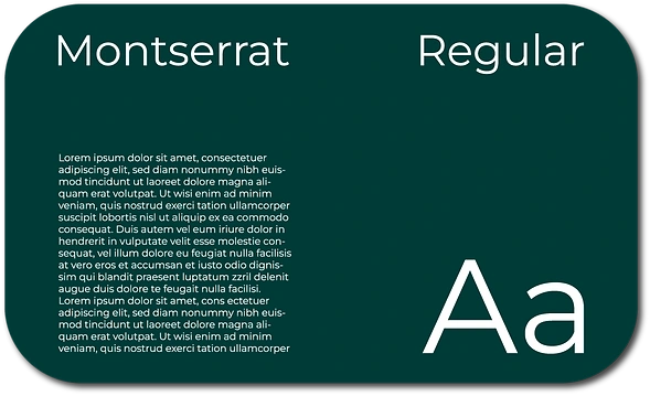
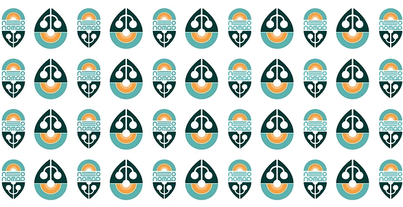
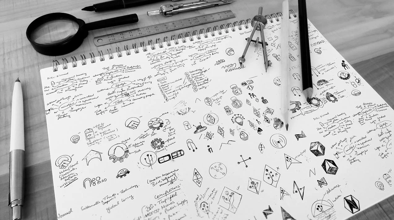
The mark is built on a circular grid, combining references to a pin, a leaf and a path within a single open form. The custom geometric typeface carries that structure into the wordmark and headlines, while the supporting typography keeps the system practical and readable.
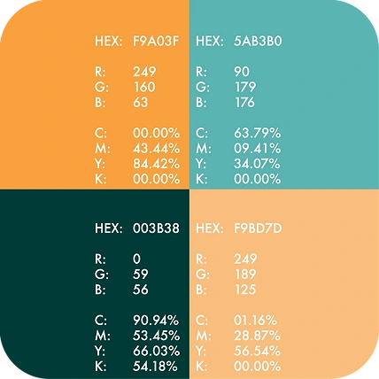
The palette balances slate, cream and warm neutrals with an amber accent, giving the identity a grounded base with enough contrast to stand apart from the category.
Together, these elements create a system that can move between physical products and digital spaces without feeling like two separate brands.
#comp-mtbixu9q svg [data-color="1"] {fill: #000000;}
PATTERN
Recognition without repeating the logo.
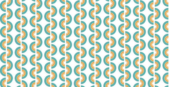
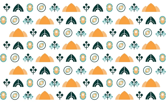
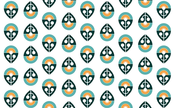
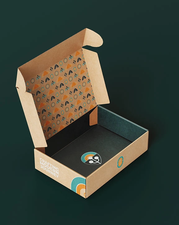
The pattern system takes the geometry of the mark and develops it into a modular grid.
The forms can repeat, shift and change colour while remaining connected to the identity. This gives the brand a recognisable visual texture without turning every surface into a logo application.
APPLICATIONS
One identity, different places.
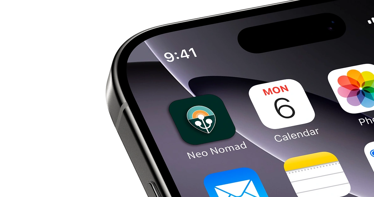
The system was designed to move naturally between the physical and digital sides of the brand.
Iconography A supporting set built from the same geometry as the mark.
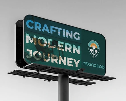
Campaign
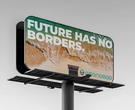
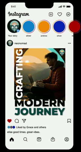
A type-led visual language built around the line “Future Has No Borders.”
Digital
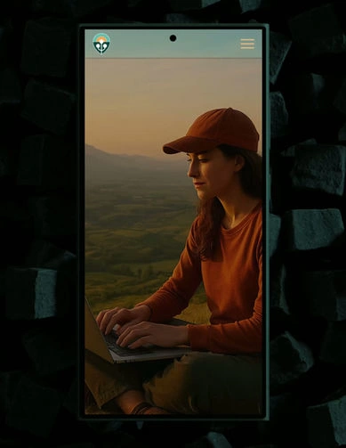
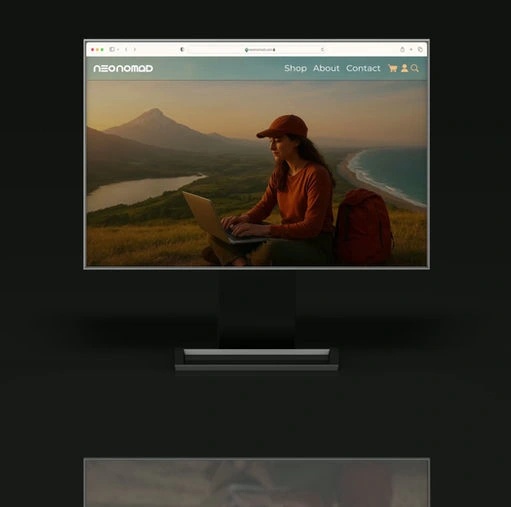
Modular layouts that give content room to change without losing the identity.
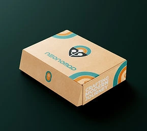
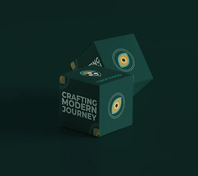
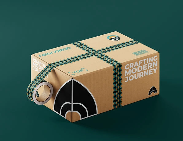
Packaging Recyclable, uncoated materials paired with the identity's typography and pattern system.
#comp-mtbkgl6i3 svg [data-color="1"] {fill: #000000;}

#comp-mtbkw9e5 svg [data-color="1"] {fill: #000000;}
#comp-mtbl0vv23 svg [data-color="1"] {fill: #000000;}
#comp-mtbljjcv svg [data-color="1"] {fill: #000000;}
#comp-mtblijxh svg [data-color="1"] {fill: #000000;}
#comp-mtblgxxy2 svg [data-color="1"] {fill: #000000;}
Like what you see? Thinking about working together?
Drop me a line here . I’m always up for a chat - especially with people who are passionate about what they do.
Future Has No Borders NeoNomad was built as a system rather than a single visual treatment. The same identity can move from gear to packaging, from a digital interface to a campaign, without needing to become something different each time.
NEONOMAD
Like this project
Posted Sep 29, 2026
NeoNomad — a self‑initiated identity system for modern travellers, including custom typeface, packaging, campaign and a modular visual language.
Likes
0
Views
1