Nonprofit Website & Social-Impact Storytelling

Joshua Adehi

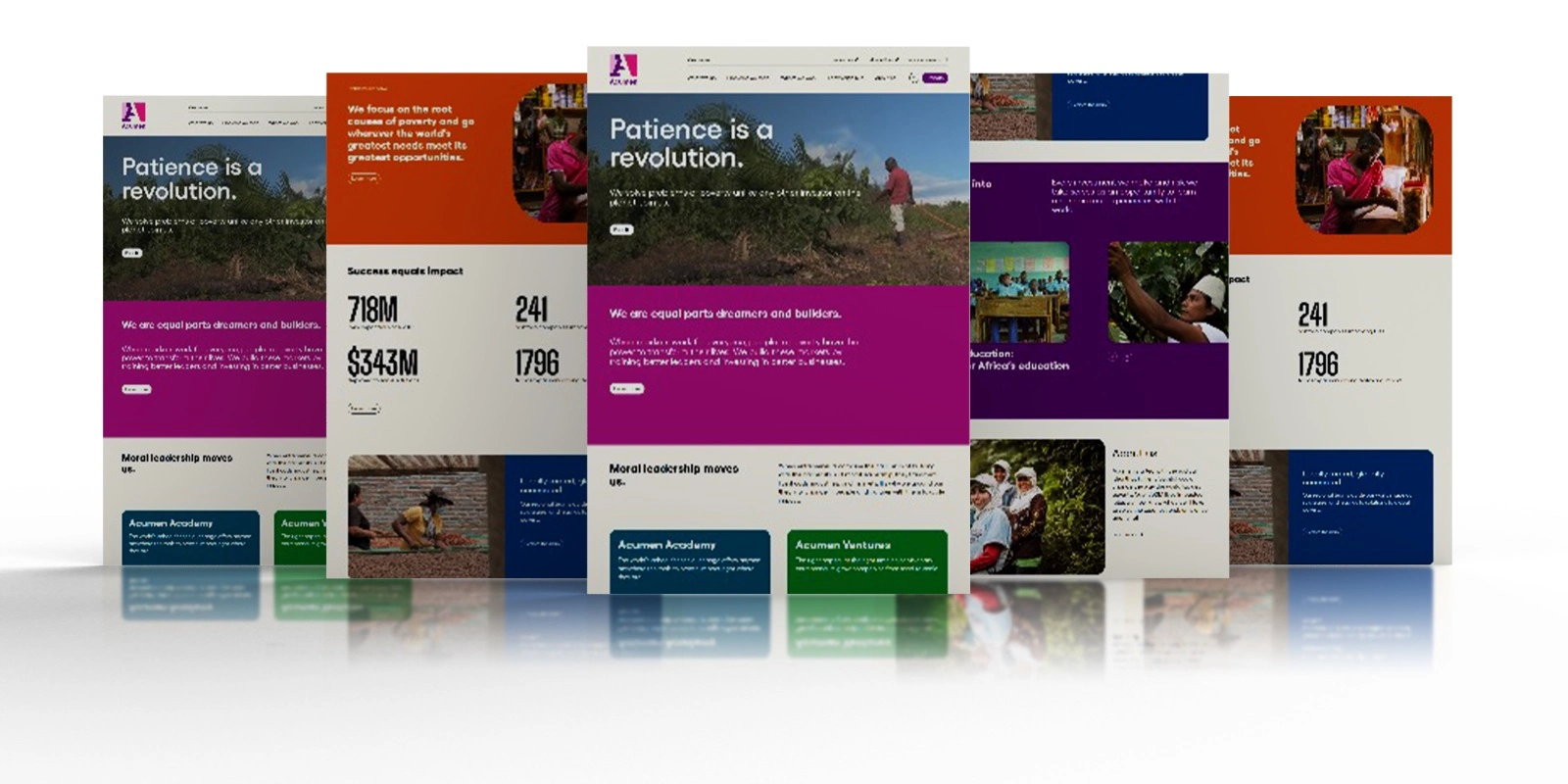
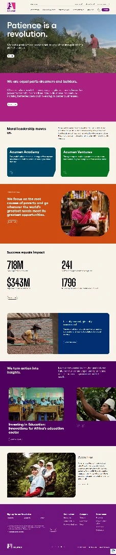
Original nonprofit website mockup showing the mission, program, and impact-content layout.
Making a complex mission easier to explore
This portfolio design shows a nonprofit website built around Acumen’s mission, programs, and stories. The focus is how the page introduces the organisation, explains its work, and gives visitors clear routes into the areas that interest them.
The communication challenge
A mission-led organisation can have several audiences on the same page: someone learning about its work, a prospective supporter, or a visitor looking for a specific program. The design needs to introduce the bigger picture without making every visitor read the entire site.
The page opens with a short mission statement and strong photography, then moves into explanatory sections, program choices, impact information, and stories. Each section has a different role in helping a visitor understand the organisation.
Design choices
Large headings establish the main message before visitors reach the longer copy. Purple, orange, navy, and green sections separate the different topics, while photographs bring people and places into the story. This creates a clear rhythm between mission, explanation, programs, and supporting content.
The program cards give visitors distinct routes into learning and venture-related information. Impact figures are treated as a dedicated part of the page, rather than competing with the opening message. Those figures belong to the organisation’s source content; they are not results attributed to my website work.
Portfolio presentation
The original multi-panel mockup shows the visual system across several sections. The full-page supporting image gives a second view of the content sequence. Both original assets are preserved, without added headline graphics or invented interface elements.
The case covers visual hierarchy, content organisation, and a mission-led website experience. It does not claim donation growth, fundraising totals, organisational outcomes, or measured accessibility compliance.
More website work: https://www.upwork.com/freelancers/kajabiexperts/
If your organisation needs a clearer way to explain its work online, send me a message on Contra.
Like this project
Posted Aug 24, 2026
Mission-led website design with clear program routes, bold visual hierarchy, impact-content sections, and original multi-panel project previews.
Likes
0
Views
3