Medical Practice Website & Appointment Page Design

Joshua Adehi

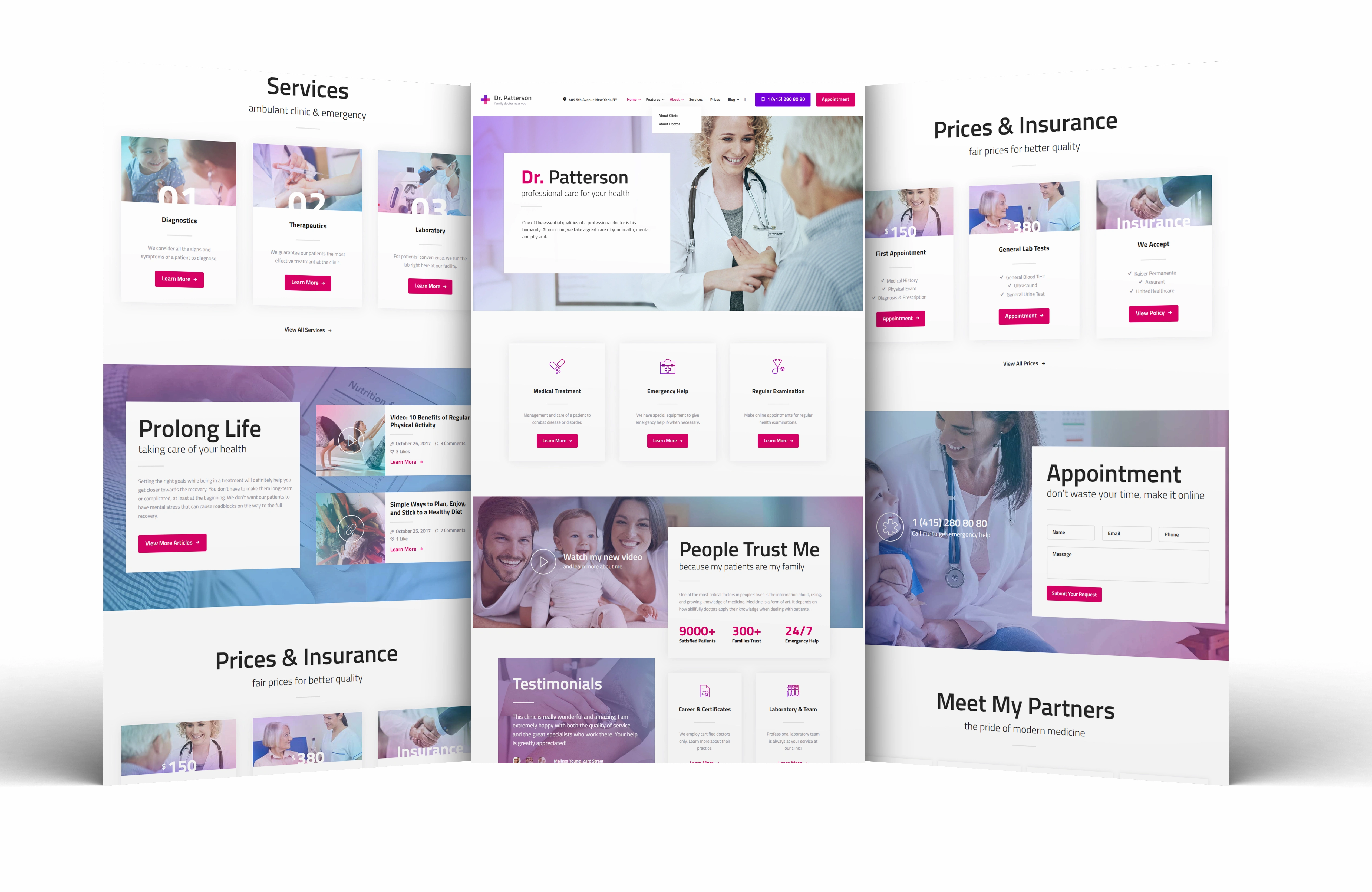
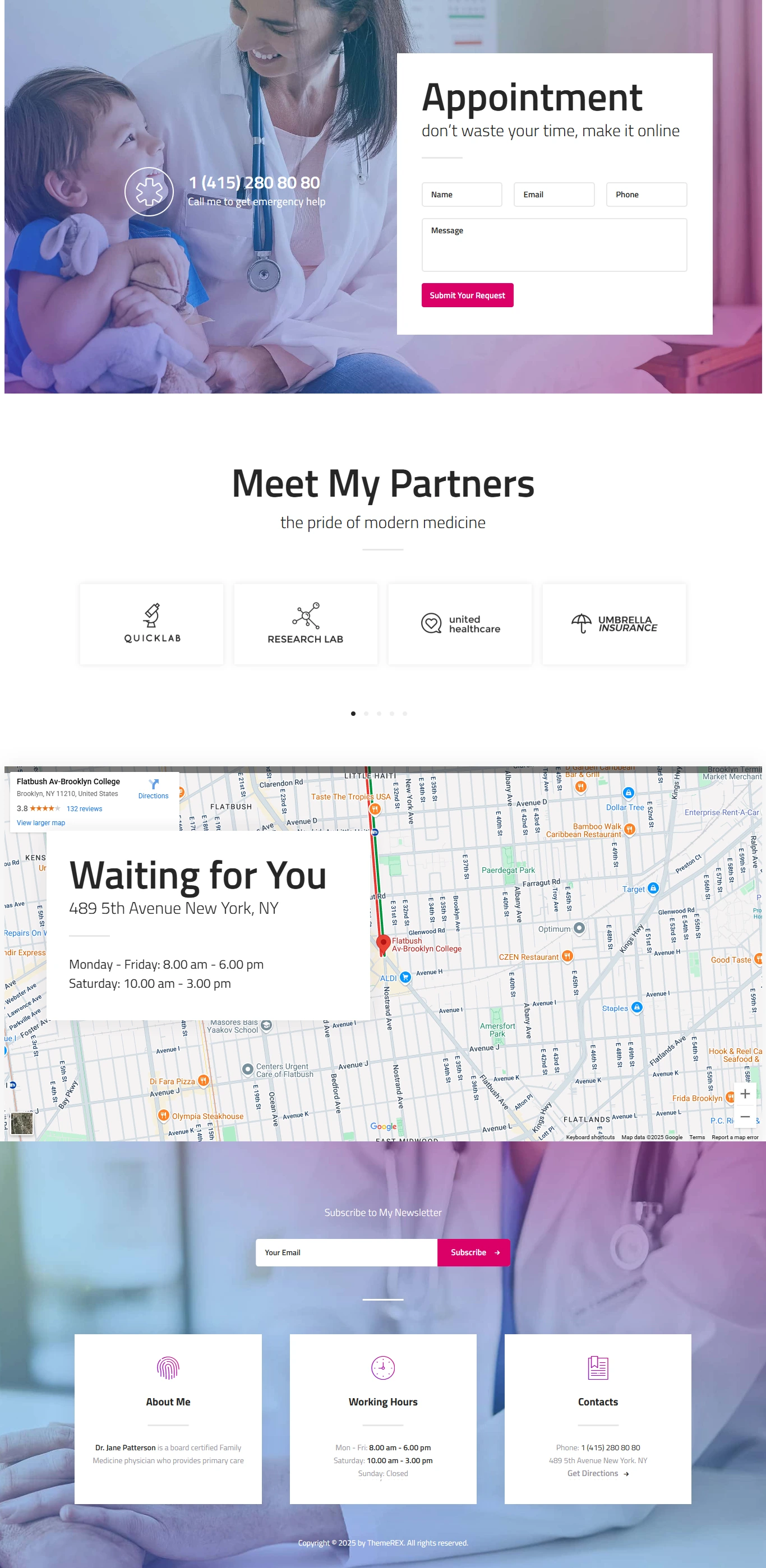
Original multi-panel medical website mockup.
Medical practice website design
This design presents a healthcare practice through a clear homepage, service information, prices and an appointment request section. The portfolio focuses on how those pages look and fit together, rather than on medical outcomes or patient acquisition results.
The layout challenge
A visitor should be able to understand the practice, find the relevant service and see how to make contact. The page separates these tasks into clear sections, with short headings and visible buttons.
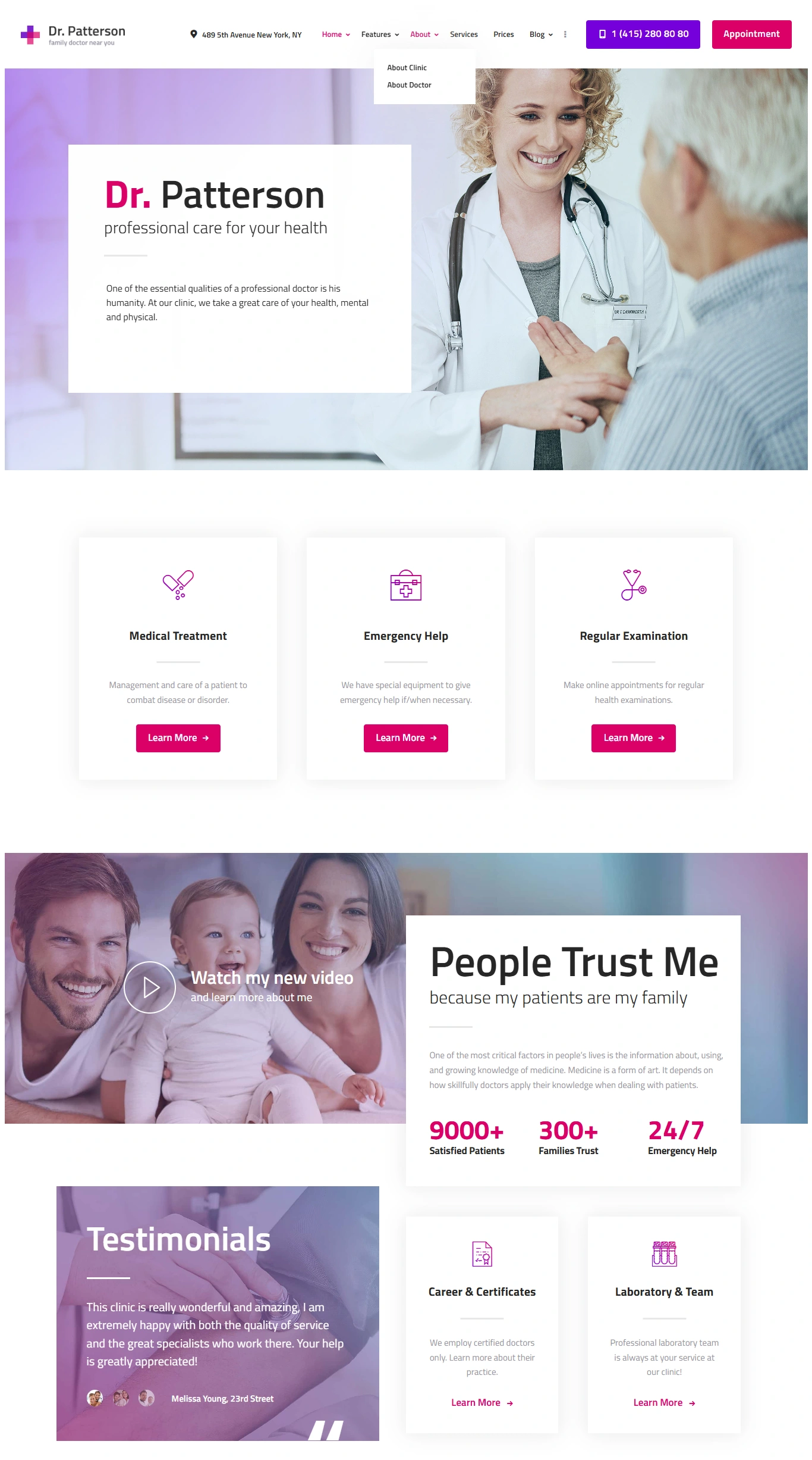
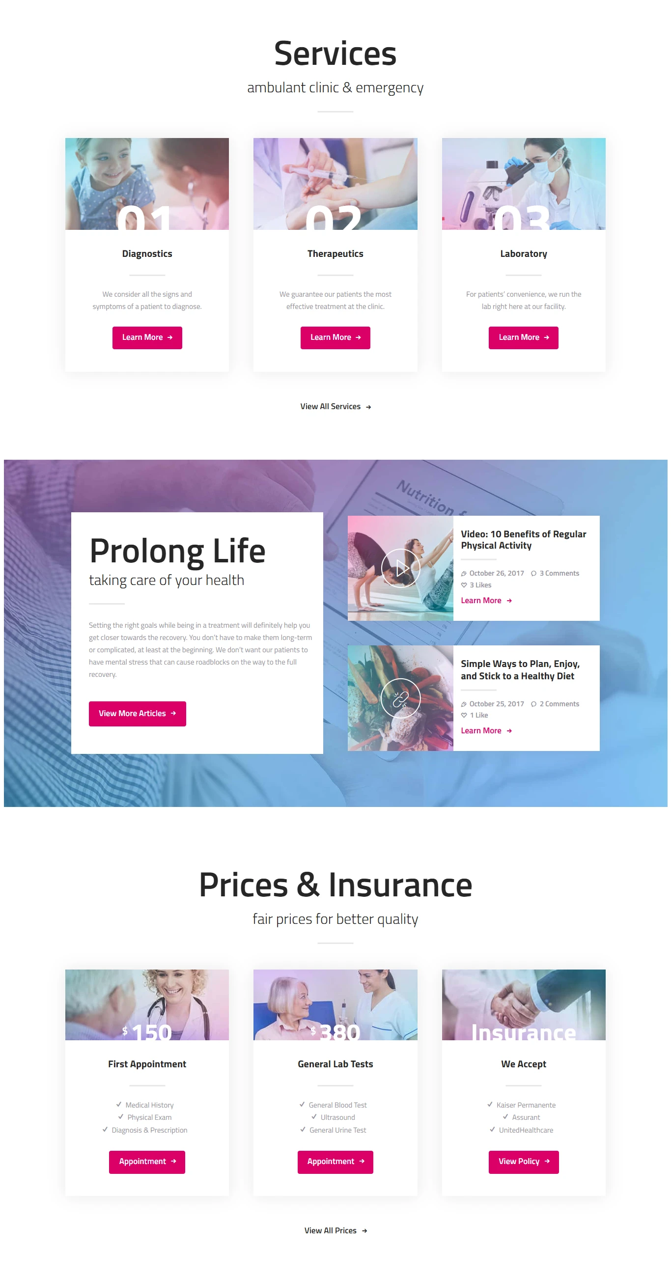
The opening layout pairs a doctor-and-patient photograph with an introduction to the practice. Service cards then break down the information into smaller choices. This helps the page stay readable without turning the introduction into a long list of treatments.
Visual direction
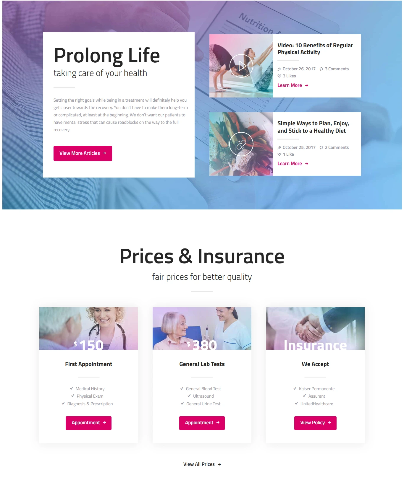
White space, soft purple backgrounds and bright pink accents keep the page consistent. Repeated card shapes connect the service and pricing sections. The same accent colour highlights the main actions across different parts of the design.
The supporting sections show the practice story, general trust information, prices and insurance. A separate appointment panel gives visitors a place to send an enquiry. These are visible interface designs; this case does not claim that a booking system, payments or medical-record integration was implemented.
Presentation and scope
The original multi-panel mockup gives an overview of the visual direction. Four additional page images let you inspect the layouts in more detail. All five original images are retained, with no generated interface screens or extra cover headlines.
This is a visual-design portfolio case. Names, prices, testimonials and figures inside the artwork are page content, not verified practice data or results attributed to my work. No clinical outcome, booking increase or revenue result is claimed.
Like this project
Posted Aug 24, 2026
A medical website design with service cards, pricing information and appointment pages, presented through an original mockup and four supporting layouts.
Likes
0
Views
4