Myco-Minimalist, Corporate Brand Identity
About the Brand
MYCO is a biotechnology company that focuses on developing sustainable materials using mycelium — the root-like structure of fungi. Instead of producing materials through traditional manufacturing or chemical processes, MYCO grows them using natural biological systems. Their goal is to offer an alternative to plastic, synthetic packaging, and other harmful materials by using mycelium-based technology to create biodegradable and renewable solutions.
Their work combines scientific research with design and innovation. They’re involved in both the development of raw material systems and the creation of real-world products, such as packaging and building materials that can break down naturally over time. MYCO believes that many of the things we use daily can be created in a smarter, cleaner, and more responsible way — not just for the sake of innovation, but to reduce waste and rethink how we produce goods.
The name “MYCO” comes from the word mycelium, and it reflects their commitment to nature-driven solutions. The brand’s visual identity — from the logo to the colors and illustrations — is designed to help explain who they are and what they do.
Design Solution
Logo Design & Variations
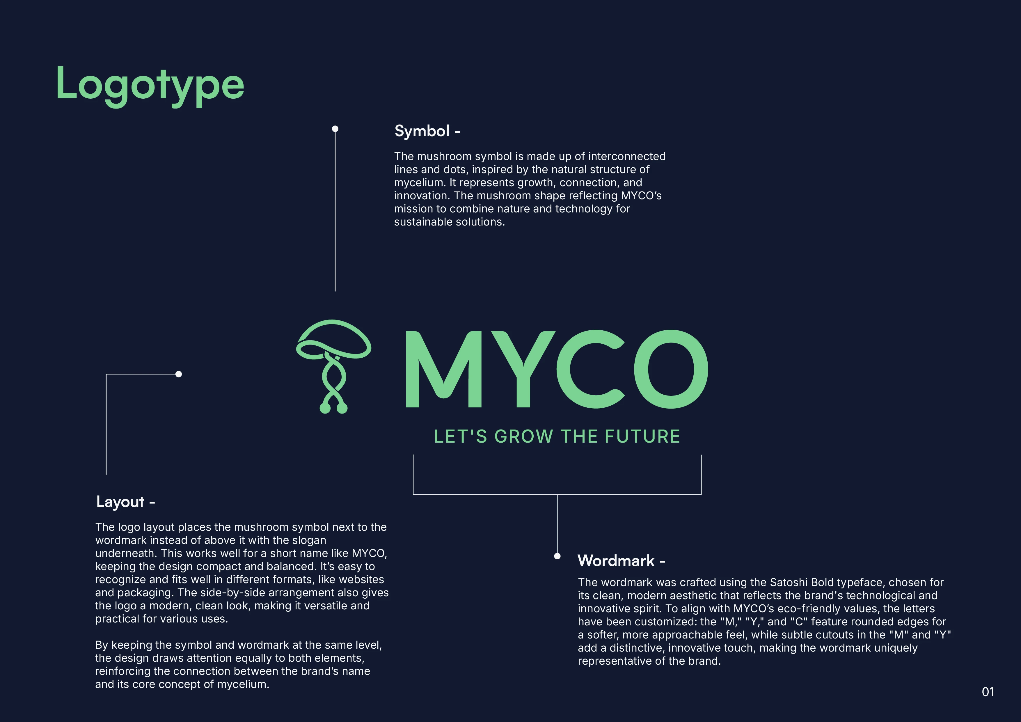
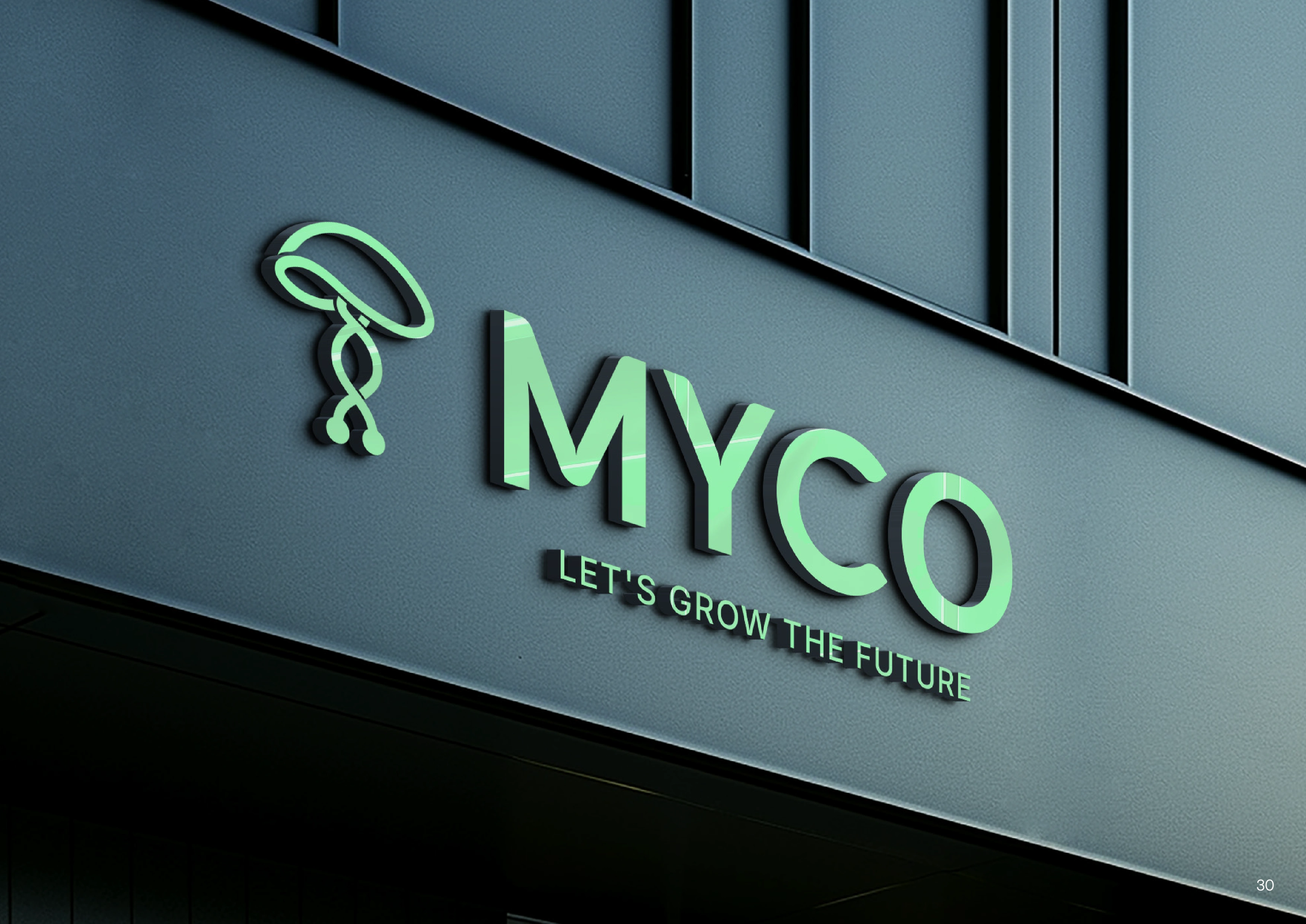
The MYCO logo captures the essence of growth, innovation, and natural networks. The custom mushroom symbol is inspired by the structure of mycelium, using interwoven lines and dots to represent connection and development. It’s designed to be iconic, scalable, and versatile across digital and physical platforms.
The wordmark uses Satoshi Bold with tailored letterforms — rounded edges and subtle cutouts in the "M" and "Y" — making the logotype feel modern, clean, and approachable.
Color Palette
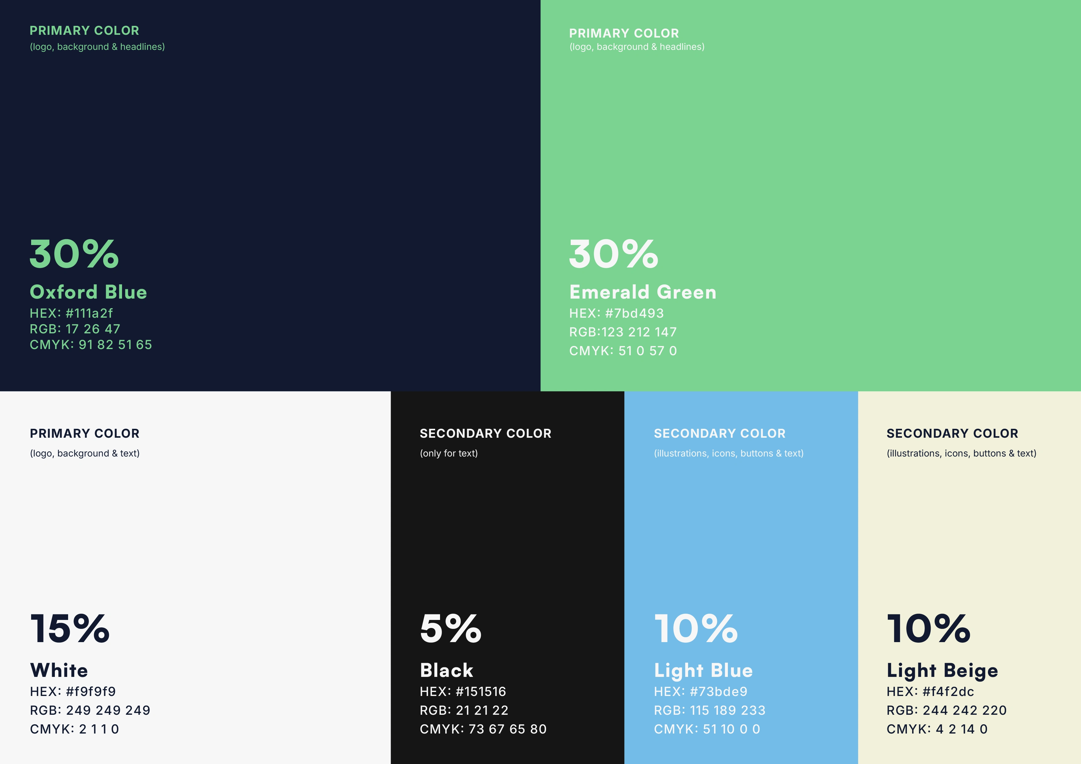
MYCO’s color palette blends professionalism with freshness. Oxford Blue brings depth and a tech-forward feel, while Emerald Green signals growth and sustainability. Light Blue adds a touch of energy and creativity, and Light Beige softens the overall look with warmth and approachability. White keeps everything clean and open, while Black is reserved for high contrast and readability. Together, these colors create a balance between nature and innovation — the core of MYCO’s identity.
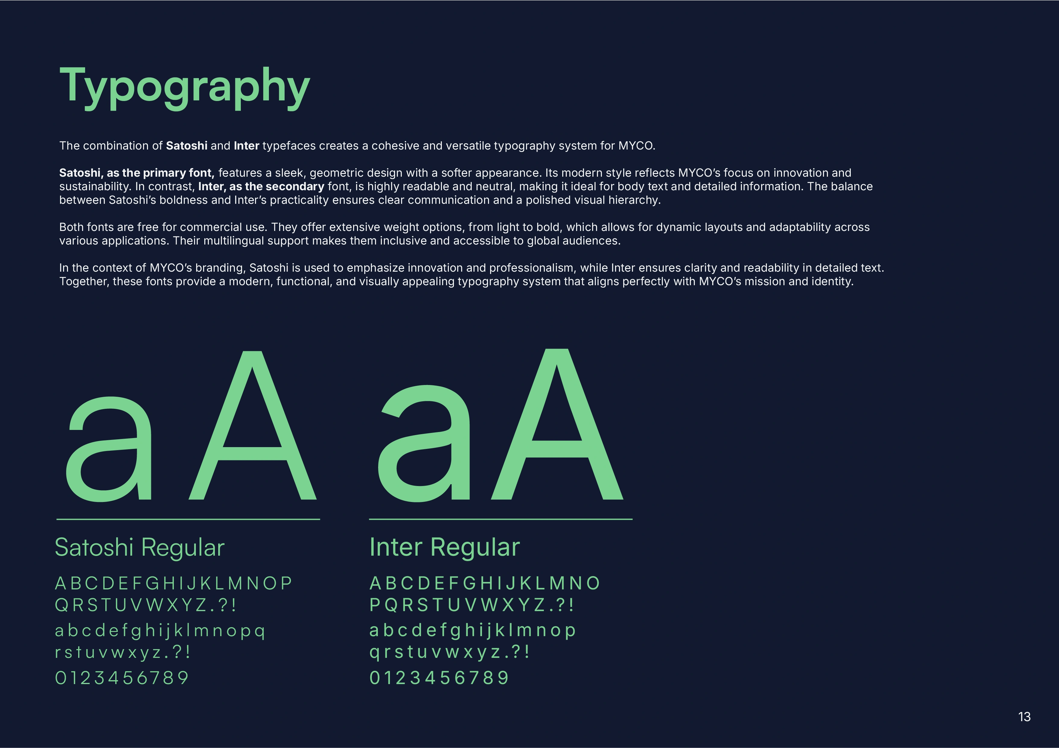
Typography
The brand uses two typefaces:
Satoshi — a modern, geometric sans-serif used for titles, headers, and impactful statements. It reflects the brand’s innovative and forward-looking nature.
Inter — a neutral, highly readable typeface for body text, technical content, and small copy. It ensures clarity and accessibility across all materials.
This pairing provides a structured, clean hierarchy suitable for both storytelling and scientific explanation.
Icons & Visual Identity
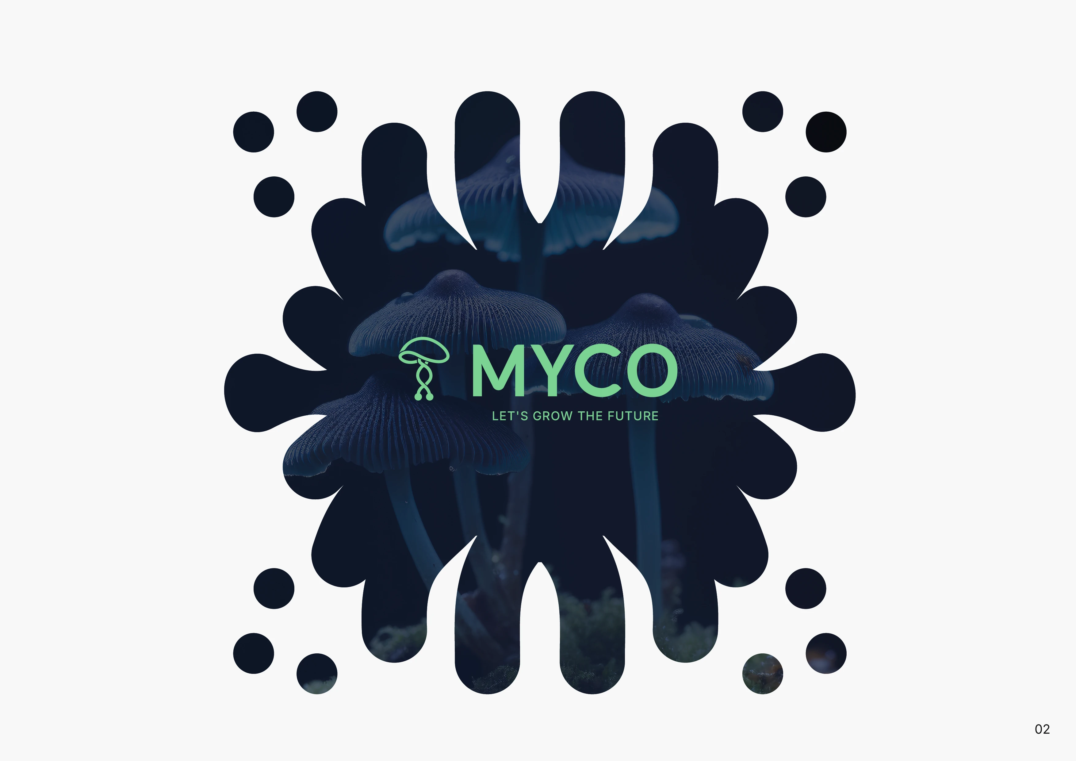
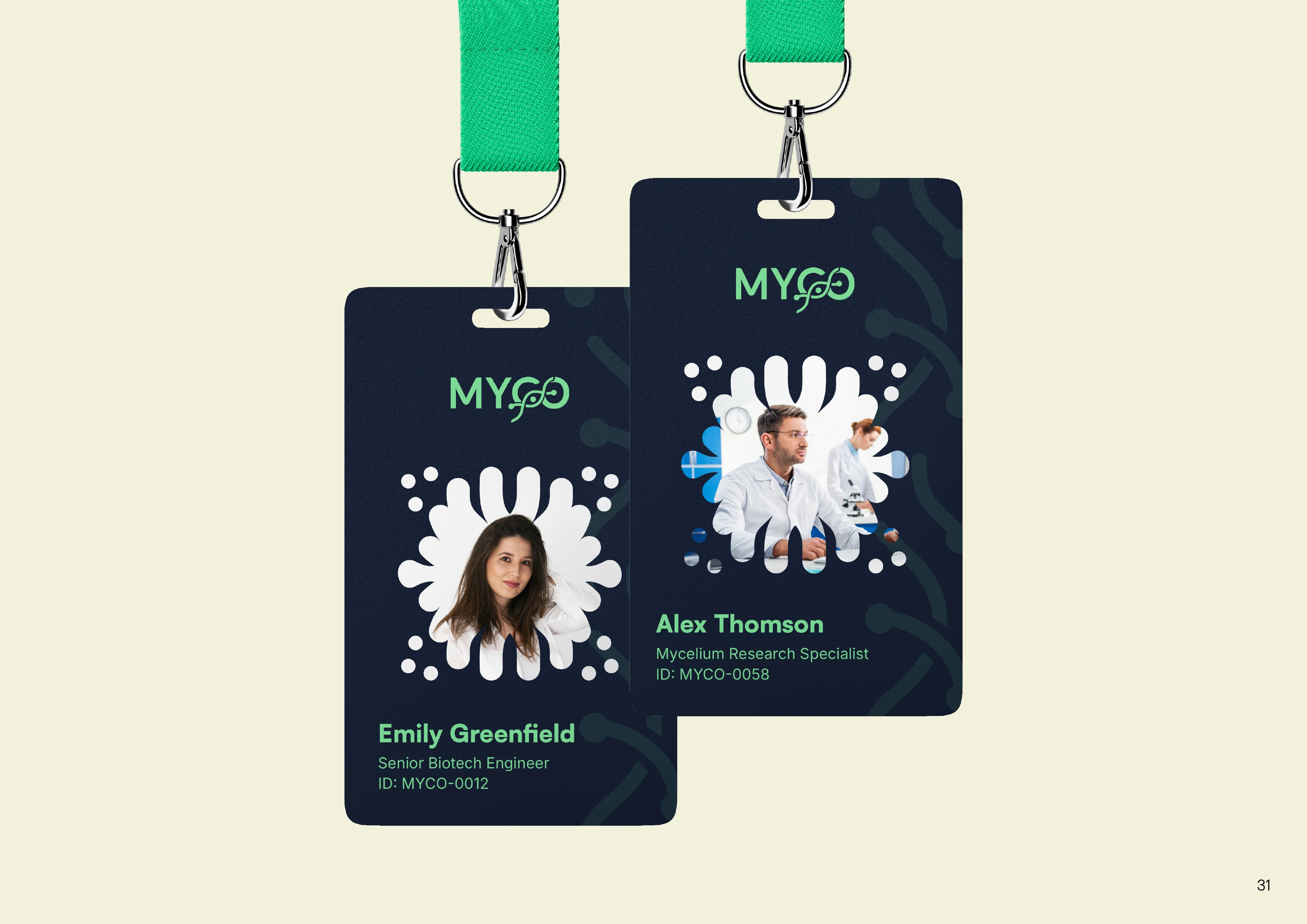
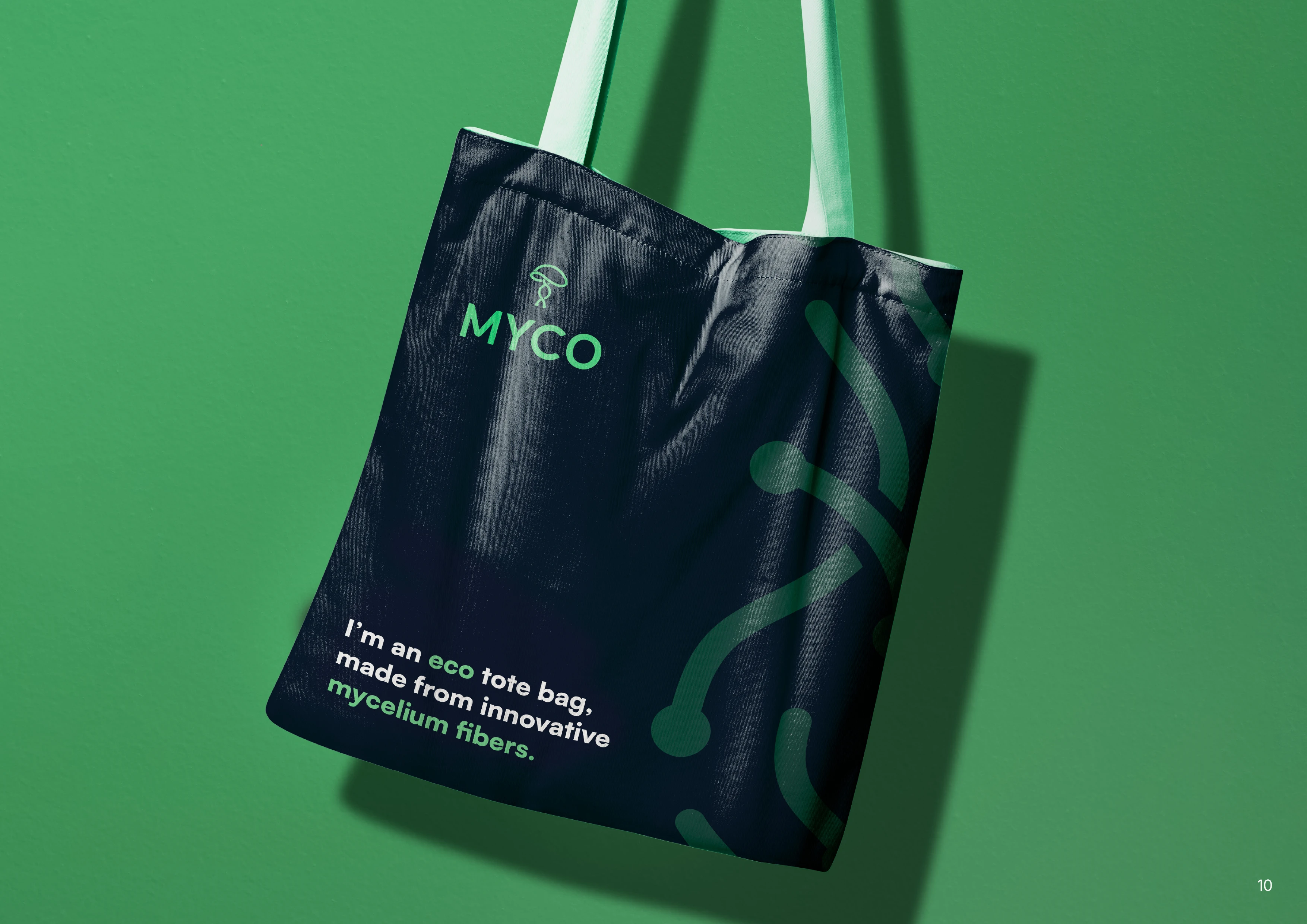
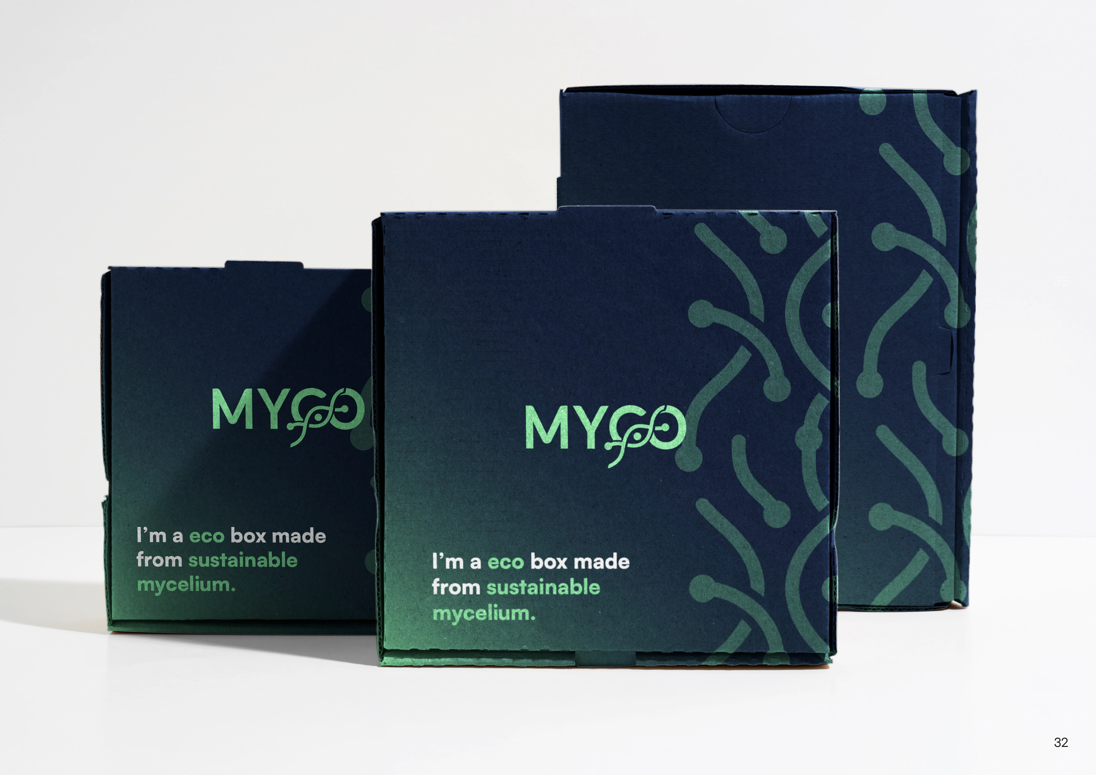
A unique pattern built from floating mycelium-inspired lines and dots supports the brand’s visual language. It’s abstract yet rooted in nature, allowing it to add texture and visual interest to backgrounds, packaging, and digital materials without overwhelming the main content.
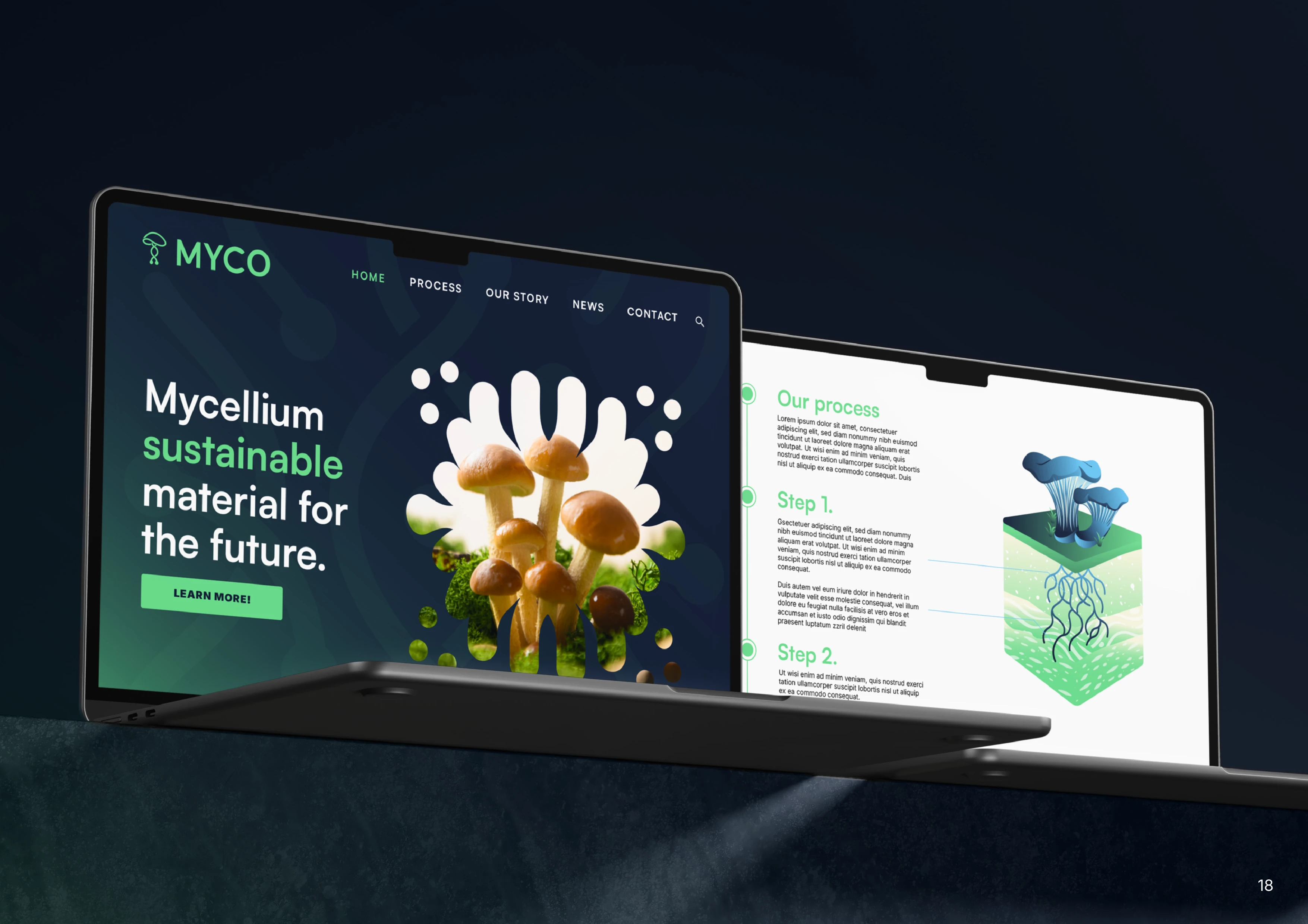
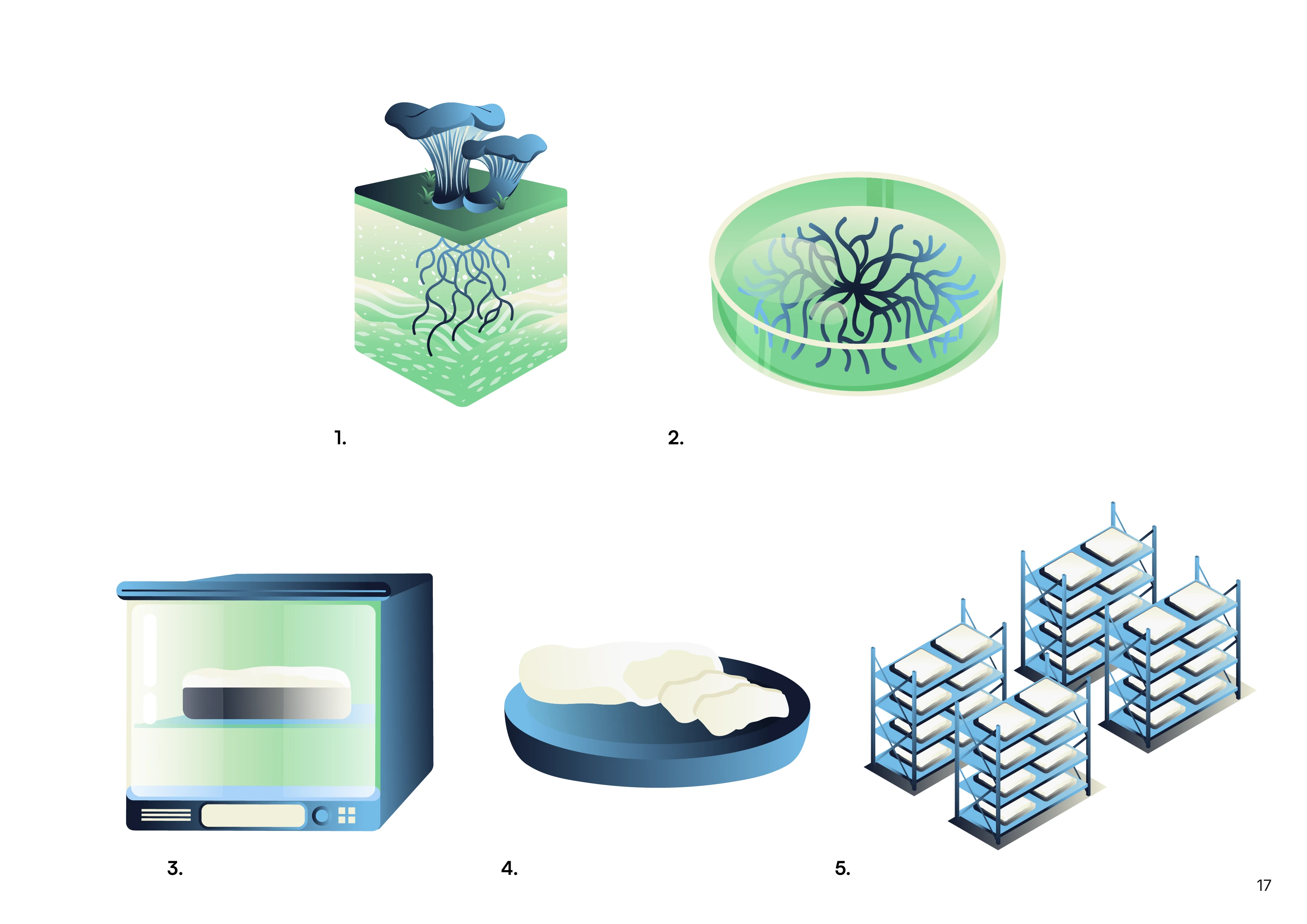
The brand also includes stylized illustrations that help explain how MYCO’s technology works, helping communicate complex biotech processes in a clear and visually engaging way.
Overall Aesthetic & Brand Application
The overall aesthetic is modern, clean, and slightly futuristic, softened by organic forms and warm tones. It’s a minimal yet expressive system that fits both scientific innovation and natural storytelling.
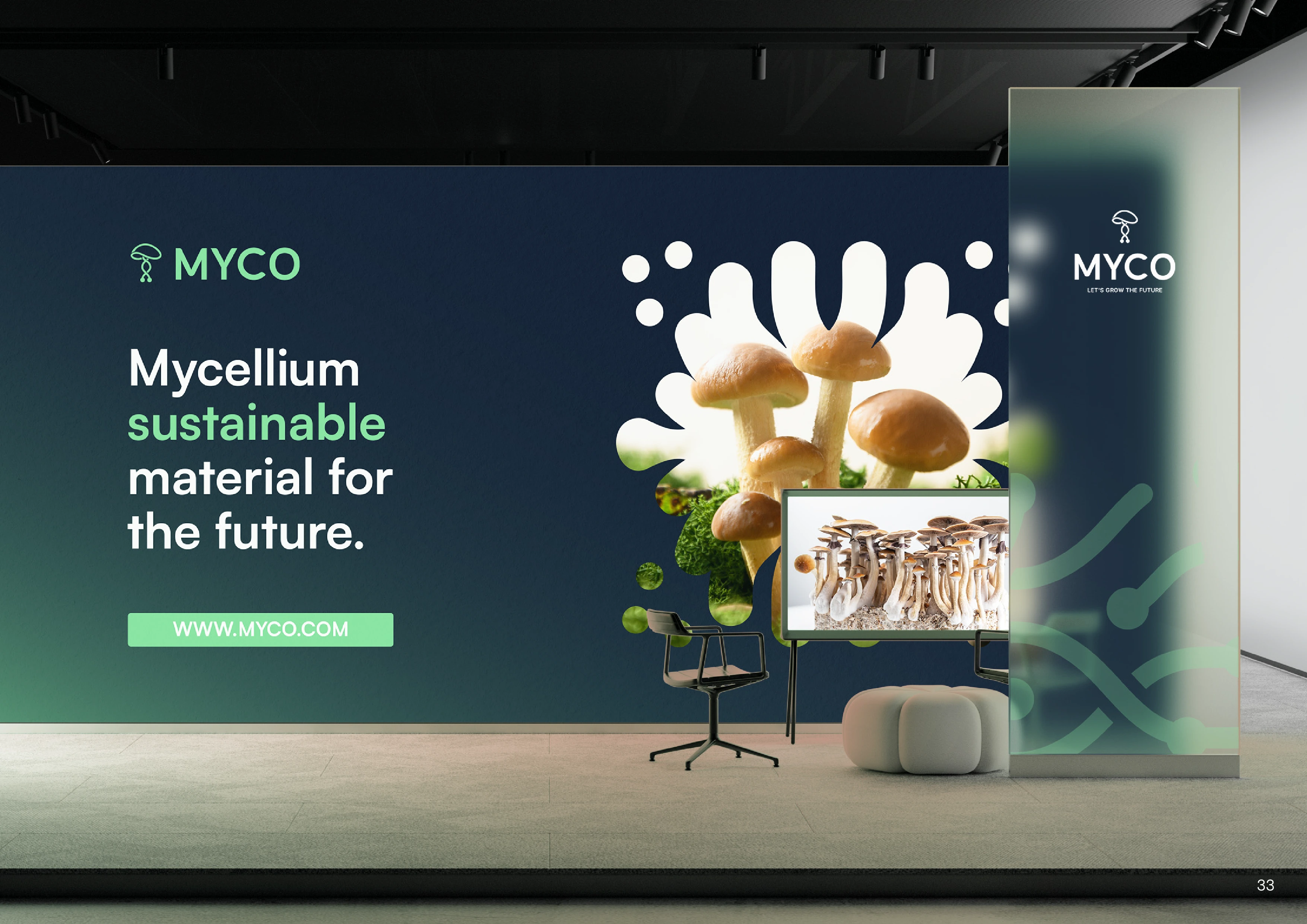
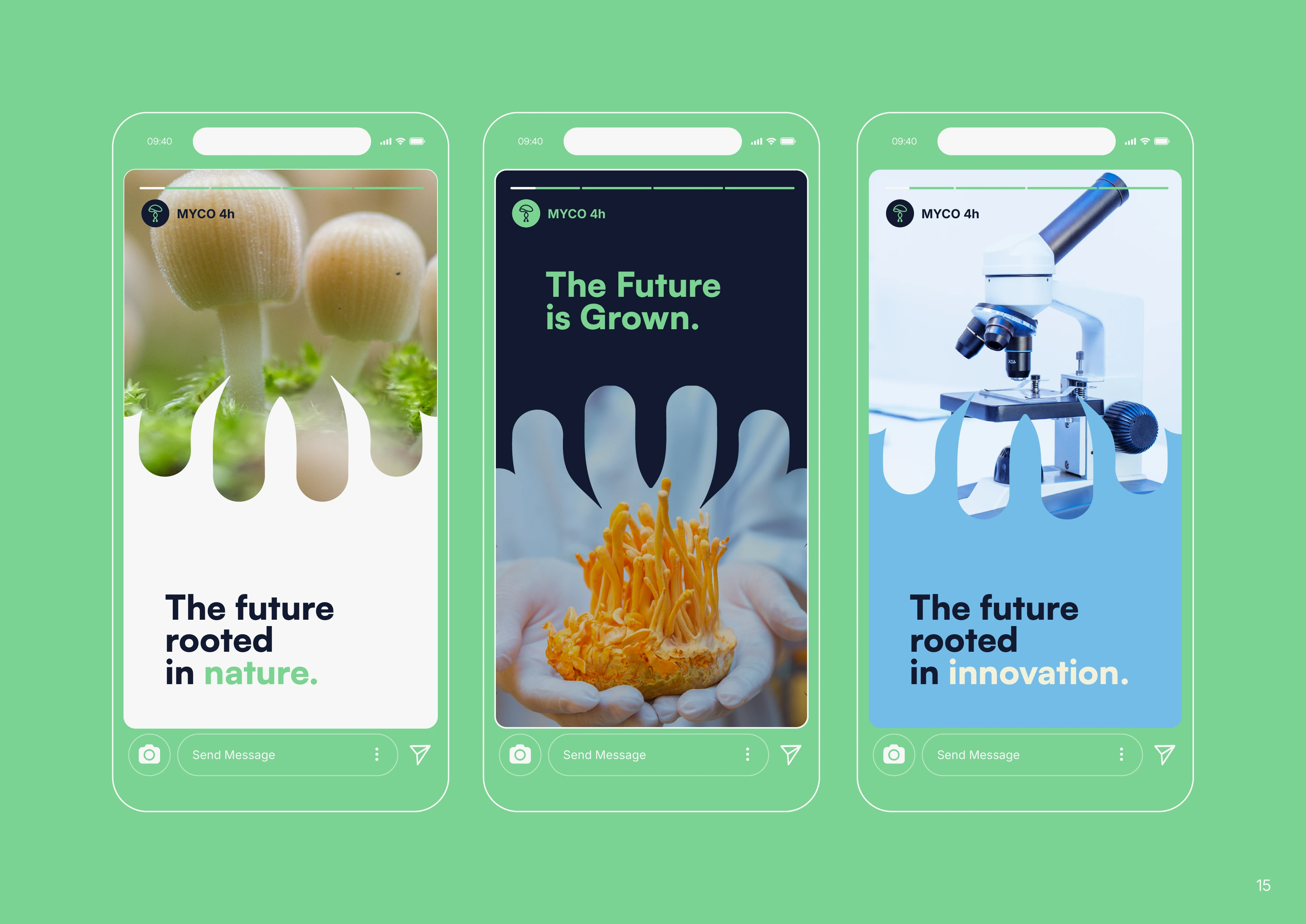
This identity was created to grow alongside the brand, easily applied across packaging, websites, pitch decks, social media, and branded materials. It’s flexible, scalable, and built to support MYCO’s mission of reshaping the future of sustainable materials.
Like this project
Posted Apr 2, 2025
MYCO's final branding is modern, clean, and slightly futuristic, softened by organic forms and warm tones. Blends scientific innovation and natural values.
Likes
5
Views
48
Timeline
Sep 1, 2024 - Oct 10, 2024

