Paloma Tequila Bar-Premium Mexican Restaurant Branding

Design Solution
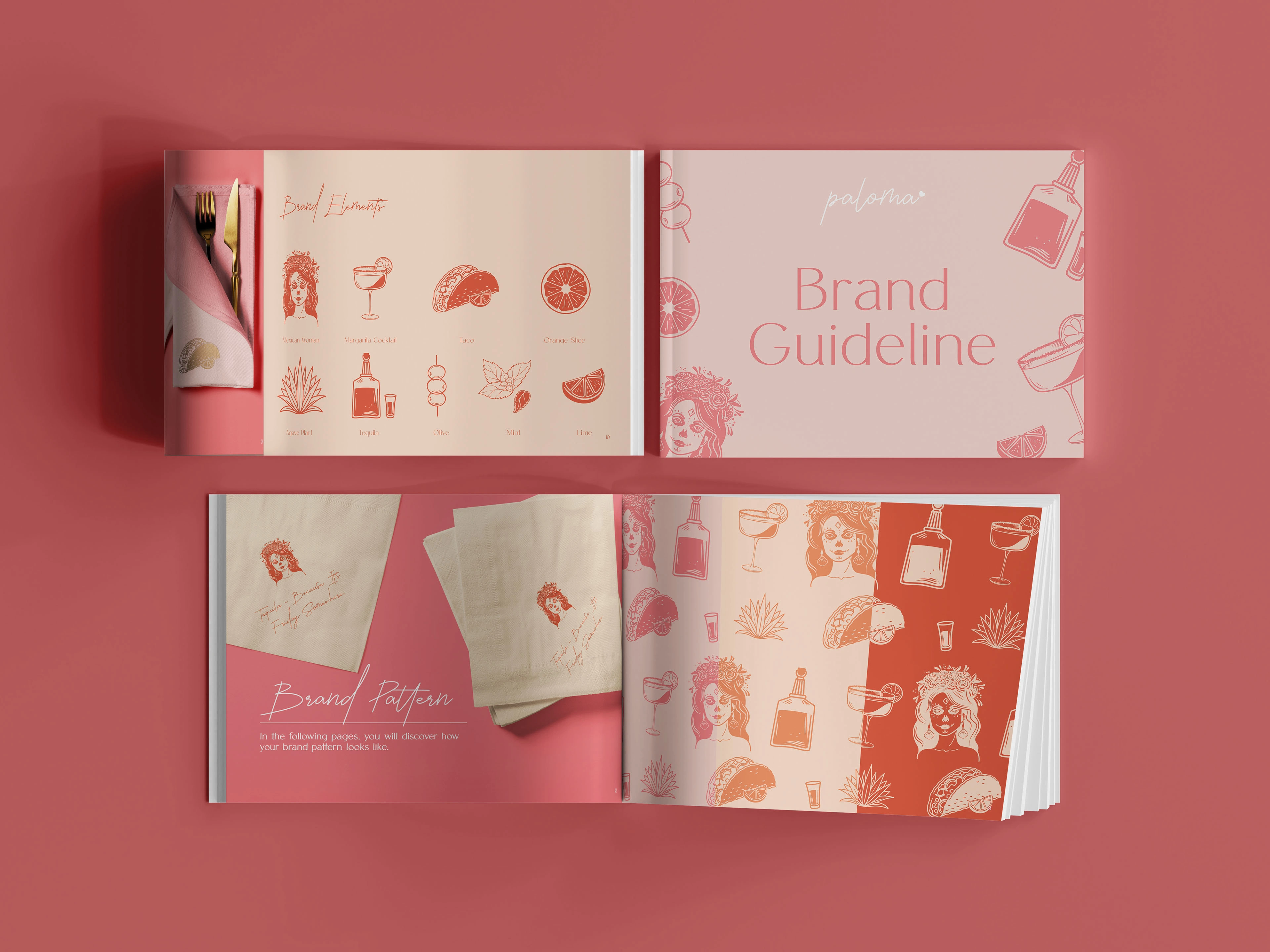
The visual identity combines minimalistic, feminine, and luxury elements to create a clean and sophisticated look with playful and colorful accents. We focus on sunset and Paloma (grapefruit) hues, including pink, pinkish-orange, and accents of orange, yellow, and brighter pink.
The brand uses a handwritten font for the logo, which adds a personal and unique touch. It is paired with simple, clean, and elegant sans-serif fonts that maintain a sense of uniqueness and premium experience.
The brand elements represent the bar experience itself, including olives, oranges, mint, margarita cocktails, and tequila, all the perfect ingredients for this bar. The Mexican woman was inspired by the Dias de los Muertos sugar skull body painting, which is the most important element of the brand and symbolizes the Mexican reach culture.
*The logo was created by another designer and they only had that when we started the project.
Like this project
Posted Dec 10, 2024
Paloma Tequila Bar draws inspiration from Barbados's natural beauty and Mexico's lively spirit. The branding combines a playful, feminine look.

