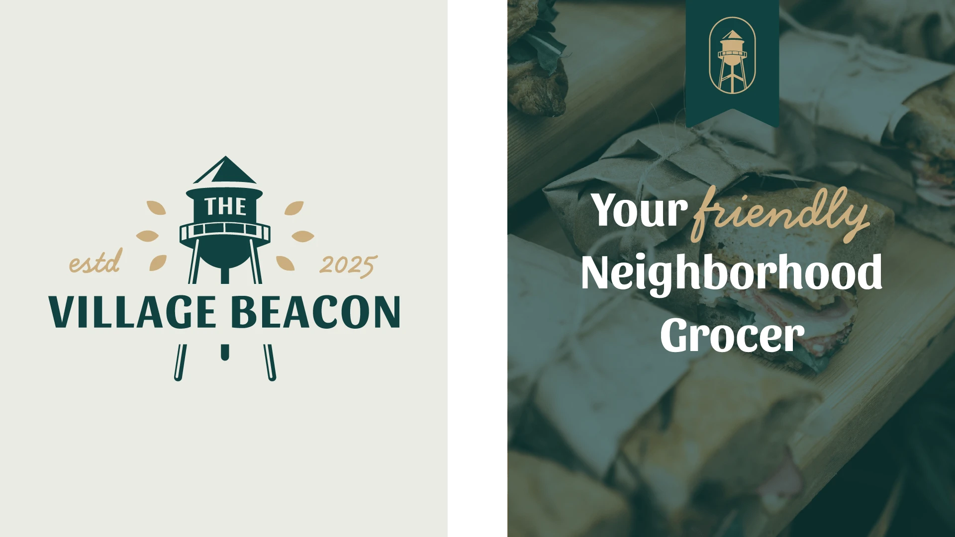
The Village Beacon ☘️ Charming Logo for a Neighbourhood Grocer
Marla Jeken
Verified
The Village Beacon: Building Community Through Brand Identity
Project Scope
Full brand identity & logo design • Exterior & interior signage • Branded coffee cups • Loyalty cards • Stickers • Business flyers • Print marketing materials
The Challenge
Merle identified an opportunity to serve the Gratz, Pennsylvania, community with a local grocer offering quality meals and groceries. However, launching a new local business required more than good products; it required immediate trust and community integration.
The challenge: create a brand identity that felt authentically local, not corporate; welcoming to working-class neighbors while communicating quality and reliability; and cohesive enough to establish professional credibility from day one.
The Approach
The strategy prioritized community belonging over generic grocery branding. Rather than defaulting to typical supermarket aesthetics, I developed a country-chic identity that reflected Gratz's character and values - approachable, dependable, and genuinely local.
Strategic priorities:
1. Authentic local identity
Design language that felt homegrown and welcoming, not imported franchise aesthetics
2. Trust through professionalism
Cohesive brand system that communicated reliability and quality without feeling corporate
3. Complete brand ecosystem
From storefront to coffee cup, every touchpoint reinforced the same community-focused message
The Solution
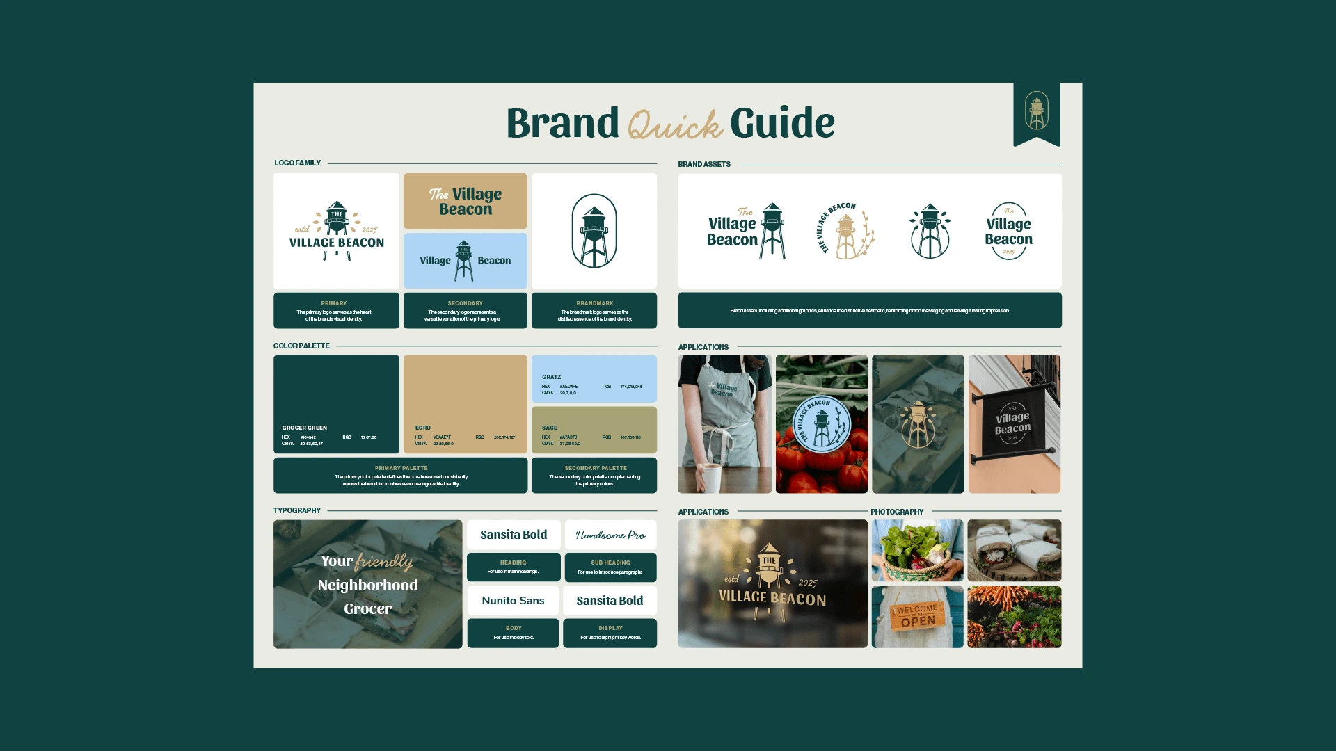
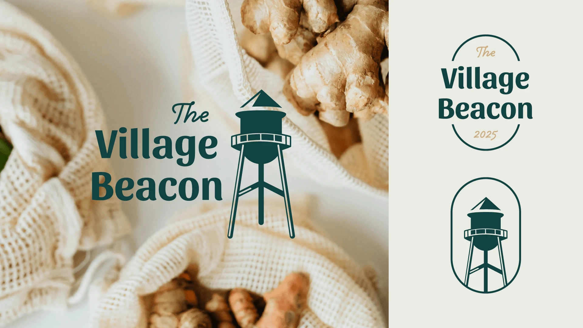
Complete Brand Identity System
Developed logo and visual identity with country-chic sensibility that immediately communicated warmth and approachability. The design balanced rustic charm with professional execution - essential for establishing trust in a community grocer.
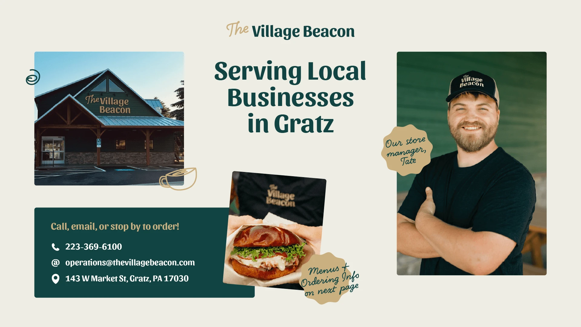
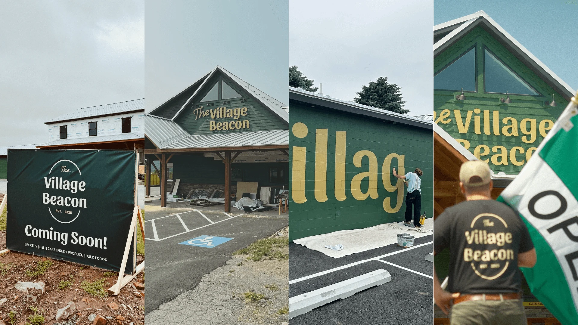
Signage & Wayfinding
Created exterior and interior signage that welcomed customers and guided them through the store experience. Clear, friendly design that functioned as both navigation and brand reinforcement.
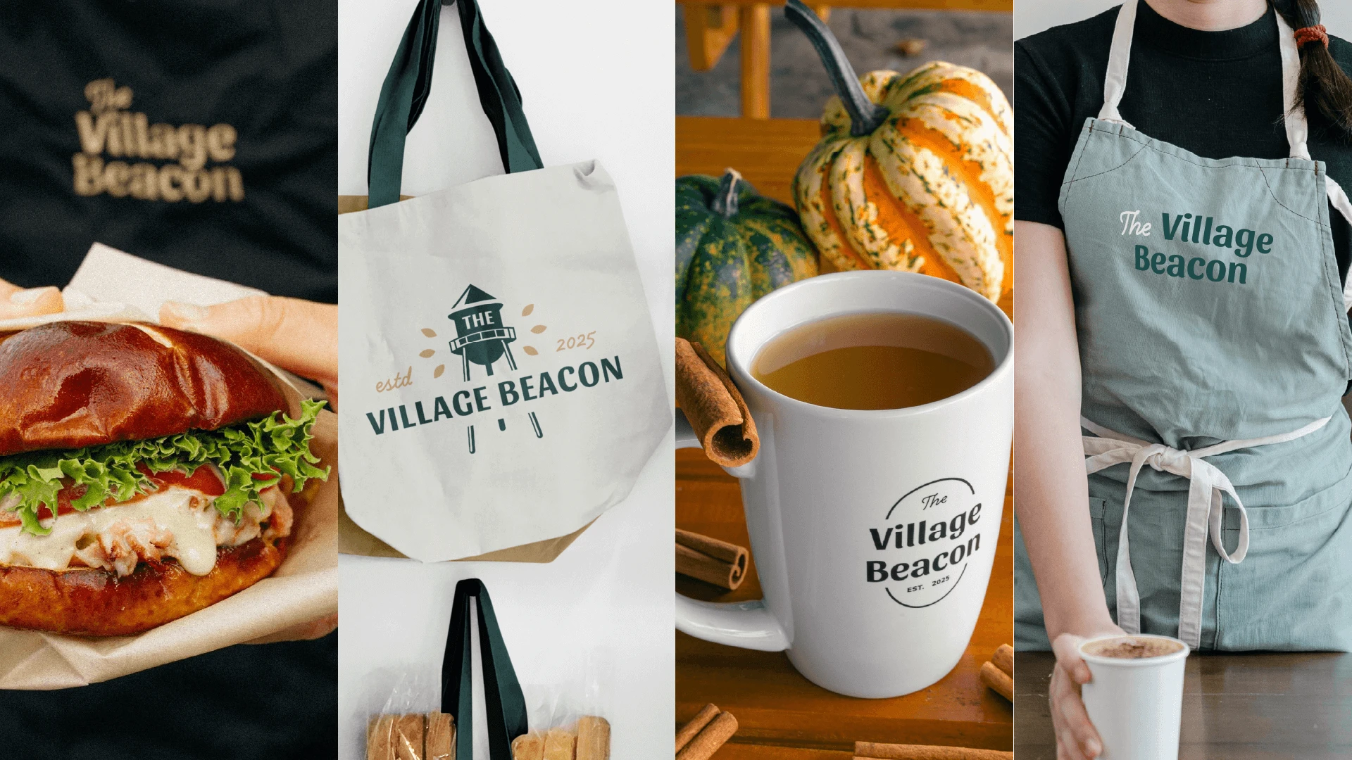
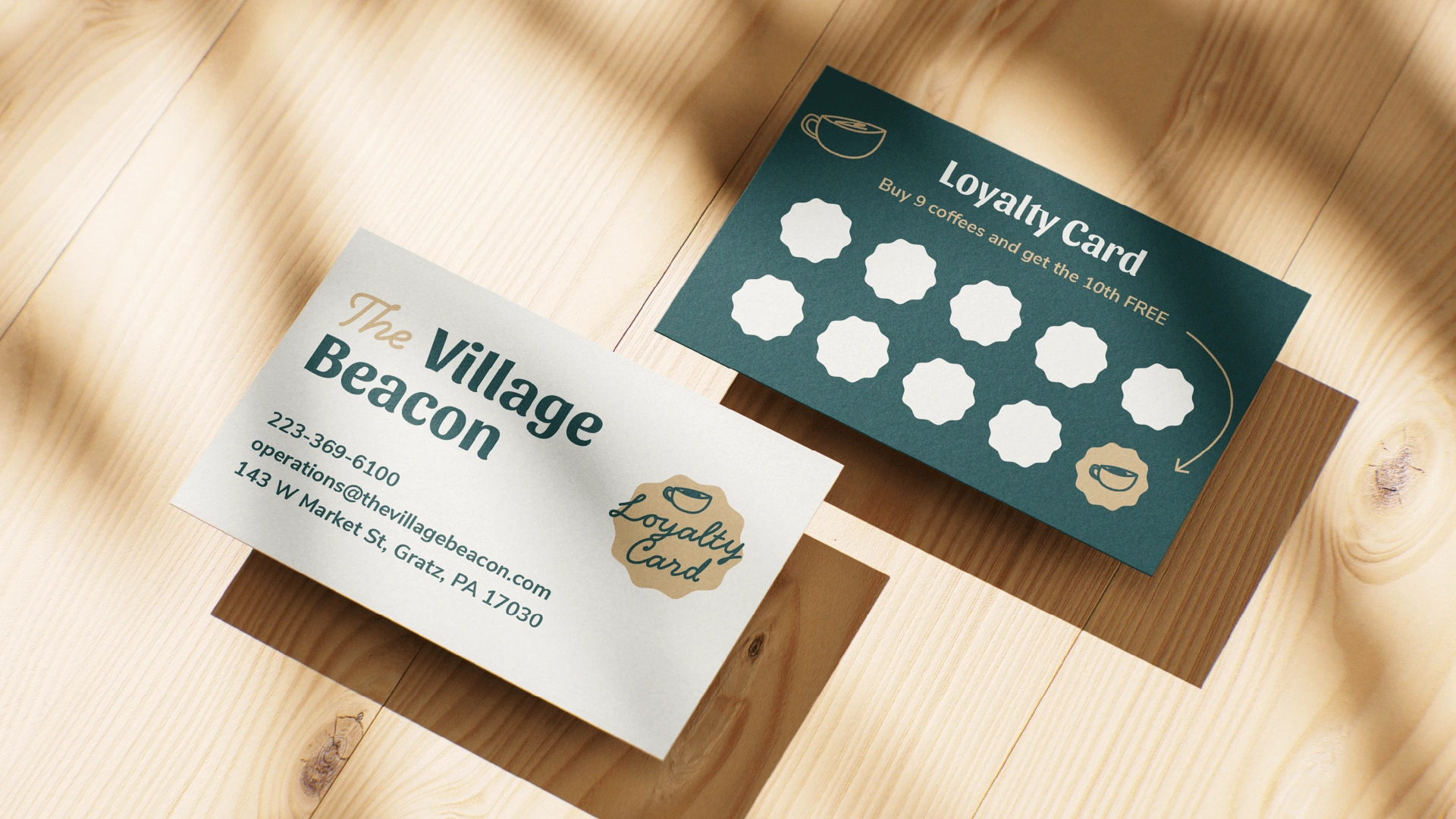
Customer Touchpoint Assets
Designed branded coffee cups, loyalty cards, stickers, and business flyers that extended the brand beyond the store walls. Each piece reinforced The Village Beacon's presence in daily community life.
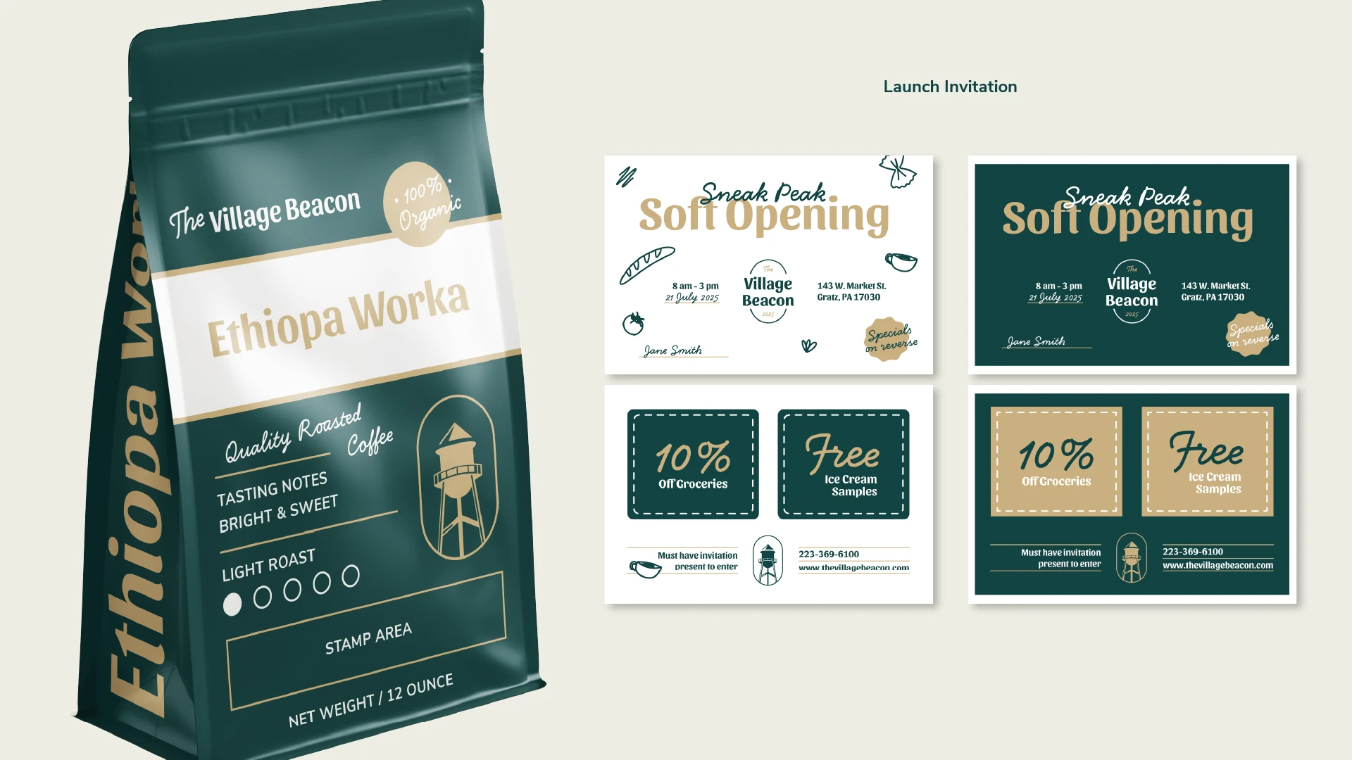
Print Marketing Materials
Developed promotional flyers and in-store signage that communicated value and quality while maintaining the welcoming, neighborhood aesthetic.
Results
Community integration through an authentic brand identity that resonated with local values
Word-of-mouth growth as customers recognised consistent quality and a welcoming environment
Professional credibility is established immediately through cohesive brand presence
Customer loyalty is built through memorable brand touchpoints and consistent experience
Customer Feedback
"I stopped and took some guests there for lunch last week. We had the Pretzel Turkey Melt, and it was one of the best sandwiches I have ever had... The facility was great! It was clean and well stocked and great selection. Go and enjoy some great food in a wonderful atmosphere."
— Rich W., Customer Review

Why This Matters
For local businesses, brand identity is about fitting in while establishing trust. Strategic design helps new community businesses feel established from day one, building the credibility needed to compete with larger chains while maintaining authentic local character.
Like this project
Posted Mar 21, 2025
Complete brand identity for community grocer. Designed logo, signage, and assets that established trust and local belonging from day one.
Likes
1
Views
41
Timeline
Dec 16, 2024 - Jan 6, 2025
Clients
360 Outdoor Media Group