Built with Framer
Hanif’s Foods Website Redesign
Anush | Foundrline
Verified

Hanif’s Foods — Repositioning a Legacy FMCG Brand Through Bold, Product-First Design
Client Hanif’s Foods
Industry Packaged Foods / FMCG / Consumer Goods
Overview
Hanif’s Foods partnered with us to redesign their entire website with a clear objective:
transform a legacy, informational website into a distinctive, modern brand and product platform that resonates with today’s households while honoring decades of trust.
This was a full-site redesign focused on strategy, structure, and expression — not a cosmetic refresh.
The Challenge
Hanif’s Foods is a well-established packaged foods brand with strong offline recall. However, its digital presence lagged behind its product quality and brand equity.
Key challenges identified:
A dated, cluttered layout that overwhelmed users instead of guiding them
No clear product hierarchy or hero SKUs
Weak storytelling around flavour, heritage, and everyday use
A visual language that felt generic and inconsistent
Poor mobile experience despite a mobile-first audience
The deeper challenge was strategic:
How do you modernize a legacy food brand without sanitizing its personality or losing familiarity?
Strategic Design Direction
Neo-Brutalist, Fun-Forward Brand Expression
We intentionally chose a neo-brutalist, playful design style — bold, expressive, and imperfect — to differentiate Hanif’s Foods from conventional FMCG websites.
This wasn’t trend-driven. It was brand-led.
Hanif’s food is flavourful, bold, and honest
The design needed to feel confident, memorable, and human
Clean minimalism would dilute personality; neo-brutalism amplifies it
The result is a site that feels alive, opinionated, and unmistakably Hanif’s.
Before vs After — What Changed Strategically
Before
Informational, static, and visually noisy
Products lacked hierarchy and narrative
Brand trust was assumed, not communicated
After
Guided, story-driven experience
Clear product heroes and flavour positioning
Trust built progressively through design, content, and proof
This is a structural and strategic transformation, not just a visual one.


Design & UX Strategy
1. Clear Visual Hierarchy with Controlled Boldness
Strong typography and high-contrast color blocks establish hierarchy
Expressive shapes and motifs add energy without sacrificing clarity
Vertical rhythm ensures easy scanning, even in dense sections
This balances visual impact with usability.
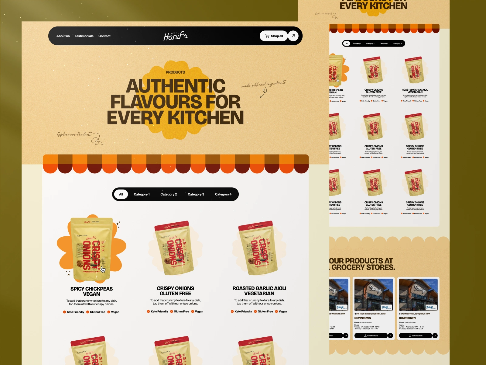
2. Product-First Experience
Products were elevated from list items to hero assets.
Each product section focuses on:
Bold packaging visuals
Contextual usage (everyday meals, kitchens, families)
Clear positioning (“Authentic flavours for every kitchen”)
This shifts perception from commodity goods to crafted, trusted products.
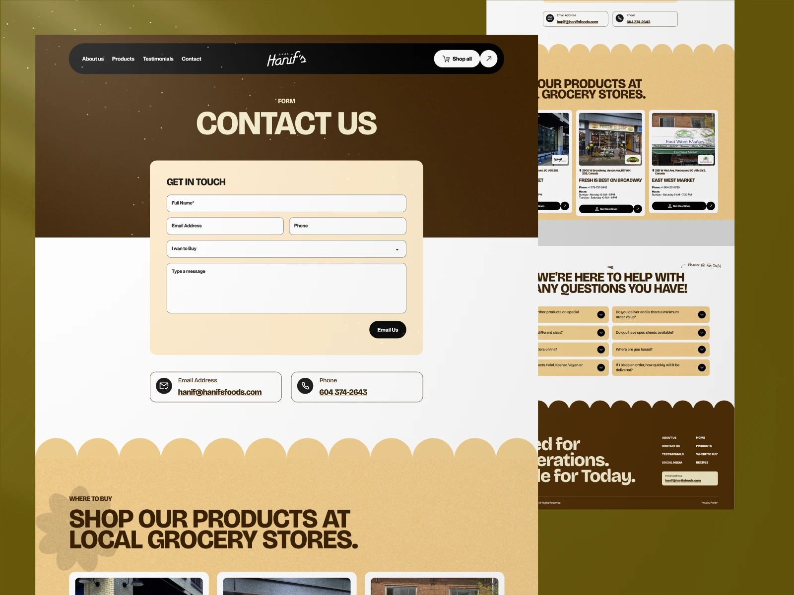
3. Integrated Brand Storytelling
Instead of isolating the brand story on an “About” page, trust signals are woven throughout:
Real family imagery and testimonials
Heritage cues embedded within the flow
Messaging framed around partnership, not promotion
The site answers a critical question implicitly:
“Why should this brand belong in my kitchen?”
4. Designed for Everyday Use
The experience emphasizes how products are used, not just what they are.
Recipe inspiration
Meal contexts
Familiar, daily cooking scenarios
This reinforces repeat relevance and emotional connection.
5. Mobile-First, Conversion-Aware Execution
Large tap targets and scannable content blocks
CTAs placed after trust is built, not prematurely
Sections designed to stack cleanly on mobile
The site feels bold yet comfortable across devices.
Outcome & Impact
The redesigned website now functions as a brand expression, product showcase, and trust platform.
Key outcomes:
Stronger brand recall through distinctive visual identity
Improved product discoverability and clarity
More engaging mobile experience
A scalable system ready for new SKUs, campaigns, and future commerce
A digital presence that reflects both heritage and modern relevance
Core Contributions
End-to-End Website Redesign
Strategic UI/UX for FMCG Brands
Neo-Brutalist Visual Direction (Applied with Control)
Information Architecture & Navigation Design
Product-Centric Experience Design
Brand Storytelling & Trust Building
Mobile-First & Performance-Ready Layouts
What This Project Demonstrates
This project highlights my ability to:
Modernize legacy brands without erasing their identity
Use bold design styles strategically, not decoratively
Balance expressive visuals with real-world UX needs
Translate brand truth into scalable digital systems
Let’s Build What’s Next — Together.
If you’re looking to design or develop a product, website, or platform that connects deeply and performs flawlessly —
👉 Visit my website or Book a call here to start the conversation.
Like this project
Posted Nov 13, 2025
Redesigned the full site with a clean UI, stronger storytelling, and a product-first layout that elevates Hanif’s Foods as a trusted FMCG brand.
Likes
2
Views
67
Timeline
Oct 29, 2025 - Jan 2, 2026