Hotel management platform/ MasterBorn Intern challenge
Niloo Fathipour

Solving the room availability issue with a clearer table design for the ACME CORP hotel staff
Overview
Hotel owner and receptionists were losing reservations. So, I worked on a hotel management platform that supports administrators of small and medium-sized accommodation facilities (3-50 rooms or apartments).
Note: Just because there was a ton of information in this table didn't mean that there had to be in my version too.
The mobile version is not part of this task.
My mission
was to transform a confusing and inefficient room availability table into a clear, intuitive tool that helps hotel staff quickly.
✅ Finding and assigning free rooms
✅ Reducing lost reservations
✅ Improving the overall booking experience.
Target group
I kept two people in my mind who were working in the hotel and were heavy users of this table:
✅ Receptionists
✅ Owners, who checked the occupancy status of the given rooms.
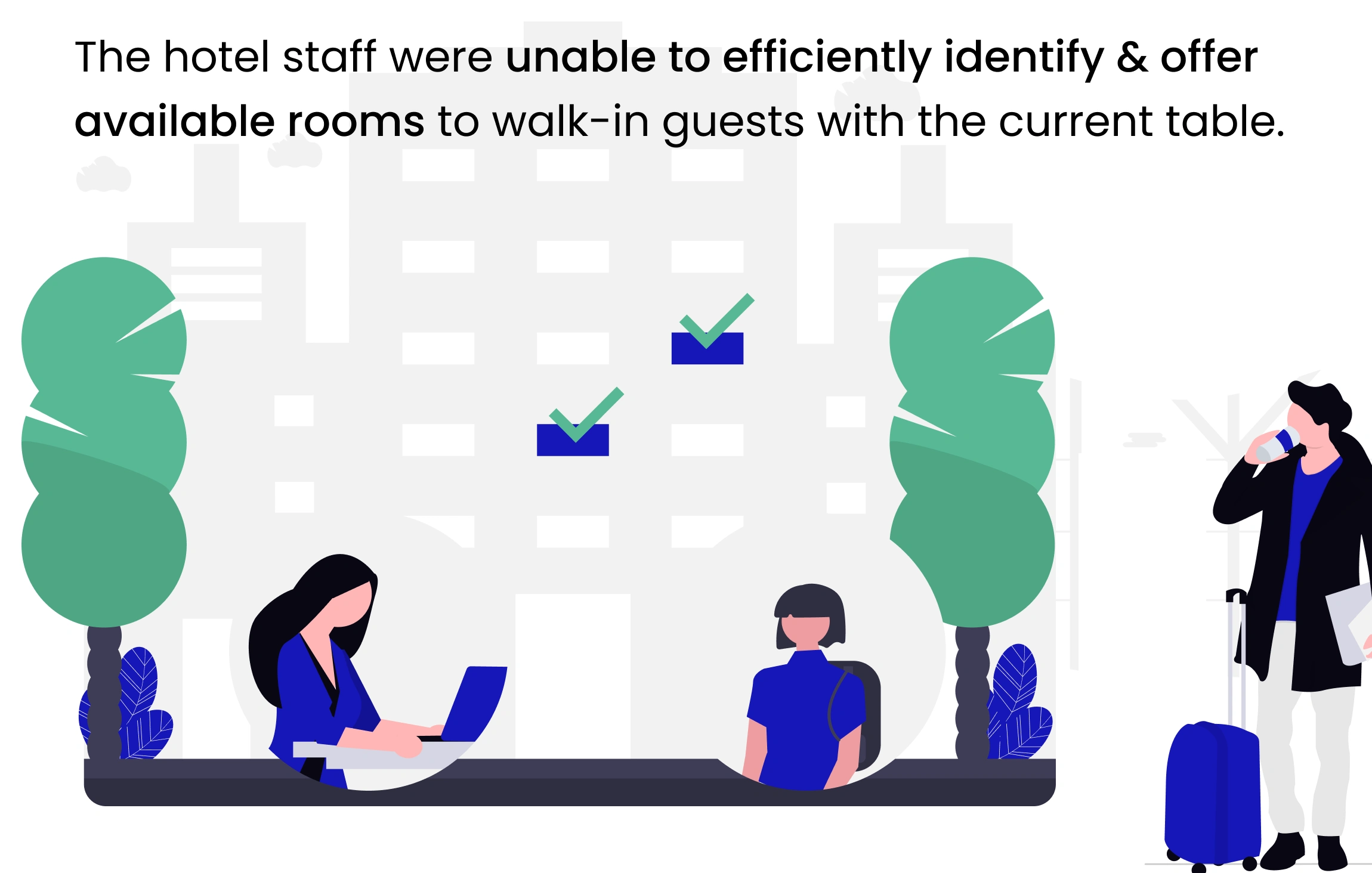
Problem statement
The current table was unreadable and difficult to navigate.
Ploblem statement
Why was it a problem?
Because that stress not only frustrated staff, but it also risks losing the booking altogether.
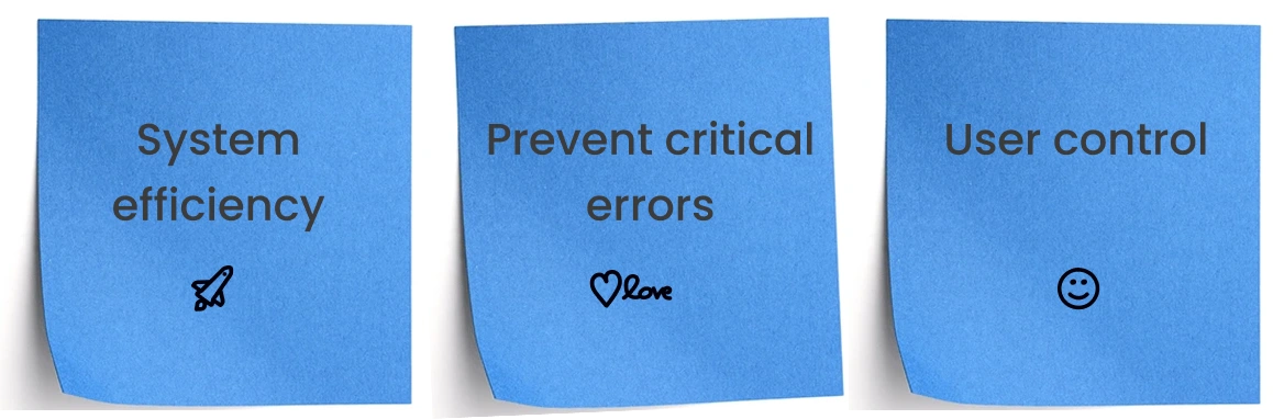
What were the expected outcomes?
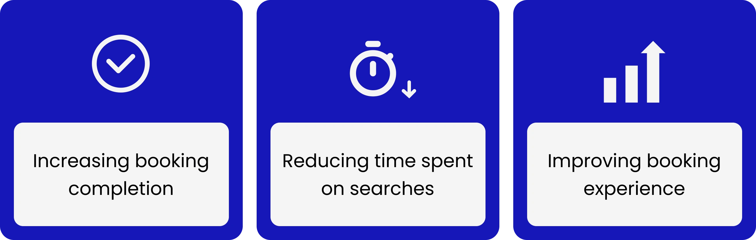
Which metrics did I improve?
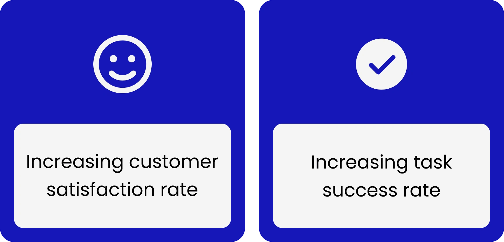
UX metrics for improving
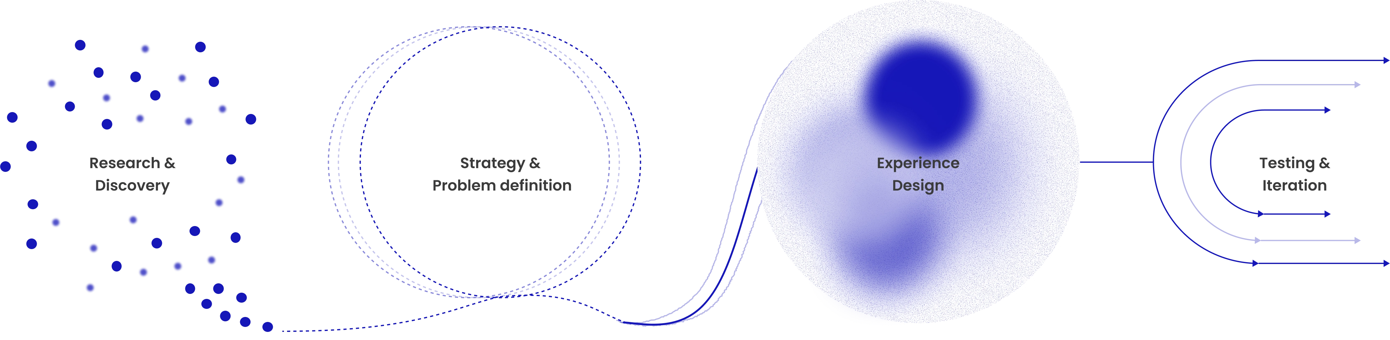
So, what did I need to do?
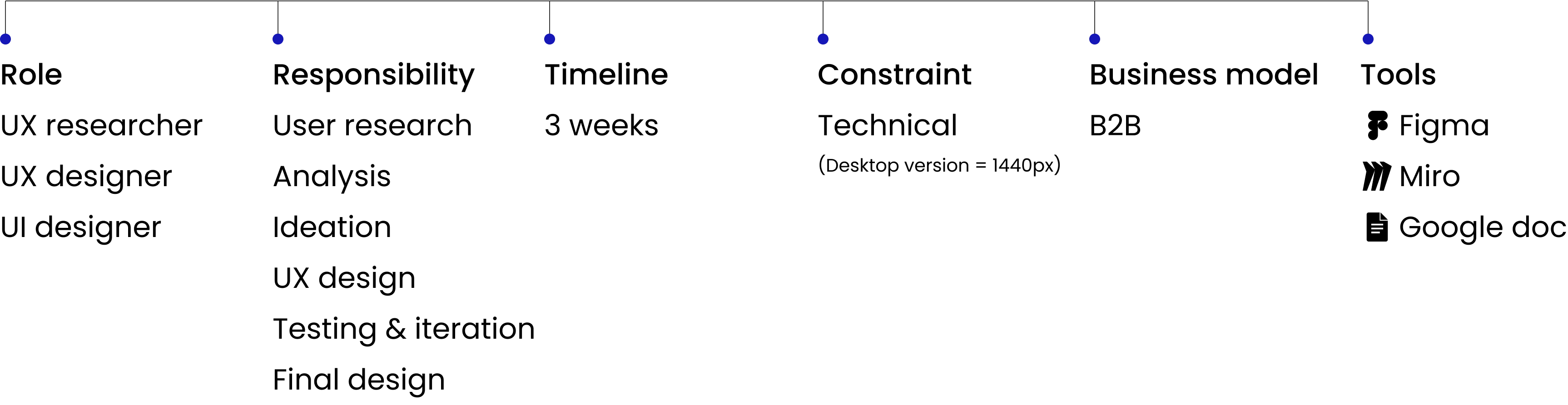
I structured the project into clear 4 sections to track progress and ensure each stage effectively solved the core problem.
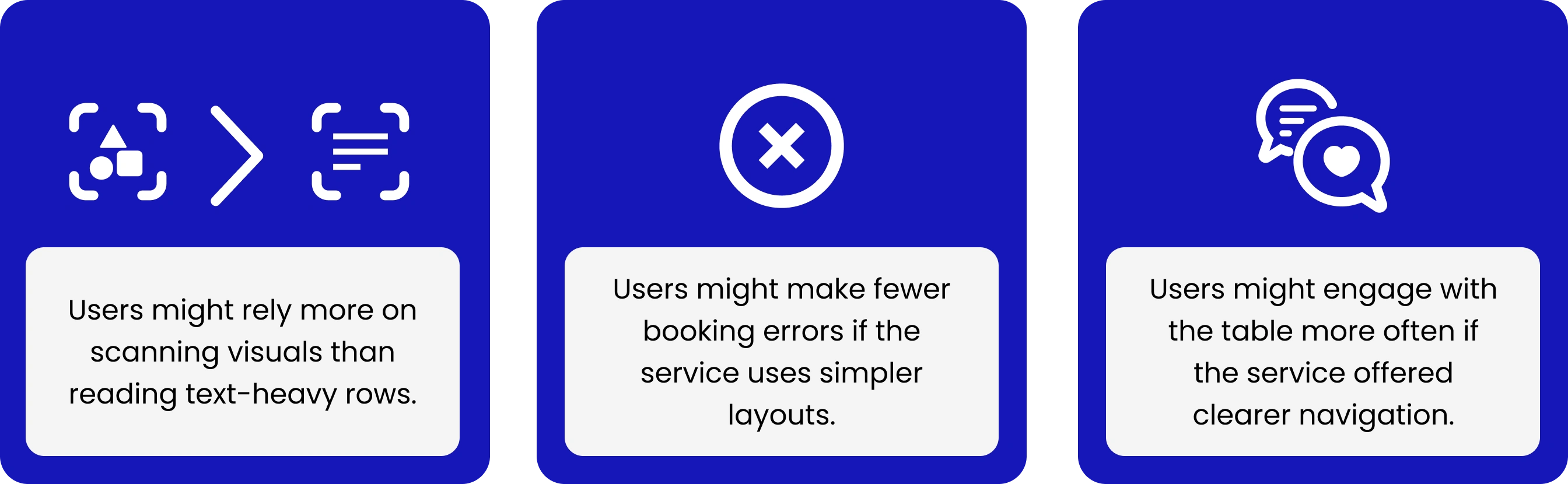
Assumptions
All of these assumptions might raise the task success rate by reducing user confusion. During the process, I validated them.
User persona
The receptionist, Anna, needed a quick and clear way to check room availability and make fast reservations, especially for walk-in guests. She wants to suggest all the availability to customers.

Anna, receptionist, photograph credits: Jake Nackos via Unsplash
Heuristic evaluation
At the initial stage, I conducted a heuristic evaluation of the table below for two reasons:
✅ I rapidly identified usability issues without needing user testing— giving me a clear foundation for improvement.
✅ Solution(s) would align with proven usability principles in finding available rooms smoothly, enhancing task efficiency, and reducing errors.
No participants were recruited for this method.
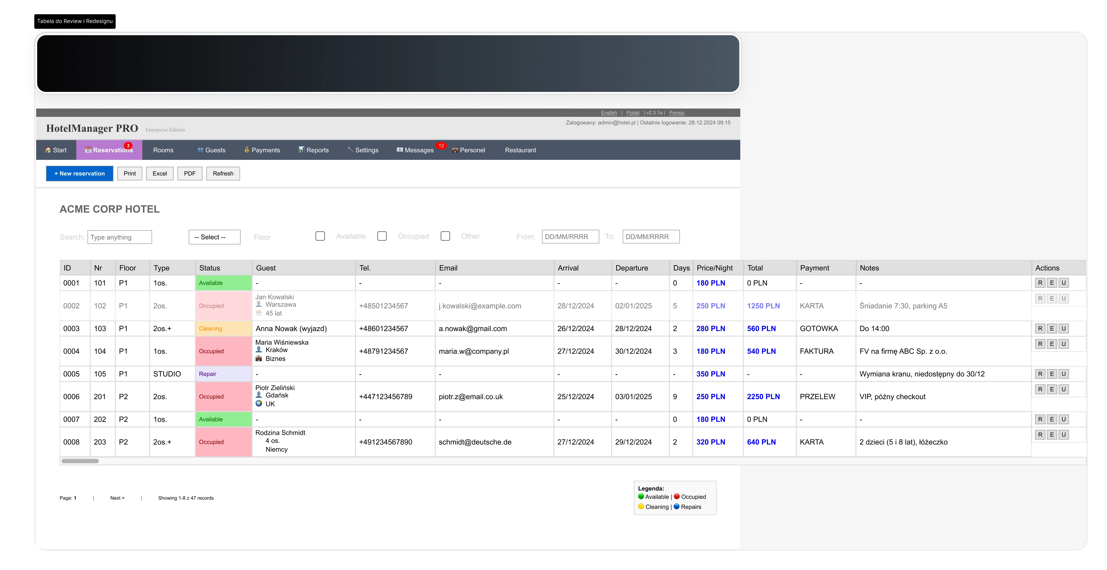
Original table as a hotel management service
The most critical issues identified were those with a high severity rating based on the heuristic evaluation.
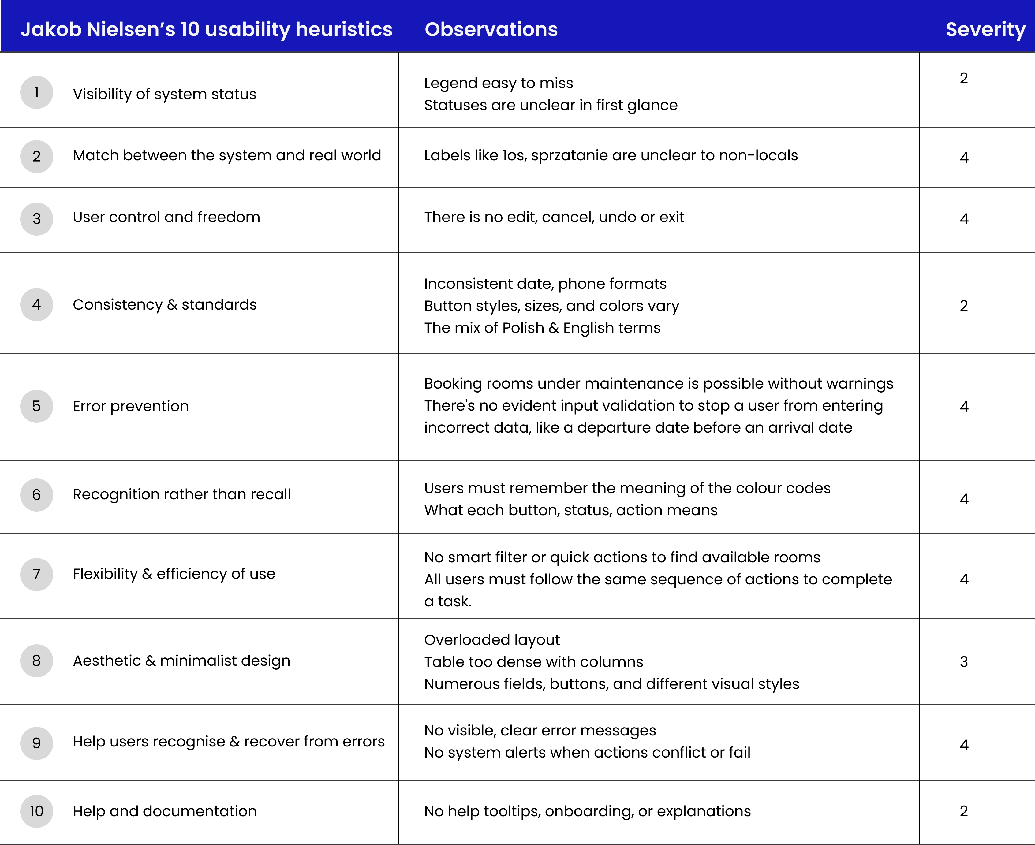
Heuristic analysis
Quantitative usability testing
I employed quantitative methods, with 5 participants performing a single task flow, which I divided into 3 phases.
The task was to determine which room is the best match for a walk-in guest who arrives today for a 2-night stay.
Two of the metrics that I collected in quantitative usability testing were:
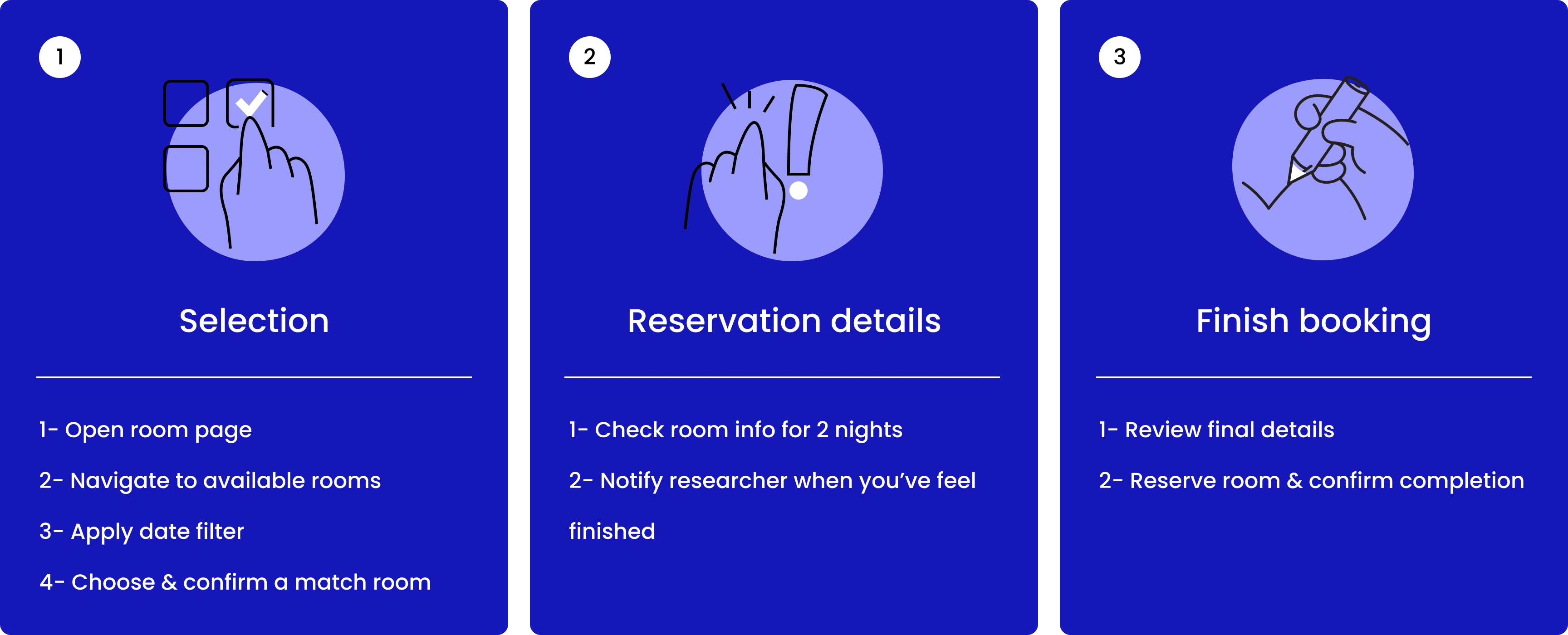
A single task flow was divided into 3 phases.
✅ Task success
The rate calculated was in percentage, and 40% of the participants could complete the task and succeeded, but with major issues.
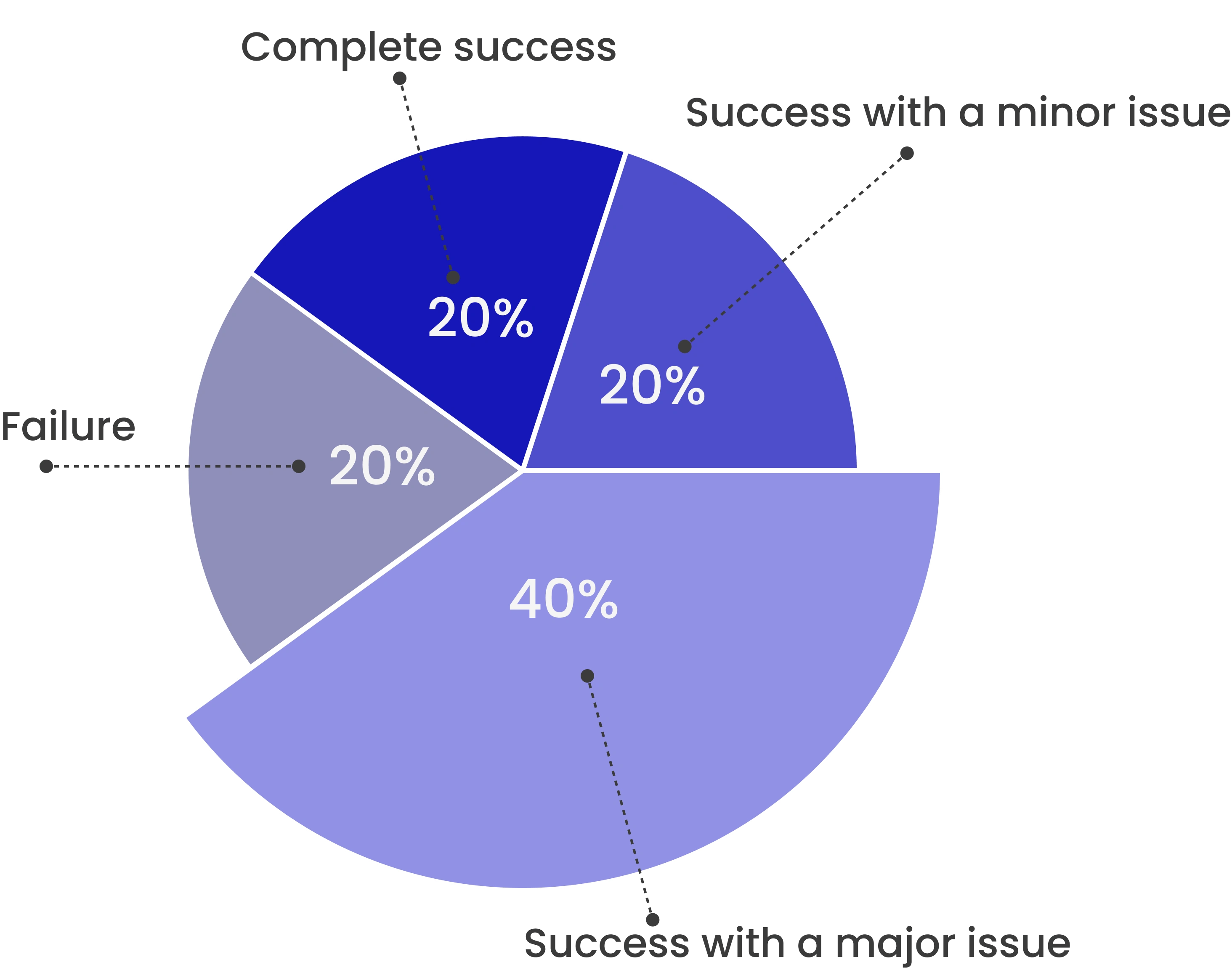
Task-completion rate
✅ Time on task.
Assigning a room in the PMS (Property Management System) process involves conducting a funnel analysis and determining the task completion time.
Time was recorded for each task completion.
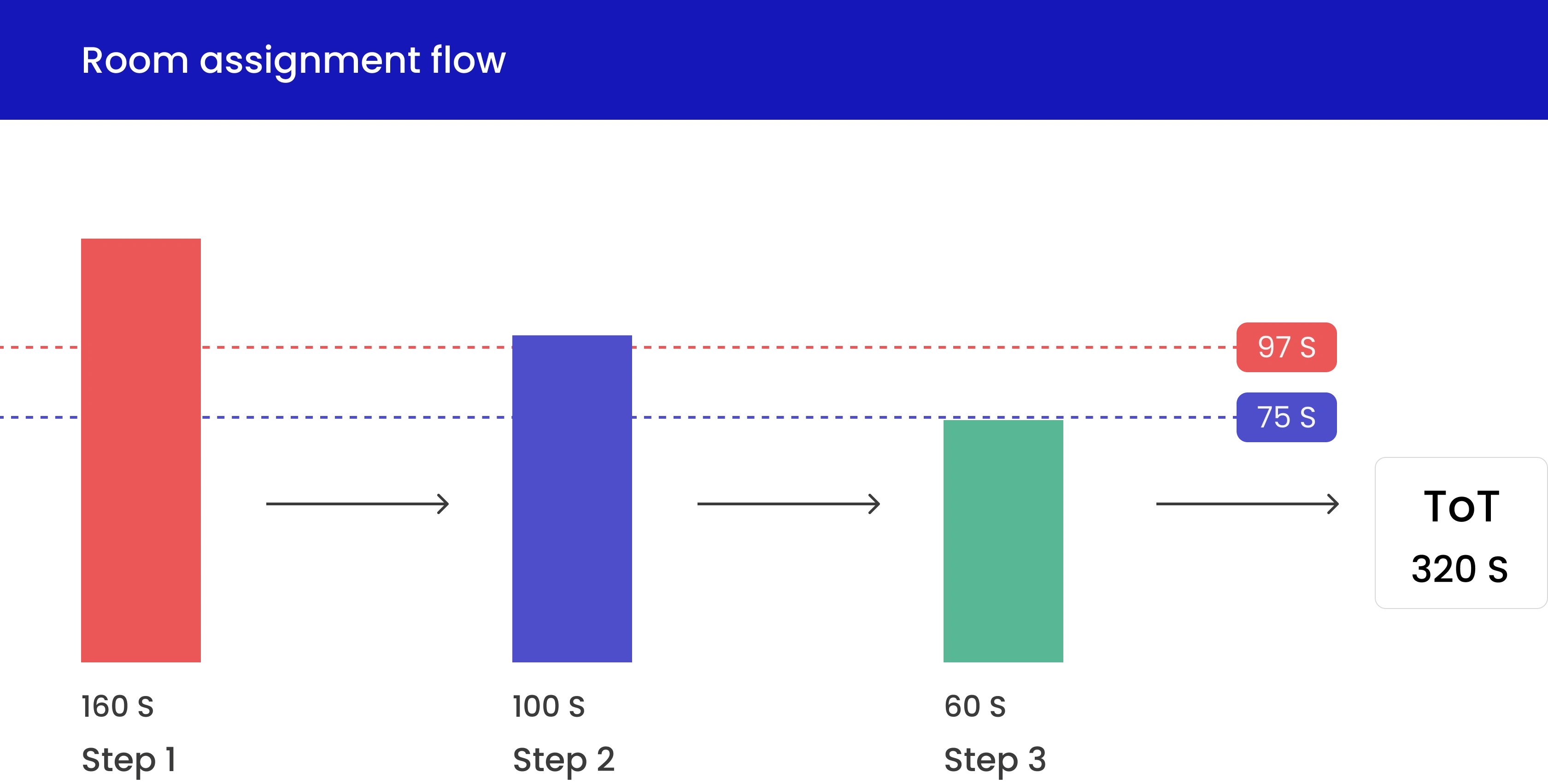
Optimizing task completion time can lead to increased conversions.
Insights prioritisation
The key insights could guide us toward solutions: Quick wins included low-effort, high-impact items that were worth pursuing.
Ideation: brainstorming & sketches & wireframes
After the research phase and completing identified and prioritised critical solutions by revising the current table, the features, actions, and content required were readily apparent.
I decided to make some quick sketches and map out the user flow. Sketching is a great way to iterate quickly and generate ideas while synthesising the insights from the research.
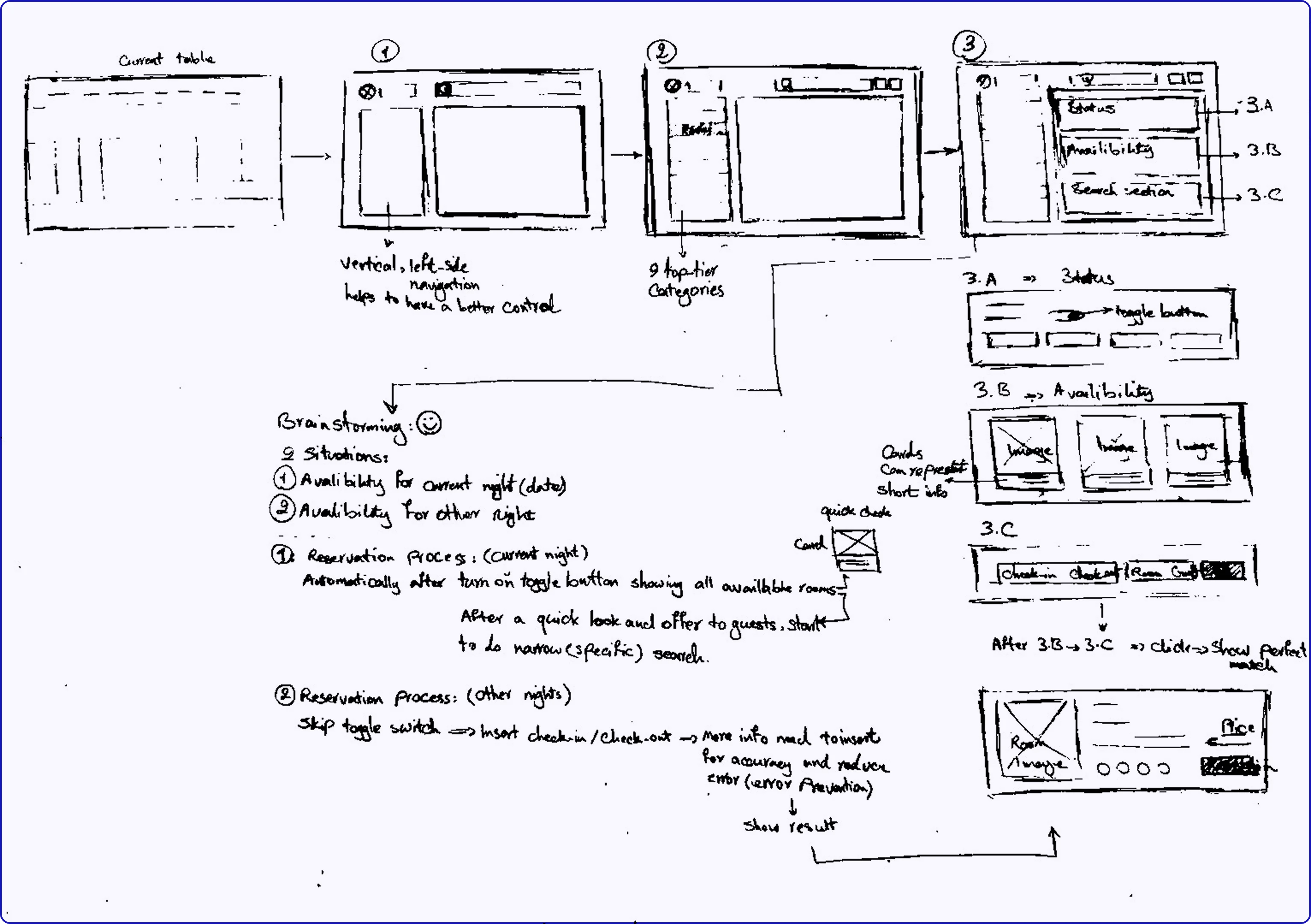
Final wireframe
After completing a couple of paper iterations, I had the general user flow mapped out. It was time to transition to the digital world, where I could further refine my designs in Figma.
User flow (just for the room section)
Every decision I made, I asked: Could I involve key insights toward solutions? Would this make Anna’s job faster? Would this give the owner clarity?
The receptionist, after logging in, opens the room section and checks the availability table, applies the “available now” filter, views rooms with simple and general information to explain quickly, and assigns a free room to the guest.
Redesign (iteration 01)
In the first version, I cut down the noise.
I didn't put all the features at the top to reduce customer choices.
Interactive (clickable) prototypes
I developed interactive prototypes to visualise design concepts and validate solutions.
Interactive prototypes
Usability testing (validation)
I tested the prototype with a few participants to collect feedback, refine, and iterate. I understood how users interacted with the hotel management system and identified usability gaps.
Redesign (iteration 02)
In the second version, I iterated on designs based on users' feedback and business requirements, and I designed high-fidelity (hi-fi) screens.
Before and after finding solutions for redesigning the hotel management platform
Takeaway
In this project, I identified key challenges, developed solutions that connected technical and business perspectives, and delivered a 20% improvement in efficiency with a clear impact for future use.

References
I read tons of articles and watched useful videos to understand this process more deeply and professionally.
Like this project
Posted Jul 17, 2025
Designing tables is one of the most challenging yet rewarding parts of product design. Good tables make working with data efficient and intuitive.
Likes
0
Views
44
Timeline
Jul 10, 2025 - Jul 11, 2025