Brand identities
Niloo Fathipour
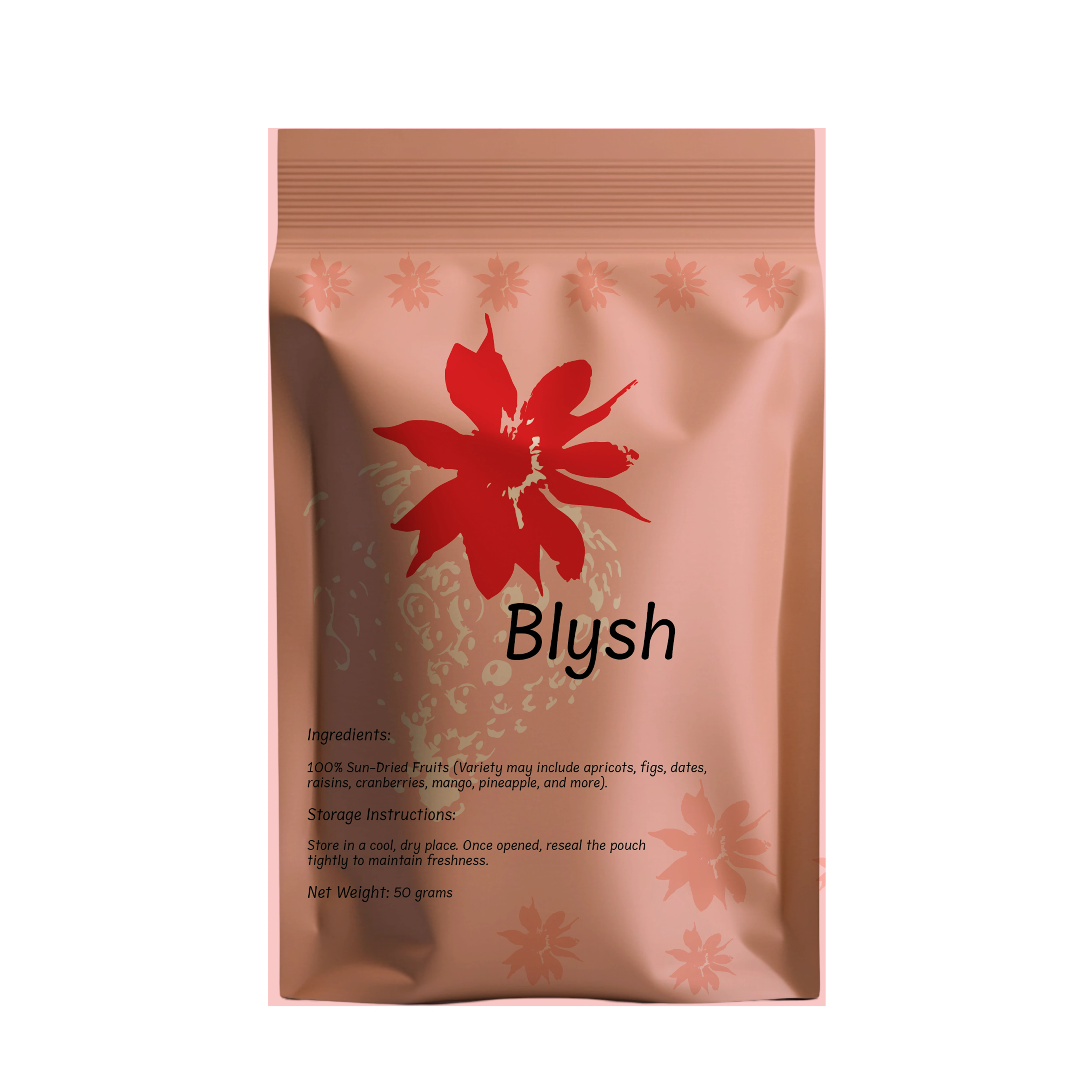
Blysh
Introduction:
Blysh is a fusion of “Berry” + “Blush”, symbolizing freshness, sweetness, and vibrancy. The brand takes inspiration from the strawberry—a fruit known for its rich color, natural goodness, and organic appeal.
The logo concept is derived from the leafy top of the strawberry, transformed into a brush-like shape, representing creativity, fluidity, and a fresh, artistic touch. The color palette embraces soft pinks, deep reds, reflecting the natural beauty of strawberries while maintaining a modern and minimalistic aesthetic.
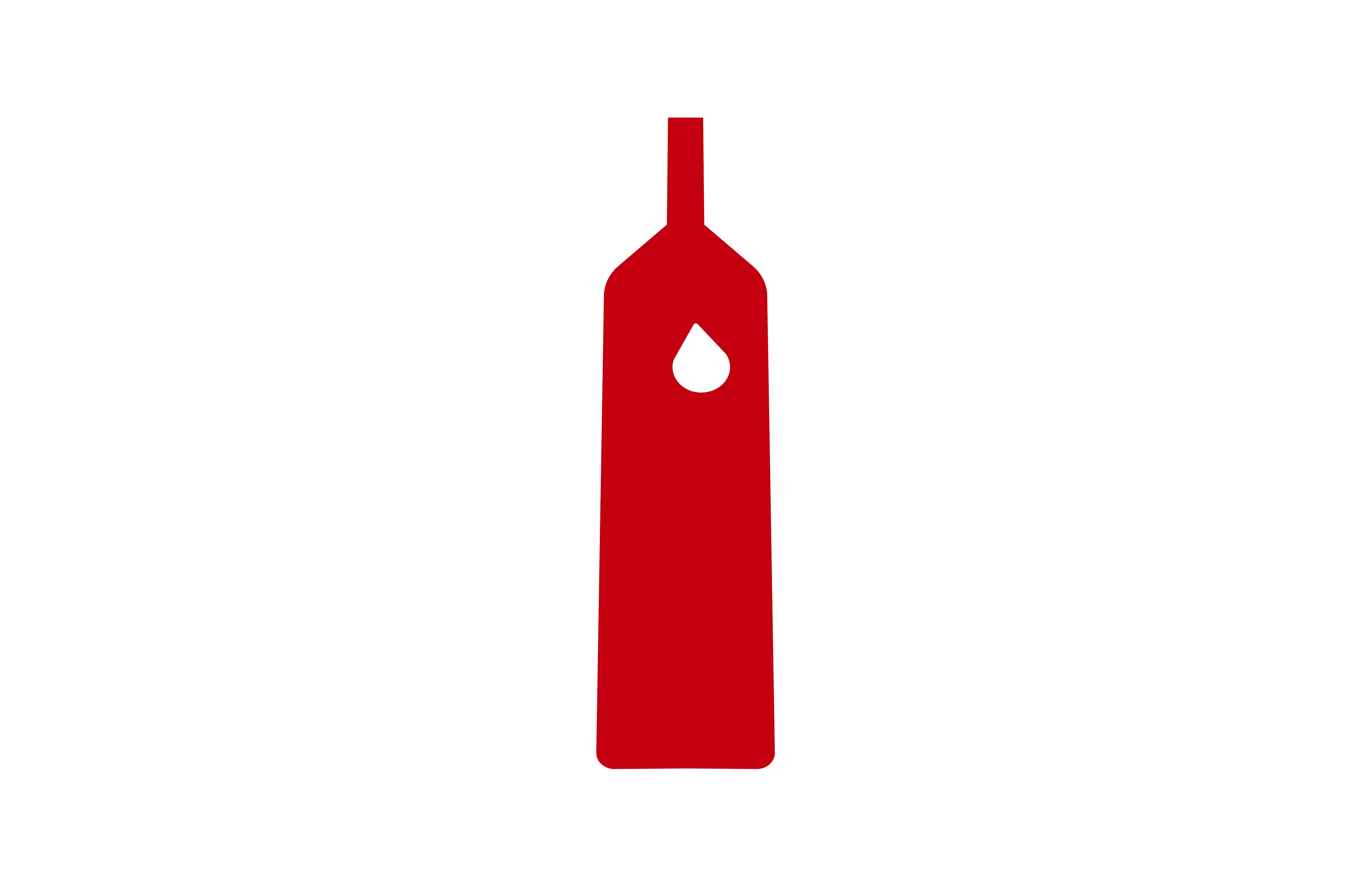
Chin-Chin
Introduction:
In the small city there is a family-owned vineyard, where generations of winemakers have poured their passion and expertise into crafting exquisite wines. From the rich, earthy notes of Sangiovese to the crisp, citrusy tones of Pinot Grigio, each bottle is a testament to centuries of tradition and a celebration of Italy's winemaking heritage.
This label encapsulates the romance and beauty of Italy, inviting wine enthusiasts to savor the simple pleasures of life through simple and minimal design.
Industry: Drink
Made in Italy
Audience: +18, worldwide
Design style: Minimalism, modern, sharp, unique.
Red color represents blood in our veins and the color of red wine. Also, wine can be like blood in our body, It gives life to moments.
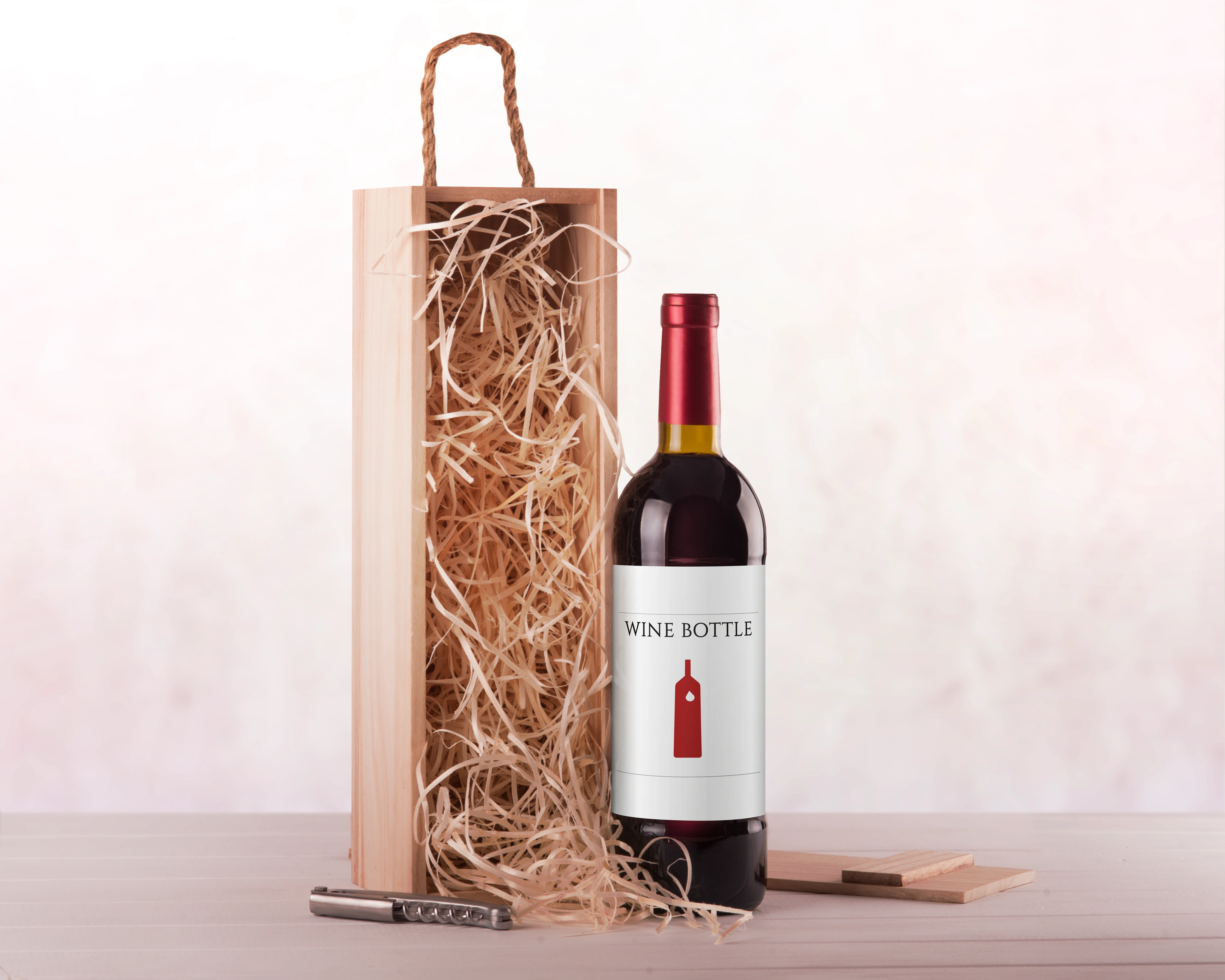
2024
Marry
Introduction:
The Mary brand logo is inspired by nature and simplicity. It takes the letter "M" from the brand's name and turns it into a clean, geometric design inside a rectangle. The colors—red and green—reflect the natural surroundings: red symbolizes the plum trees, while green represents the lush landscape. This combination of shapes and natural colors connects the logo to the brand's essence, blending modern design with its roots in nature.
Industry: Food
Made in Iran
Audience: +18, worldwide
Design style: Minimalism, nature lover
This business is started by a young woman as the first online shop for organic and handmade food products in the COVID-19 period in a small village.
She started her work with a berry tree as the first concept of her business in the center of her house's yard with her mother's support in the Northern part of Iran.

2023
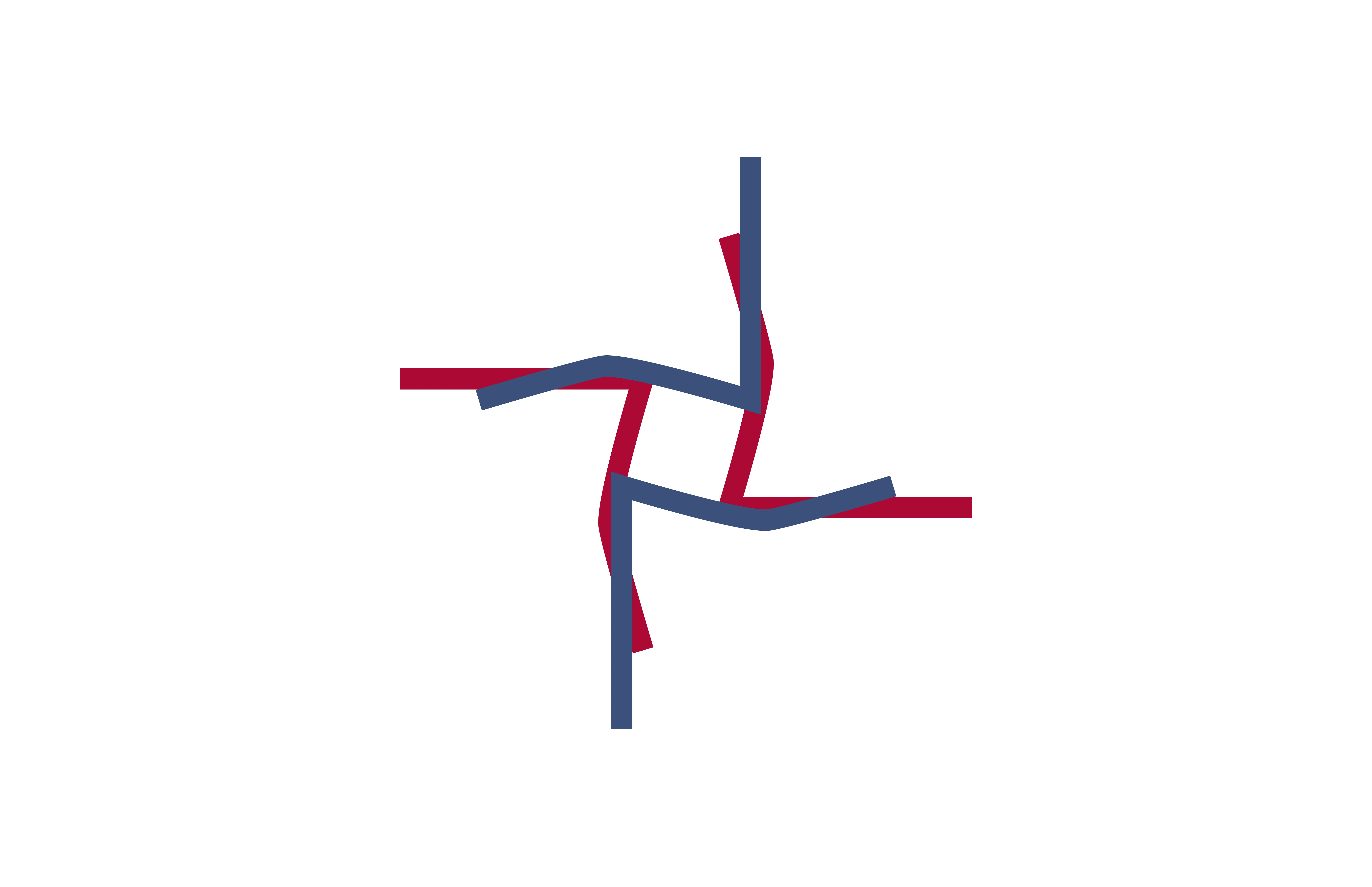
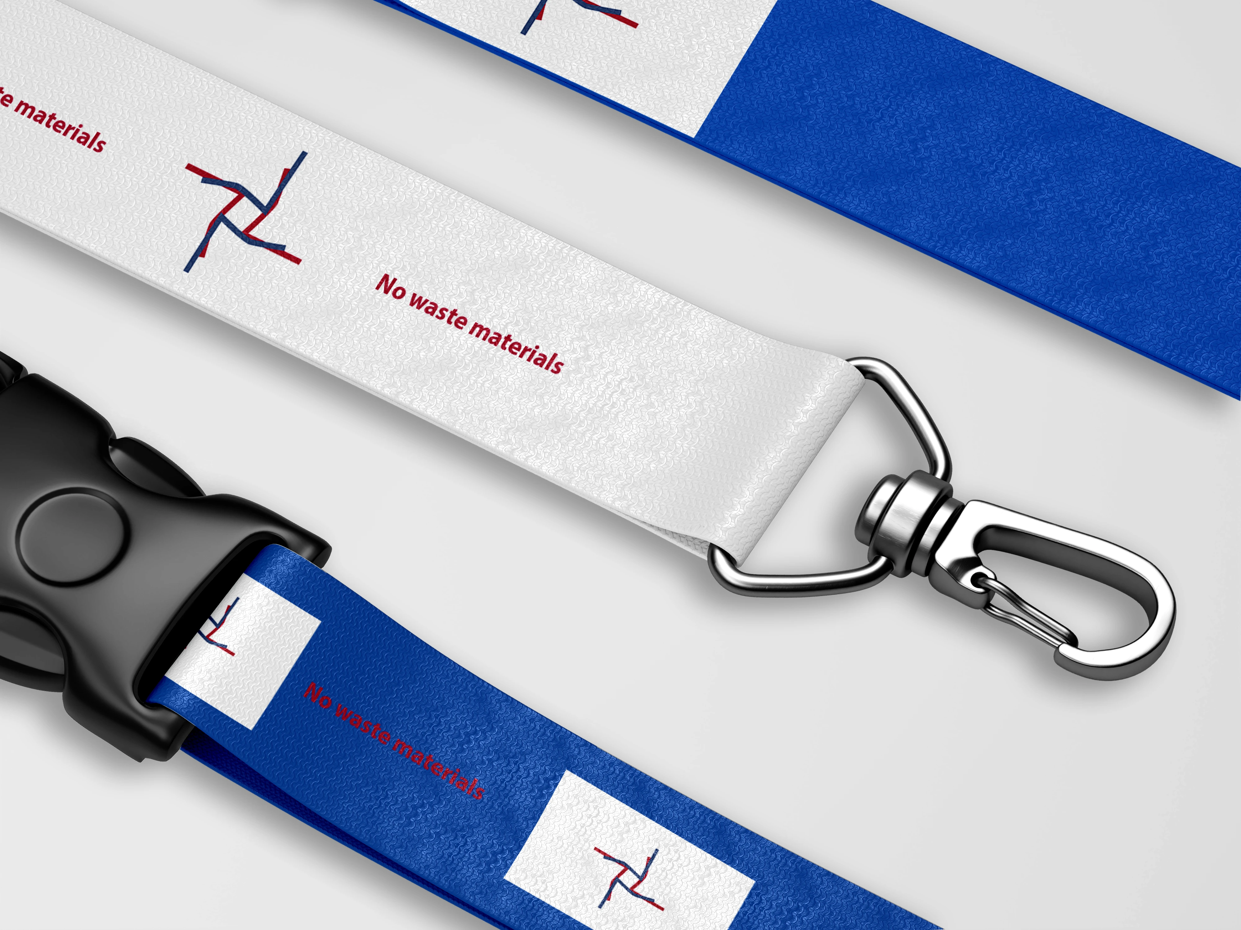
3R- HUB
Introduction:
The focus of the work is on redefining and reusing fabric and fabric waste, which is why an attempt has been made to use the warp and weft of the fabric as an evocative and foundation for the formation of the fabric.
Industry: Recycling and waste management of textiles
Made in Italy
Audience: People < 65
Design style: Minimalism, modern, geometric.
The logo concept started with a rectangle and then ended with broken lines. These broken lines indicated a reduction in fabric waste relative to the rectangular size.
The linear design of the logo is also reminiscent of the warp and weft of fabric.
2023
Like this project
Posted Dec 3, 2024
Brand identity is a core of each business.
Likes
0
Views
21