Compass Mints 🌿 Brand Refresh
Taby L.S.
Compass Mints – Brand Identity Refresh
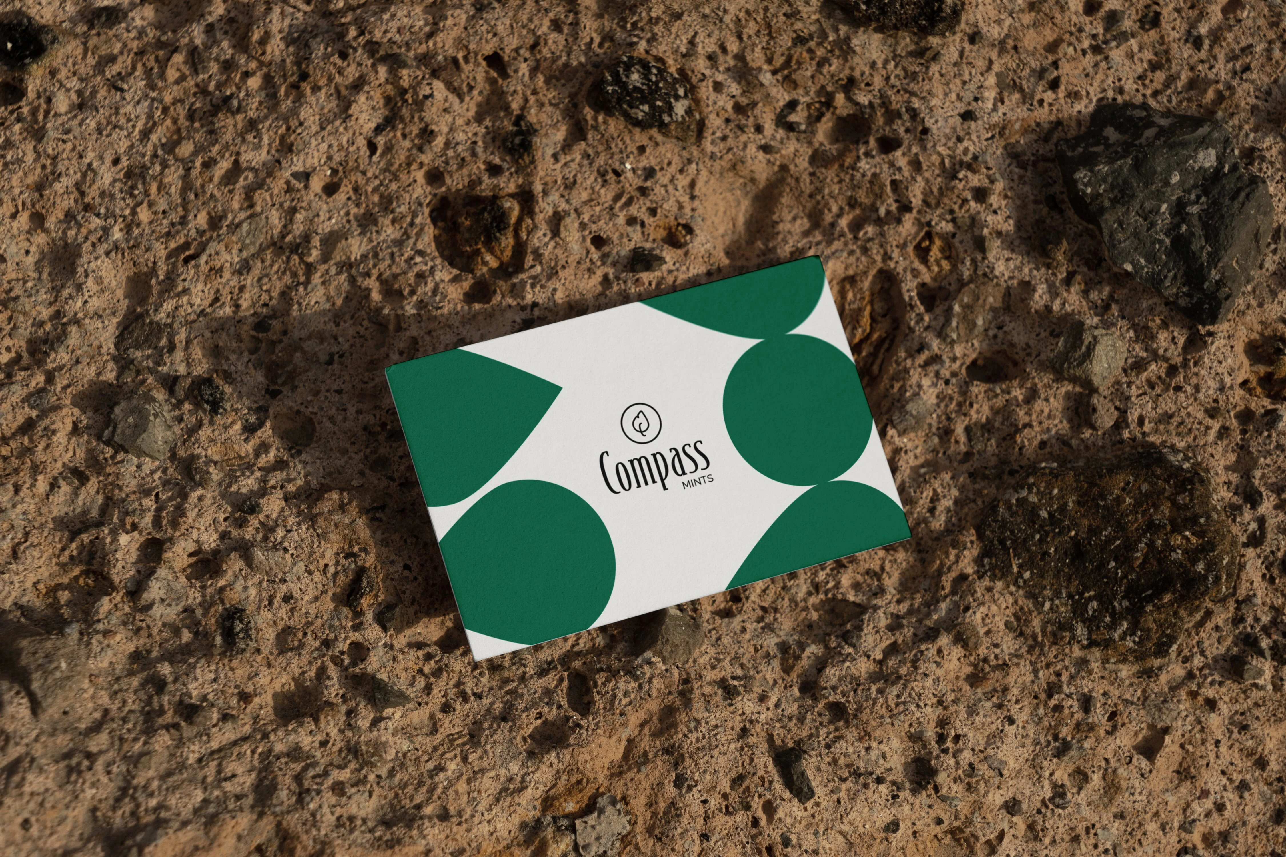
The brand refresh involved refining the existing wordmark and developing a complementary logo mark and branding package for an eco-conscious, high-quality mints brand. The goal was to align the branding with their commitment to sustainability. The logo icon conveys an organic yet modern look and feel, featuring mint leaves arranged in a compass shape, while also referring to the characteristic round shape of their mint pastilles.
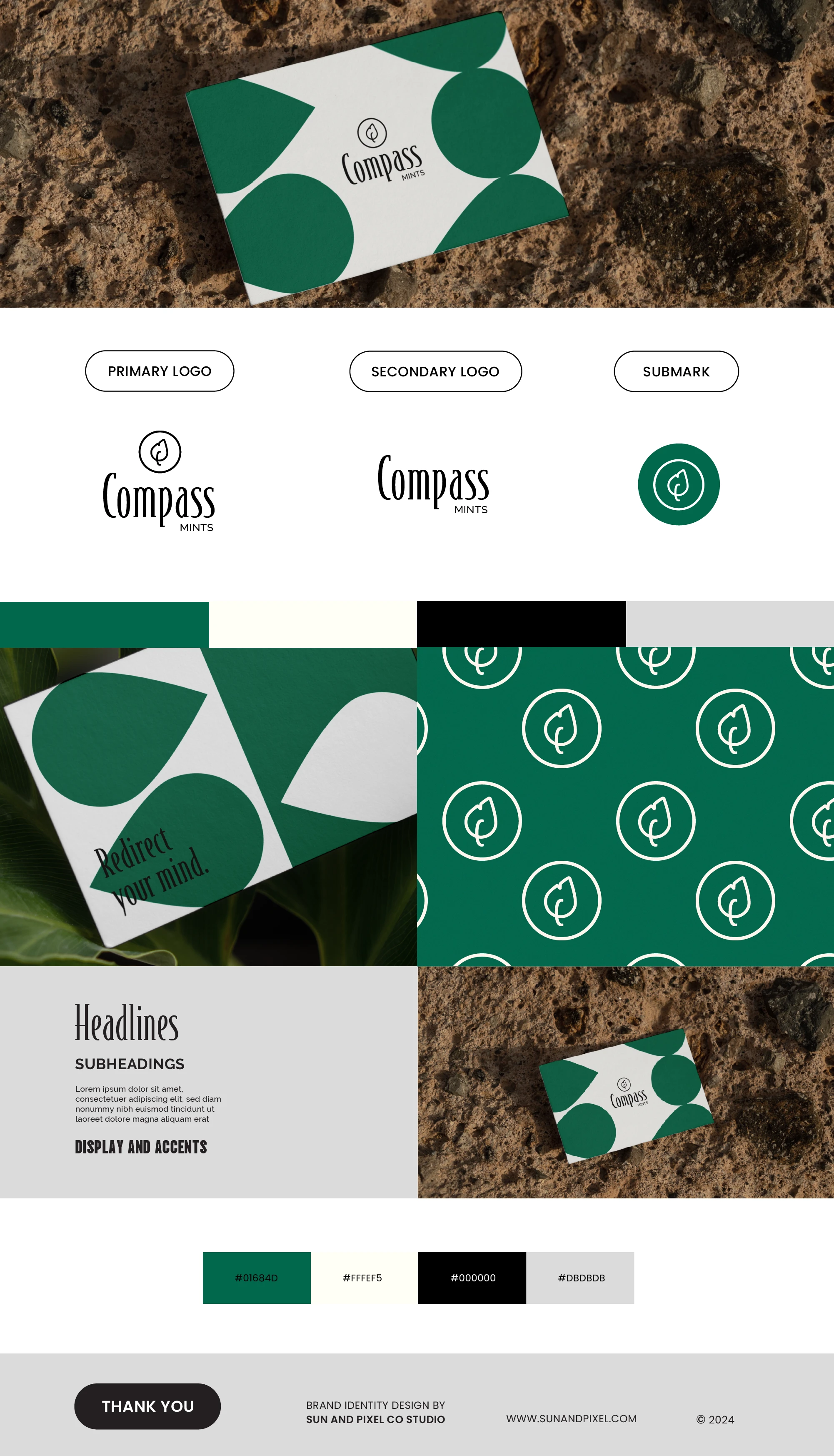
Compass Mints / Brand Board
Like this project
Posted Mar 3, 2024
The brand refresh involved refining the existing wordmark and developing a complementary logomark and branding package for an eco-conscious mints brand.
Likes
0
Views
5