Studio Notam 💻 Brand Identity Design
Taby L.S.
Studio Notam Social Media Studio – Brand Design
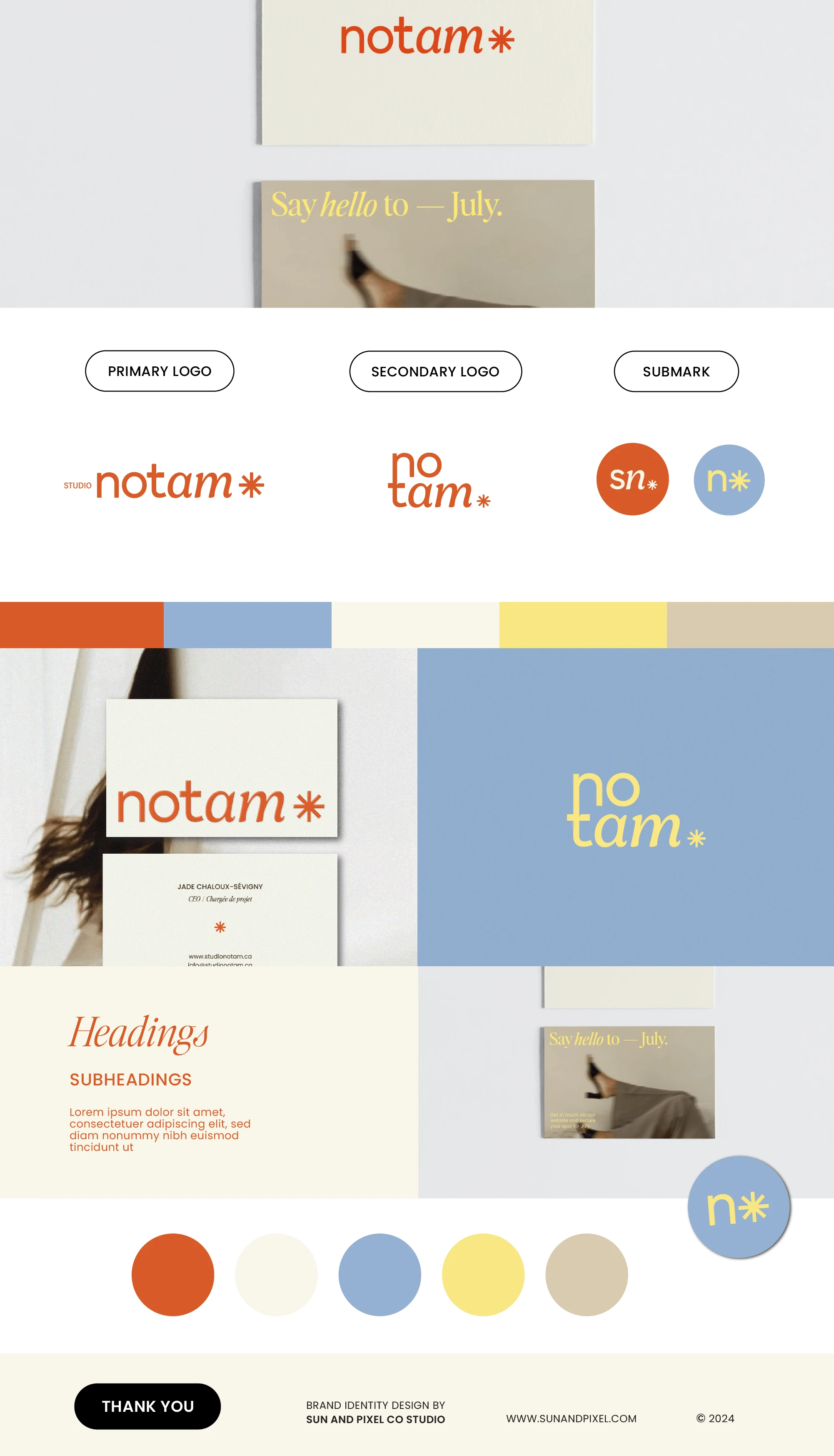
The creative direction for Studio Notam's rebranding is focused on combining friendly, minimalist, and airy aesthetics with a touch of sophistication, alongside a vibrant colour palette. The wordmark was created by mixing and modifying letters from different fonts. Using lowercase letters lends it an approachable feel, while the serif letters add a touch of sophistication.
The icon, designed with a friendly minimalist approach, was created by rotating the crossbar of the 't', maintaining a connection to the wordmark. In terms of typography, a blend of refined serif fonts and classic sans-serif fonts was selected to complement this direction.
Like this project
Posted Jul 14, 2024
The creative direction for Studio Notam's rebranding is focused on combining friendly, minimalist, and airy aesthetics with a touch of sophistication.
Likes
0
Views
13