
A 40-second brand film for AXORA, a studio working across architecture, interiors and landscape.
The film opens on construction grid lines and moves through the "O" glyph into a courtyard, then reveals the wordmark with photography inside the letters. It continues through the studio's core ideas (Structure, Counterspace, Threshold), a mineral color palette, a 12-frame photo montage cut to the beat, and printed and digital applications, ending on the line "Leave room for life."
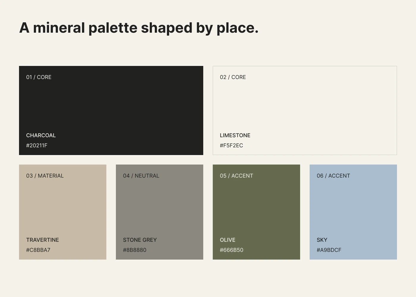
Palette: Charcoal, Limestone, Travertine, Stone Grey, Olive, Sky. Typeface: Inter.
Delivered in 16:9 and 9:16 at 30 fps, cut to a 120 BPM custom track.
My role: brand identity, art direction, motion design and editing.
AI use: all photography, interior and landscape scenes, renders and mockup visuals in this project, both in the film and in the case study below, are AI-generated. The brand identity, logo system, layouts, art direction, motion design and editing are my own work.
Axora Brand Identity
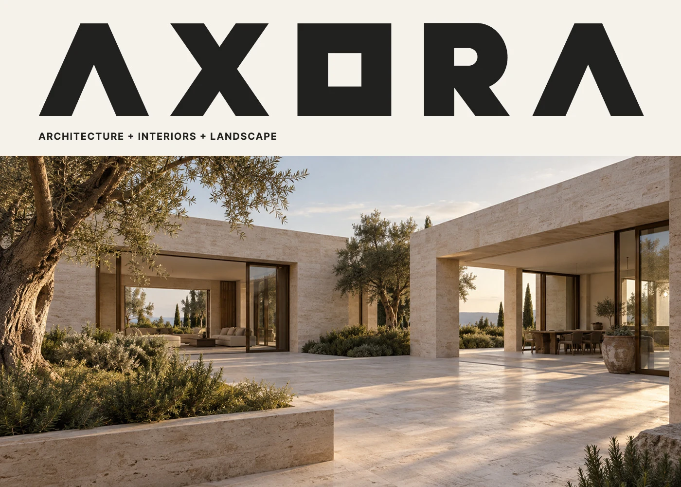
AI-generated visual
Axora is an architecture, interiors and landscape studio that treats space as the starting point of every project. The identity turns that philosophy into a quiet, structural visual language: built from space, drawn from light and grounded in natural materials.
Role: Art Direction & Brand Identity · Scope: Logo system, typography, colour, stationery, signage, editorial and social
Note: every image in this case study is an AI-generated visual, created to present the identity in use.
AI-generated visual
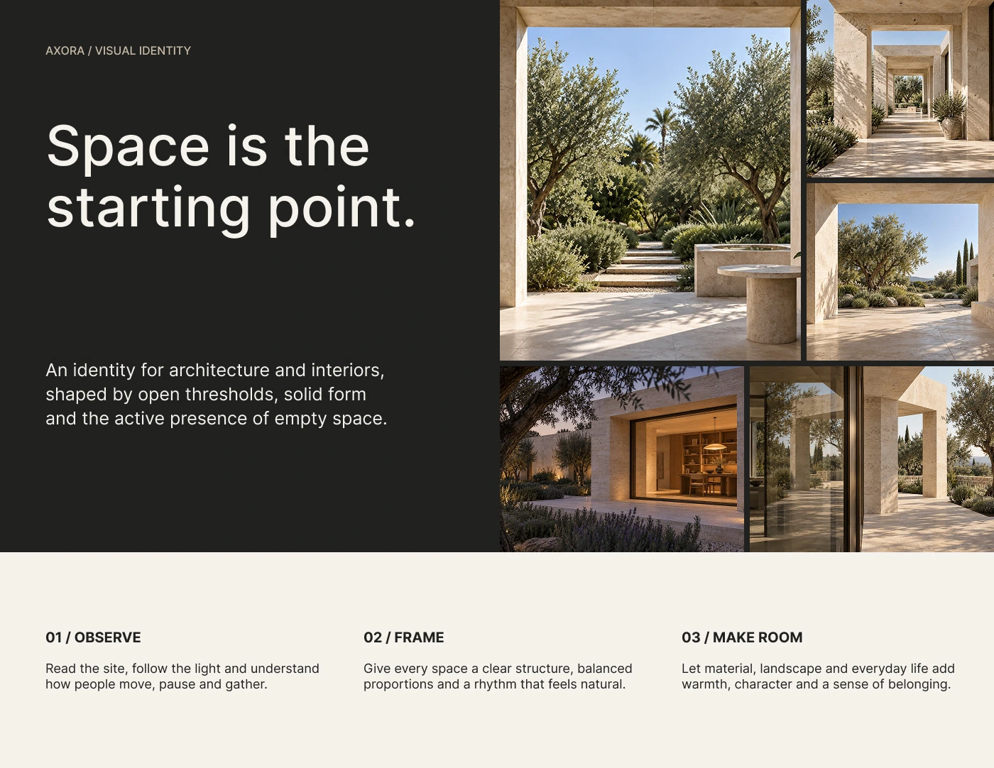
AI-generated visual
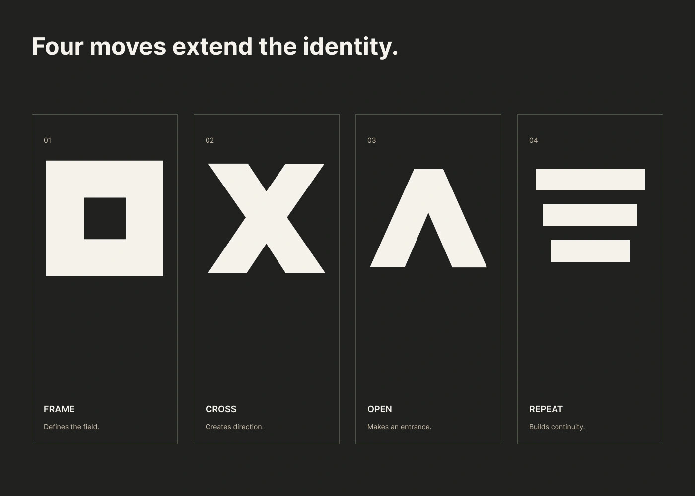
Three Principles
Structure, space and threshold, the three ideas behind every Axora building, are translated into three simple shapes that build the logo and the wider visual system.
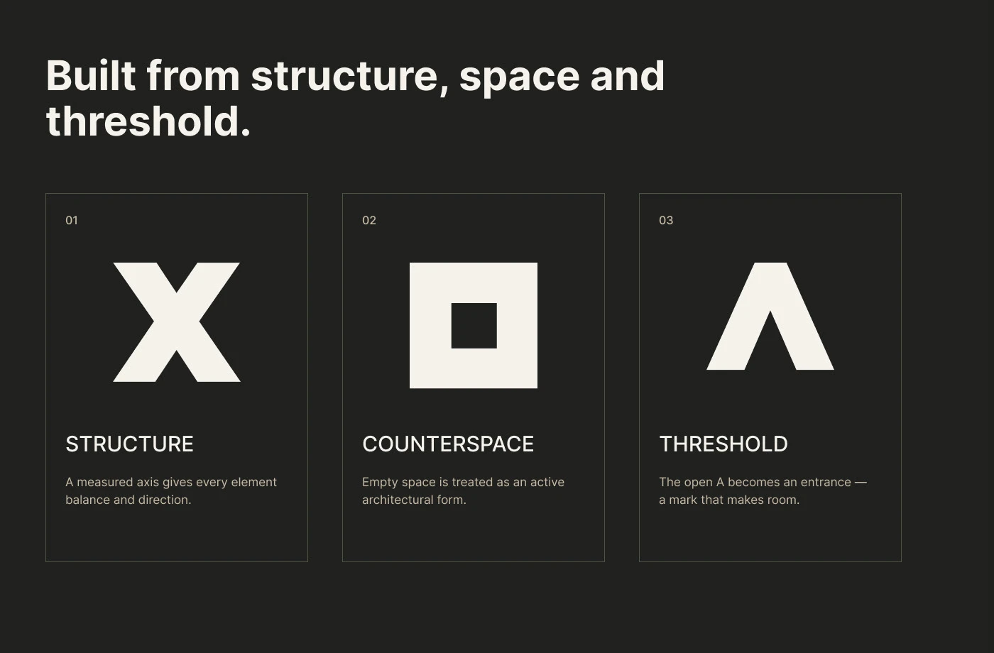
AI-generated visual
The Mark
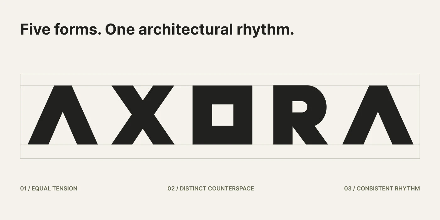
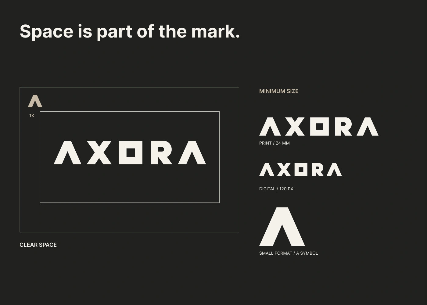
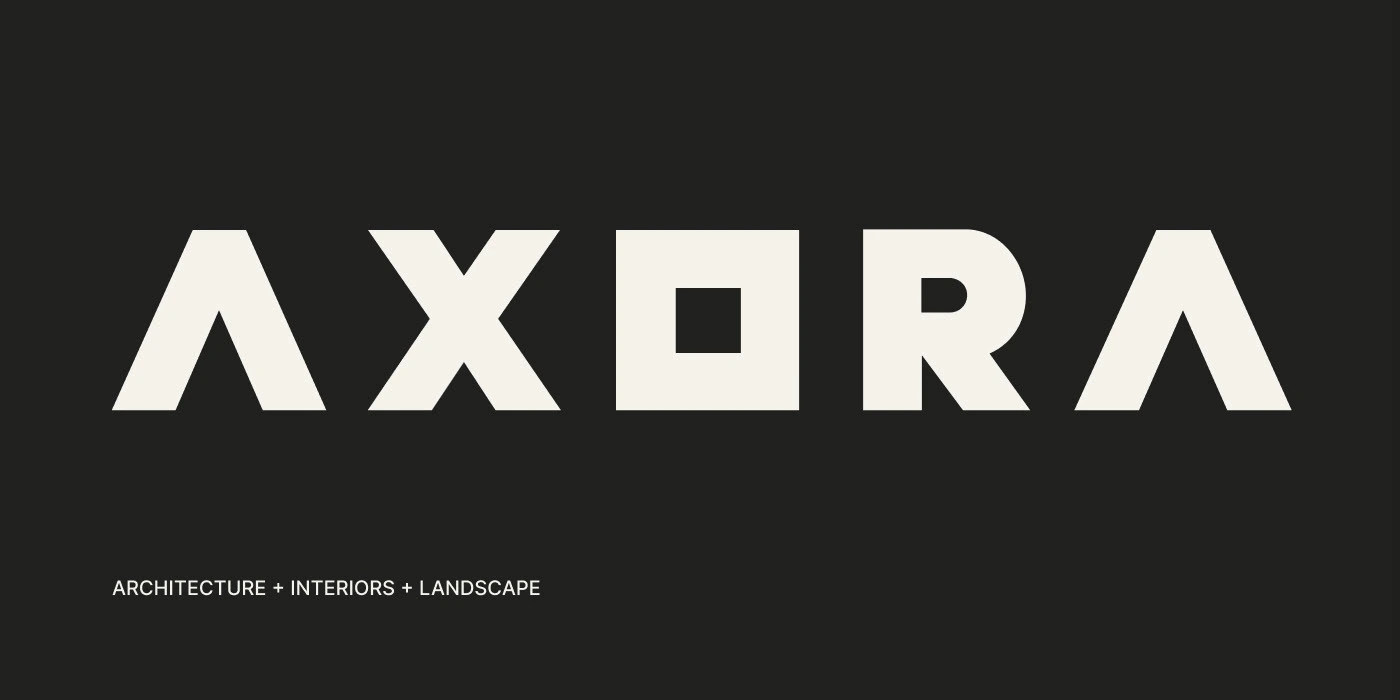
The wordmark is built from three architectural ideas: structure, space and threshold. Each letter can stand alone as a symbol, giving the studio a modular family of marks for signage, patterns and small applications.
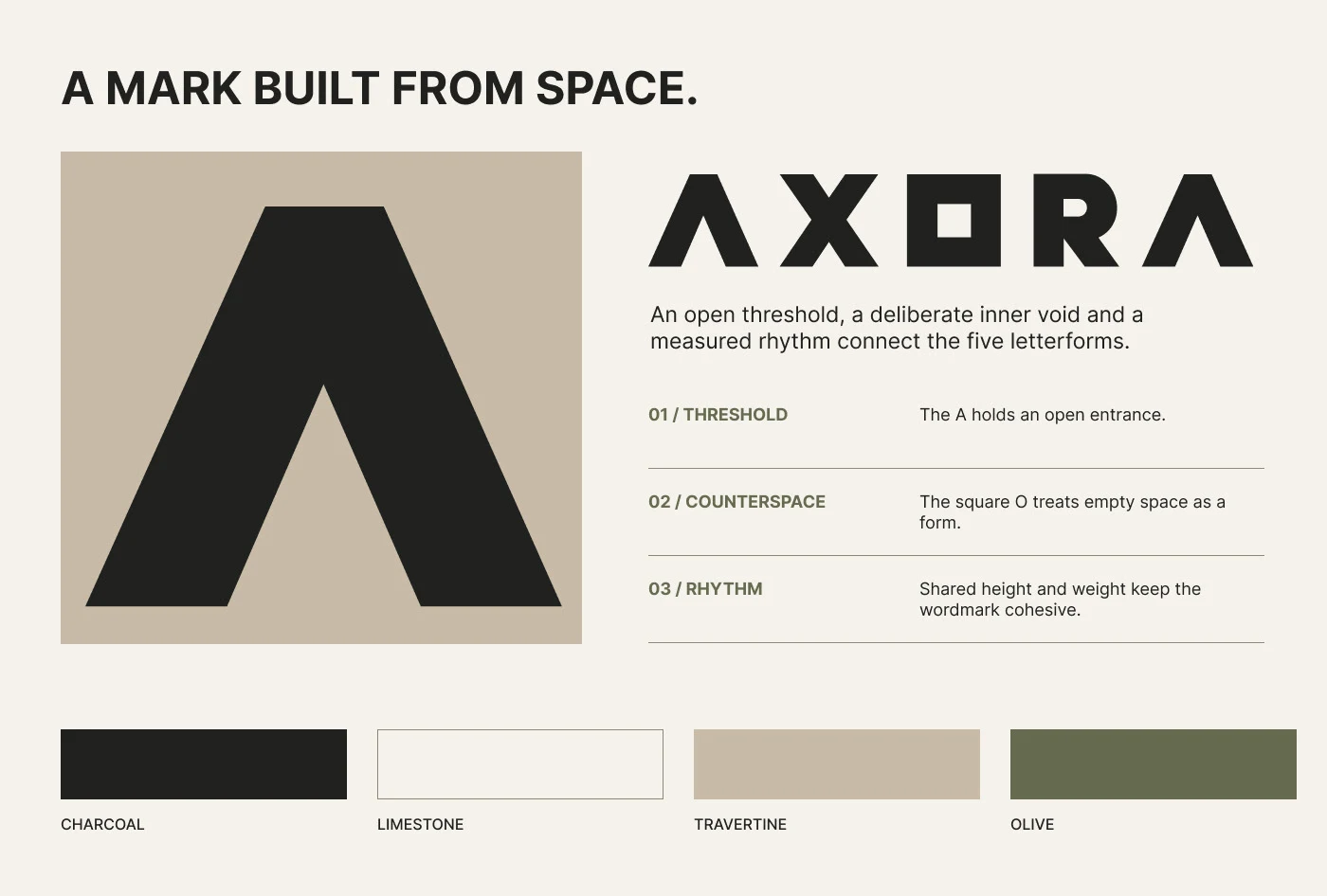
AI-generated visual
AI-generated visual
One Mark, Three Disciplines
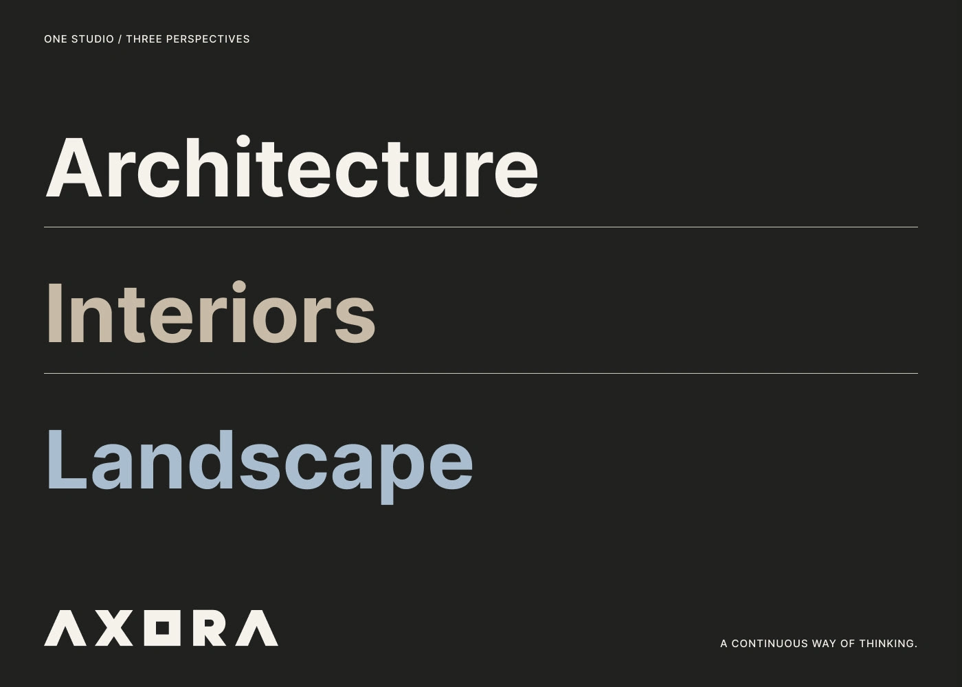
Architecture, interiors and landscape share one wordmark. Its geometric letters are spaced like rooms in a plan, giving every application the same sense of order.
AI-generated visual
AI-generated visual
Material Palette
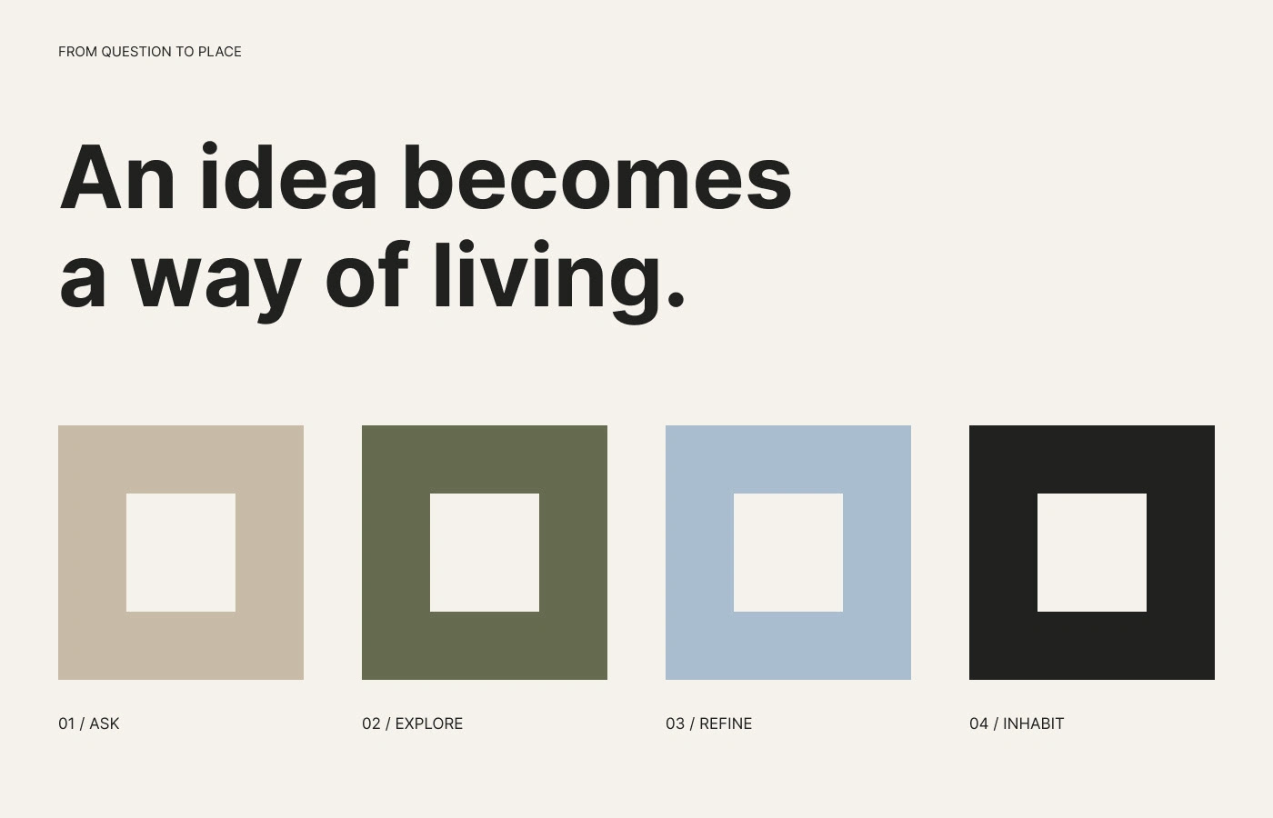
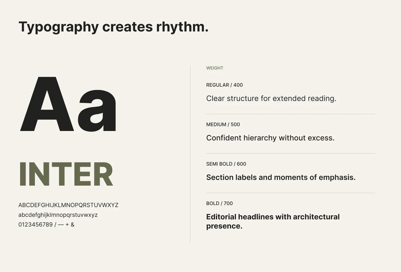
Inter carries every message with clarity, from headlines to technical notes, while a restrained set of earthy tones keeps the identity calm and timeless.
AI-generated visual
AI-generated visual
Shaped by Place
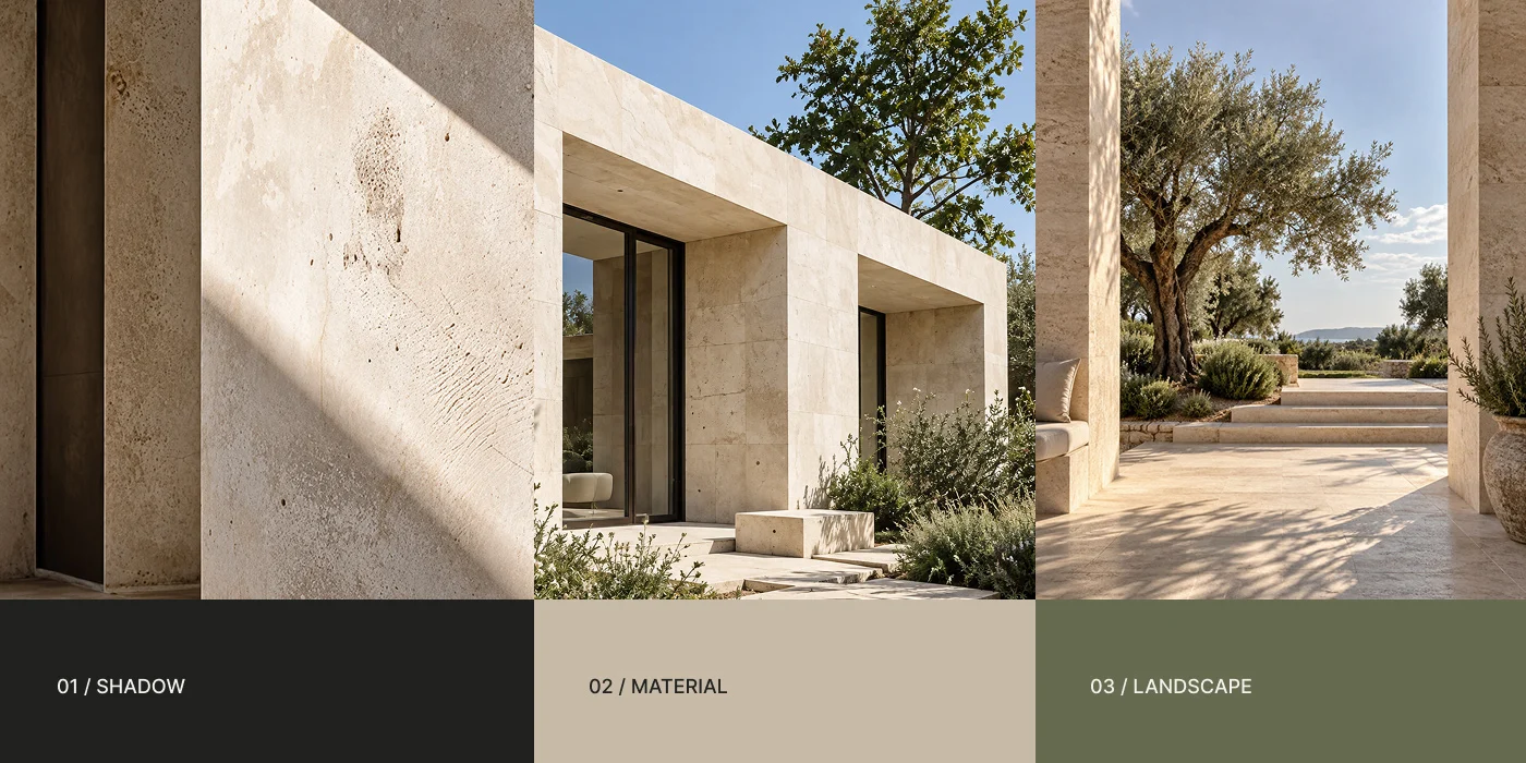
The palette is taken directly from the Mediterranean landscape the studio works in: limestone, olive leaves, dry earth and an open sky.
AI-generated visual
AI-generated visual
Colour Creates Hierarchy
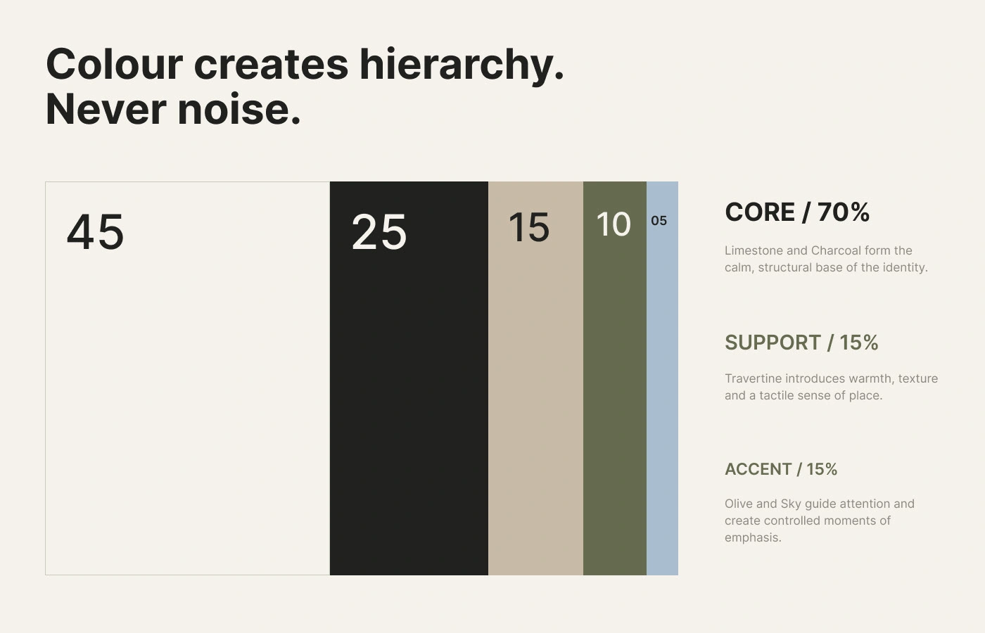
Colour is used in clear proportions: dark charcoal for structure, warm sand for calm, olive and soft blue as quiet accents. The shapes of the logo extend into a flexible graphic language.
AI-generated visual
Colour & Type
A palette shaped by place (charcoal, limestone, sand, olive and soft sky blue) meets Inter in a calm, rhythmic hierarchy. Colour is used in proportion, like materials in a building: mostly neutral, with accents only where they matter.
AI-generated visual
AI-generated visual
Built with Purpose
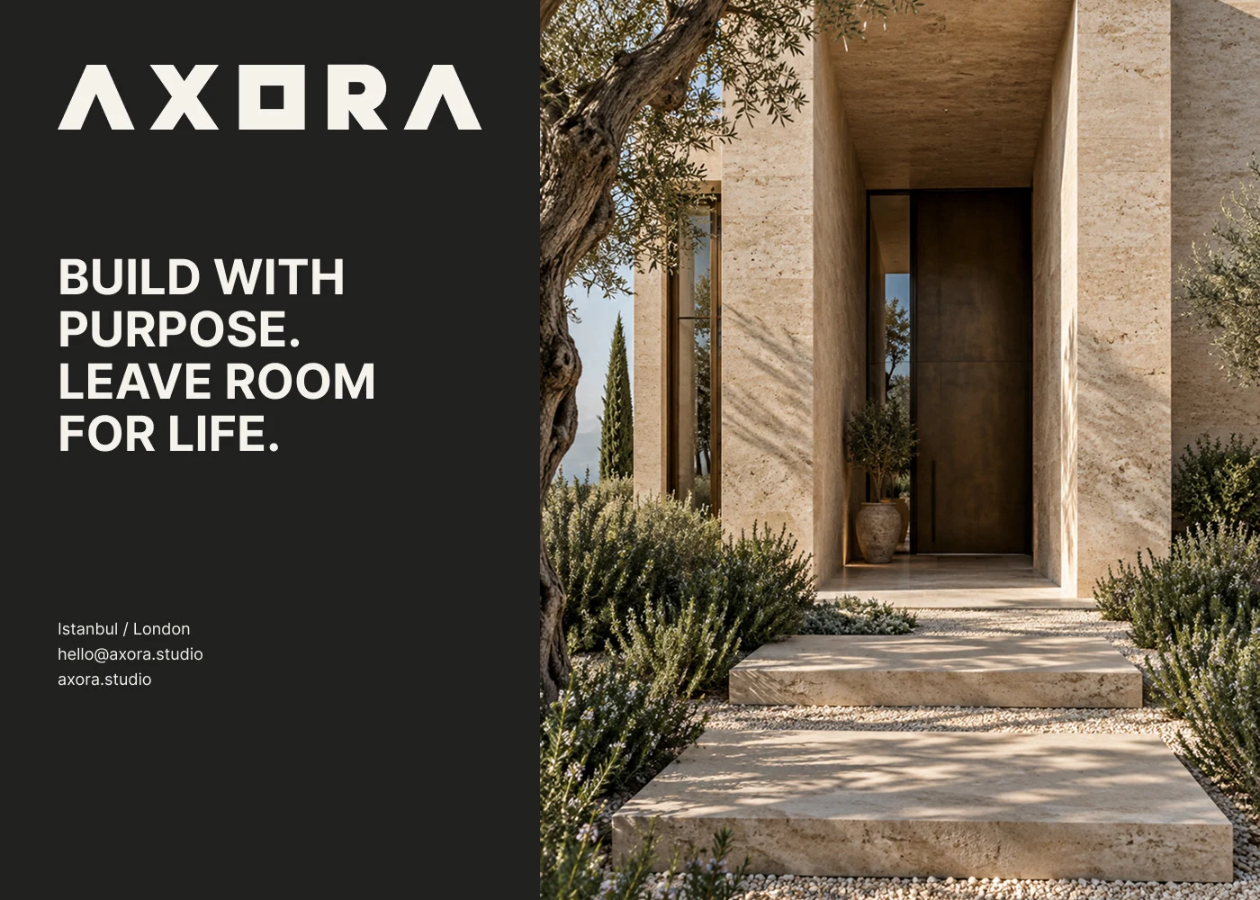
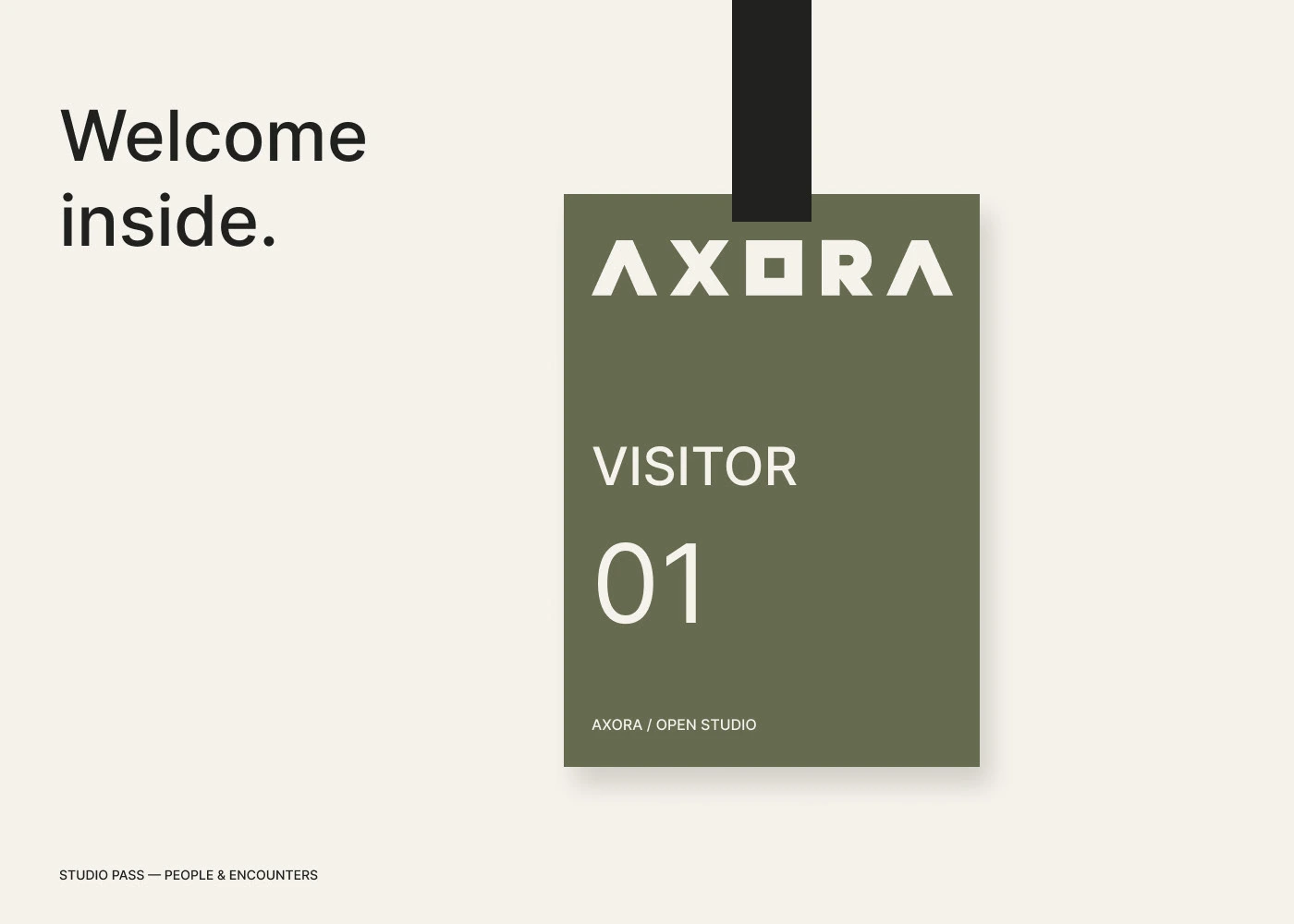
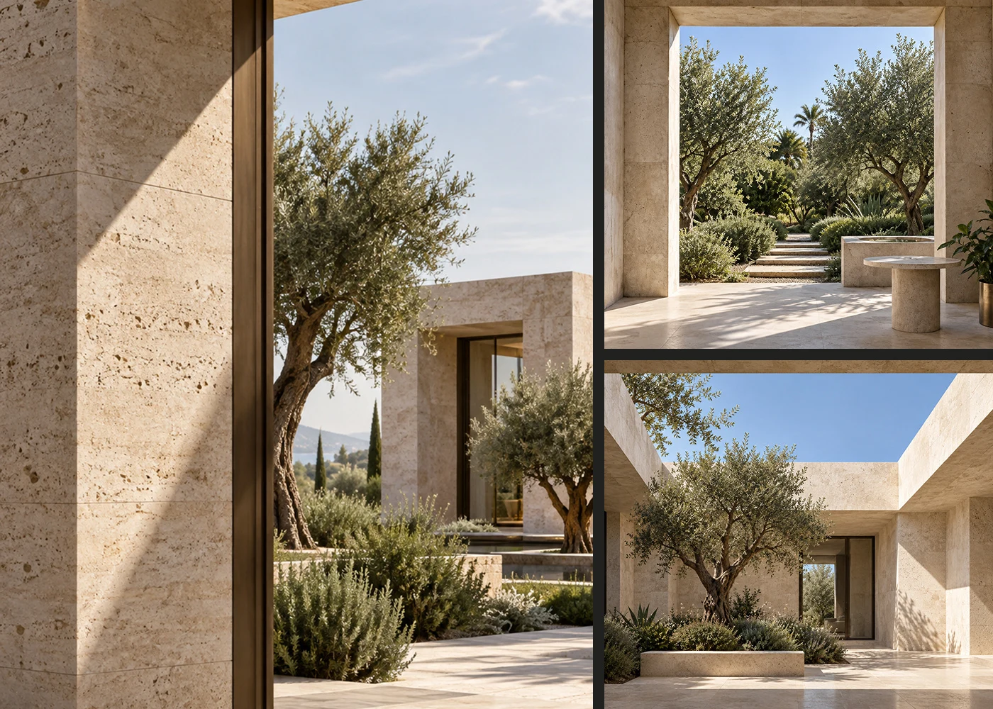
AI-generated photography of warm stone, deep shade and lush planting sits beside simple statements, while visitor badges welcome guests into the studio.
AI-generated visual
AI-generated visual
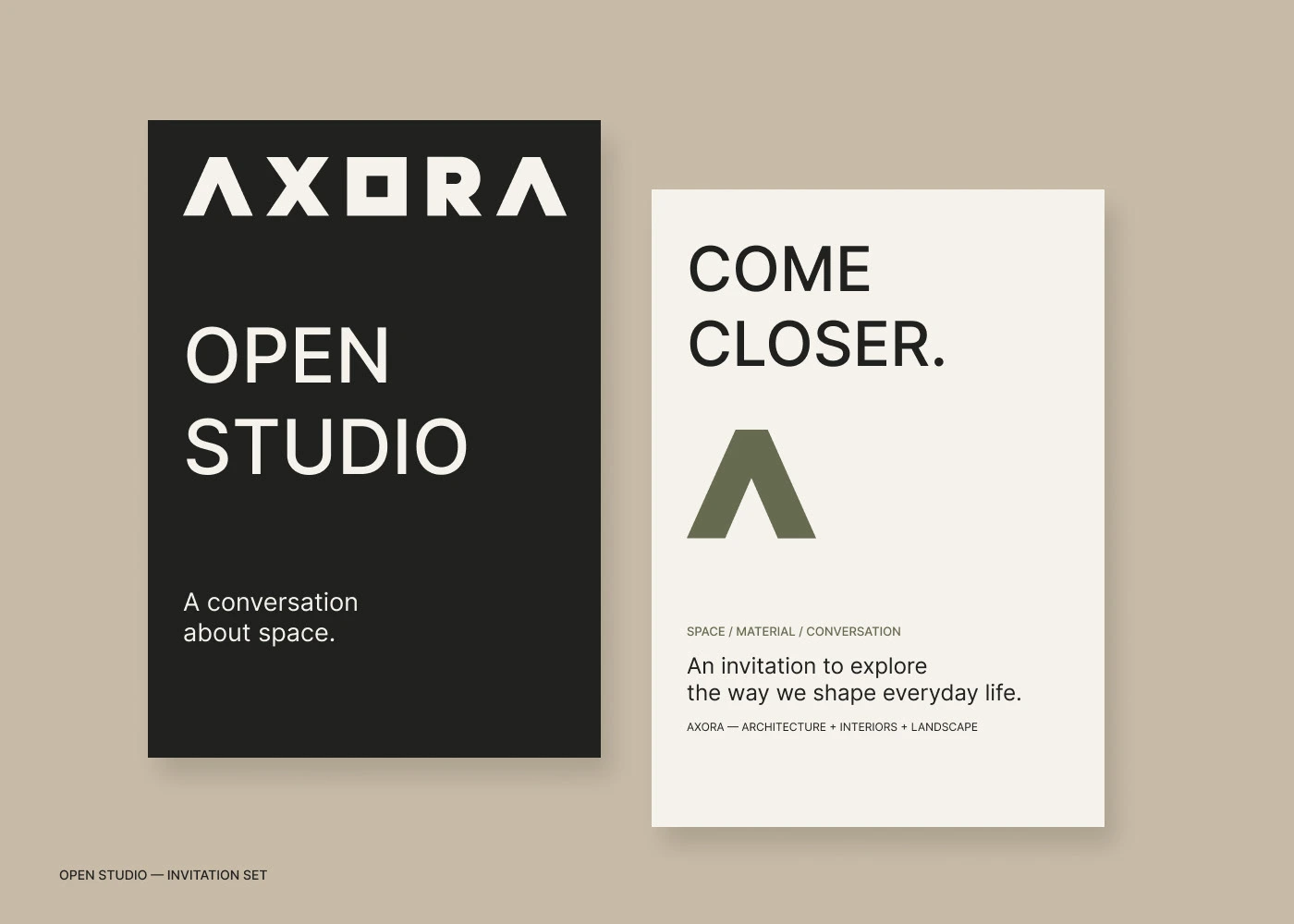
Open Studio
Event invitations and visitor passes invite people to come closer, using the same muted palette and confident type to make the studio feel open and approachable.
AI-generated visual
AI-generated visual
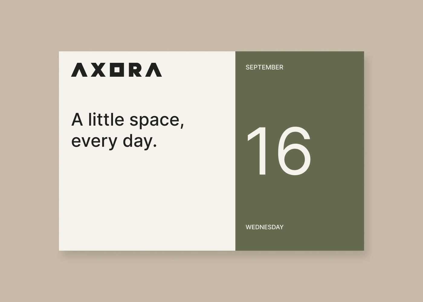
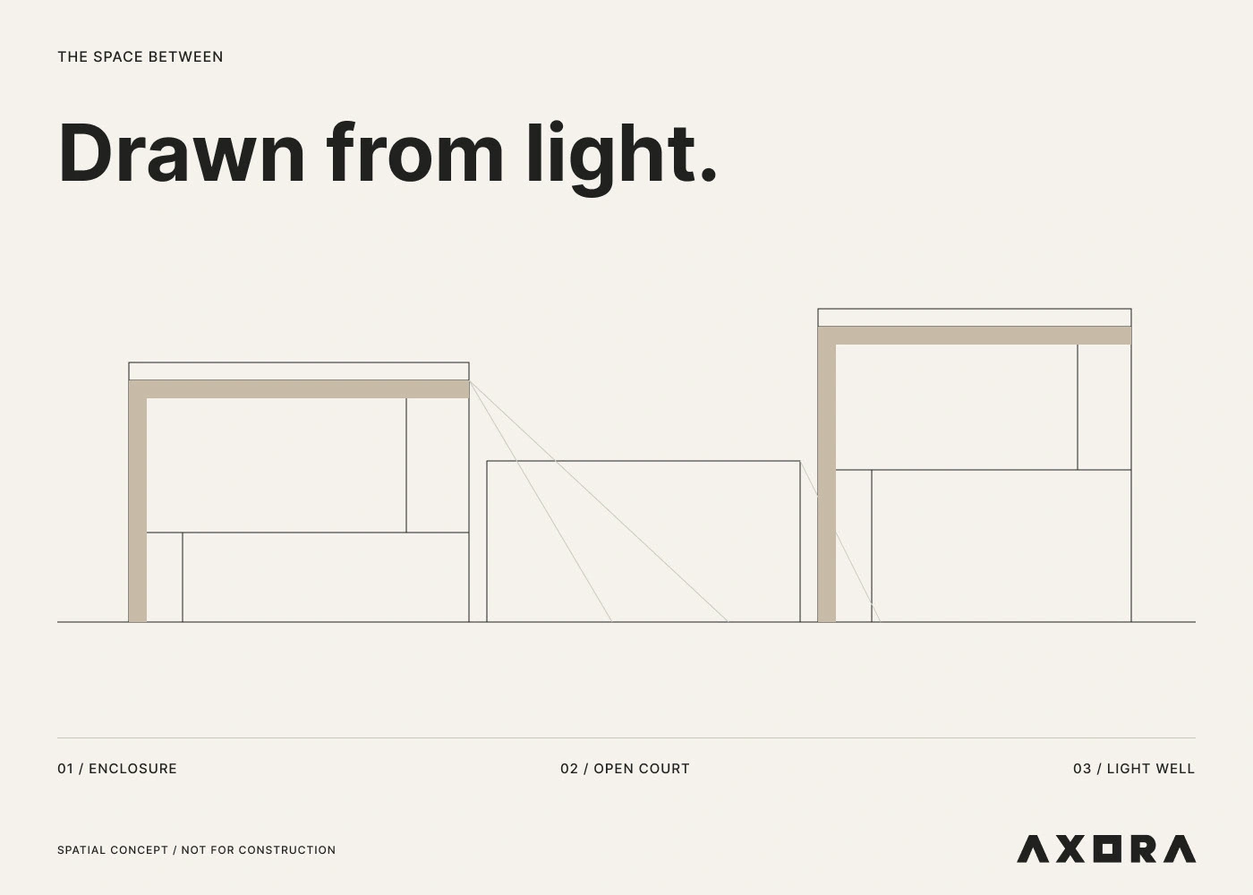
A Little Space, Every Day
Calendars, numbered sequences and line drawings turn the brand into everyday objects, small reminders of the studio's idea that good space shapes daily life.
AI-generated visual
AI-generated visual
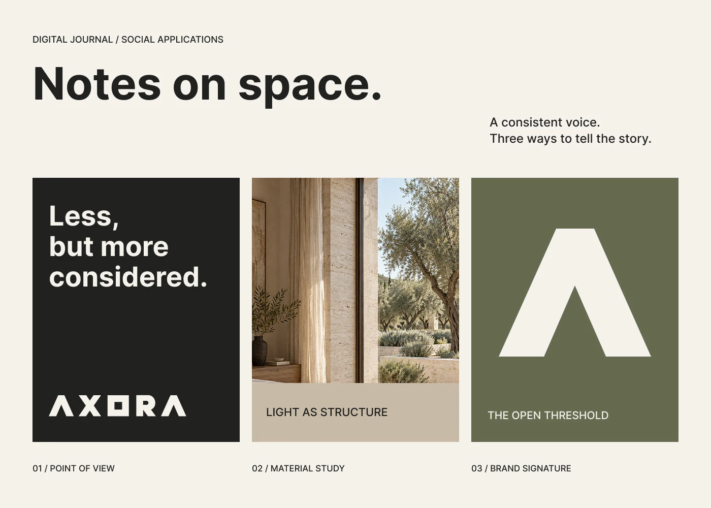
Notes on Space
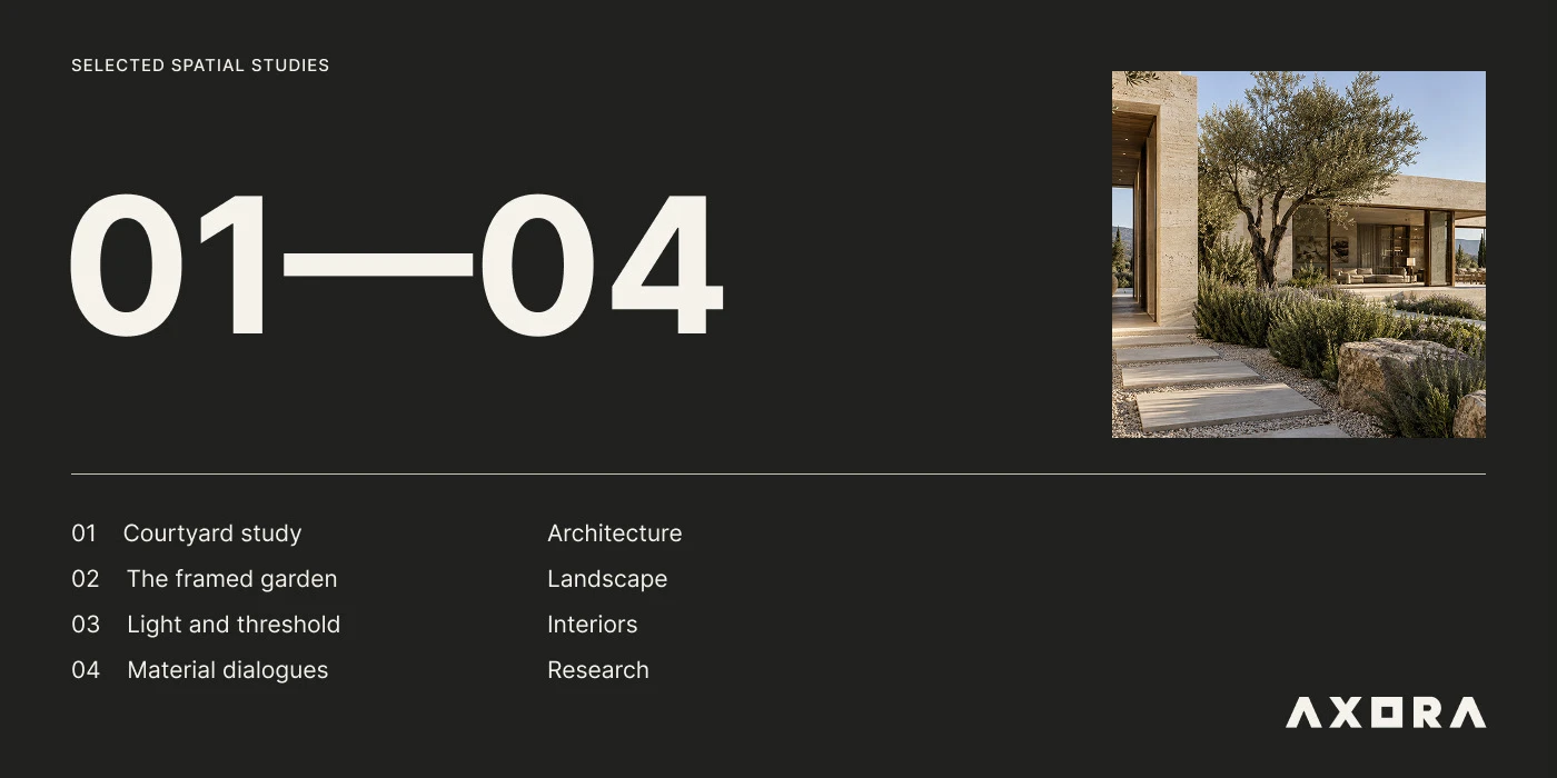
Editorial spreads mix photography, white space and short statements like less, but more considered, giving the studio a thoughtful voice in print and online.
AI-generated visual
AI-generated visual
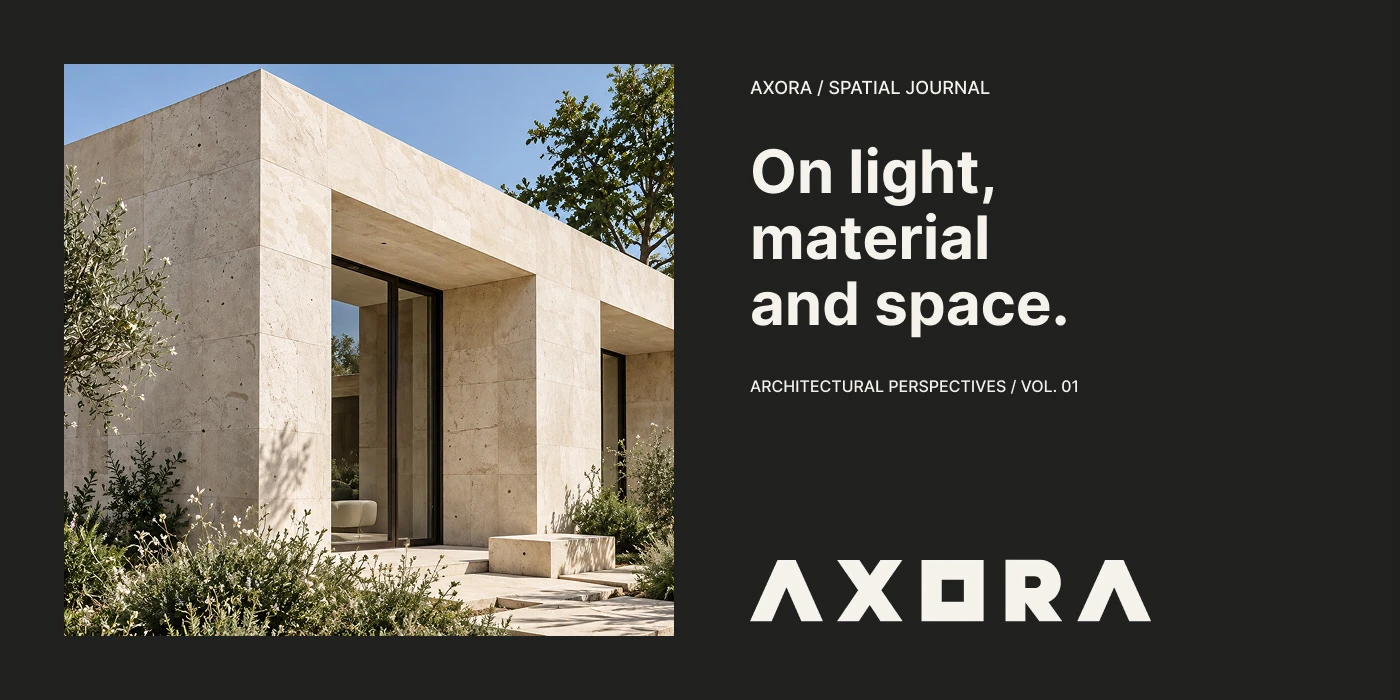
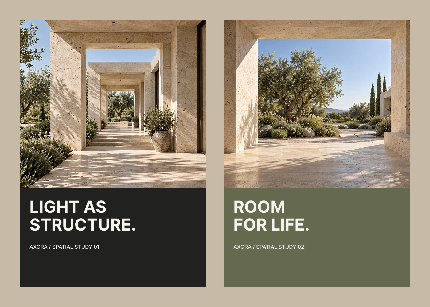
On Light and Material
Covers and presentation boards pair sunlit stone, olive trees and deep shadow with short headlines, so every layout feels like walking through one of the studio's spaces.
AI-generated visual
AI-generated visual
Brand in Use
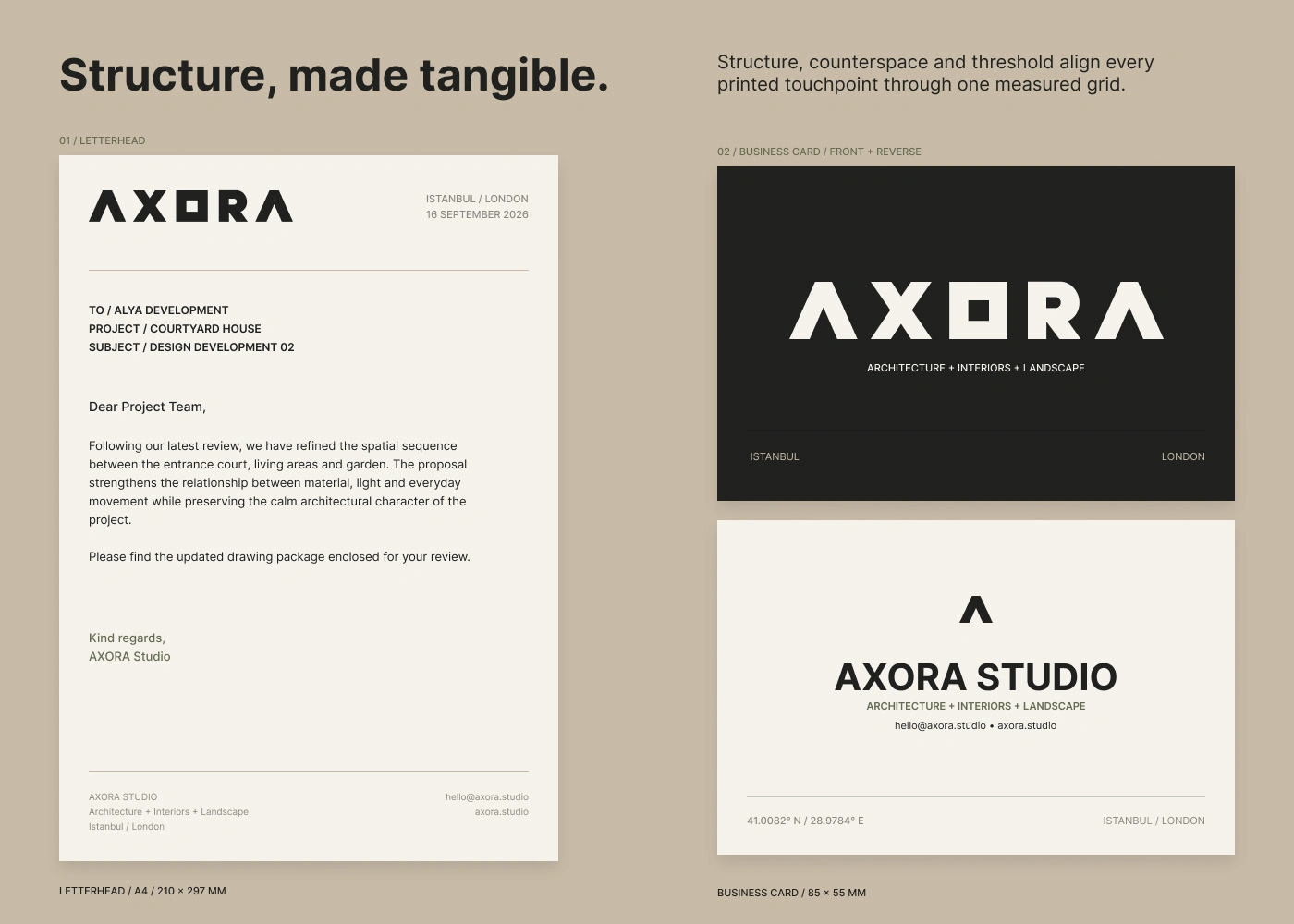
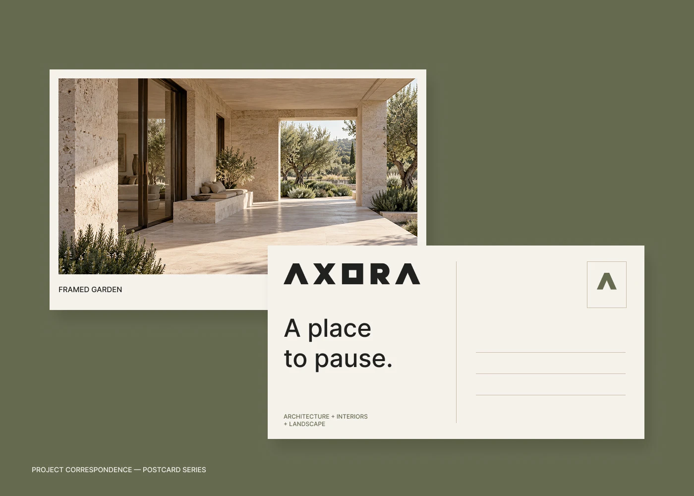
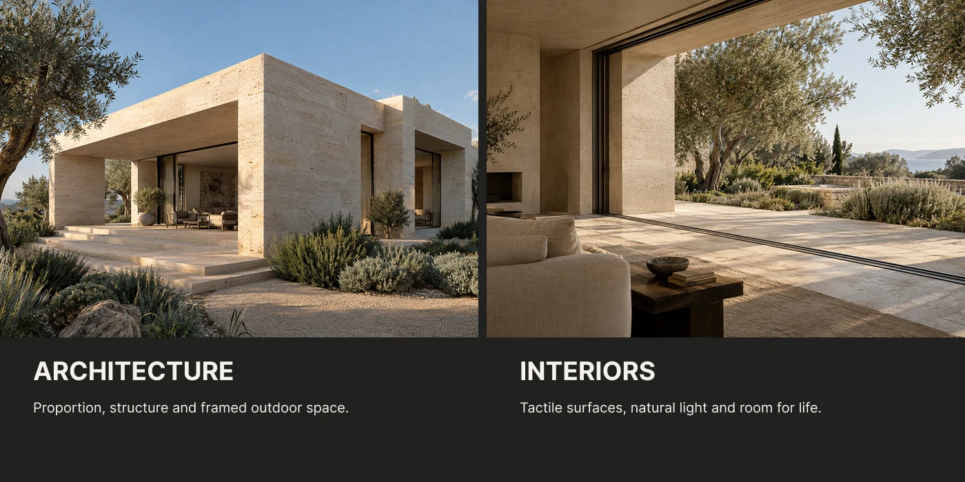
Stationery, studio signage, visitor passes, wayfinding, editorial layouts and social posts share one restrained grid, so every touchpoint feels like a room designed by the same hand.
AI-generated visual
AI-generated visual
Structure in Repetition
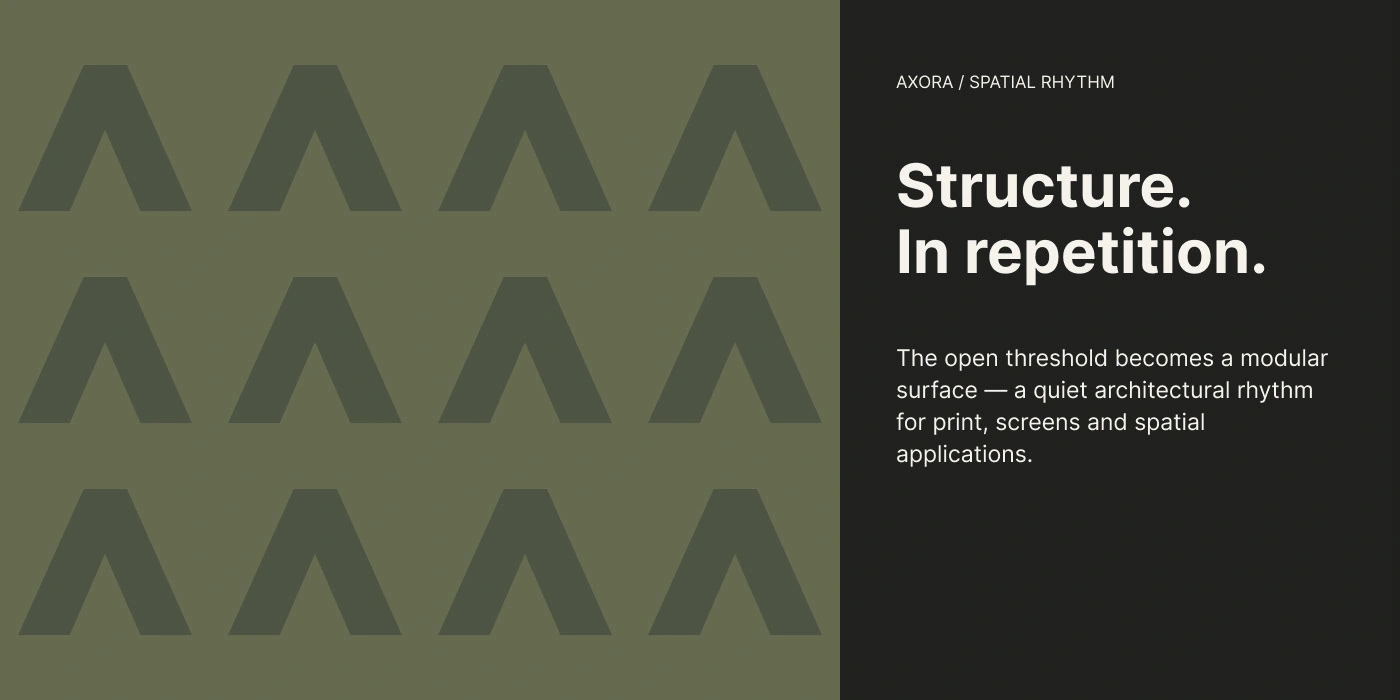
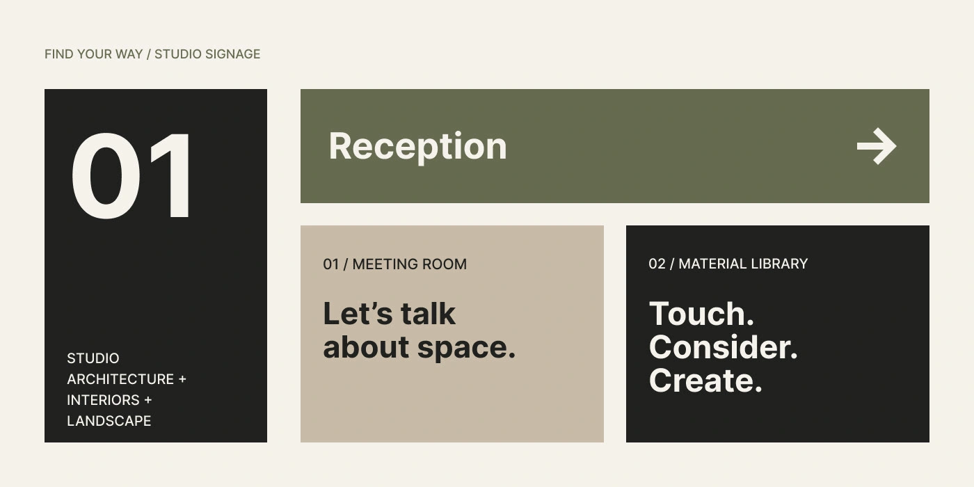
Repeated, the A mark becomes a pattern for wayfinding, packaging and interior surfaces, and room numbers and reception signs follow the same calm rhythm.
AI-generated visual
AI-generated visual
A Quiet Confidence
From the reception desk to social media, the identity stays calm and consistent, letting the studio's architecture do the talking while the wordmark simply signs it.
AI disclosure: all visuals in this project are AI-generated. Concept, brand identity and art direction by Mehmet Kırlangıç.
AI-generated visual
0 likes · 2 views · Nov 15, 2026
Brand film and identity for AXORA, an architecture studio. All photography and visuals are AI-generated; identity and art direction are my own.


