Human + Flo
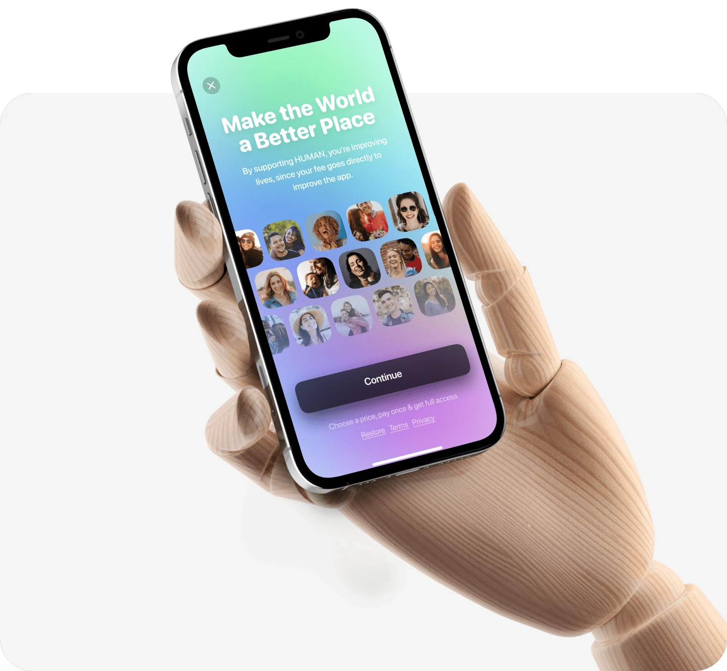
”Human playable therapy” is a mobile application for mental health therapy with a collection of life story games, where you make choices and get expert commentary as you play. Learn coping skills and lead a happier life one story at a time! The application also includes a chatbot to discuss with users and get recommendations.
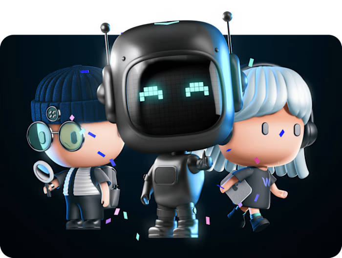
The ”Human” was a startup where I was in the role of key product designer with the following responsibilities:
Developed, built, and maintained design libraries (iOS);
Created animation and visuals;
Conducted user research.
But this story is about how we created an app and implemented the same mechanic at the other popular mobile app – Flo.
Part 1. “Human” as an independent mobile app
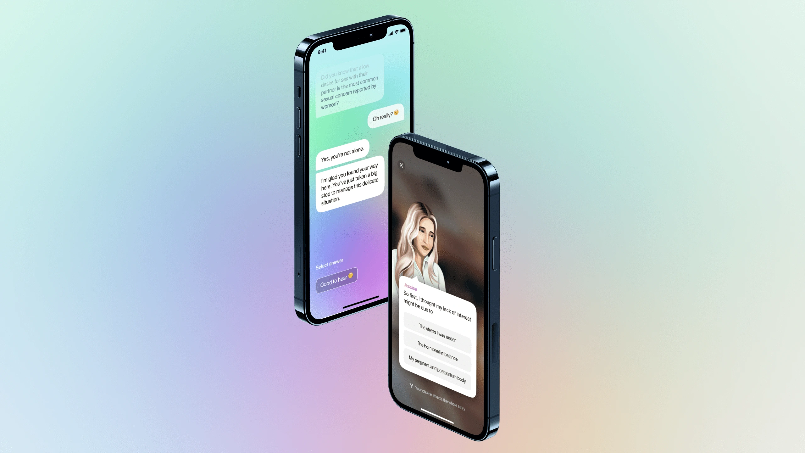
Concept session / Prototyping
The development session started with learning the mechanics of similar games and applications and creating a concept/prototype. Since the functionality in the application is not very much, and the mechanics are relatively simple, it was important to see how such an application can combine different types (and colors) of illustrations with different interface elements.
It was also important to check the animation mechanics since in this kind of application, animation at the micro-interaction level is extremely important (the application is half a game).
Finding UI
To create the best UI design, it is important to consider 2 key points:
Visual overload - when the user focuses on reading the main image and text content, he does not have time to "see" the UI without actually paying active attention to it. The more "colorful" the UI, the more it will conflict with the image, interfering with its perception.
The UI should be in harmony, merge with the image (and help the text to be readable), and because of different images (in colors, compositions, etc.), someone color scheme may be well combined with some images, but not well combined with others.
Given the above, important points from the point of view of the UI are the location of text and interactive blocks so that they do not conflict with the image.
The key to app design success is extremely responsive micro-interaction animation and UI details.
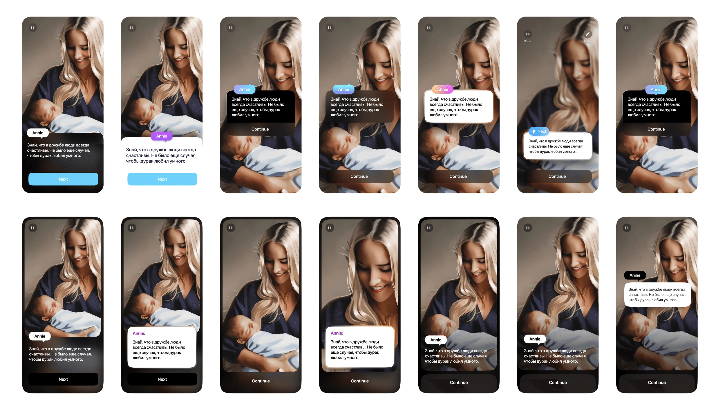
Finding the conception to combine together story images and interface
Design
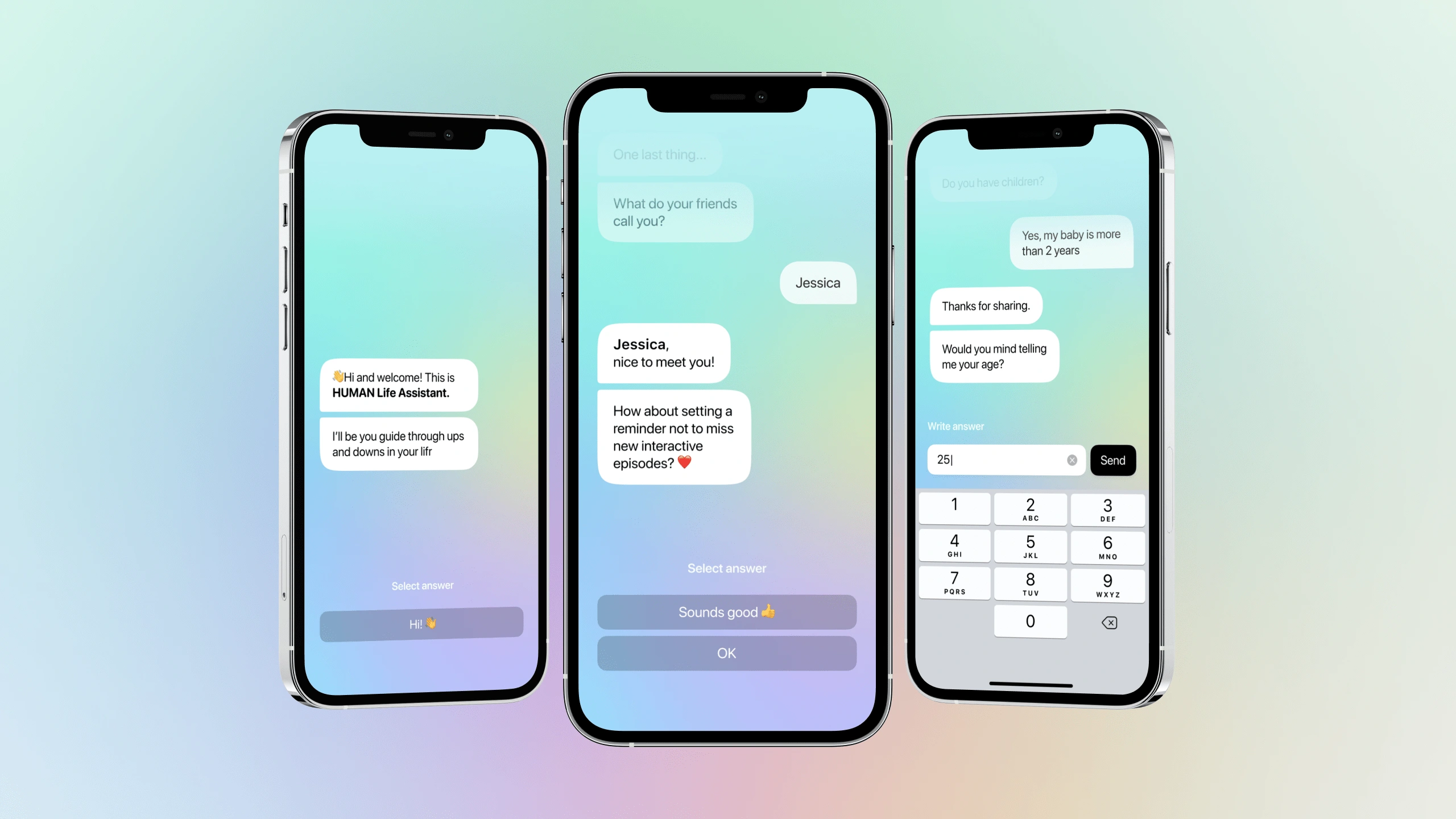
Home page: Chat bot interface
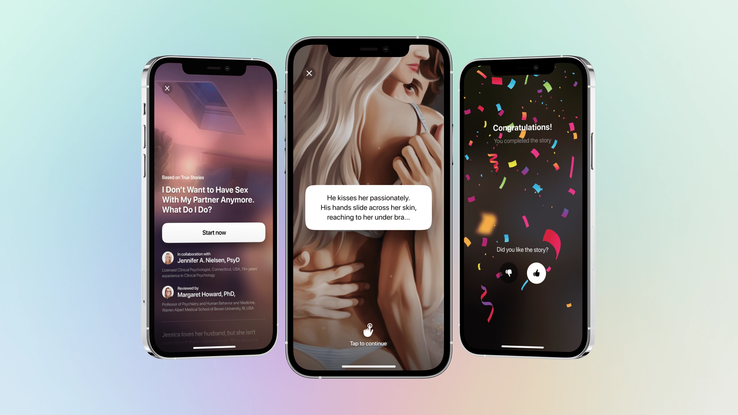
Start page - Middle state - End page
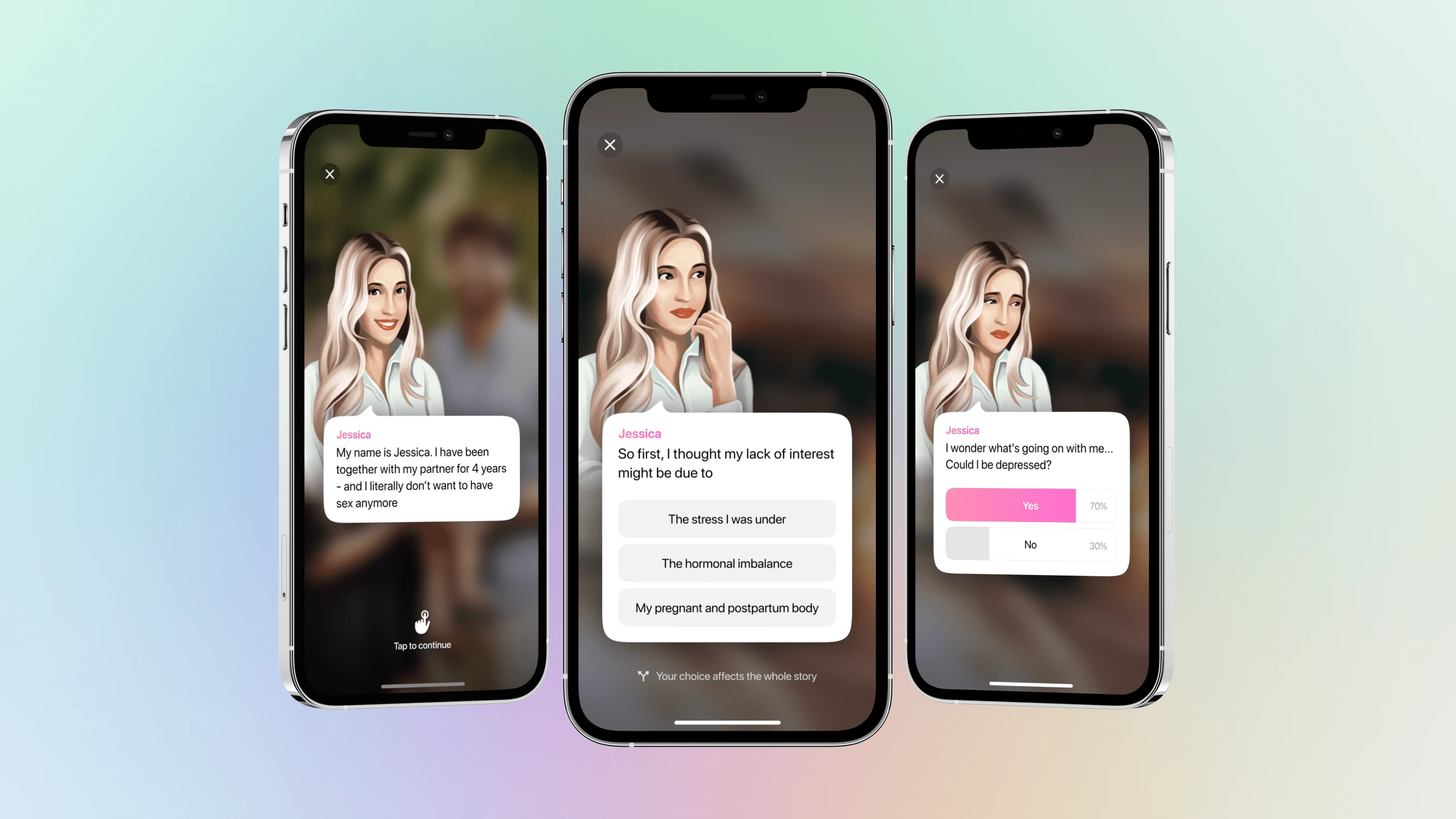
Character screen
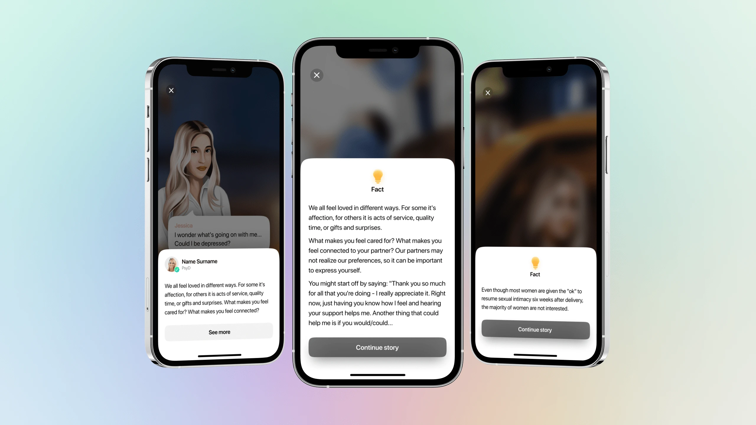
Expert's screen
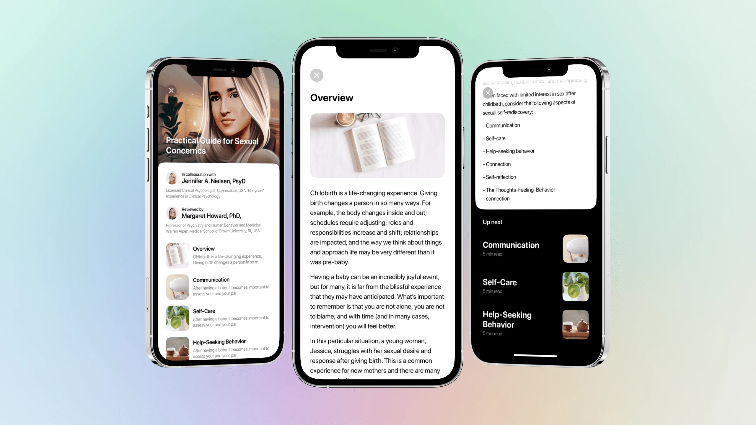
Articles
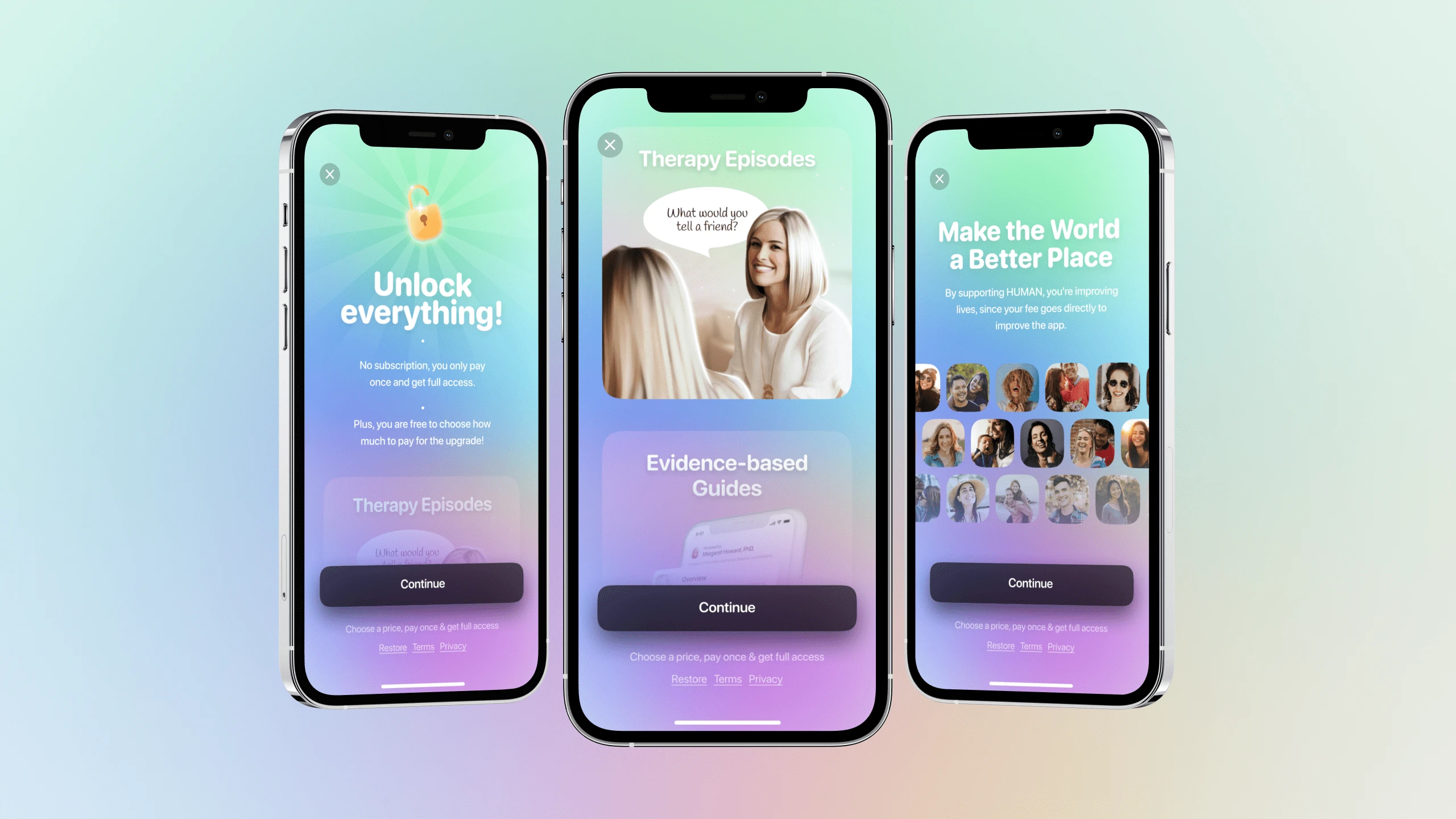
Paywall
Part 2. Flo app
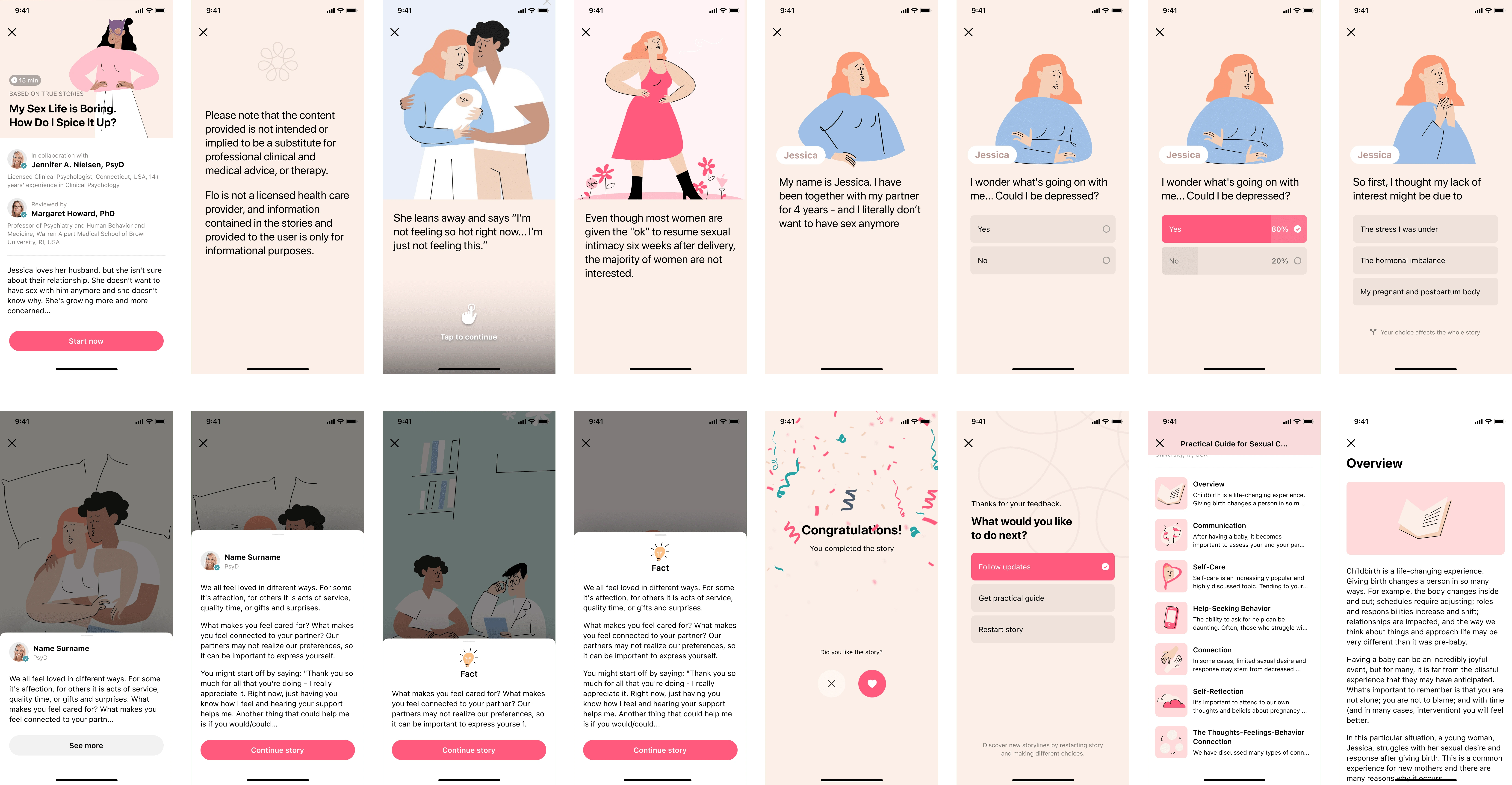
The app’s idea is very important. We wanted to draw the attention of users to their psychological health through the game form and storytelling. How important it is to take care of yourself and contact a specialist on time. Since our audience was mostly women, we collaborated with another mobile application that also worked in the field of women's health - Flo. We adopted our mechanics to the visual brand of Flo and as a result, implemented this functionality within their mobile application.
So, the user could find the story that most resonates in their hearts and somehow describes a similar problem to the user. Going through the story, the user at a certain point had a choice of how this story could continue. At the same time, at a certain point in the story, we showed the comments of certified specialists.
After all, we showed specific recommendations and articles users can read. We don’t solve people's problems, but sometimes, we helped people understand that they may have a problem they need to solve with a specialist or vice versa, they have nothing to worry about since the problem is not a problem, but a completely normal thing that they simply did not know about.
In collaboration with the designers from Flo (and using Flo's brand assets), I designed this part of the product.
Demo
Screen design example
Like this project
Posted Oct 10, 2023
This story is about how we created an app and implemented the same mechanic at the other popular mobile app – Flo.
