Nood - dating mobil app
Maksim Borisov
Nood - is a dating mobile application I designed as a freelance designer. Unfortunately, the mobile application wasn’t published, but it’s not a reason to not to show you my work results. Moreover, as because it was a startup, it was really challenging to provide a big scope of work for a short time.
Ideation
The process of creation started with finding ideas, which should make this application competitive and interesting for users. So not only attractive design but also some “values” was discussed.
Based on these “ideas” I started to find the “brand visual language” of this app. At the same time, based on discussed scopes and scenarios I started to create wireframes.
Research
For a better understanding, of how dating apps should work, I also started with competitor research. But I’m not just looking through dating apps. There are a lot of interesting articles and research, analytics, and test results, which help me understand the social mechanics, and very nice tricks for app monetization which I learned and tried to apply in this app.
For example: “feeling important”. The important thing is to make user happy, by providing him this feeling. While feeling important and in demand, the user interacts with the application more often. There are a lot of mechanics how to do that, honest and not so (so-called dark patterns).
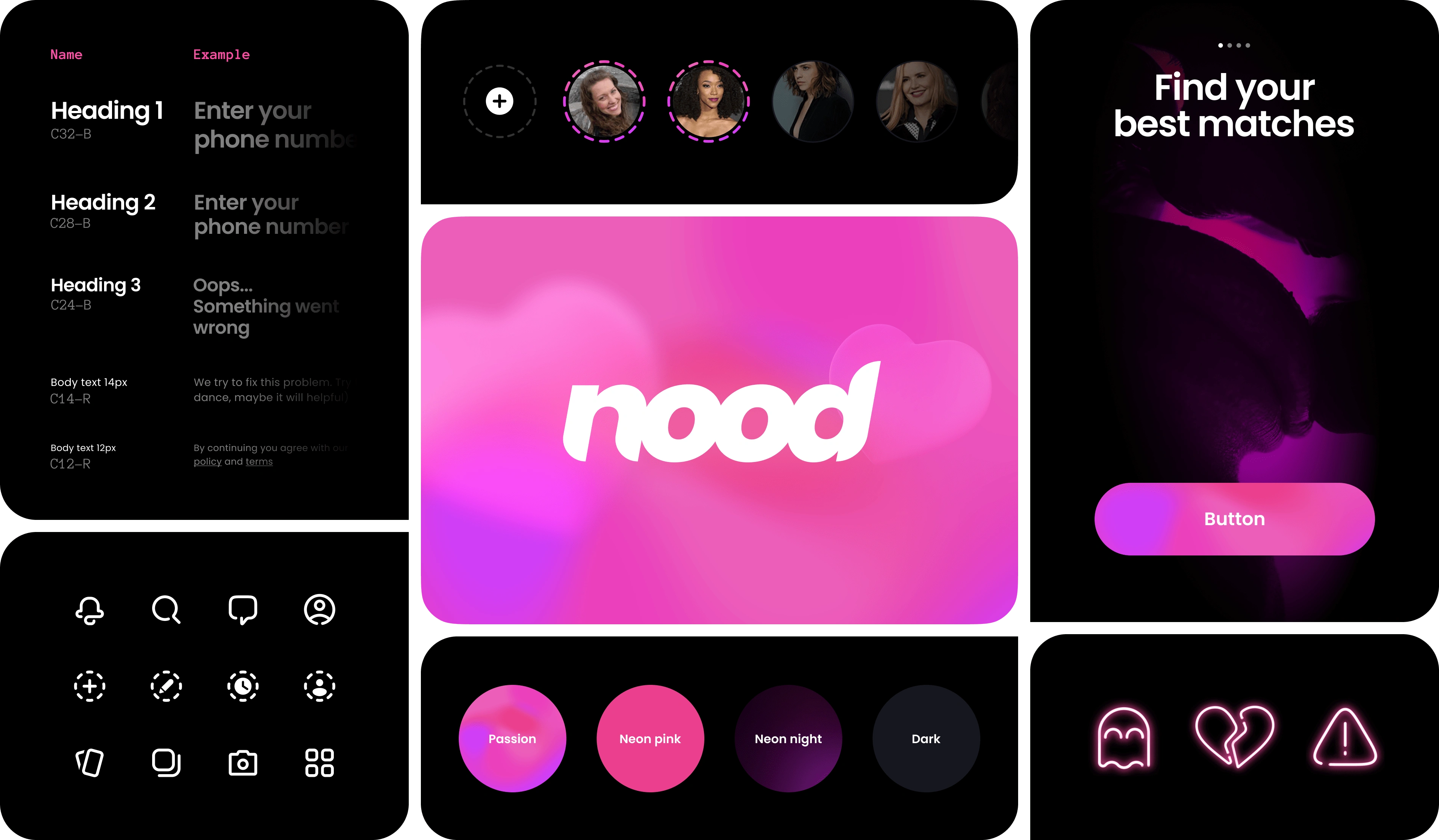
Finding the brand visual language
The first iteration was to prepare 3 key visuals for the client presentation. The process of the finding is below.
Moodboard
The way to find brand visuals usually starts from collecting a moodboard. The moodboard for this project was collected based on client's vision and feelings. So it helps us to understand which visual technics, color combinations and etc. we need to use to achieve the result we want.
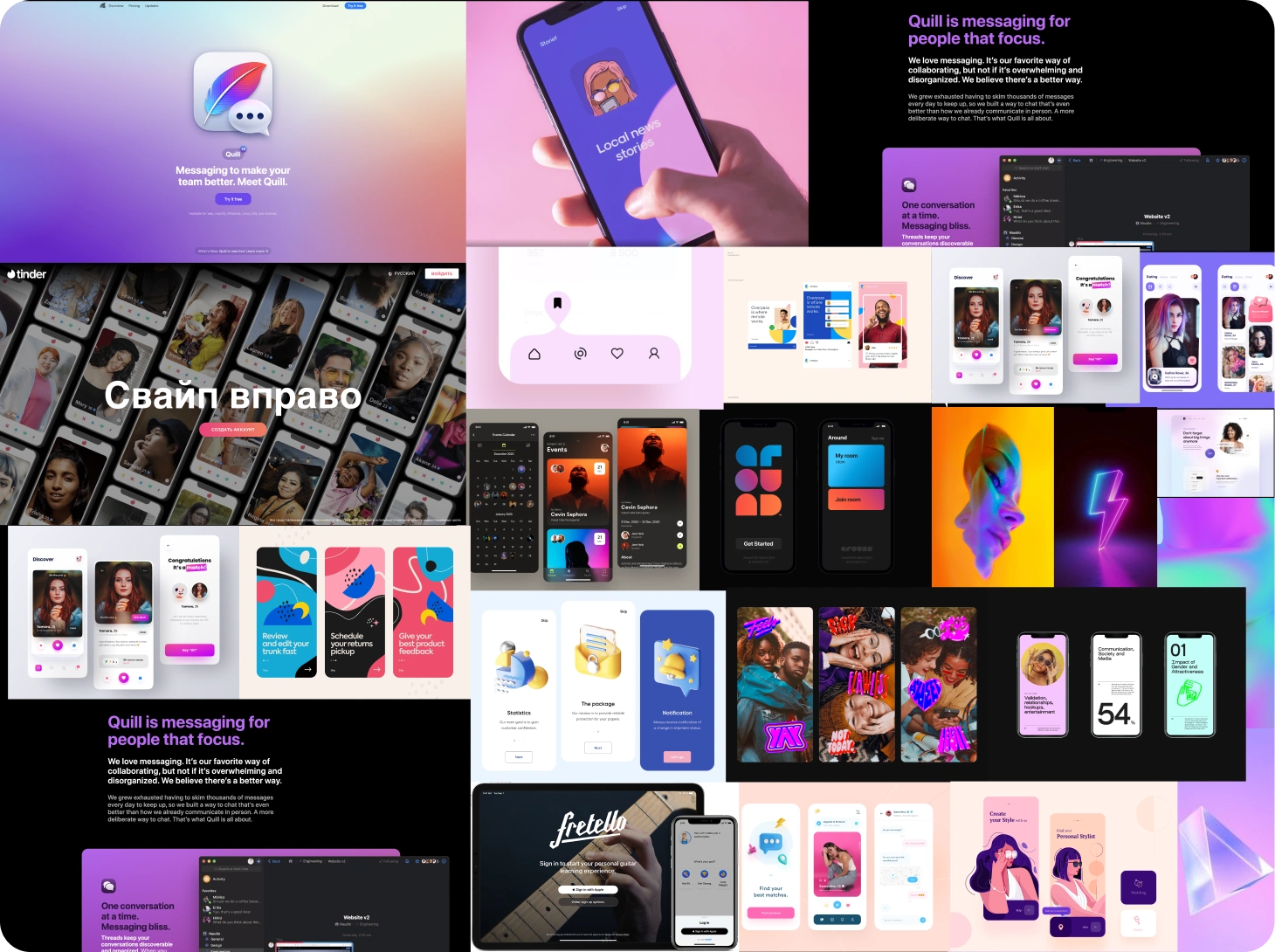
The example of the first moodboard
Proof of concept
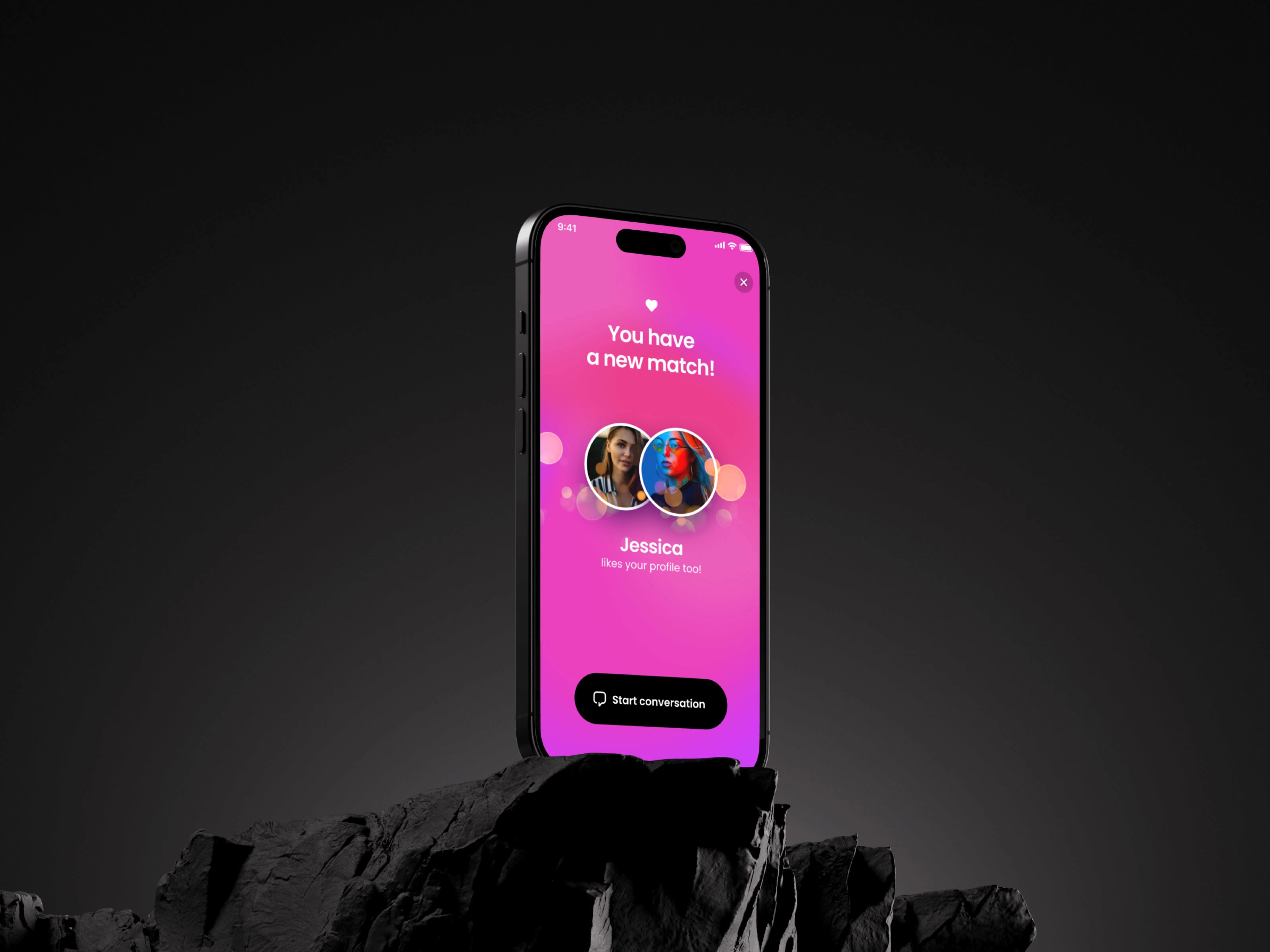
Usually, to find and represent an app visual, I took 2-3 key screens and start “making”. I try different styles, play with layouts and etc., until I will find a perfect matching 😁. I work with “customer expectations”, with the moodboard I created before, my own “researches” about our target audience (what do they like) and last but not least - brand principles. After all this session there was a decision to continue design in the “dark” direction which represent the “night” (most passion time of the day). And “neon pink” was chosen as a main colour.
Wireframing \ Prototyping
Wireframing is one of the most important parts of the design process. It helps, first of all, organize and visualize the necessary scope of functionality, so a team can see what they will do. At the same time, based on well-built wireframes, it’s a good opportunity to make prototypes for testing.
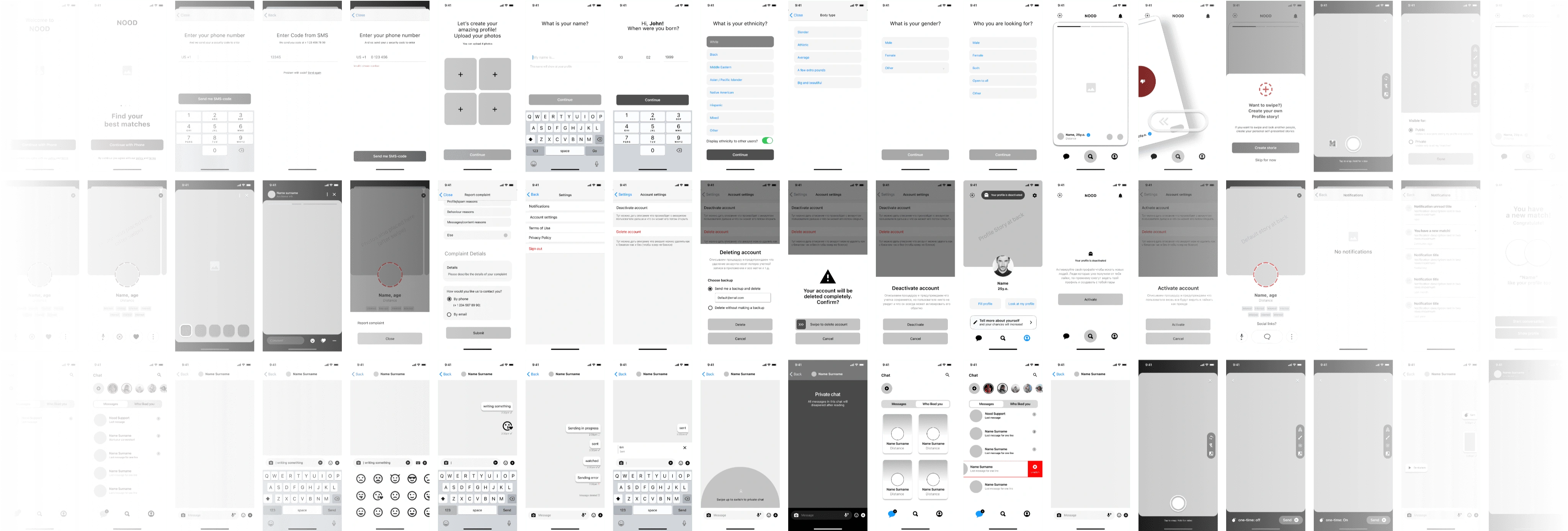
Usually I suggest create 2 types of wireframes and prototypes: Low-level and High-level.
Low-level wireframes and prototypes can help understand and check scenarios and flows (how user can complete their goals through the screens, in the process). For example - registration process, or adding product to the cart and other user scenarios.
High-level wireframes and prototypes can help understand and check concrete functionality on interaction levels, for example - working with filters, input forms, and other use cases.
So than, when brand visual founded, and wireframes are builded, it is time to start make a final design.
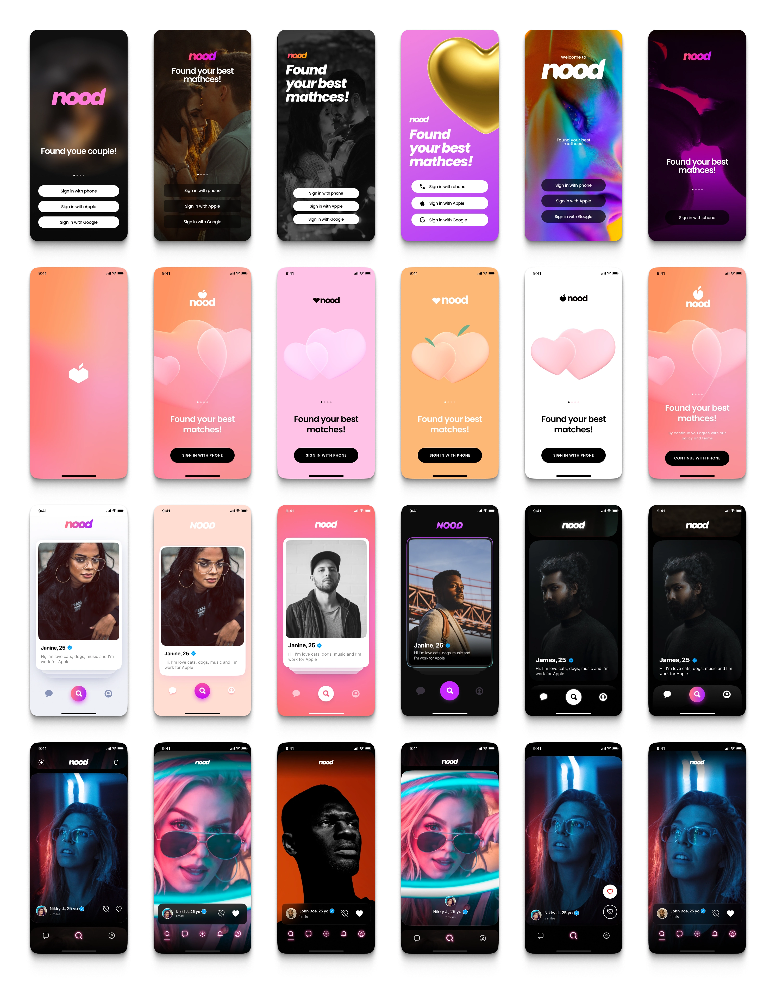
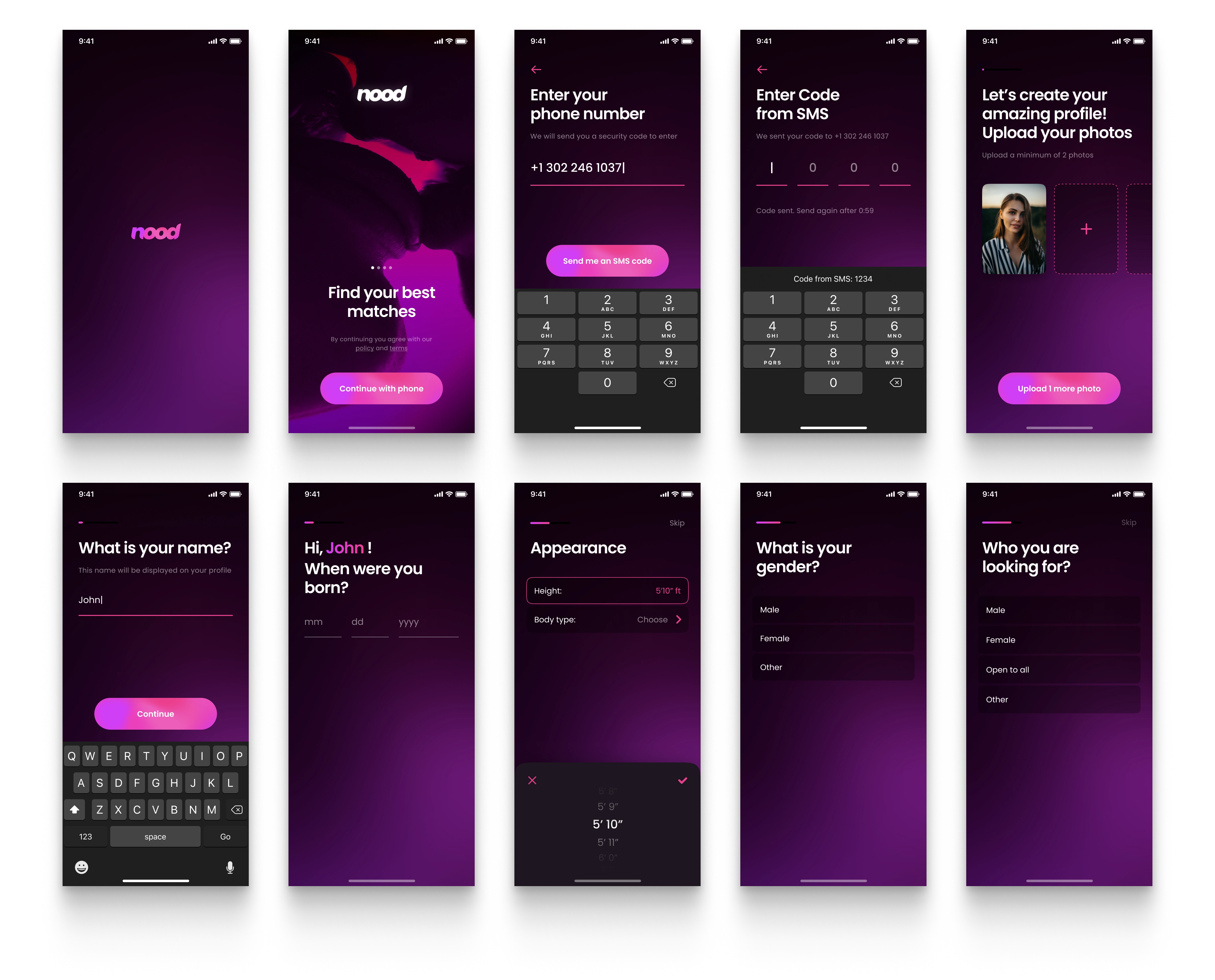
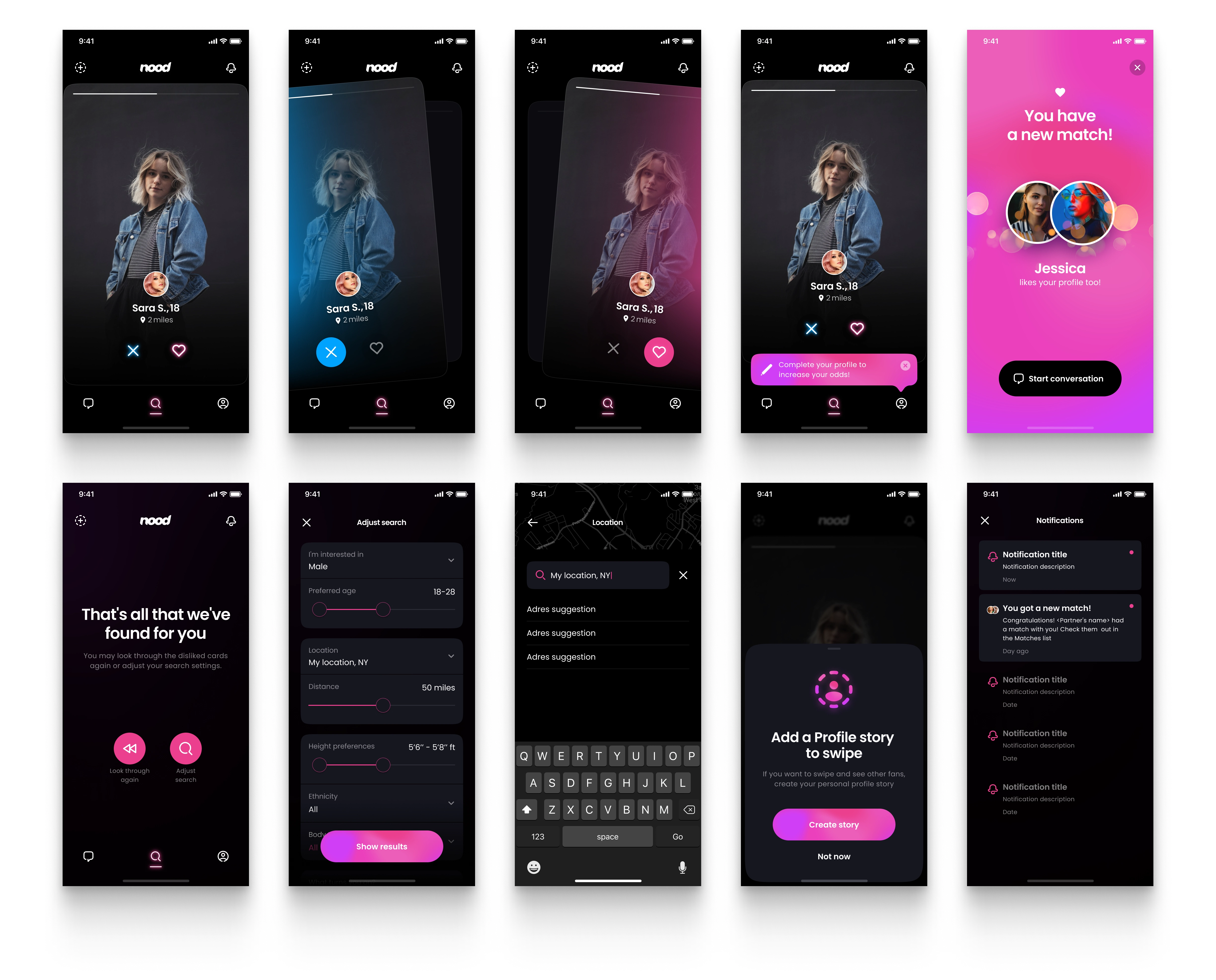
Result
As a result, it was delivered a lot of screens for a big part of app functionality.
Branding
Final design
Entrance screen
Home page screen
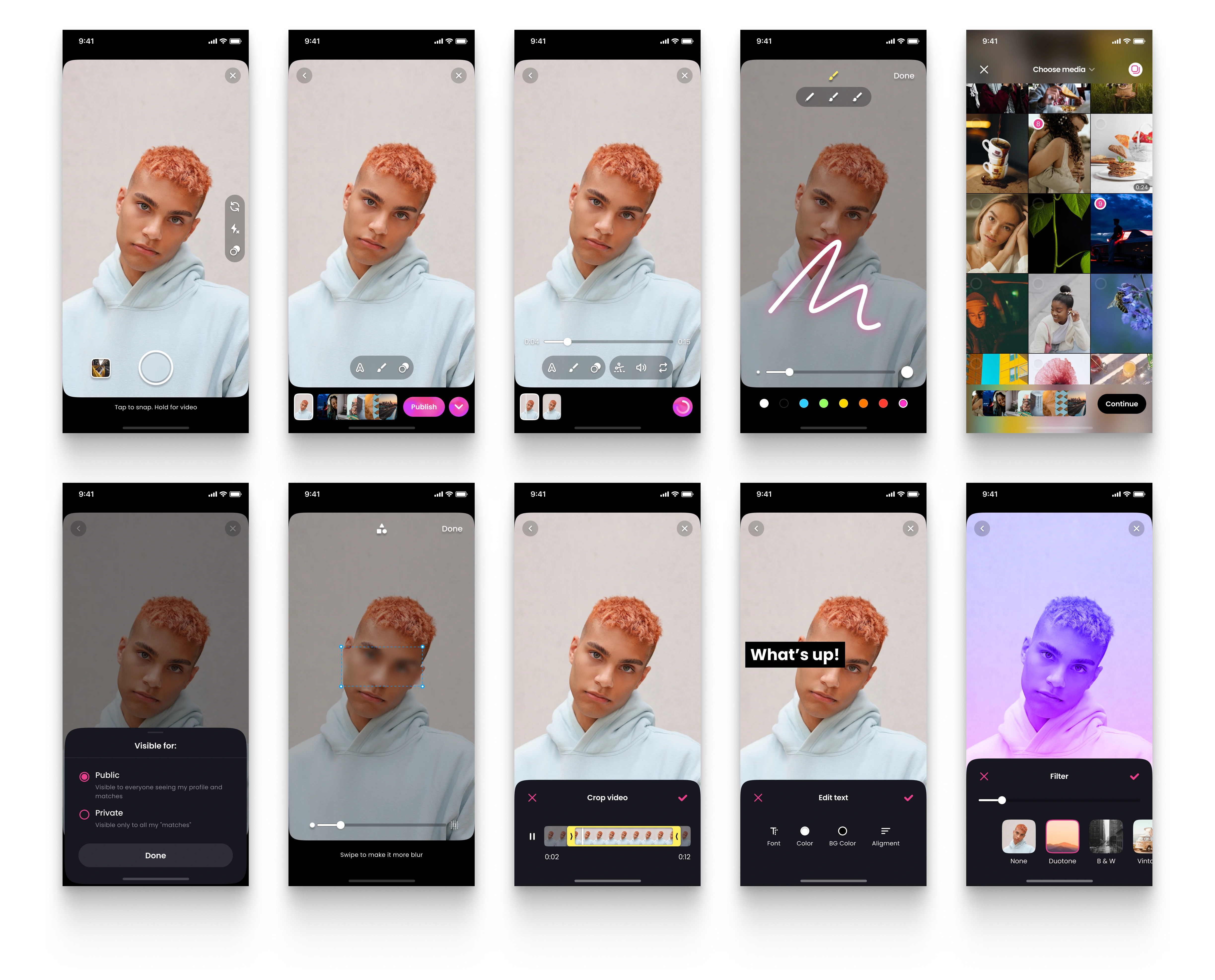
Stories
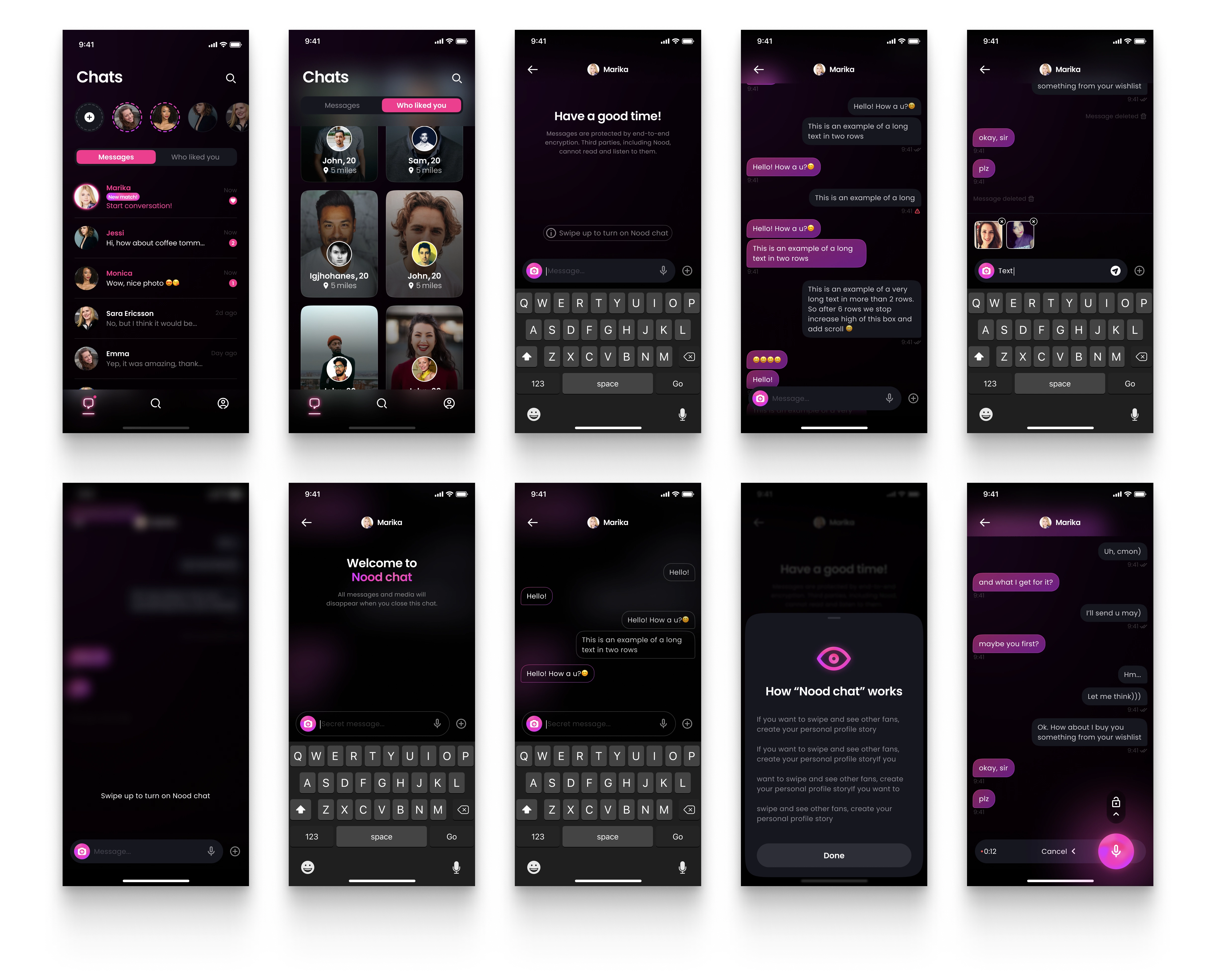
Chat
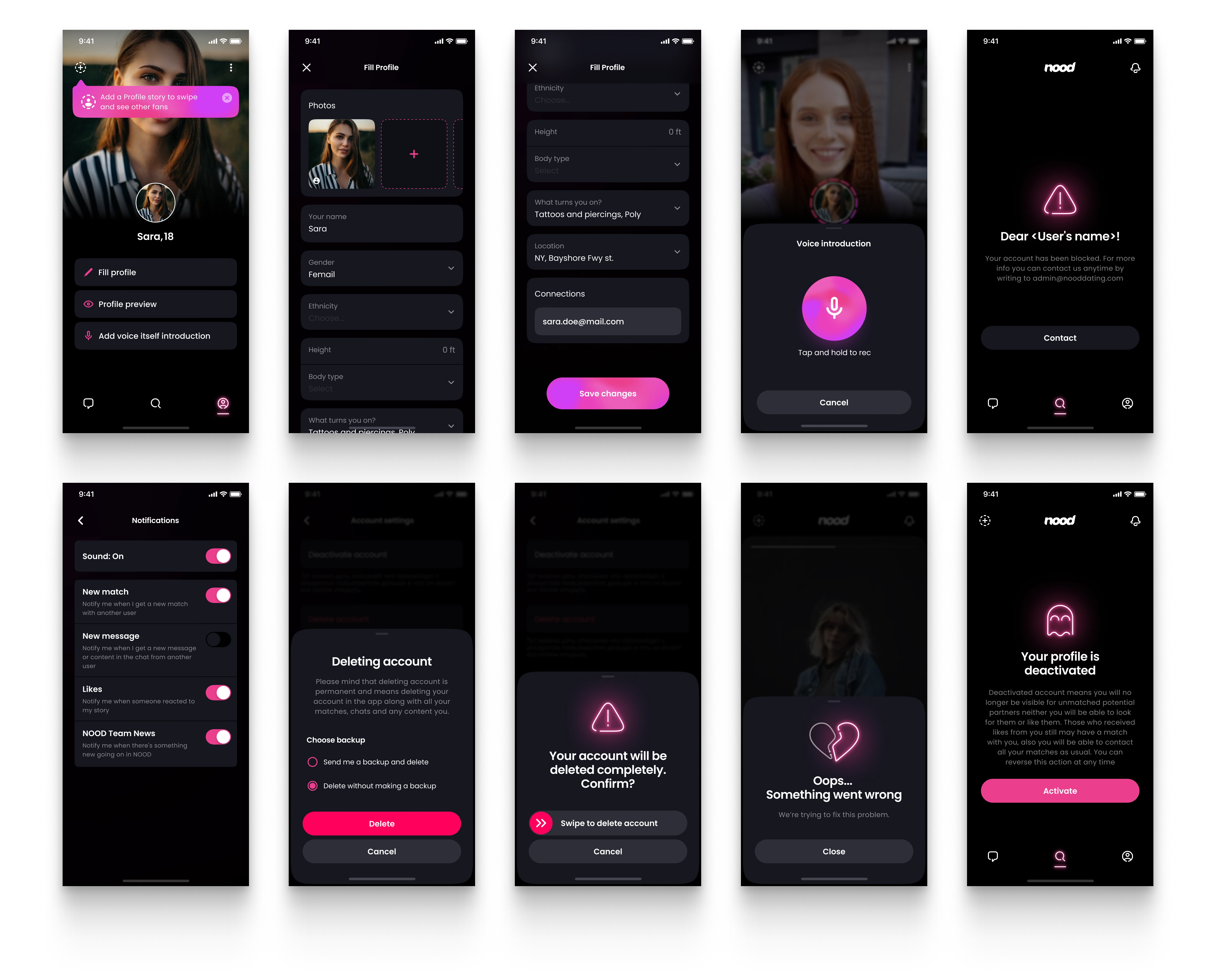
Profile and other
Like this project
Posted Oct 11, 2023
See how I've created the dating mobile app design from scratch.
Likes
2
Views
1.4K