
The starting point
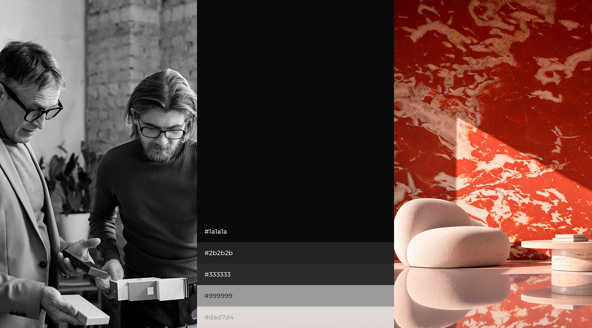
A logo, three colours and a lot of very flat stone photography. With that, we had to show that every piece is unique.
What we achieved
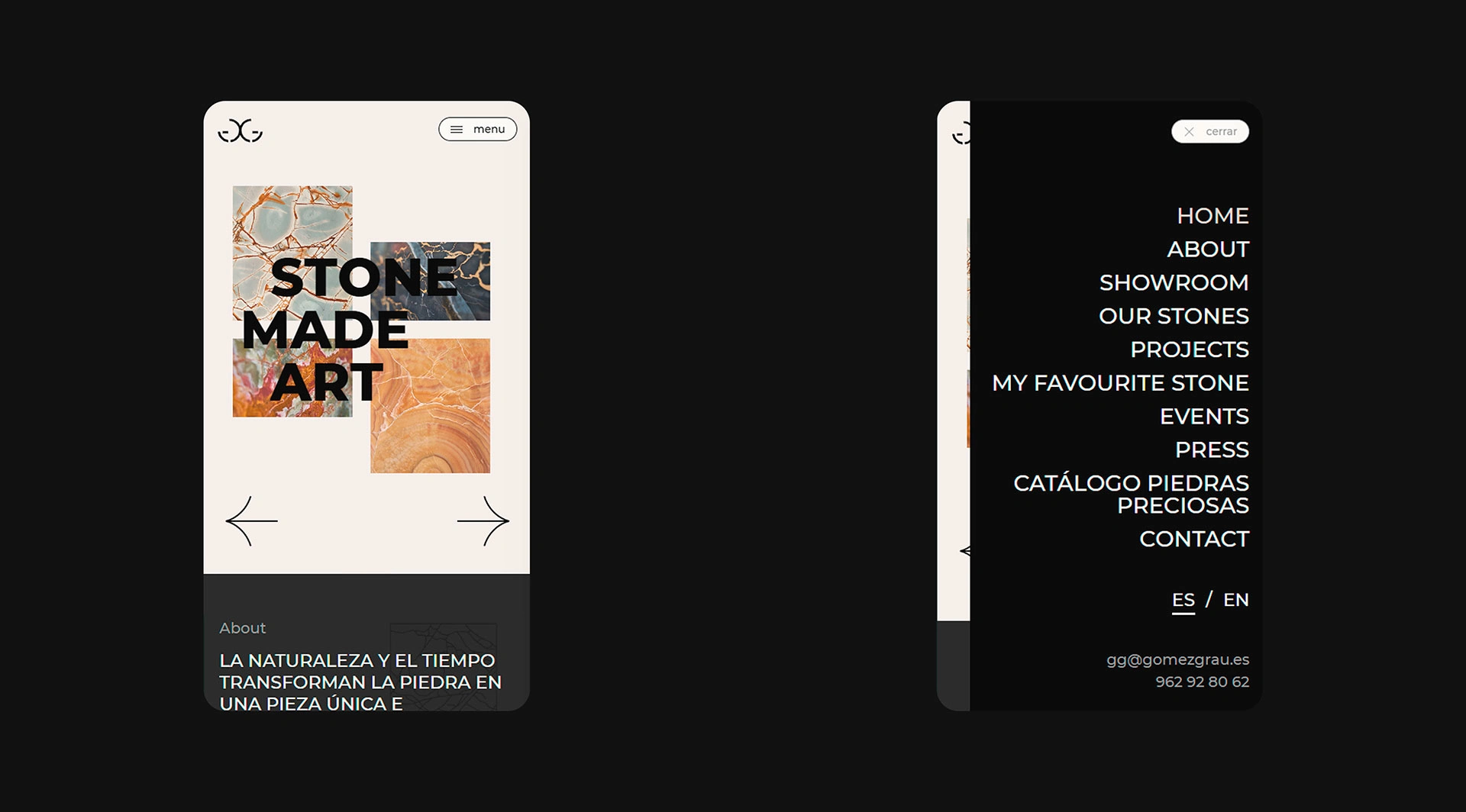
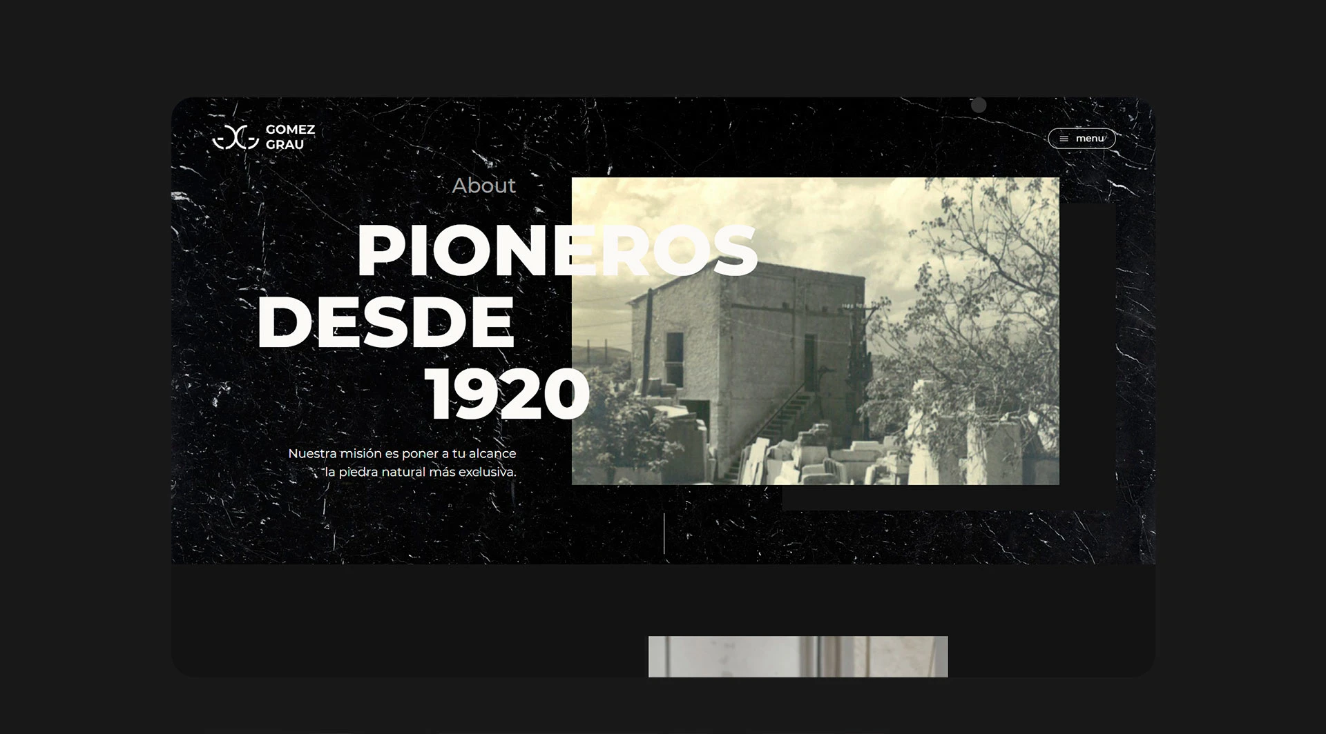
We expanded the brand without touching its foundations. Using the logo and the three colours as a starting point, we defined a visual language for the website that feels elegant and distinctive, closer to an architecture magazine than a materials catalogue. The result is a website with authorial character, built for an audience of architects and interior designers who see a lot of material and can tell the difference at a glance. Here, stone is presented for what it is: a unique piece for projects that want to stand apart.
Depth where there was none
Where the photos fell flat, we created depth. Broken-up layouts that step outside the usual grid, and textures that, by contrast, highlight the simplicity of everything else. The stone stops looking like a catalogue shot and shows all its nuances.
The details
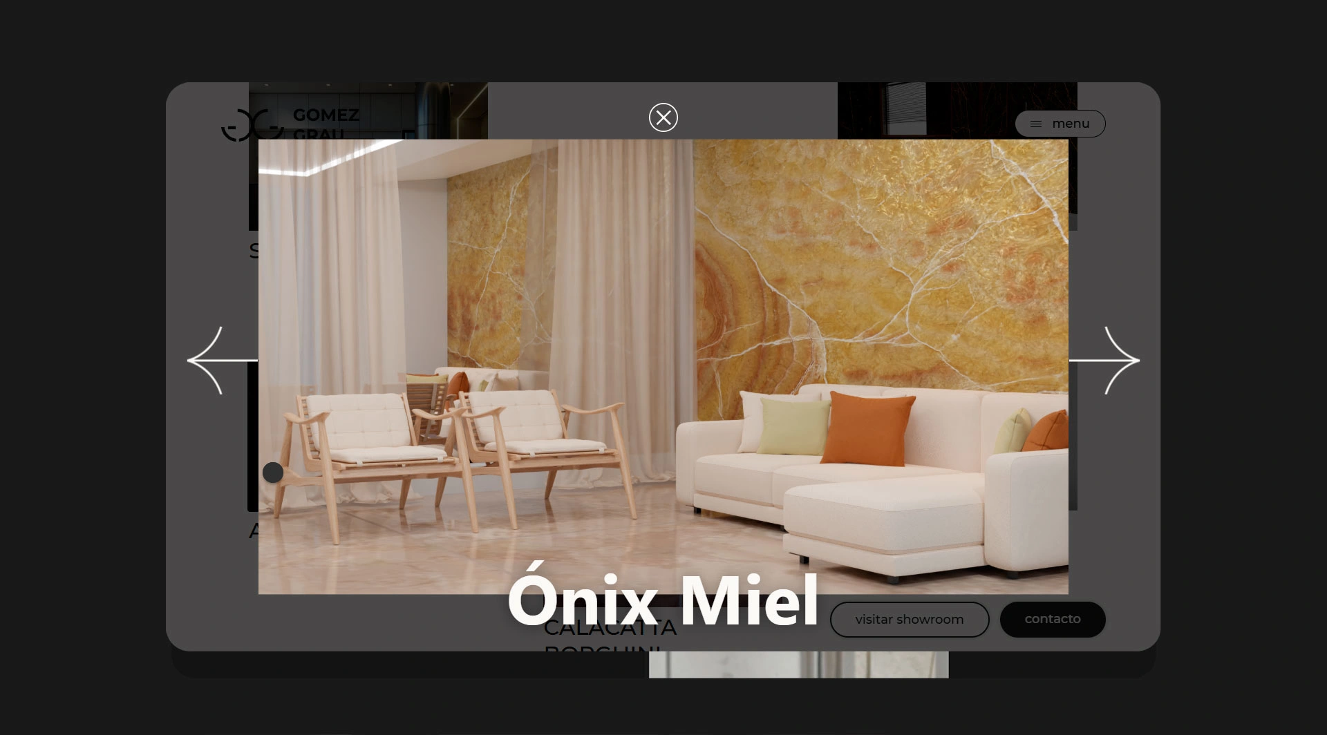
What moves, gets noticed. We chose a handful of micro-animations and placed them where they add rhythm without stealing the spotlight from the material. A website built on still photography comes to life, invites visitors to take their time and leaves the same feeling as a fine piece of stone: something crafted down to the last detail.
0 likes · 0 views · Sep 3, 2026
Unique natural stone for standout architecture. From a logo and three colours, we built an elegant website with an authorial feel, worthy of the material.


