
The starting point
A studio making handmade work, from illuminated wooden signs to decorated spaces, that needed a name, a voice and an identity that could hold it all together.
What we achieved
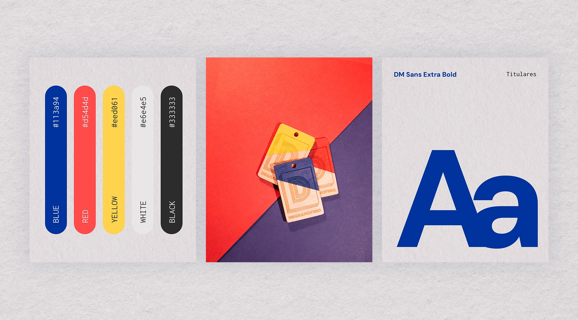
We started with the name. Degranofino plays on the grain of wood and the idea of fine craftsmanship: it sounds like a trade and says what the studio does. From there, we built a bold, confident identity: five colours (blue, red, yellow, white and black), a heavyweight typeface and a simple logo that works just as well engraved in wood as it does on a screen. A brand designed to live alongside real materials.
Art direction beyond the screen
The same colours and type come to life in illuminated wooden signs, tags, decorated spaces and hand-painted pieces. Every commission is different, but they all clearly belong to the same house.
A website with a workshop soul
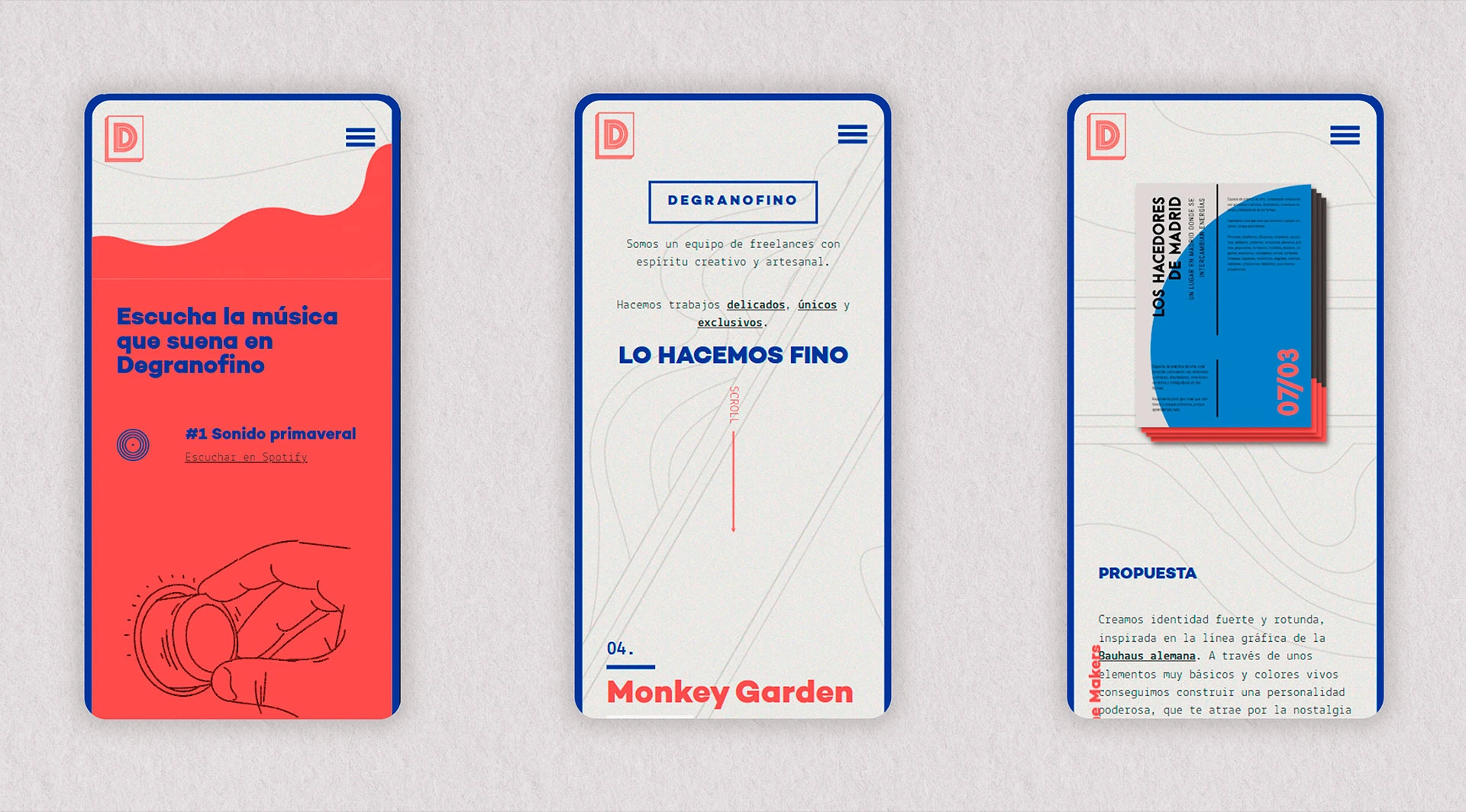
We designed and built a website that presents each project as a short story, with paper-like backgrounds, line illustrations and even a playlist of the music that plays in
0 likes · 0 views · Nov 10, 2026
Naming, brand and website for a studio of handmade work: illuminated wooden signs, hand-painted pieces and art direction, with one identity across all of it.


