Brand Guidelines
Abdullah Sartaj
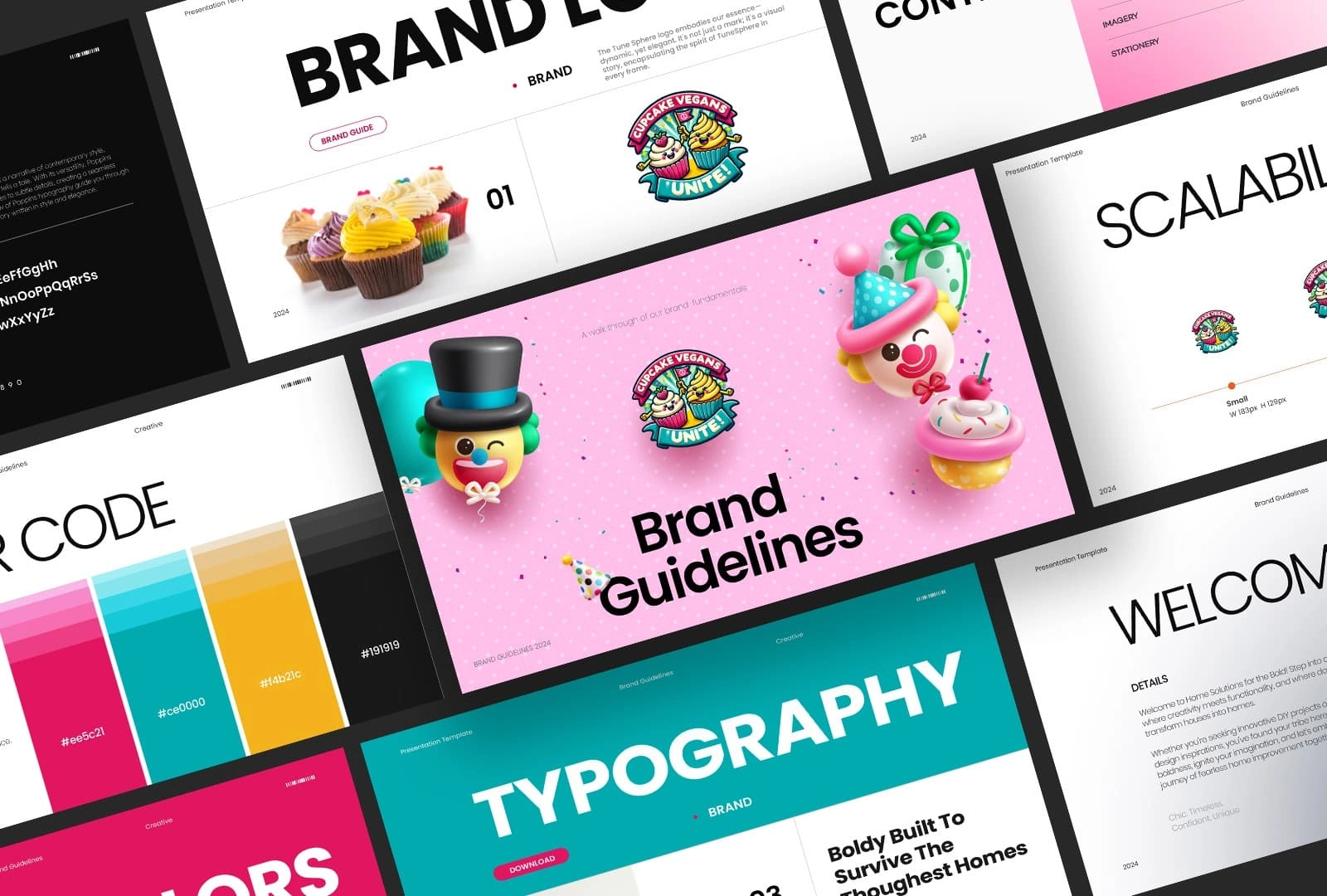
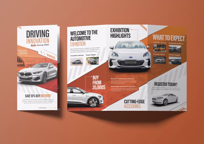
Cupcake Vegans Unite-Brand Guidelines
Case Study 1: Cupcake Vegans Unite – Brand Guidelines
Overview:
Cupcake Vegans Unite is a whimsical, family-friendly brand combining fun, flavor, and values. The brand guideline focuses on playful energy and accessibility while aligning with ethical food values.
Objective:
To design a vibrant, character-driven guideline that encapsulates the spirit of celebration, joy, and inclusivity—aligned with the brand’s commitment to plant-based fun.
Approach:
Visual Identity: Iconic, cartoon-style characters were central to the identity. A bold custom wordmark was used to maintain recognition across scales and devices.
Color Palette: A bright and lively color scheme (pink, teal, yellow, black, and white) reflects a sense of youthfulness and joy. The palette was coded with hex values for precise implementation.
Typography: A bold geometric sans-serif font was selected to communicate modernity and readability across media formats, from packaging to mobile screens.
Scalability: The guide includes detailed guidance on logo sizing and usage across various dimensions.
Presentation Style: Diagonal compositions and oversized elements add excitement and draw attention, mirroring the personality of the brand.
Outcome:
The guide gave Cupcake Vegans Unite a strong, cohesive identity that was both scalable and emotionally resonant. It improved brand recall and ensured seamless execution across packaging, digital, and in-store branding.
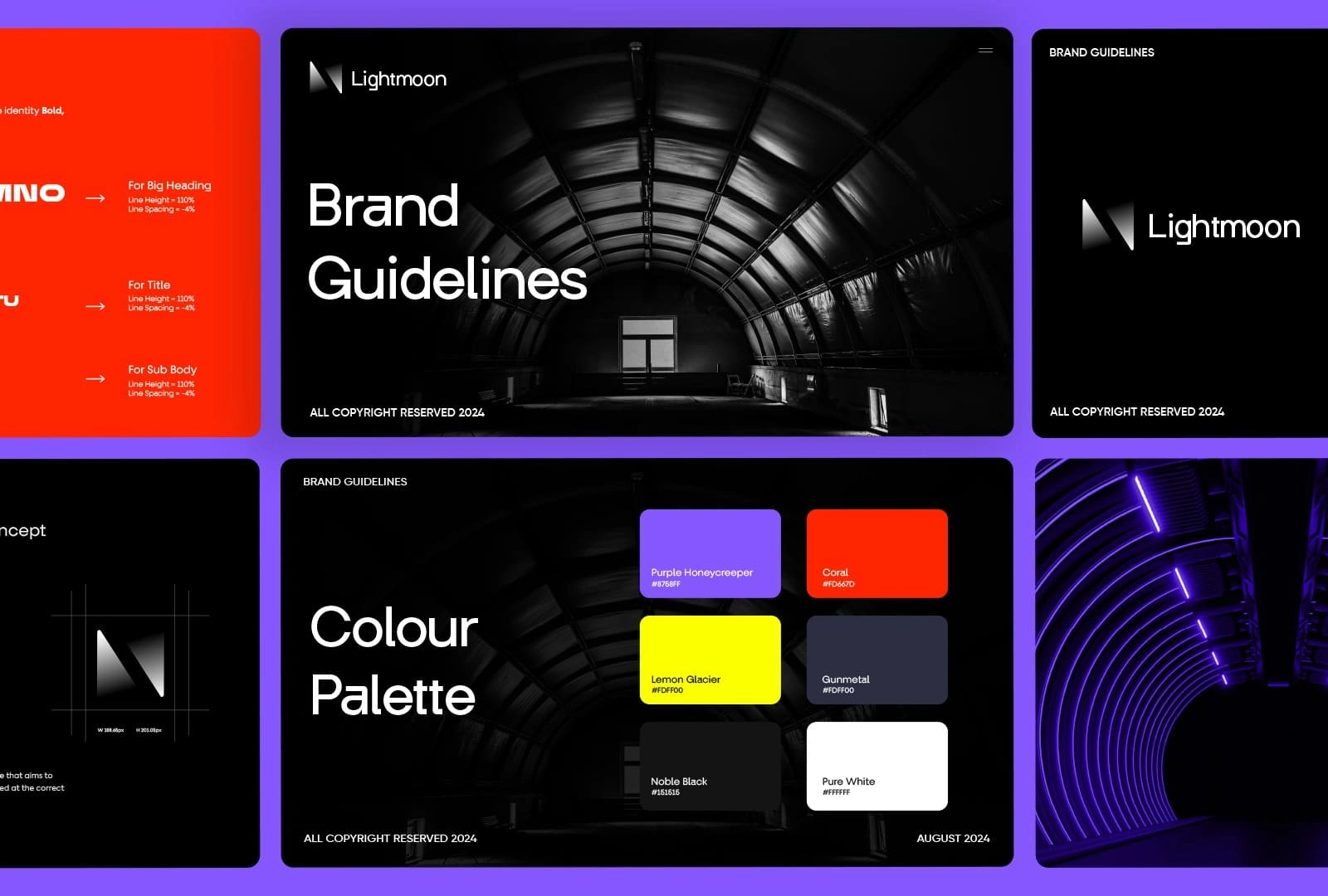
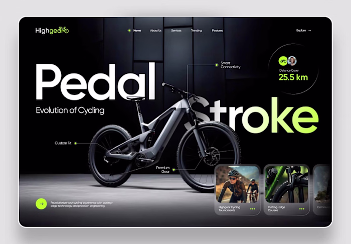
Lightmoon-Brand Guidelines
Case Study 3: Lightmoon Brand Guidelines
Overview:
Lightmoon is a high-concept, tech-inspired brand positioned at the intersection of innovation and mystery. The brand guideline presents a dark, cinematic identity supported by a futuristic aesthetic.
Objective:
To create a visually bold and immersive brand guideline that captures the essence of Lightmoon’s forward-thinking, mysterious character.
Approach:
Logo System: The logo system was built on a dynamic grid, with emphasis on geometric precision and balance. A grayscale version ensures it adapts across dark and light environments.
Color Palette: Contrasting neons (purple, coral, lemon yellow) against deep blacks convey energy and innovation. This palette evokes a tech-luxe, sci-fi vibe.
Typography: A custom modular font style was used for key headings, paired with clean sans-serif fonts for body copy. Line spacing and font weight were optimized for digital reading.
Photography: Architectural and tunnel-like imagery with deep shadows reinforce the brand's mysterious and futuristic theme.
Structure: The guide’s consistent use of black backgrounds and centered compositions gives it a monolithic, immersive quality.
Outcome:
The Lightmoon brand guidelines established a strong visual identity system for tech campaigns, product packaging, and motion graphics. Its futuristic mood created a lasting impression and differentiated the brand in a competitive market.
Like this project
Posted Jun 30, 2025
A cohesive, modern brand guideline design that defines visual identity clearly and consistently to strengthen brand recognition and trust.