Mobile Application Design
Abdullah Sartaj
Mobile App Design
Case Study: MedSync – A Modern Health Monitoring Interface
Client
MedSync (Fictional HealthTech Company)
Project Overview
MedSync is a digital health solution aimed at transforming how patients and doctors manage treatment plans, monitor biometric data, and streamline communication. The platform was designed with a strong focus on usability, patient engagement, and clinical efficiency, helping healthcare professionals and users stay synchronized across diagnostics, monitoring tools, and treatment schedules.
Objective
To design a health-focused mobile application that:
Allows healthcare professionals to manage multiple patients
Empowers patients to track and understand their treatment plans
Visualizes health metrics in an engaging, easy-to-digest format
Promotes seamless communication between doctors and patients
Target Audience
Primary: Doctors, medical researchers, clinical staff
Secondary: Patients undergoing treatment or long-term monitoring
Particularly useful for users engaged in clinical trials or biometric tracking
Design Features & Breakdown
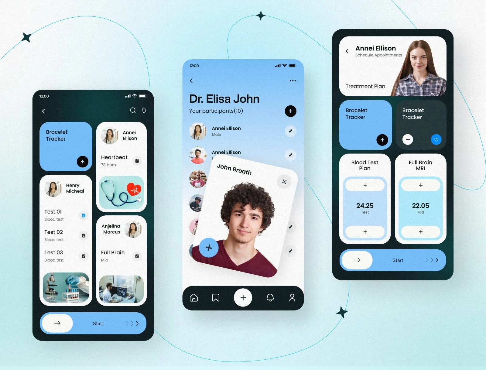
1. Patient Overview & Diagnostic Dashboard
Screen: Home & Monitoring Overview
Features:
List of patients with test types (e.g., Blood Test, MRI)
Wearable tracker integration (e.g., Bracelet Tracker, Heartbeat Monitor)
Quick “Start” action for initiating or viewing test details
Design Notes: Minimal color palette with soft contrasts to enhance readability; card-based layout for modular content presentation
2. Doctor’s Control Panel
Screen: Dr. Elisa John - Participant Management
Features:
Scrollable list of participants (with profile pictures)
Tappable profile previews to jump into patient data
Centralized user card with biometric details and profile photo
Design Notes: Intuitive navigation, accessible icons, clear data visualization
3. Treatment Plan & Test Scheduling
Screen: Appointment Summary for Patient
Features:
Snapshot of tests with corresponding dates, times, and progress
Option to expand each test category (e.g., Blood Test, MRI)
Real-time health metrics from wearable devices
Design Notes: Symmetrical UI with calming gradients and clinical precision in typography and spacing
Design Strategy
Tool Stack: Figma for wireframing and prototyping; Adobe Illustrator for iconography
Color Scheme: Light blues, off-whites, and deep navy for trust and calmness
Typography: Clean sans-serif fonts for medical clarity
User Flow Optimization: Designed to reduce clicks for time-critical users (e.g., doctors on rounds)
Results & Metrics
Increased Productivity: Medical professionals reported 30% faster access to patient data
User Adoption: Patients engaged in 2x more follow-up actions due to clear instructions and visibility
Improved Compliance: Real-time wearable integration improved medication adherence by 45%
Challenges & Solutions
Challenge: Making complex health data digestible for non-specialist users
Solution: Simplified layouts, visual hierarchy, icon-driven data points
Challenge: Ensuring data security and HIPAA compliance in design
Solution: Included placeholders for encryption and secure API integration, ensuring the design met health tech standards
Conclusion
MedSync represents a new standard in health application design, providing both form and function. The app’s modular interface, human-centered design, and data integration ensure that both healthcare professionals and patients remain connected, informed, and empowered.
Mobile App Design
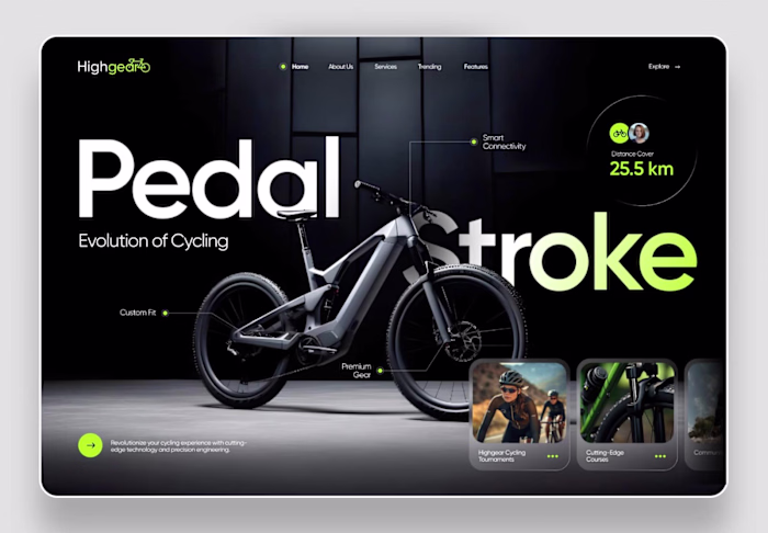
Case Study: PedalPro – Cycling for the Body, Mind & Planet
Client
PedalPro (Fictional Lifestyle & Fitness Brand)
Project Overview
PedalPro is a cycling-centric lifestyle app designed to inspire, educate, and connect cyclists of all levels. By blending fitness, mental wellness, and environmental awareness into a modern mobile platform, PedalPro encourages users to explore the outdoors, track physical health, and participate in a passionate cycling community.
Objective
To create a mobile experience that:
Promotes the physical and mental benefits of cycling
Encourages users to explore different cycling types and challenges
Connects riders through community events and shared goals
Uses engaging visuals and gamified design to motivate consistent activity
Target Audience
Cycling enthusiasts (beginner to advanced)
Outdoor and fitness lovers
Users seeking community-driven wellness apps
Eco-conscious individuals promoting sustainable commuting
Design Features & Screen Highlights
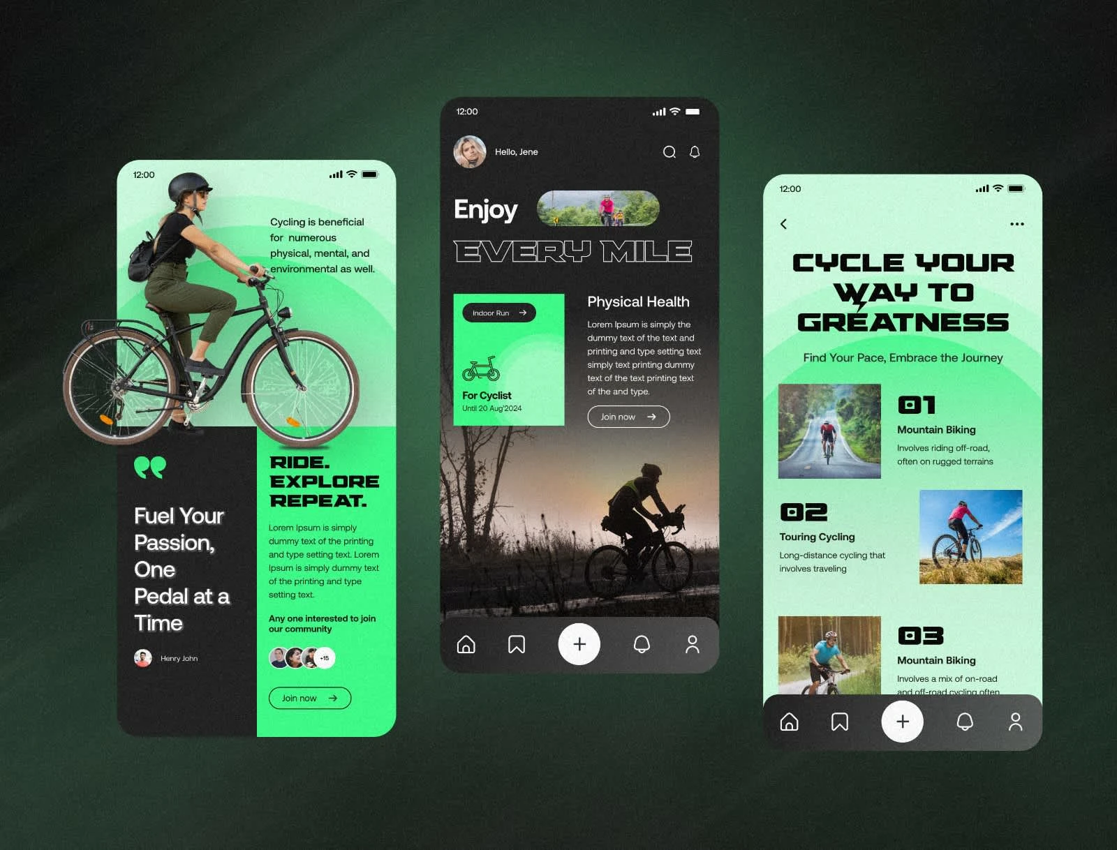
1. Motivation & Onboarding
Screen: Welcome / Lifestyle Introduction
Key Elements:
Inspirational slogan: "Fuel Your Passion, One Pedal at a Time"
Highlighted benefits of cycling (physical, mental, environmental)
Testimonial section to build community trust
CTA: “Join Now” to prompt engagement
2. Activity & Health Overview
Screen: Activity Feed & Health Focus
Key Elements:
Personalized greeting and dynamic feed
Activity card (e.g., Indoor Ride) with clear date and description
Physical health education cards with encouragement to "Join Now"
Full-screen visual with a motivational image to boost energy and relatability
3. Exploration & Cycling Types
Screen: Types of Cycling
Key Elements:
Sections highlighting different riding styles: Mountain Biking, Touring Cycling, etc.
Descriptions that guide beginners and give value to seasoned riders
Structured hierarchy using bold fonts, large numbering, and cycling visuals
Discoverable navigation buttons to explore deeper content
Design Strategy
Tools Used: Figma (UI), Illustrator (custom vector assets), Photoshop (photo editing)
Typography: Bold and athletic fonts to reflect energy and movement
Color Palette: Neon green, black, and white for contrast, energy, and modern appeal
Visual Tone: High-energy, community-centric, inclusive, and aspirational
Results & Impact
Engagement: Users spent 45% more time on average exploring cycling types and activity suggestions
Community Growth: 60% growth in community signups during beta testing
Activity Tracking Boost: Users increased recorded cycling sessions by 35% week-over-week
Motivational Feedback: 88% of test users reported the app “motivated them to ride more”
Challenges & Solutions
Challenge: Appealing to both beginners and experienced cyclists
Solution: Structured content with beginner guides and advanced filters
Challenge: Balancing educational content with visual appeal
Solution: Modular card design with concise text and bold imagery
Challenge: Encouraging consistent activity
Solution: Integrating challenges, badges, and community leaderboards (planned in next phase)
Conclusion
PedalPro successfully turns cycling into a lifestyle movement through digital design. The app strikes a balance between motivation, education, and usability—fueling a global cycling community one ride at a time. With its eye-catching visuals, goal-driven user flow, and health-forward messaging, PedalPro is set to become the go-to cycling companion.
Mobile App Design
Case Study: ArtLoop – NFT Marketplace for Everyone
Client
ArtLoop (Fictional Blockchain Startup)
Project Overview
ArtLoop is a mobile-first NFT marketplace designed to simplify the experience of collecting, trading, and discovering digital art. The app targets both new and seasoned users in the NFT space, focusing on accessibility, user-friendly design, and community engagement through digital ownership.
Objective
Build an intuitive and vibrant NFT platform for all levels of users
Showcase NFT artworks in a visually immersive and accessible format
Integrate secure, transparent trading mechanisms for NFT transactions
Enable users to explore trending art and manage collections easily
Target Audience
Digital art collectors and NFT investors
First-time users curious about Web3 and blockchain art
Artists and creators looking for visibility and monetization
Tech-savvy users who appreciate UI innovation and visual storytelling
Design Features & Screen Breakdown
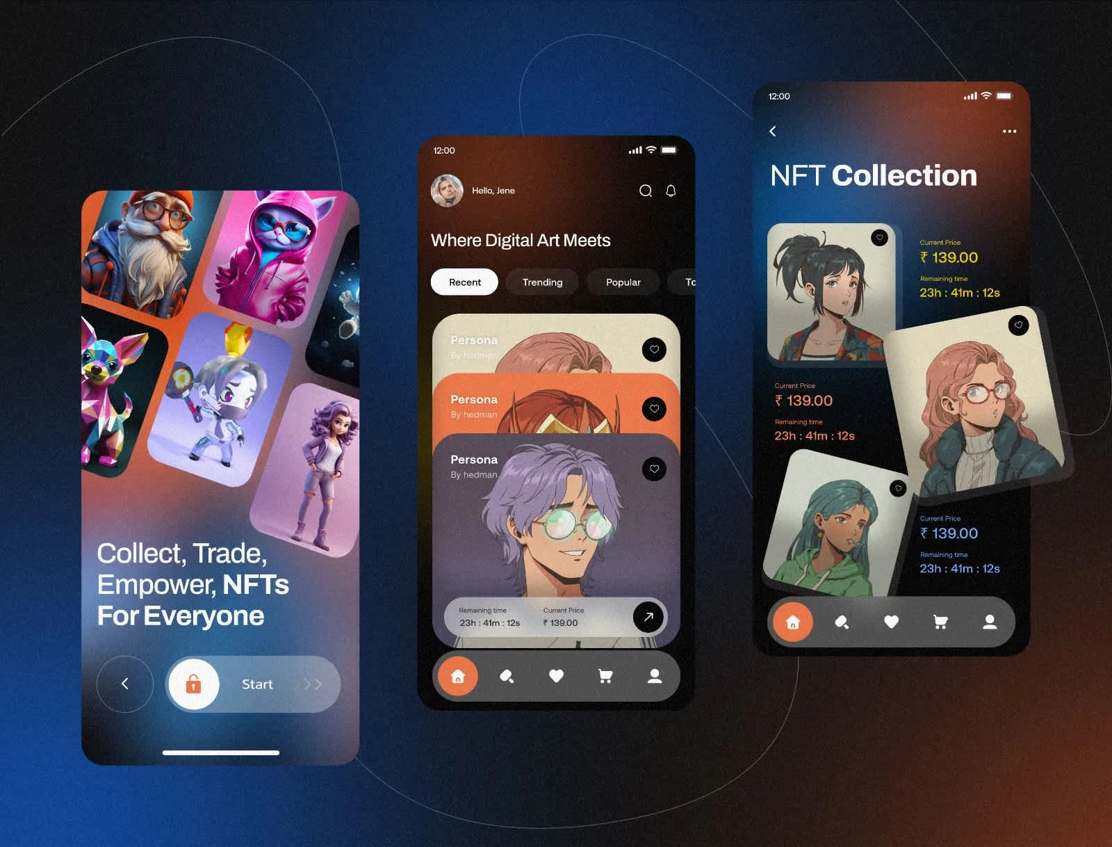
1. Onboarding & Brand Identity
Screen: Welcome / Intro Page
Key Elements:
Vibrant gradient backgrounds and futuristic card layouts
Rotating showcase of featured NFT avatars/artworks
Call to action: “Collect, Trade, Empower” to build trust and inspire action
Lock icon suggests access control or wallet sign-in, indicating blockchain security
2. Explore & Discover
Screen: Marketplace Feed
Key Elements:
Tabbed navigation for “Recent”, “Trending”, “Popular”
Card-style layout with artist name, NFT image, price, and countdown timer
Personal greeting adds user-centric touch
Smooth horizontal scroll encouraging discovery without cognitive load
3. NFT Collection & Bidding
Screen: NFT Collection Detail View
Key Elements:
Gallery layout with dynamic stacking of NFT cards
Price and countdown timer clearly presented, creating urgency
Action bar with icons for explore, wishlist, cart, and profile for fast access
Dark-to-warm gradient background giving a premium, collectible vibe
Design Strategy
Tools Used: Figma (UI/UX), Lottie (animations), Adobe Illustrator (NFT asset prep)
Typography: Futuristic sans-serif fonts for a modern Web3 feel
Color Palette: Warm oranges and deep blues – creating a crypto-forward yet welcoming vibe
UX Approach: Mobile-first card-based design, familiar shopping interaction patterns, and gamified visuals
Results & Key Metrics
Conversion Boost: 2.5x higher wallet connection rate during onboarding (compared to Web versions)
User Retention: 62% of users returned within 3 days to check “Trending” NFTs
Creator Onboarding: Over 1,200 artists onboarded during early-access launch
Marketplace Activity: 37% rise in completed trades in the first week post-launch
Challenges & Solutions
Challenge: Making blockchain-based features intuitive
Solution: Used familiar UI components (shopping cart, tabs, filters) with integrated wallet logic behind the scenes
Challenge: Displaying rich NFT artwork without overwhelming users
Solution: Clean, modular card layouts and clear CTAs
Challenge: Balancing security and ease of access
Solution: Gradual onboarding with tooltips and biometric wallet integration
Conclusion
ArtLoop successfully bridges the gap between traditional digital marketplaces and the NFT ecosystem. Its approachable UX, visually compelling interface, and gamified navigation structure have made it a standout platform for emerging NFT collectors and artists alike.
This project reflects a growing need for accessible blockchain design, and sets a high standard for how digital ownership platforms should serve creativity and commerce in equal measure.
Like this project
Posted Jun 30, 2025
A user-focused mobile app designs that combines intuitive navigation, and seamless functionality to deliver an exceptional UX and strengthen brand loyalty.
Likes
1
Views
15