Logo Design
Abdullah Sartaj
Logo Design for LUXEBOLT
Case Study 1: LUXEBOLT
Overview
LUXEBOLT is a premium brand rooted in high performance, strength, and modern aesthetics. This project aimed to develop a bold, dynamic identity that would resonate with an audience drawn to innovation and action.
Objectives
Develop a striking logo symbolizing energy and sophistication.
Establish a color palette and type system reflecting strength and luxury.
Create visual assets that connect the brand with athletic performance and cutting-edge design.
Design Execution
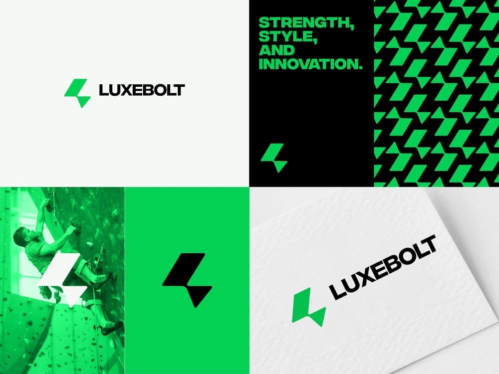
Logo: The abstract lightning bolt mark represents speed, precision, and power—matching the name “LUXEBOLT.” Its angular form delivers a tech-forward and confident look.
Typography: A geometric sans-serif typeface was chosen for its bold presence and modern tone, providing excellent legibility and impact.
Color Palette: Neon green paired with stark black and white evokes energy, contrast, and modern luxury.
Brand Applications: Patterns derived from the logo symbol create dynamic backgrounds, enhancing brand recognition. Lifestyle imagery—like indoor rock climbing—reinforces strength and motion.
Outcome
LUXEBOLT’s identity now communicates premium energy and confidence across mediums, from digital platforms to physical gear and marketing.
Logo Design
Logo Design for APEX REALTY
Case Study 2: APEX REALTY
Overview
Apex Realty needed a refreshed identity to position itself as a bold, modern real estate firm that values precision and trust. The rebrand focused on building a memorable, scalable system across digital and print assets.
Objectives
Design a smart, professional logo that reflects upward growth.
Establish a bold color palette and flexible visual system.
Introduce a refined typographic identity that conveys stability.
Design Execution
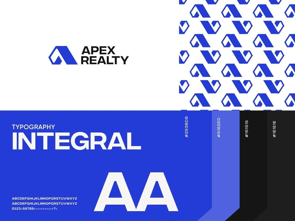
Logo: A stylized “A” icon forms an abstract peak, symbolizing elevation and excellence—core traits of the real estate business.
Typography: The chosen typeface, Integral, is assertive and clean, pairing perfectly with the geometric nature of the logo.
Color Palette: A strong blue (#263BD8) dominates, supported by shades of cool violet, black, and light grey. This palette evokes trust, professionalism, and clarity.
Pattern Design: A repeated motif of the logo icon creates bold, modern patterns, ideal for both print and digital collateral.
Outcome
The new identity elevated Apex Realty’s brand perception, aligning with its values of growth, reliability, and modernity. It has proven versatile across business cards, digital platforms, and signage.
Logo Design
Logo Design for EVOKE CREATIVES
Case Study 3: EVOKE CREATIVES
Overview
Evoke Creatives is a design studio focused on human-centered digital experiences. The goal was to build a brand that was minimal, approachable, and reflective of creativity and individuality.
Objectives
Design a distinctive, soft, yet modern logo.
Create a cohesive visual identity that scales across print and merchandise.
Emphasize creativity and warmth through color, form, and typography.
Design Execution
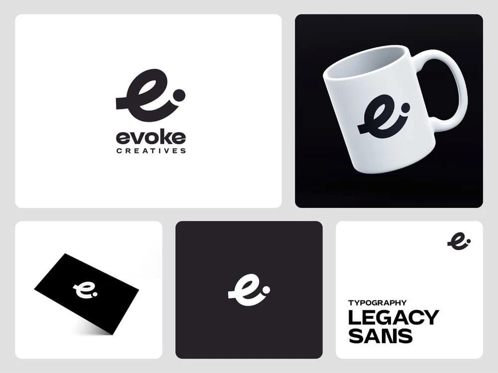
Logo: The lowercase “e” mark is playful and elegant, with a dot suggesting curiosity or connection. The curved, friendly form reflects the studio's emphasis on user-centered design.
Typography: The Legacy typeface complements the logo with rounded, contemporary characters that strike a balance between professional and friendly.
Color Scheme: A simple, high-contrast monochrome palette keeps the focus on design quality and content.
Applications: Branded elements on merchandise like mugs and business cards emphasize the studio’s clean and creative ethos.
Outcome
The brand identity has positioned Evoke Creatives as a boutique design firm with a distinct voice—approachable, professional, and uniquely creative.
Like this project
Posted Jun 30, 2025
Logo is the most important thing in branding, some of the best logo design from Portfolio