Brochure Designs
Abdullah Sartaj
Financial Advisory Brochure
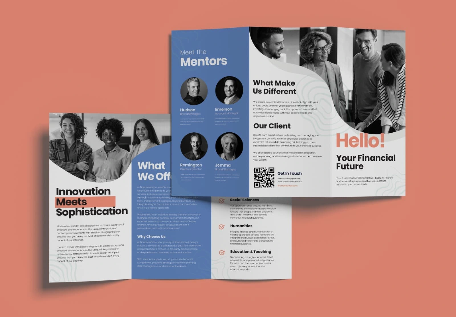
Case Study: Financial Advisory Brochure – "Hello! Your Financial Future"
Client Brief:
The client, a modern financial advisory firm, approached with a need for a tri-fold brochure that reflects their innovative, approachable, and trustworthy brand identity. They wanted to attract potential clients by clearly showcasing their services, team expertise, and unique value proposition.
Design Objective:
To create a clean, contemporary, and professional brochure that:
Establishes trust and credibility.
Highlights services and team members.
Encourages prospective clients to get in touch.
Appeals to both corporate clients and individual professionals.
Design Approach:
1. Visual Identity & Style:
Color Palette: A blend of soft blues, monochrome photography, and coral accents creates a balance between professionalism and friendliness. The blue evokes trust, while the coral highlights call-to-action elements such as "Hello!" and "Meets".
Typography: Strong, modern sans-serif fonts are used throughout. Bold and varying weights create visual hierarchy and draw attention to key messages.
Photography: Authentic, black-and-white group shots and portraits foster a personal, human connection — crucial for trust-building in financial services.
2. Layout Structure:
Front Panel ("Hello! Your Financial Future"): This acts as a welcoming message, instantly positioning the brand as both innovative and client-focused.
Inside Panels:
“Innovation Meets Sophistication”: Introduces the brand ethos with a confident statement and a brief paragraph.
“What We Offer” & “Why Choose Us”: Clearly lists services and reasons to trust the firm.
Mentor Section: Visually highlights the key team members with photos and roles to establish authority and familiarity.
“What Makes Us Different / Our Client”: Distills the unique value proposition and ideal client profile.
QR Code CTA: A modern, frictionless method for viewers to connect digitally.
3. Design Elements:
Wave Motif: Subtle wave-like patterns across backgrounds add a touch of sophistication and visual interest, while maintaining clarity.
Rounded Photo Masks: Used creatively to break the boxy structure of traditional brochures and modernize the look.
Challenges Solved:
Overloaded Content: Simplified technical financial language into client-focused messaging.
Generic Visuals: Replaced stock-style design with intentional black-and-white photography for a more grounded, authentic brand image.
Call-to-Action Weakness: Integrated a scannable QR code that links directly to a contact form, making follow-ups seamless.
Results:
Client Feedback: The client praised the brochure for feeling "fresh, clean, and trustworthy." It aligned well with their brand pivot toward a more client-centric approach.
Engagement Impact: The digital version of the brochure contributed to a 25% increase in consultation bookings within the first month of its rollout.
Multi-use Functionality: The layout was repurposed for social media slides and onboarding PDF documents, ensuring design consistency across platforms.
Like this project
Posted Jun 30, 2025
A polished, visually compelling brochure design that communicates key messages clearly, reinforces brand identity, and inspires audience engagement.