Reframing a Law Firm’s | Communication + UX/UI Design

Valentina Guerrero
Verified


Turning Legal Complexity Into Clear Business Decisions — Global District Law
Short description
Strategy-first legal website that transformed complex terminology into clear guidance for businesses, investors, and individuals in the Dominican Republic.
Overview
Global District Law had strong legal expertise, but its previous website relied heavily on technical terminology and a traditional law-firm structure that made it harder for users to understand when they might need those services.
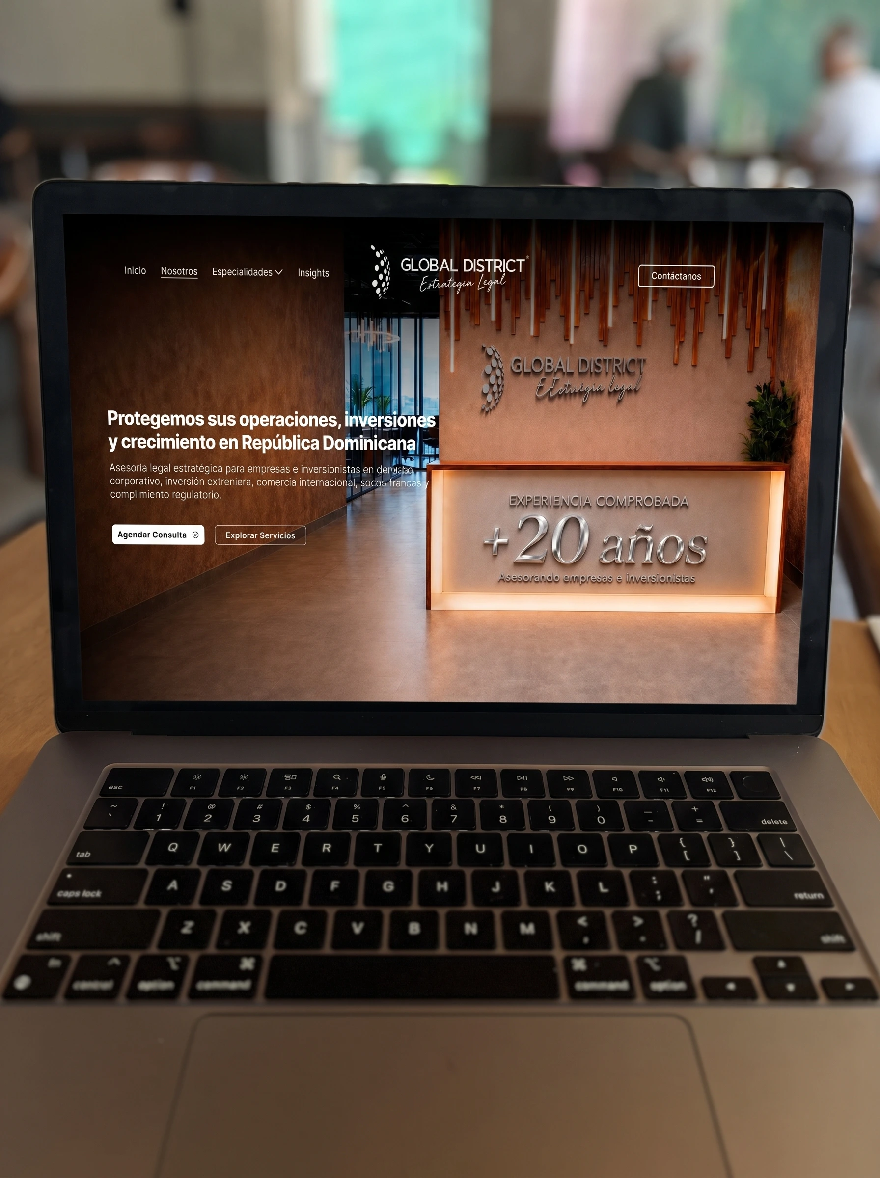
I led the communication strategy, content, information architecture, art direction, UX/UI design, and development to transform that complexity into a clearer digital experience—helping both local and international users understand what the firm does, who it helps, and what their next step should be.
Phase 1 — Researching the Existing Experience
Before designing, I reviewed how the firm was presenting its services, positioning, and expertise.
The main issue was not lack of knowledge or credibility—it was how that knowledge was being communicated. The website was organized around legal terminology, while users were more likely to think in terms of situations, business goals, risks, or opportunities.
Key findings included:
Strong expertise, but difficult to scan and understand quickly.
Services organized around legal categories instead of client needs.
Business and investment positioning was not immediately clear.
International users needed more context to understand the local legal environment.
The website communicated knowledge, but not a clear decision journey.
Phase 2 — Communication Strategy
The strategic shift was simple:
Do not start by explaining the law. Start by explaining what the client is trying to do.
Instead of leading with technical legal terms, the new communication focused on recognizable goals such as starting a business, investing in the Dominican Republic, protecting operations, resolving disputes, or expanding with legal support.
This led to a new communication hierarchy:
Trust → Credibility → Opportunity → Solutions → Legal Expertise → People → Contact
Key communication decisions included:
Reframing legal services around user intentions and business situations.
Positioning the firm as a legal partner for companies, investors, and international operations.
Introducing context before technical terminology.
Making the value of each service easier to understand before going deeper into legal detail.
Creating a clearer path from “I think I may need help” to “I know who to contact and why.”
Phase 3 — Art Direction
Once the communication strategy was defined, I established the visual direction that would support the new positioning of the firm.
The goal was to move away from a traditional, overly formal legal aesthetic and create a visual language that felt authoritative, contemporary, international, and approachable.
This direction guided:
The balance between legal credibility and business sophistication
The use of imagery connected to people, business, and decision-making
The visual tone of the brand across digital touchpoints
The photography approach for the firm's team
The use of custom AI-assisted imagery to complement original photography and maintain a more consistent, tailored visual language
I also shared pose references and wardrobe recommendations for the photography session so the team could be presented in a way that aligned with the positioning we were building.
Phase 4 — Initial Concept Exploration
With the art direction established, I developed three initial website concepts to explore how that strategy could be translated into the interface.
Each concept tested a different balance between:
Institutional authority
Business positioning
Human connection
Visual hierarchy
Modernity and accessibility
The purpose of this stage was not simply to choose a visual style, but to validate which direction communicated the firm's positioning most effectively before expanding the design across the full website.
Phase 5 — Selected Direction & Refinement
After the preferred concept was selected, I refined the visual system and user experience to create a consistent foundation for the rest of the website.
The selected direction was strengthened through:
Clearer hierarchy for complex information
A more business-oriented visual language
Strategic use of team photography as a trust-building asset
Integration of real photography and AI-assisted visuals
Stronger contrast between strategic messaging and technical detail
A more contemporary and international perception of the firm
Hero Section
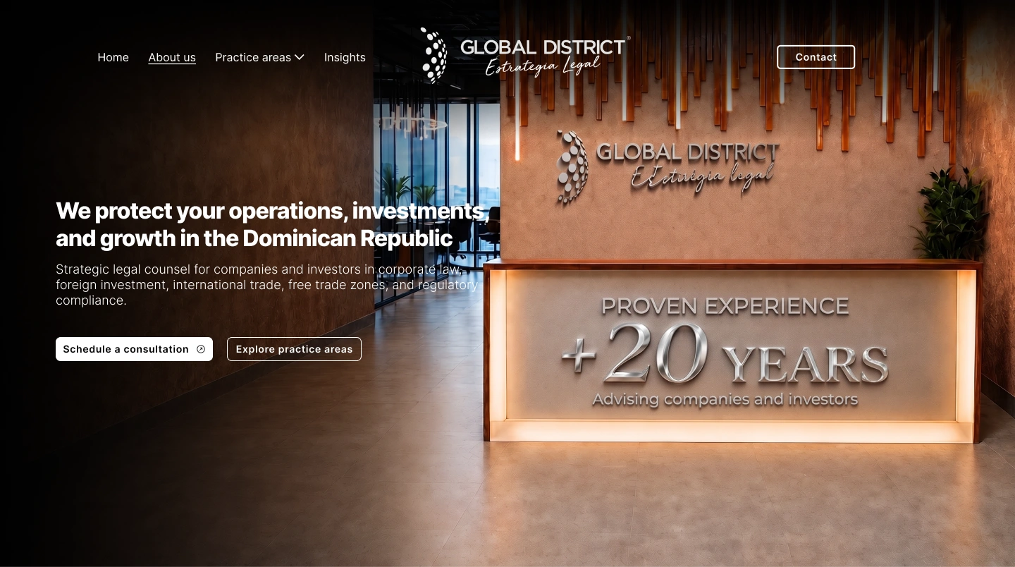
The hero section was restructured to help users quickly understand what the firm does and communicate its experience in the market, building trust from the very first interaction.
Our Team
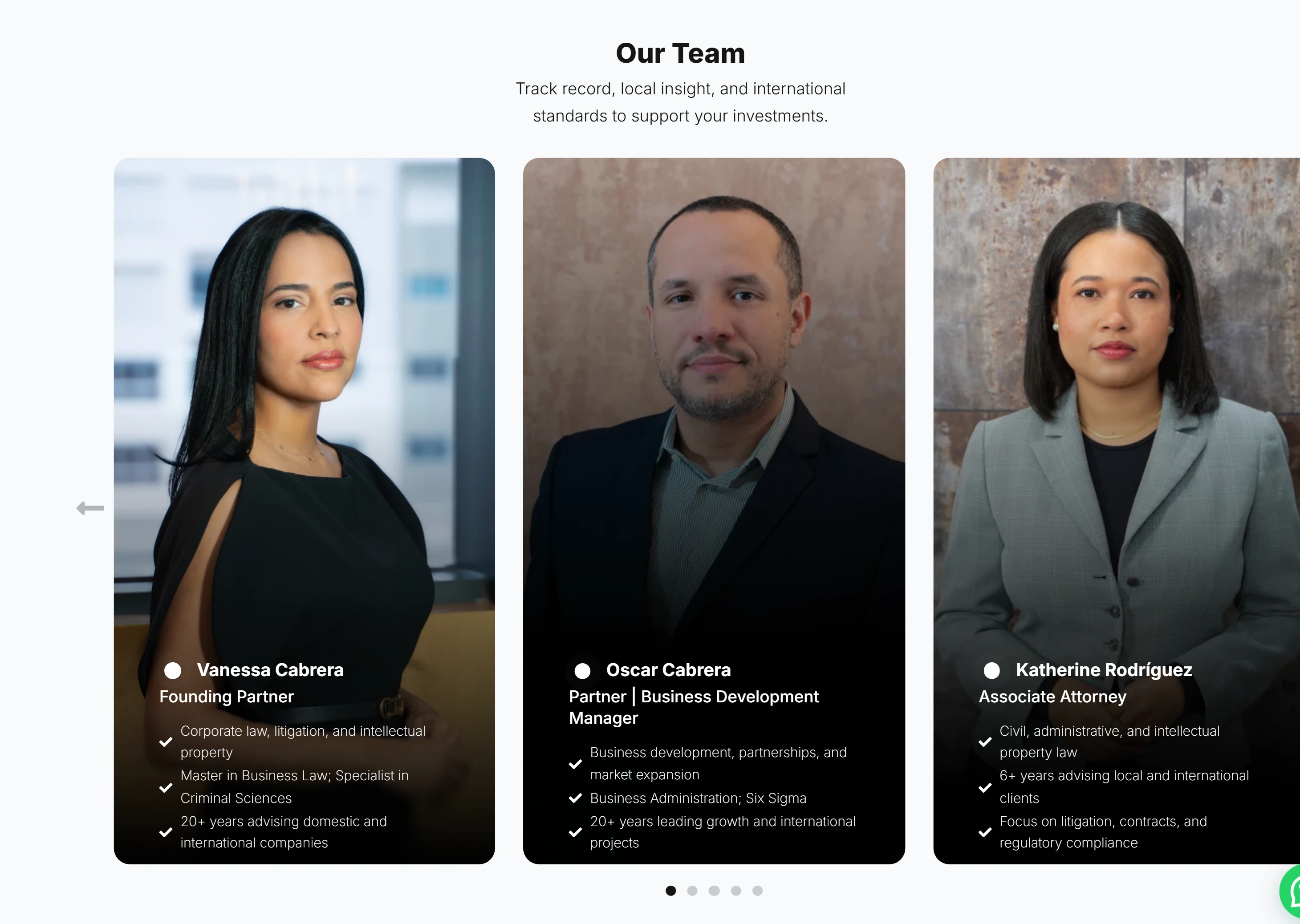
One of the main reasons people seek legal support is the knowledge and experience an attorney can provide. With this in mind, I introduced an “Our Team” section to highlight the people behind the firm and give users a clearer sense of the expertise and human support they can expect when choosing to work with them.
Practice Areas
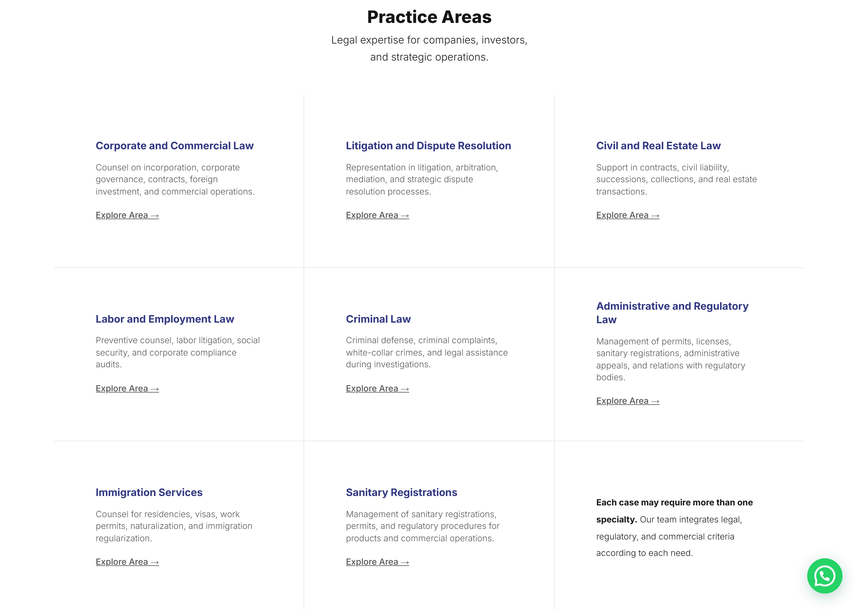
This is one of the most important sections of the website. In the previous version, the practice areas were presented as a dropdown list that didn’t really communicate anything. It was confusing to navigate and made it difficult for users to understand which area of expertise was relevant to their specific situation.
I restructured the section into broader categories that are further divided into specific practice areas. Each one is paired with a short, approachable description designed to help users recognize which area best relates to their particular situation.
The practice areas are presented in a grid to clearly separate them from one another and avoid creating unnecessary visual competition between them. The hierarchy of the content guides users toward the information that matters most, while each area includes a CTA inviting them to explore it further.
Phase 6 — Development & Testing
Once the structure, content, and design direction were approved, I developed the complete responsive website.
Development focused on preserving the communication hierarchy and keeping the consultation journey clear across devices.
Key priorities included:
Maintaining readability across content-heavy legal pages
Creating clear pathways from specialty pages to consultation
Supporting both desktop and mobile decision-making
Ensuring forms and contact flows felt clear and accessible
Testing hierarchy, interactions, and content clarity across devices
The contact experience was also designed to reduce uncertainty by helping users understand what happens after they submit an inquiry.
Outcome
The final website repositioned Global District Law from a terminology-heavy legal website into a clearer and more business-oriented digital experience.
Instead of asking users to decode legal language first, the new experience helps them recognize their situation, understand the firm’s value, and move toward contact with more confidence.
Role: Communication Strategy · Content Strategy & Copywriting · Information Architecture · Art Direction · Photography Direction · AI-Assisted Visual Direction · UX/UI Design · Web Development
Like this project
Posted Sep 22, 2026
Strategy-first legal website that turned complex expertise into clearer guidance for businesses, investors, and individuals.
Likes
1
Views
11
Timeline
May 2, 2025 - Jun 20, 2025