SparkLabs Product Page
Timeline
November 2023 - January 2024
My Role
Oversee the project and guide the team in creating wireframes and mockups.
Problem
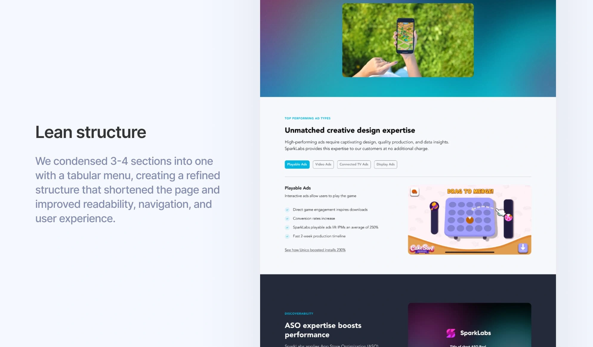
The SparkLabs product page was poorly organized, with an unclear flow that didn’t effectively communicate what we do. Information was lengthy, scattered, and cluttered, making it hard for customers to engage and understand our offerings. Additionally, the section showcasing our creative timelines required thoughtful restructuring, as it lacked both intuitive design and responsiveness, further detracting from the user experience.
Solution
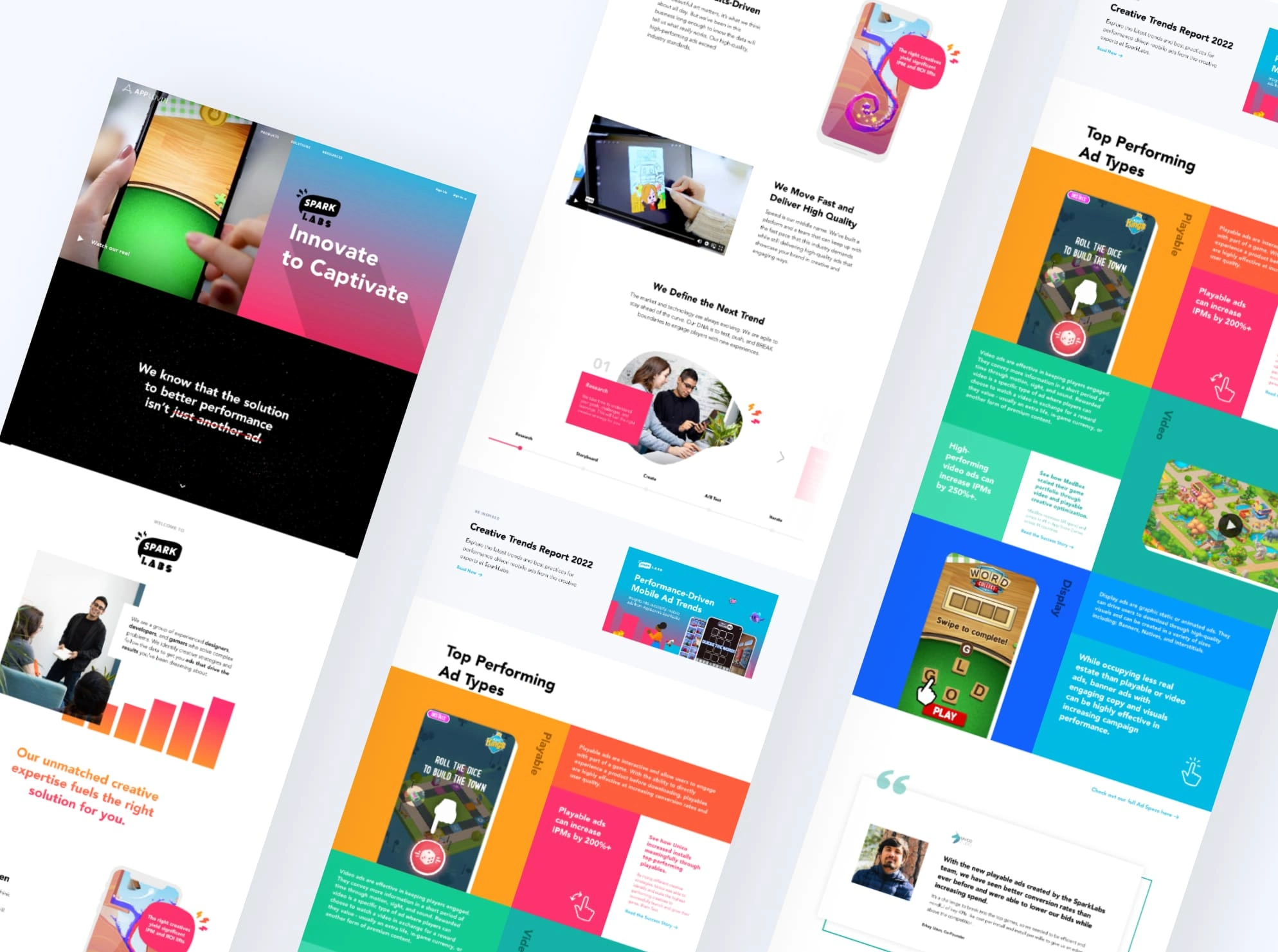
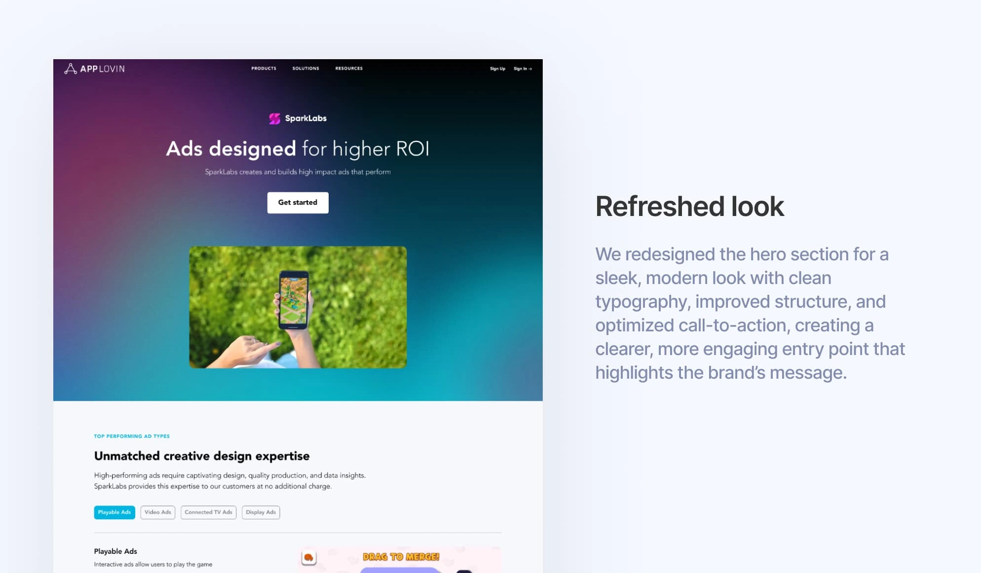
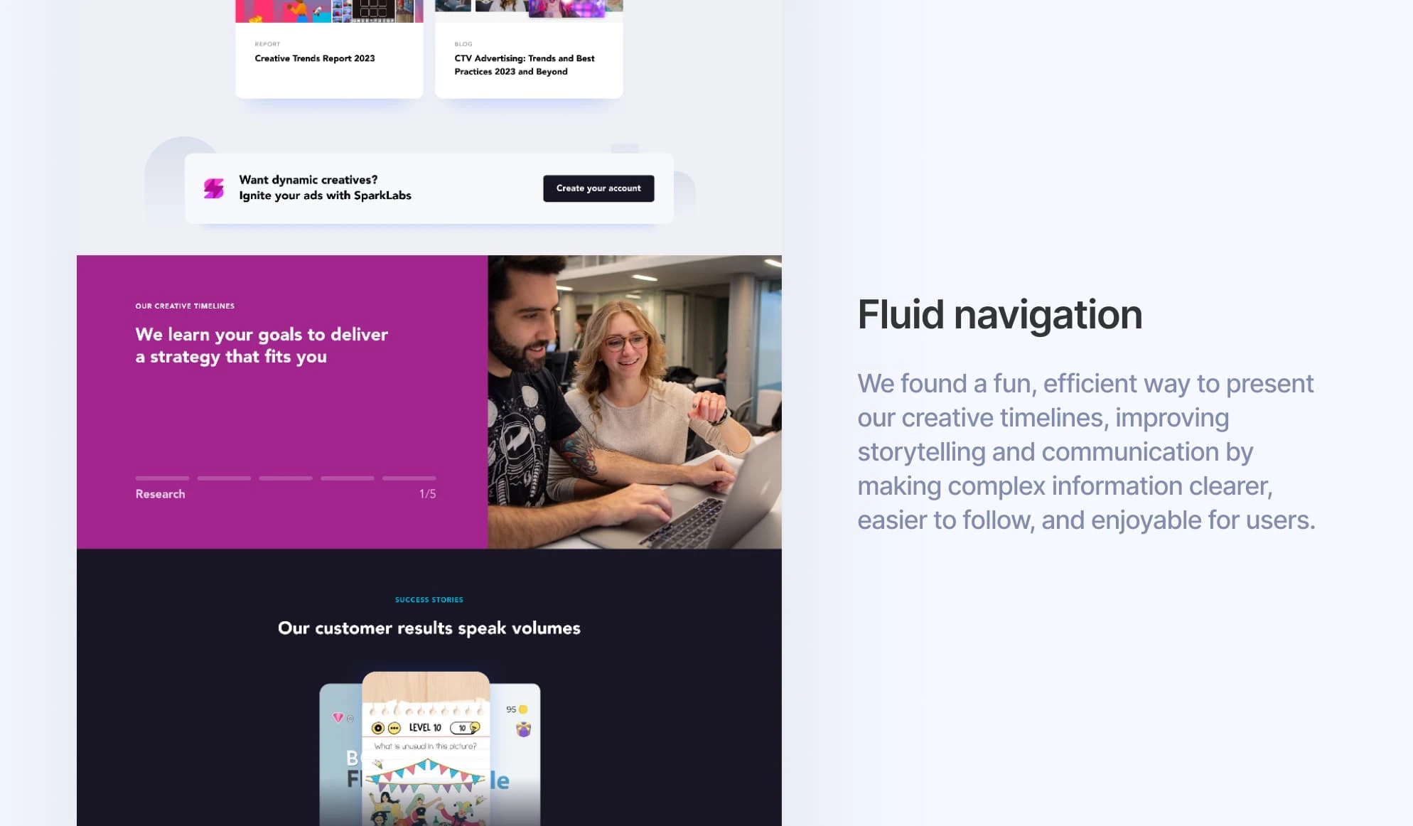
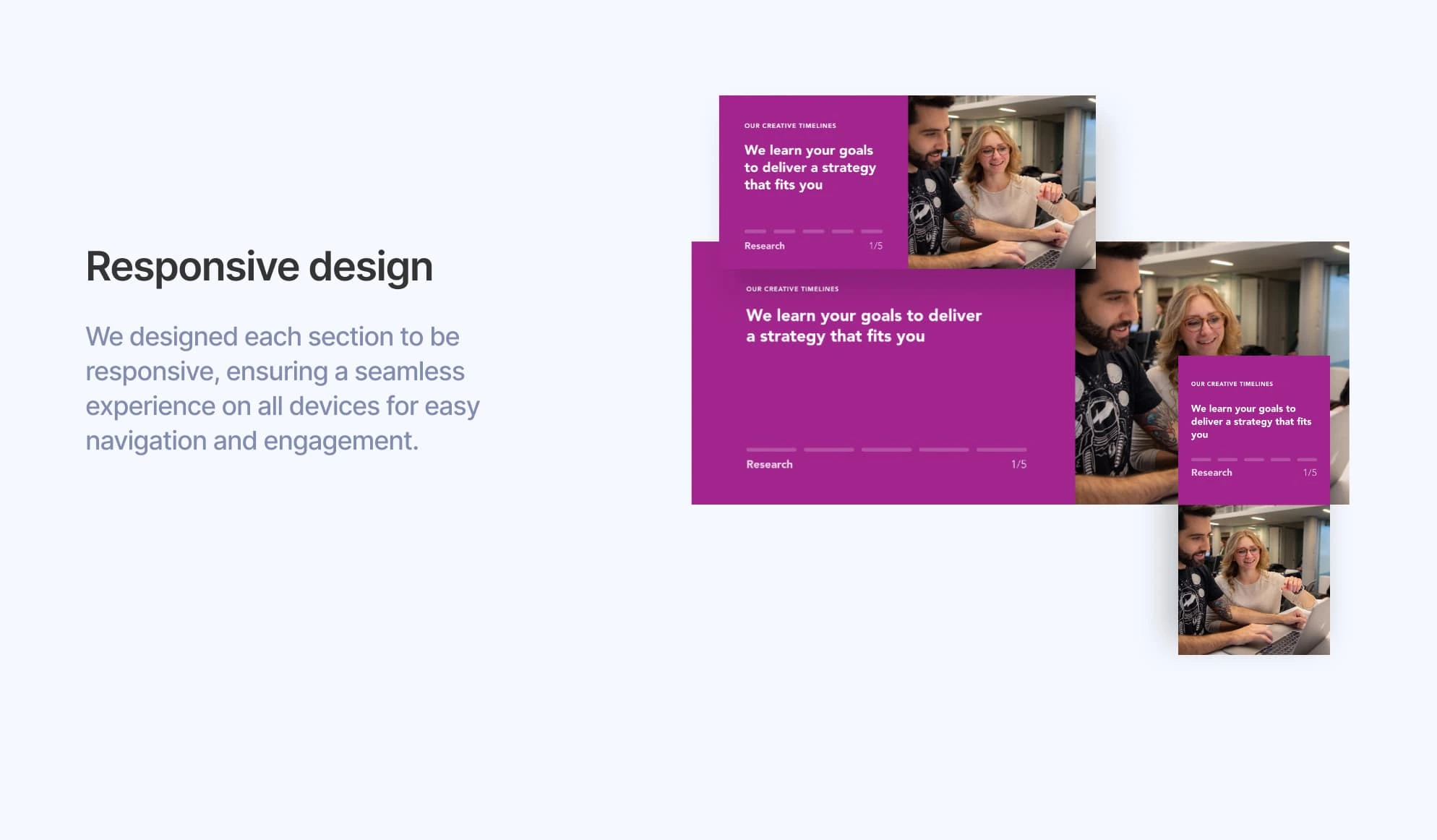
We redesigned the page to be highly responsive across all devices, featuring a sleek, modern look that boldly represented the Sparklabs brand. Thoughtful use of various colors added vibrancy without overwhelming the design. We also refined the creative timelines with smooth animations, ensuring each step was easy to view and navigate, enhancing overall user engagement and experience.
Insights I took from this project
A rigid process doesn’t always apply. We don’t always move directly from wireframes to finalized mockups; often, additional wireframe iterations are necessary to uncover the ideal solution. Taking the time to gather input from all stakeholders is invaluable in crafting the best possible experience.
Like this project
Posted Nov 5, 2024
We redesigned the page for full device responsiveness, with a sleek, modern Sparklabs look. Vibrant colors and smoother timeline animations improved navigation

