Planet Lodges - Rebrand Project Management
As a Project Manager and Creative Director, I spearheaded Planet Lodges' rebranding, crafting a refreshed identity that harmonizes luxury with environmental consciousness. The project embraced the brand’s origins, rooted in the founders’ vision inspired by the color Sage, while introducing modern design elements that align with contemporary trends.
This rebranding aimed to create a cohesive, visually compelling identity that reflects the brand’s dedication to sustainability, sophistication, and memorable guest experiences.
Key Contributions and Deliverables
1. Brand Identity Development
Designed a comprehensive brand system that combines luxury and environmental awareness, reflecting the brand’s mission and history.
Established a refreshed identity incorporating elegance, harmony, and eco-conscious values to connect with target audiences effectively.

Main Logo
2. Logo Design and Variations
Delivered a versatile logo system, including Primary, Secondary, Centered, and Logomarks/Icons, ensuring adaptability across platforms and mediums.
Provided organized logo files in .ai format and PNG variations, categorically arranged for easy access and application.
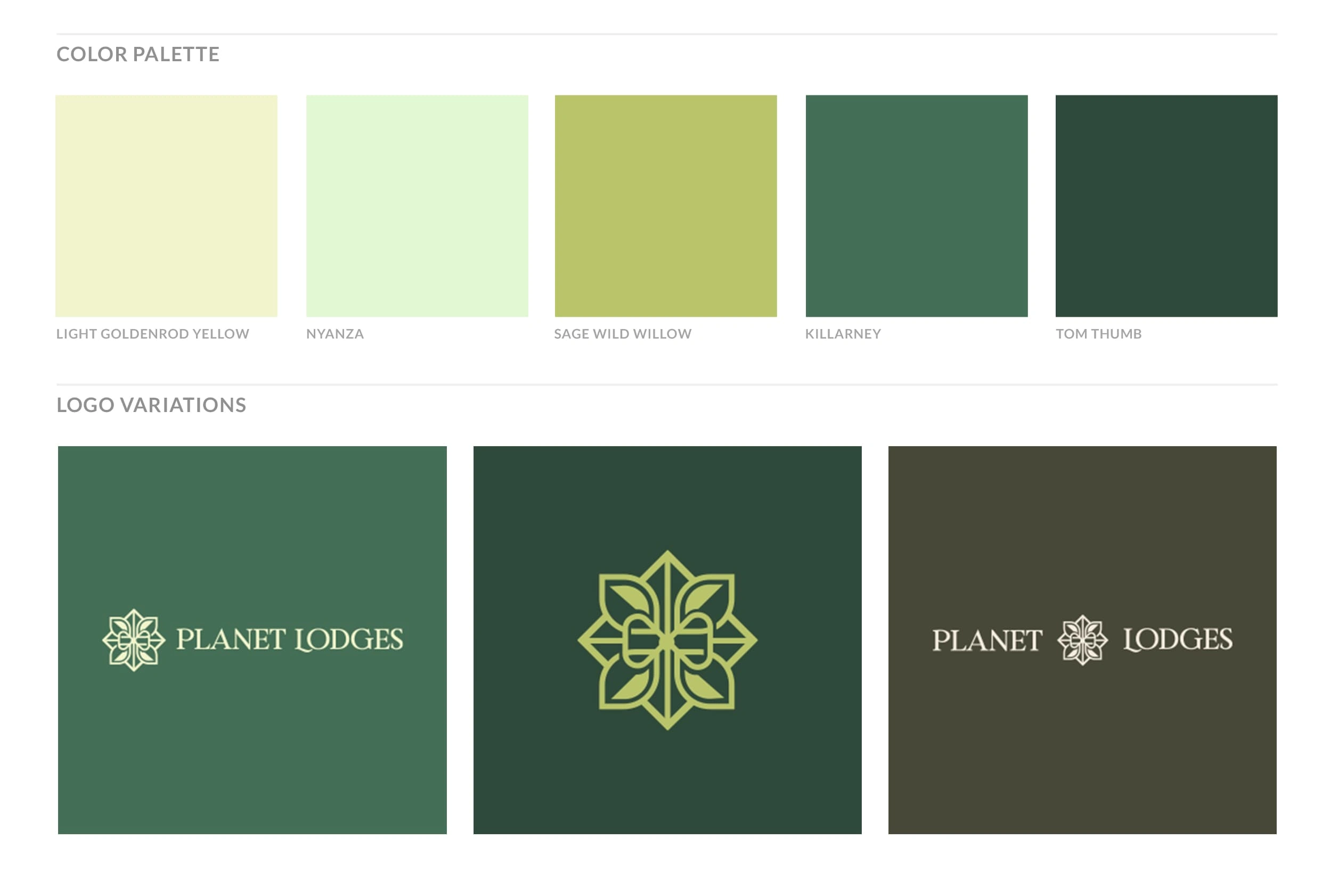
Logo Variations and Primary Colors
3. Typography System
Selected a mix of Serif, Sans Serif, and Calligraphic fonts to establish a dynamic yet elegant typographic hierarchy:
Ageo as the primary typeface in multiple weights.
Riverflows (Regular and Italic) and The Billion as secondary fonts.
Ensured all design works adhered to these typefaces for a unified brand presentation.
4. Brand Board Creation
Designed a detailed Brand Board showcasing the brand’s applications, including the primary and secondary logos, inspirations, fonts, imagery, and color palette.
Created a visual guide to assist users in consistently implementing the brand identity across touchpoints.
5. Color Palette Design
Developed a well-curated color palette reflecting the brand’s roots and eco-conscious focus:
Primary Colors: Sage-Wild-Willow, Tom Thumb, Nyanza, Killarney.
Secondary Colors: Light Goldenrod Yellow, Zinnwaldite Brown, Alabaster, Rifle Green.
Provided detailed HEX and CMYK codes for seamless application.
6. Brand Pattern Development
Introduced two distinctive brand patterns to enhance brand recognition, bring depth to the identity, and create memorable experiences.
Designed patterns to integrate effortlessly across digital and print media, enriching the overall brand experience.
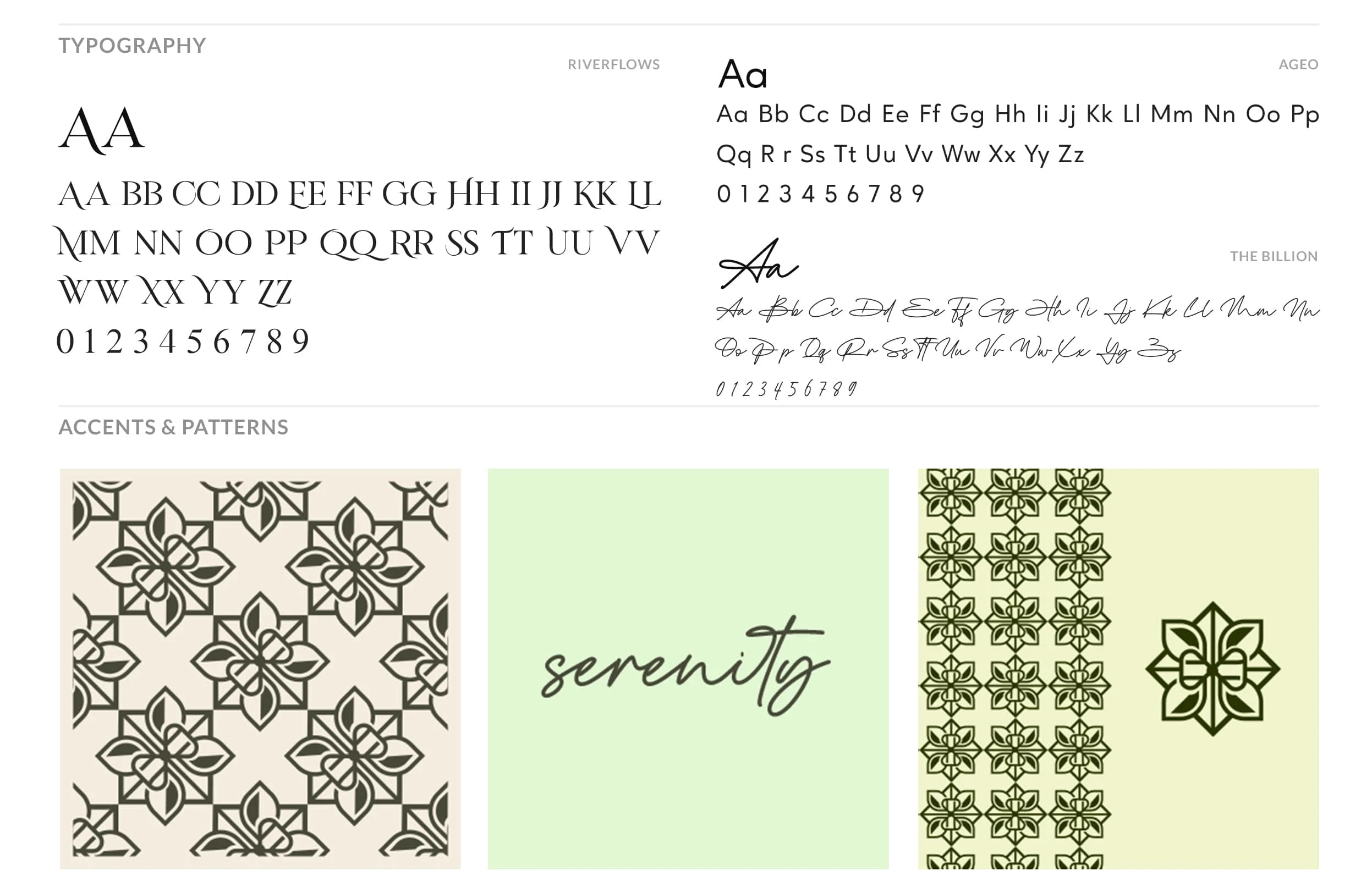
Typography and Patterns
7. Resource Organization
Delivered all brand assets in a master folder, categorized into:
Logo Folder: Includes source files and variations.
Fonts Folder: Contains official typefaces and usage instructions.
Brand Board Folder: A visual guide for brand implementation.
Pattern Folder: Contains high-quality, scalable patterns for branding applications.

A complete Brand Board.
Outcome
The rebranding of Planet Lodges established a cohesive, modern identity that embodies the harmony of luxury and environmental friendliness. The refined design system ensures consistency across all platforms, enabling seamless adoption by internal and external teams. This new identity highlights the brand’s mission of offering memorable, sustainable experiences, positioning Planet Lodges as a leading name in the eco-conscious luxury hospitality market.
Like this project
Posted Dec 20, 2024
Managed a rebrand of Planet Lodges, creating a cohesive identity with logos, typography, brand boards, and patterns, blending luxury with eco-conscious values.

