Picktime — simpler booking UI/UX
SAM BLANK
deliverables
figma prototype
ui/ux redesign
the brief — briefly
Picktime's free plan offered unlimited appointments, multiple events, and multiple users — the perfect tool.
But it wasn't. The booking experience was so "un-friendly" that I had to create this case study.
the redesign — 4 sections long
1 — Event selection
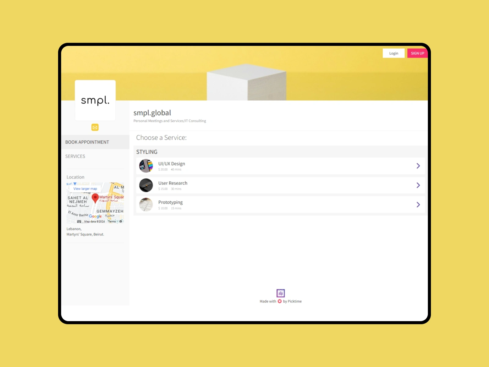
before — overwhelming
information overload
tight spacing
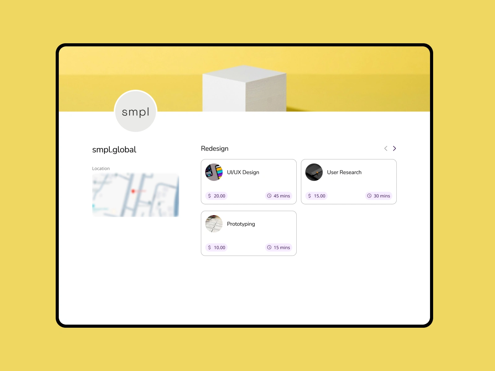
after — minimal
removed unnecessary details
more breathable elements
2 — Date picker
before — mobile nightmare
clickable "unavailable dates"
too much scrolling
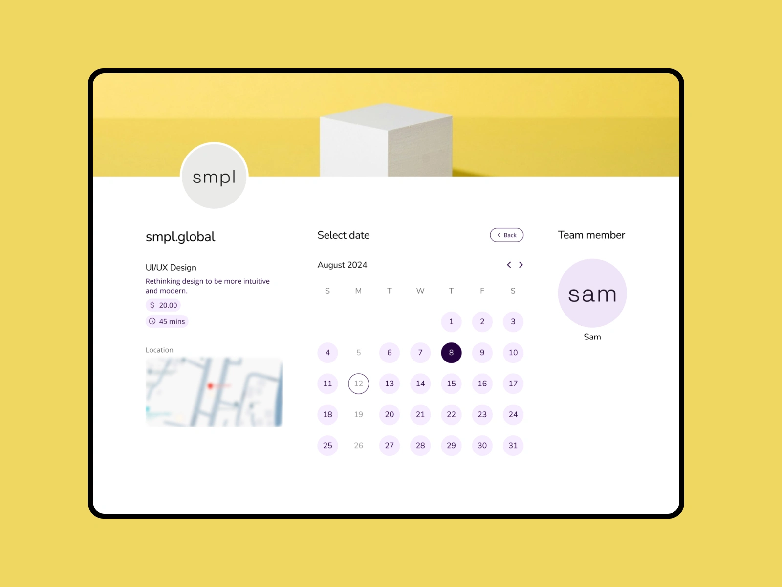
after — just responsive
clear date availability
all in one screen
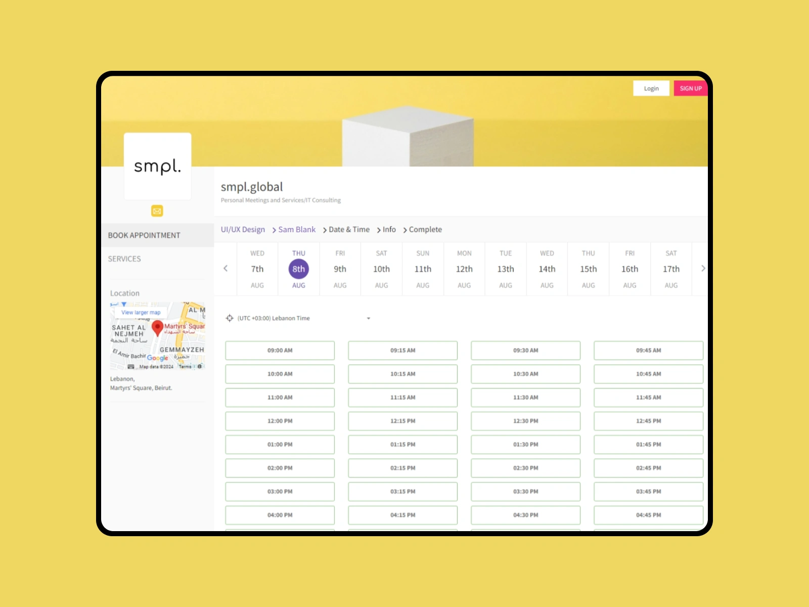
3 — Time picker
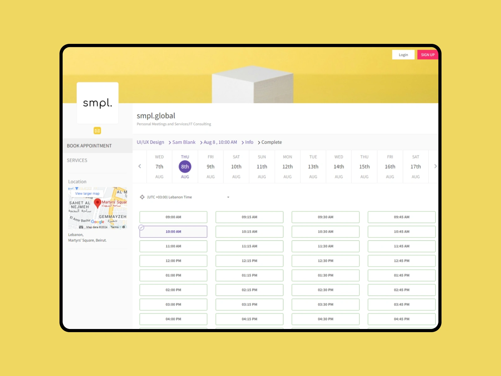
before — time-pick guess work
hidden "time availability"
manual checking required
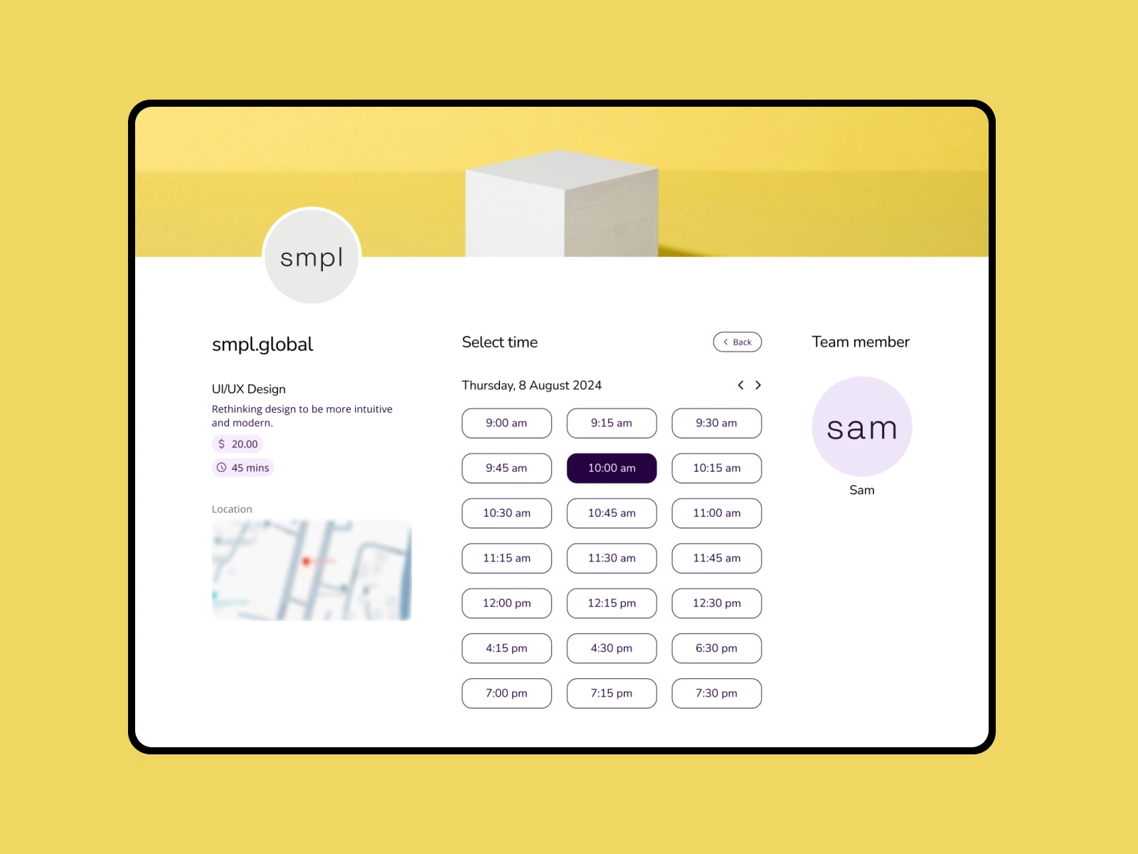
after — that time works
only available times displayed
less clutter
4 — Confirm booking
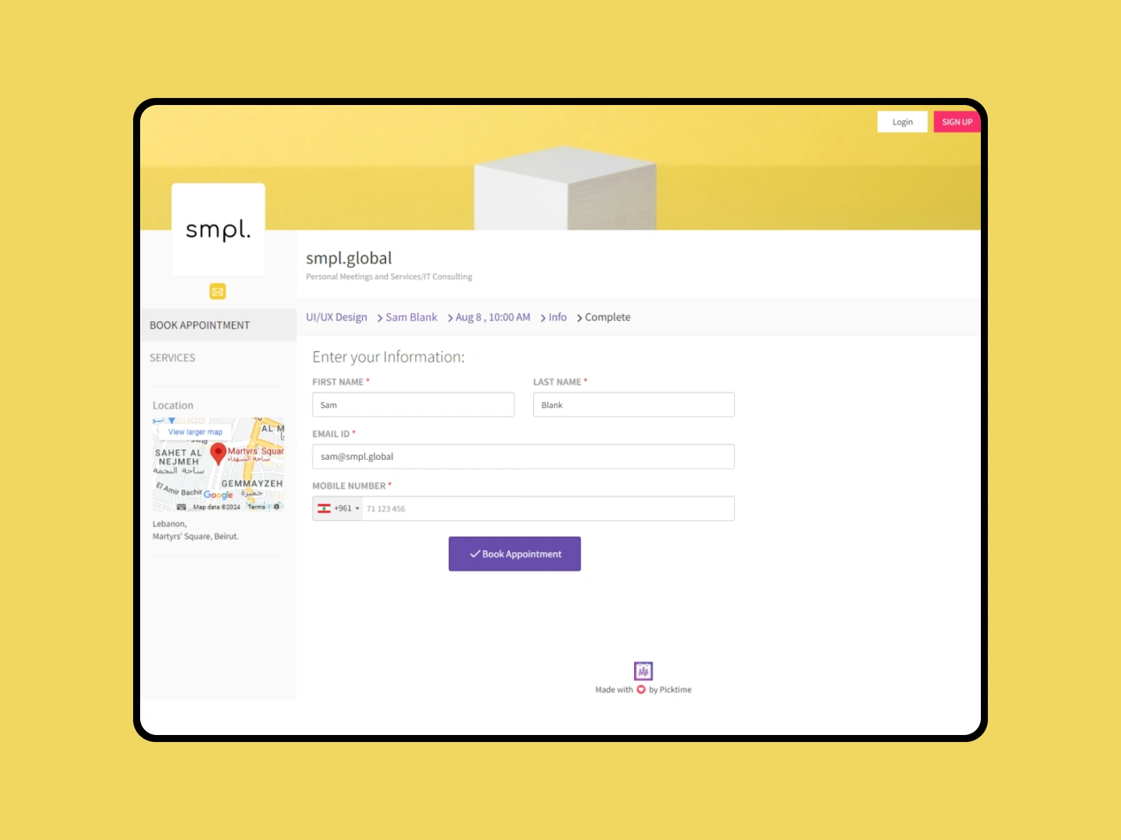
before — what did I select?
hard-to-find date/time selection
too generic
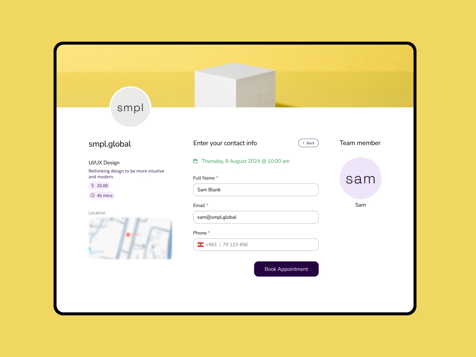
after — I confirm that
highlighted date/time selection
feels lively
view in website — same info
Like this project
Posted Nov 2, 2024
Redesigned Picktime's booking process to be more intuitive, clear, and modern — as it should have been.
Likes
1
Views
9