Designed Subscription Product That Converts 2K User To Subscribe
Muhammad Aziz

🎬 Introduction
Flip is a fintech-based payment platform in Indonesia. Users can transfer to different banks for free, do e-wallet top up without having to pay for additional fees, and send money abroad securely with lower fee. Flip users can also pay electricity bills, buy electricity tokens, top up phone credits, and buy data packages at the lowest cost. For companies, Flip also provides the best business financial management solutions.
There's a freemium business model that Flip use for their main send money feature, first it's called "Flip Instant" where user needs to pay Rp900 ($0,059) for instant transfer (process <10mins), and "Flip Plus" where user needs to pay Rp2.500 ($0,16) for transfer more than 5 millions a day. This help Flip to generates the revenue.
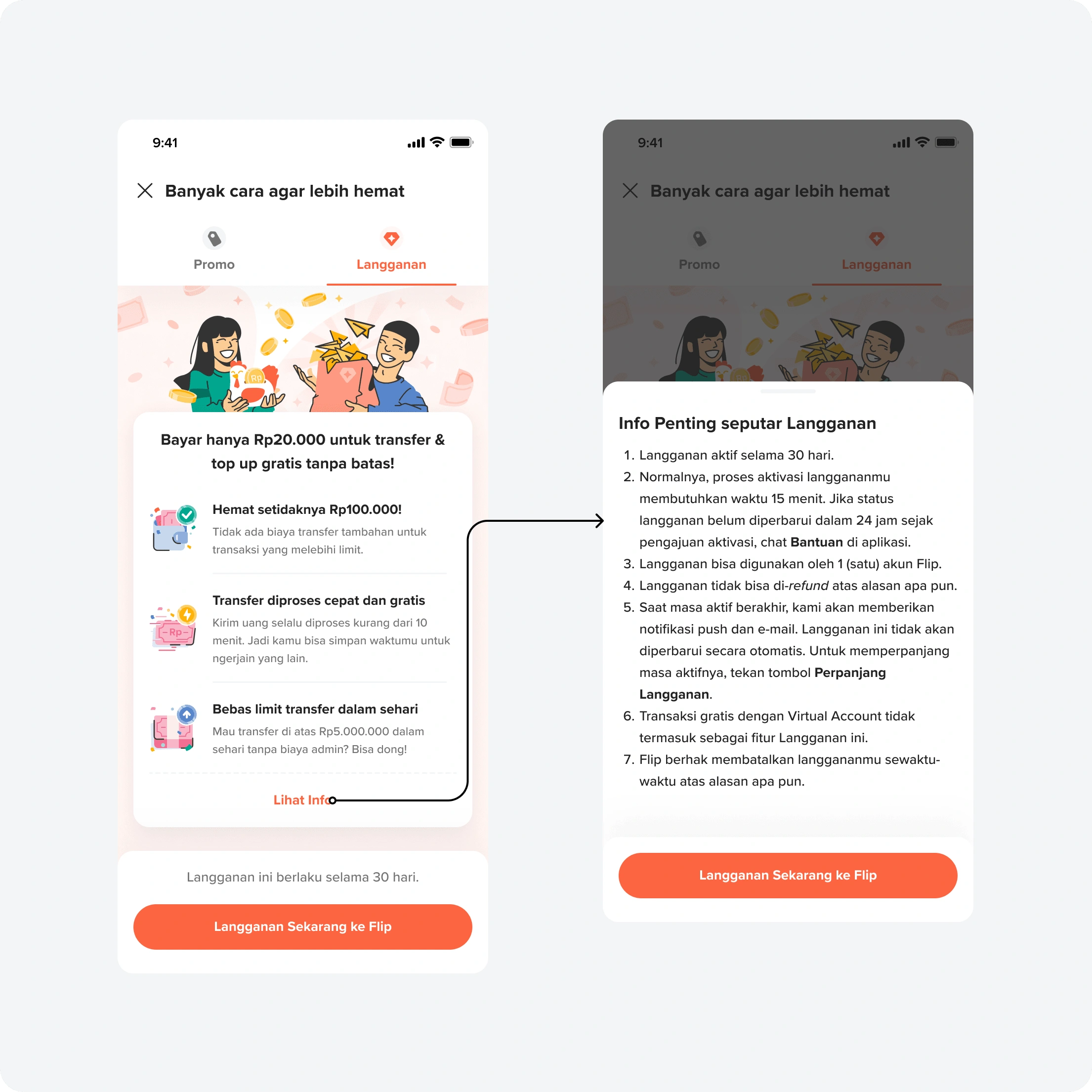
In order to increase the number of revenue, Flip had launched a subscription product called "Flip Freedom". User needs to pay Rp20.000 ($1,31) to be able to have unlimited transaction for a month. No need Flip Instant, and Flip Plus anymore.
😢 Issue On Current Flip Freedom
In order to create a MVP product, Flip Freedom was made not in the native app. But Flip reach out the user through Whatsapp chat blast. This works for the first time, but now, if user wants to renew it, user needs to open Whatsapp again, and at that time the subscription is not always available.
✨ What Problem Will Be Solved?
By introducing Subscriptions, we will solve for the user pain point of paying extra or waiting every time a user needs to transact beyond the free transfer limit. Users who use Flip for transfers heavily.
🤝 What Will We Offer (MVP)?
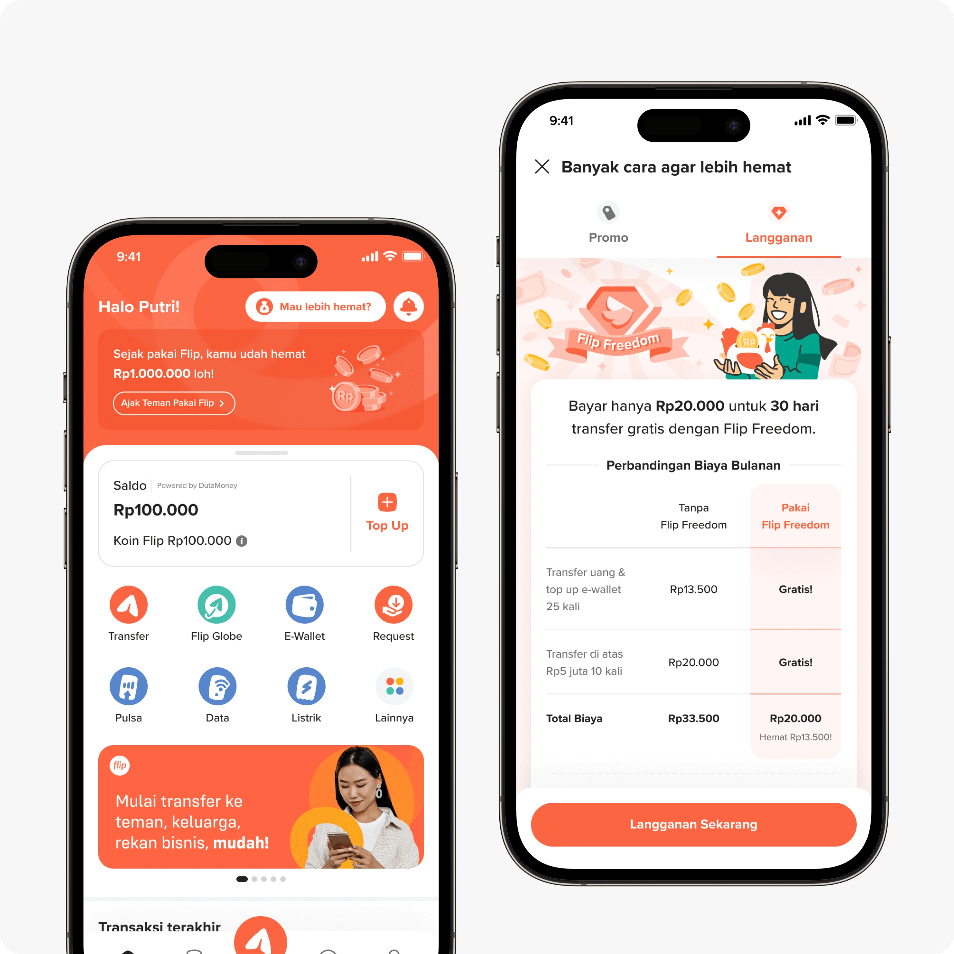
Benefit: User will be able to unlimited transfer instantly and transfer >Rp5.000.000 a day without any extra fees.
Price: Rp20.000/month
Active Period: 30 days without auto renew
🗺 Where's The Best Place To Offer? Let's Map It!
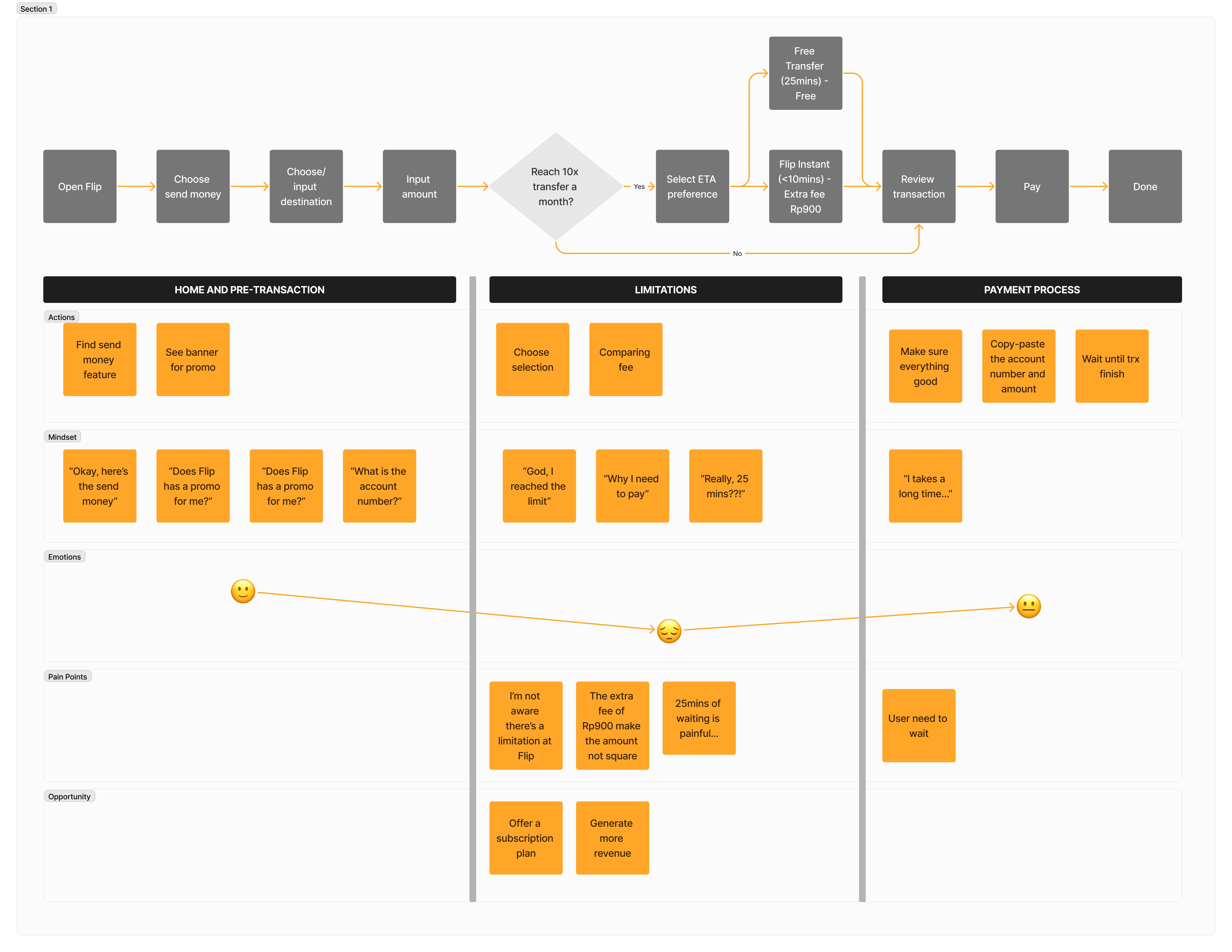
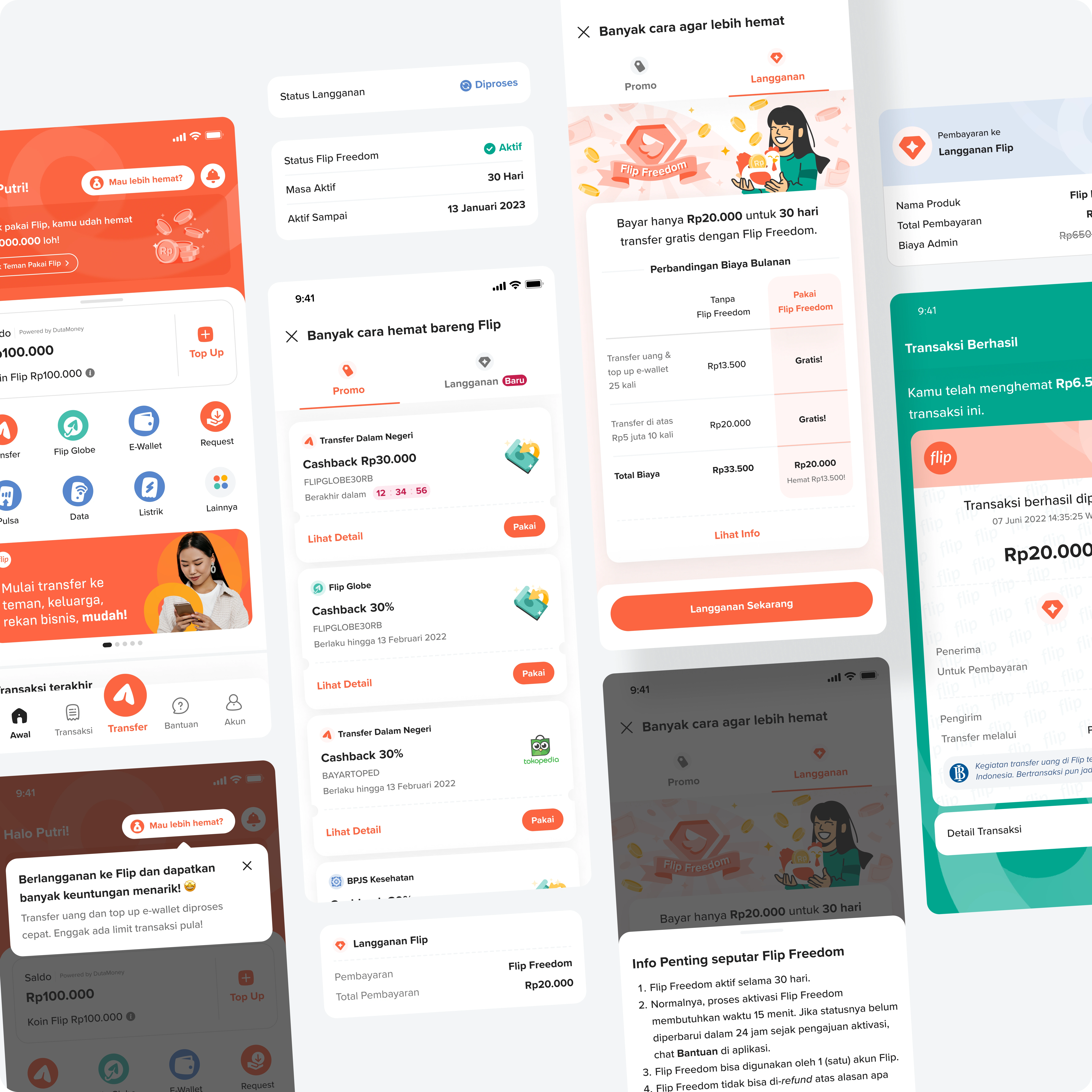
As we can see, the emotions of the user turns down when they're reached the limit of Flip Instant or Flip Plus. Also, from the data perspective, the users who experienced using Flip Instant and Flip Plus amplify users conversion rate to Flip Freedom (manual register) by 4.5x and 5.2x.
Hence, we're aligned to go with some several touch points to offering Flip Subscriptions.
Get momentum when the system offering Flip Instant and Flip Plus, we offering to subscribe or a better pricing and experience.
Previously, we have promo entry point on the home page. We thought that this subscription is also need a visibility for the discovery, so we're planned to combine promo and subscription into one entry point because it has same goal "so user can save more"
📌 For the MVP matters and reduce the scope of work, stakeholders are agreed to move forward with point no. 2 first. Point no. 1 would require cross-product-stream collaboration.
👀 We Aim To Build A Mental-Model-Friendly Design. Let's Do Benchmark!
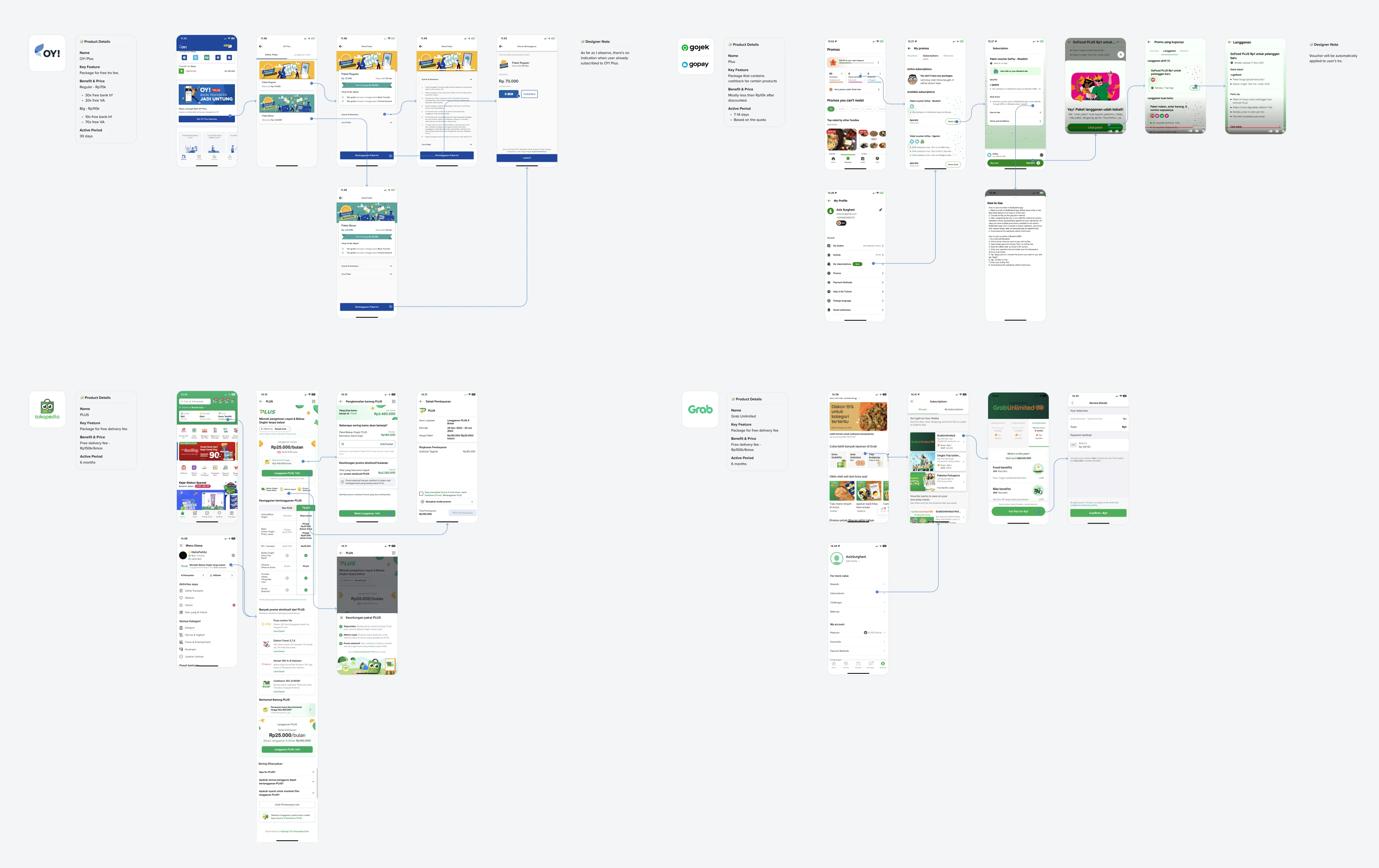
From the benchmarking to the similar apps or functions, we're knew that to build a good understandable subscription product, we should provide at least these information and behavior:
For a better discovery, it can be quick accessed from the home page, and user can track their subscription commonly on the profile/account page
User will do the math to decide to subscribe or not, so having the information of "you'll saved x if you subscribe" would be helpful
Payment for subscription should be fast and hassle free
Most of the app that we benchmark has auto renew
Nice to have: Simulation on the how much many can be saved based on user's number of transaction
Nice to have: Dedicated branding and logo for the subscription can make the context more delight.
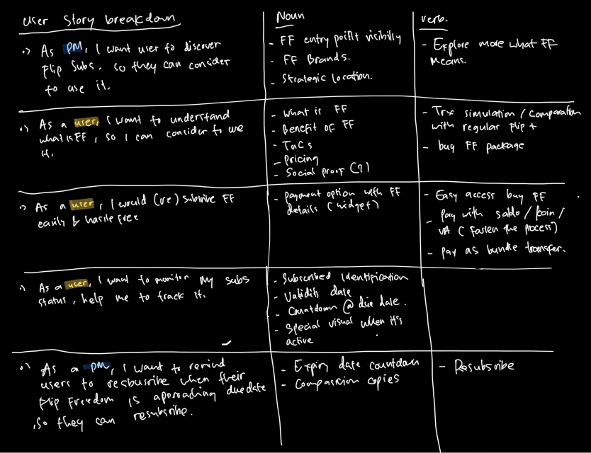
🕺 User Stories & Information Architecture
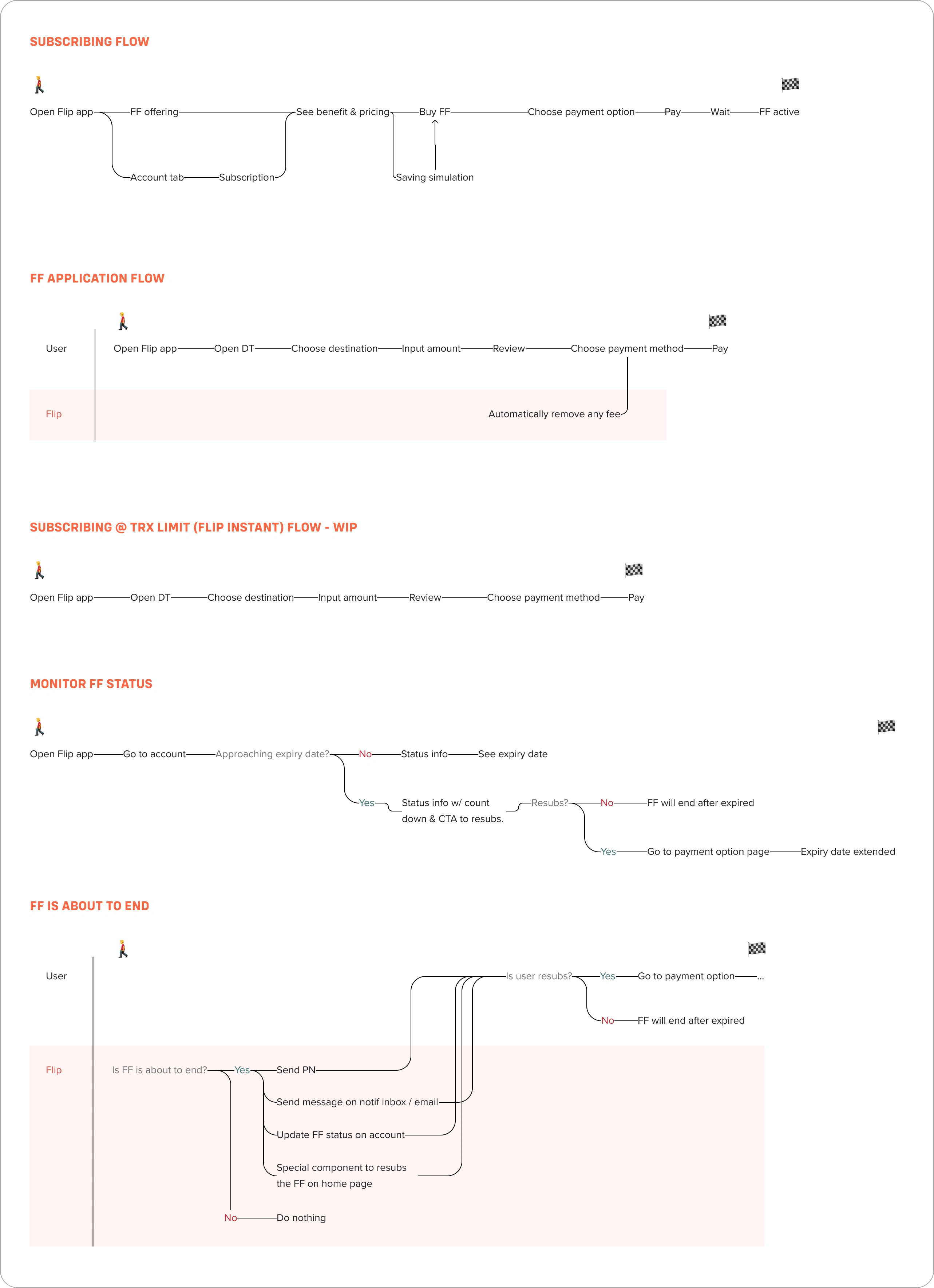
💨 User Flows
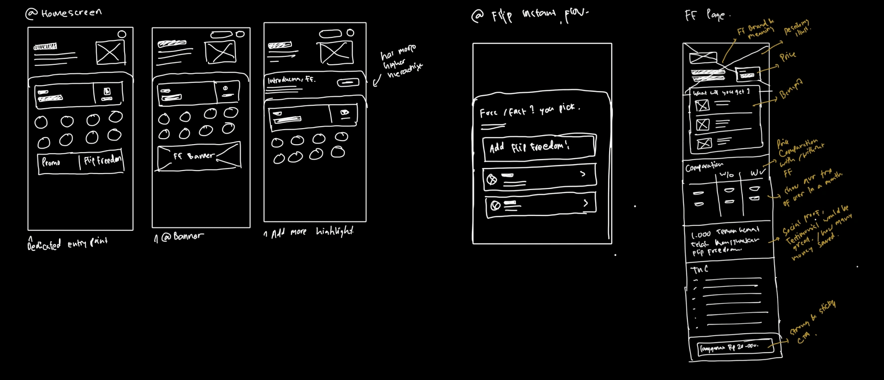
✏️ Let's Do Sketches!! (First Draft)
✏️ First Draft High Fidelity Design
Discovery on home page
I proposed 3 different touch points:
Separate section below the balance card, theoretically it's more visible, but it seems the placement is not like a permanent spot.
We already have the promo entry point on the top-left side of the page, we can combine the entry point
Rely on the in-app-banner. This is might the quickest solution, but it's seems not promising, reminding in-app-banner performance in Flip has low click rate.
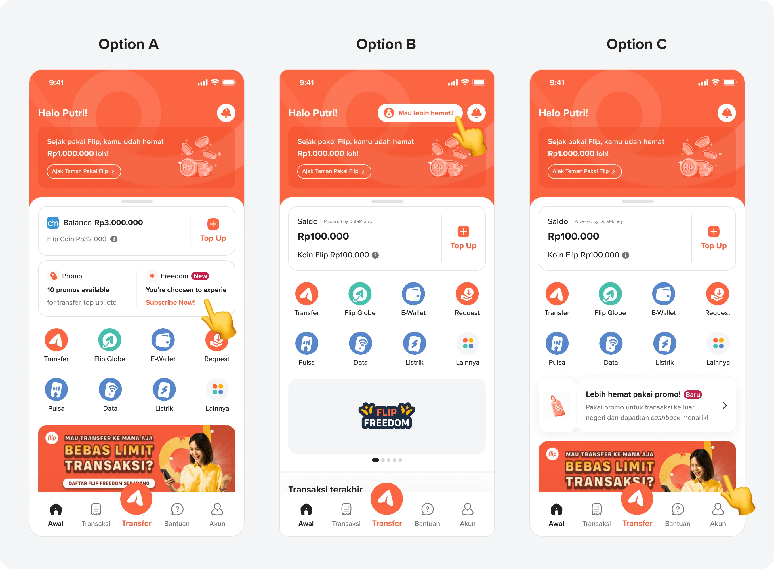
Option A Card Variations
After showcasing these 3 options, we're agreed to move forward with Option B for the reason of:
The effort is medium
The entry point is already there, we're just need to tweak the copy and the animation
Even though it more possible to skip (not on the center, eyes need to jump to the edge of the screen, etc) but we can do something to emphasize more, for example giving an animation, or a coachmark for the first timer user.
The placement is seems more permanent
Discovery on home page
🔍 Validate It!
With the help from research team, we conducted the usability testing to test is this design good and understand enough? is the entry point visible? is user understand what is Flip Subscription?

We talked to 5 Flip users, and here's the executive summary o findings that we've got:
Low discovery of Subscription entry point. Most respondents main focus area to see every time they open the app is the center of the page (Flip Balance & Banner)
Consideration of the product naming, since most of user feel that ”Subscription” does not feel exclusive/premium for the users
Activation process run smooth for all of the user
Most of users find this feature as a potential solution for their current interbank transfer needs. Even though, there are still some T&C that need to be clarified such as the length of period, reminder, limitation (quota and usage per day or month), etc.
🎨 Final Design
📈 Business Impact
Got 2151 subscribers in week 5
Most recent subscribers have the highest conversion rate of over 35%
📖 Lesson Learned
User love the premium things. If we want to offer them some premium feature, they need to feel on the top priority, visually premium, and proud.
Be transparent on every number relating to this calculation. User will decide is this product worth or not after they calculating
This freemium product should targeting power user (has high transaction frequency and high amount). They are not count anymore, and feels this product is useful and tend to subscribe directly.
Like this project
Posted Aug 11, 2023
Help Flip launch their subscription product that aim to increase MTU and revenue