DOTARE Dashboard — Blockchain Platform
Appsylvania
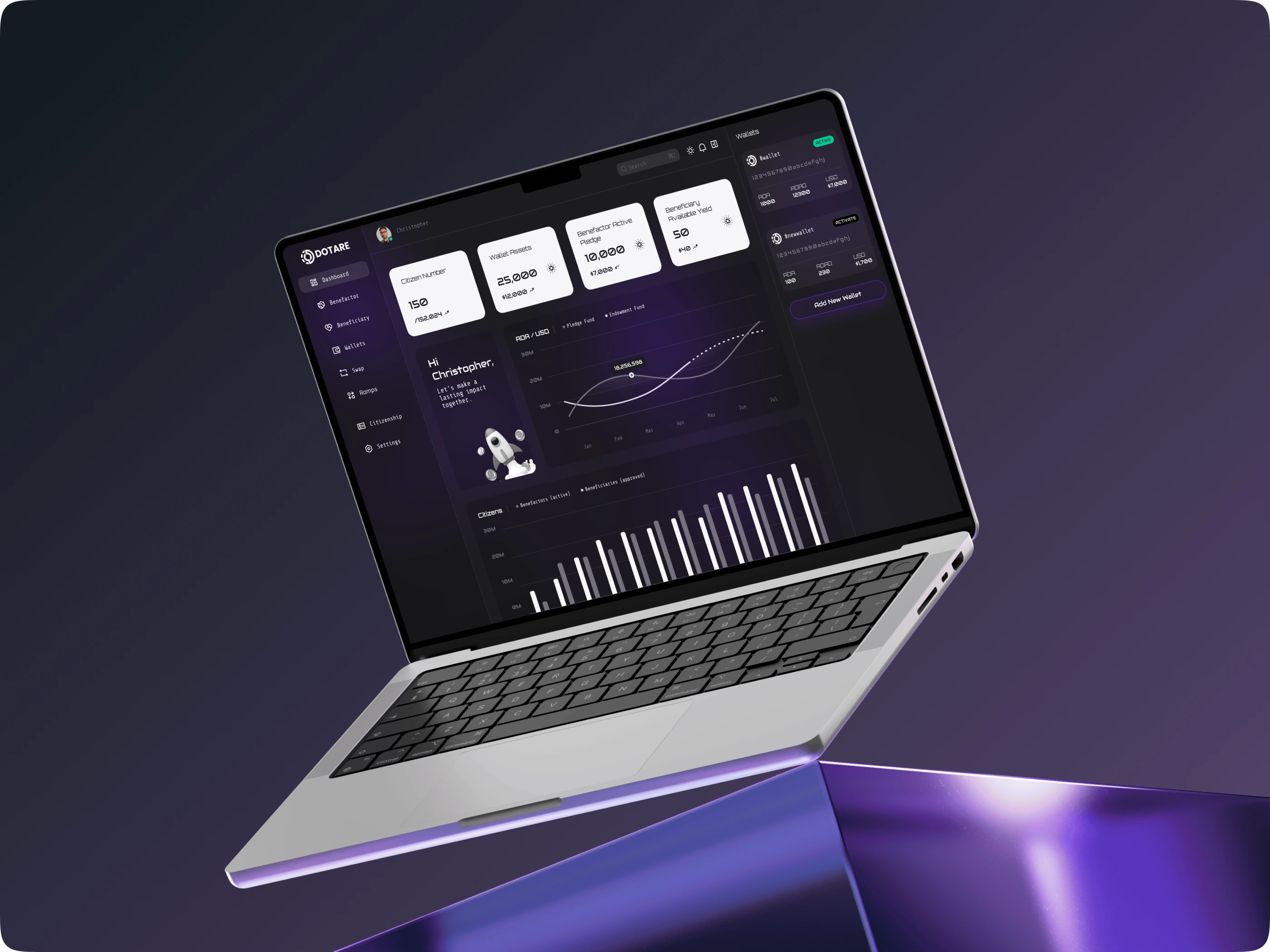
DOTARE is a groundbreaking DeFi platform that empowers benefactors to pledge funds for lasting social impact, beneficiaries to access yields transparently, and citizens to track community growth through blockchain tools like wallets, swaps, and endowments. In early 2024, Appsylvania designed the core dashboard from scratch, creating an intuitive, cosmic-themed interface that simplifies complex crypto interactions while fostering emotional connection to philanthropy. The result? A dark-mode portal that turns abstract metrics into motivational stories of change, boosting user adoption in the competitive social finance space.
The Challenge
Traditional DeFi and philanthropy platforms often overwhelm users with dense data, cryptic navigation, and a lack of personalization, leading to high drop-off rates. For DOTARE, we needed to address intimidation from blockchain jargon, ensure seamless responsiveness across devices, and highlight "impact" in a visually engaging way—without gimmicks. Research from 15 user interviews and competitor benchmarks (like Uniswap and Gitcoin) revealed that 70% of users craved simpler flows for pledges and yields, while personas like benefactor Christopher sought motivational elements to feel their contributions matter.
Our Approach — Impact-First Design
We prioritized empathy and clarity, blending DeFi mechanics with human-centered UX to make philanthropy feel accessible and inspiring:
Cosmic Aesthetic for Motivation: Purple gradients, rocket icons, and subtle animations evoke "launching impact," aligning with DOTARE's mission of sustainable growth.
Glanceable Metrics: Prominent cards for key stats like Citizen Number (150+ scaling to 152K+), Wallet Assets ($25K+), Active Pledges ($10K+), and Available Yields ($50+), with personalized greetings like "Hi Christopher, Let's make a lasting impact. Together."
Dynamic Visualizations: Wavy line charts for AOR/USD trends (peaking at $18M+) and monthly bar graphs for community expansion, ensuring data feels alive and actionable.
Streamlined Navigation: Intuitive sidebar with icons for Wallets, Swaps, Ramps, Citizenship, and more, fully responsive for desktop-to-mobile transitions.
Iterative Testing: Prototypes in Figma refined via user feedback, achieving a SUS score of 84 by adding tooltips, high contrast, and progressive disclosure for complex features.
Dashboard Overview
Calm, full-width layout with greeting, metric cards, and charts—designed to inspire at first glance.
Inspired by the transformative DOTARE dashboard? Partner with Appsylvania to craft intuitive, impact-driven designs for your next DeFi or fintech project.
Like this project
Posted Oct 28, 2025
Dashboard for DOTARE, a DeFi platform for impact pledges & yields. Intuitive dark-mode UI boosts engagement, simplifying blockchain philanthropy. (UI/UX · DeFi)
Likes
1
Views
3
Timeline
Jan 1, 2024 - Ongoing