
Almost every cybersecurity website looks the same. Blue gradients, padlock icons, and a stock photo of a hacker in a hoodie.
For my AFTRDRK concept, a threat intelligence company that operates in the hidden corners of the internet, I went the other way.
Their whole value is access to places others can’t reach. So instead of looking “safe,” the site leans into the dark:
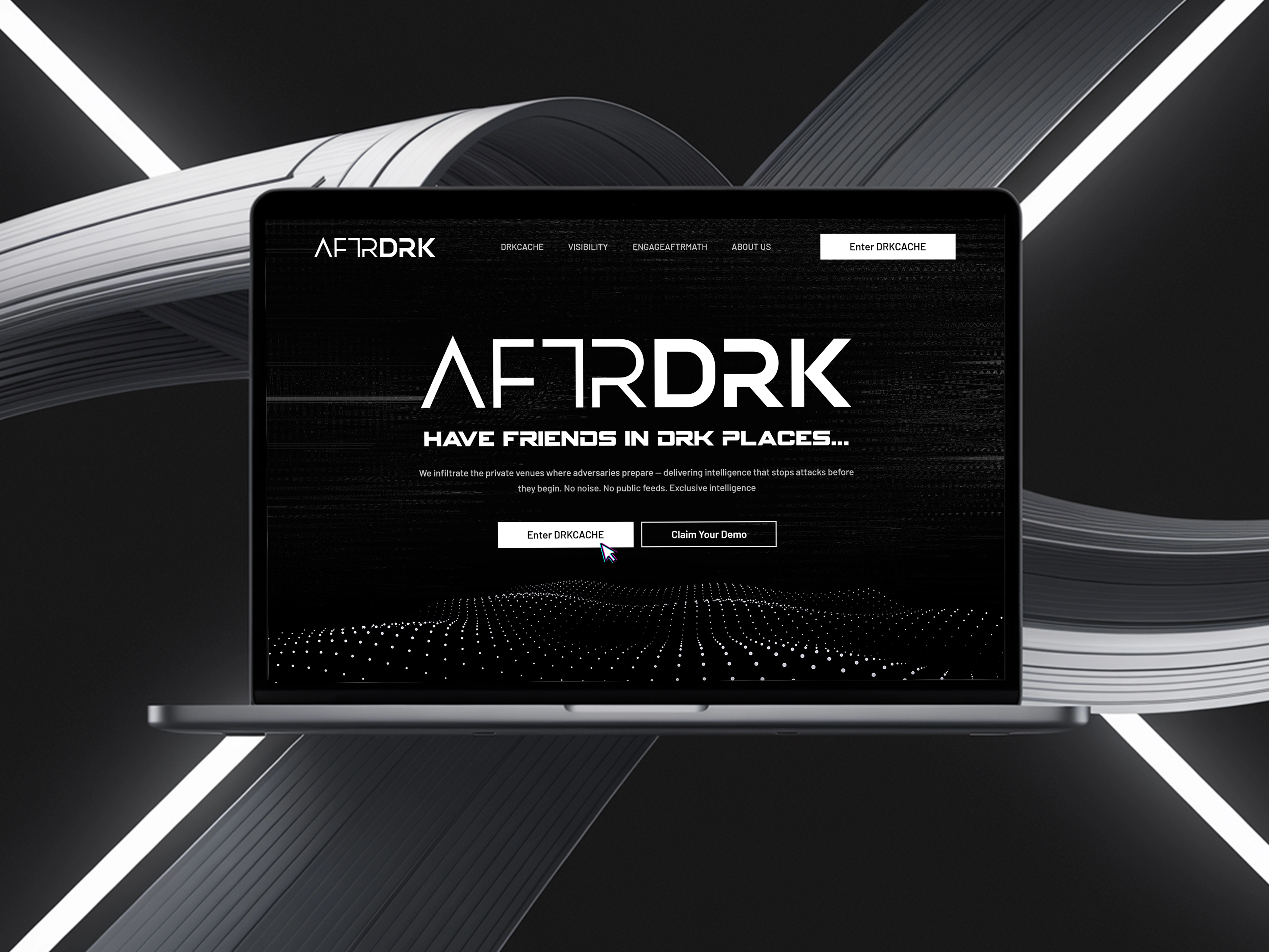
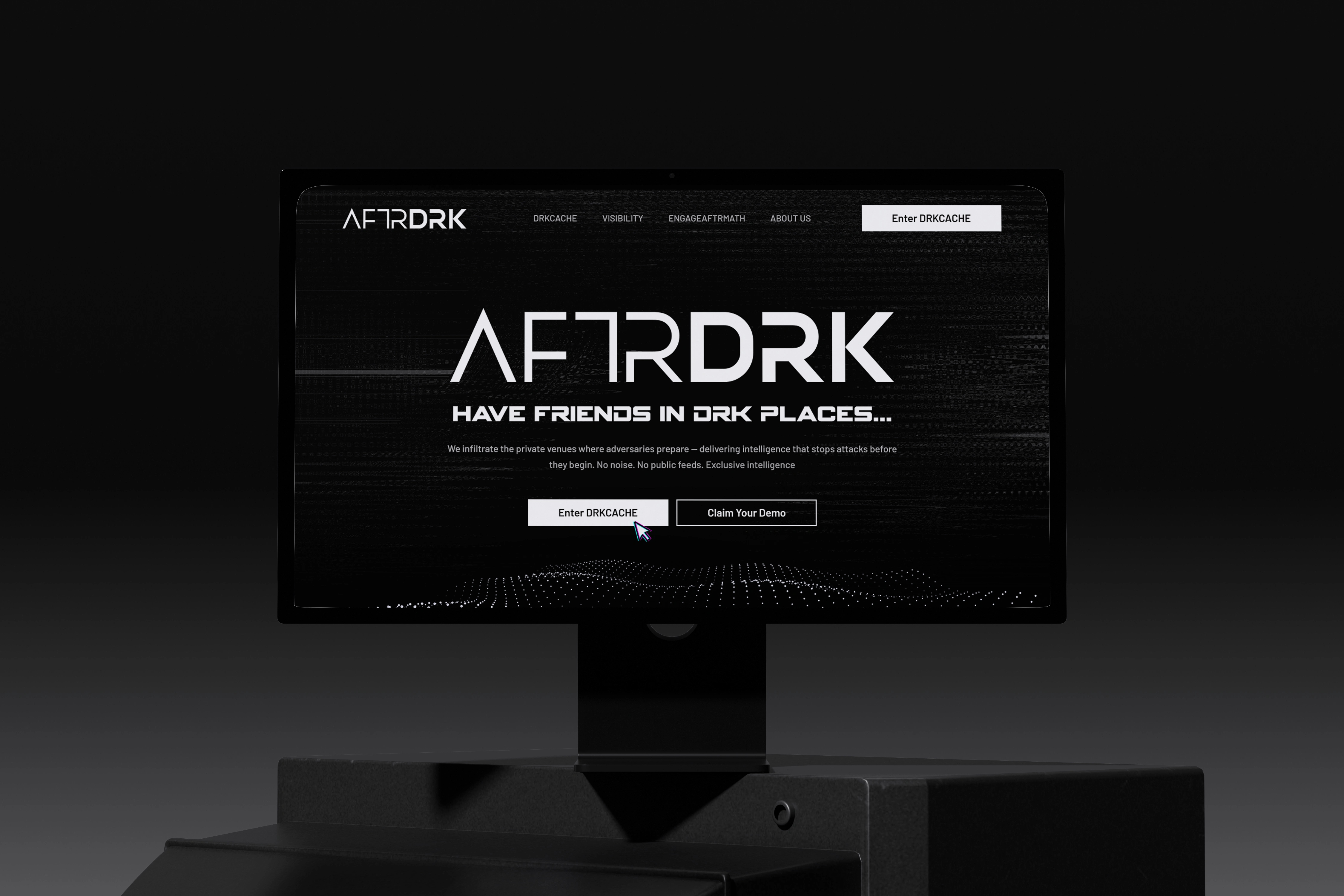
1) Pure black and white, no accent colour. The restraint makes it feel serious and exclusive
2) Glitch textures, scan lines and a particle wave, so the page feels like it’s picking up signals from somewhere hidden
3) A headline with attitude: “Have friends in DRK places...” It tells you exactly what they do in five words
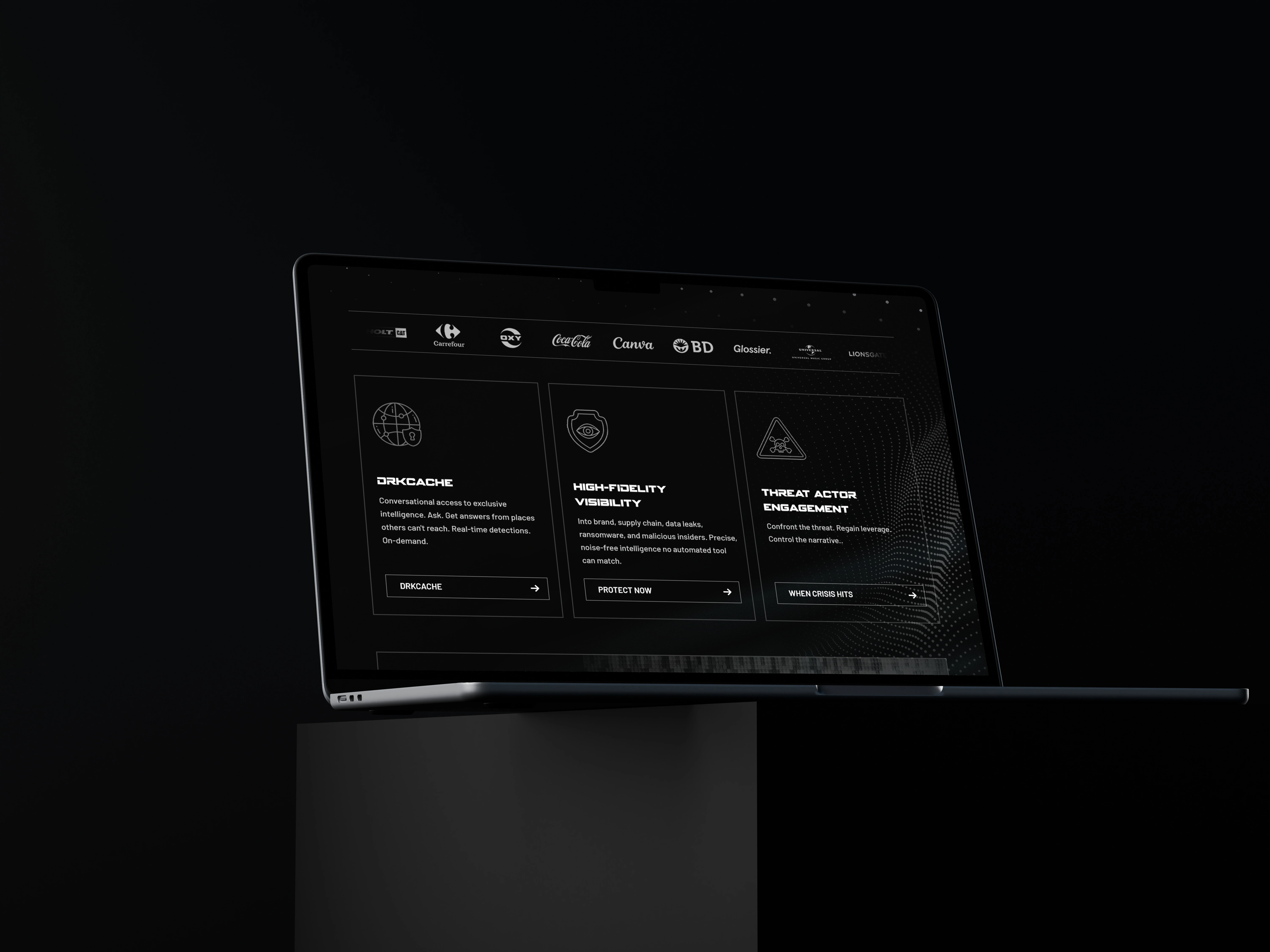
4) Three services, each with its own action: DRKCACHE, Protect Now, When Crisis Hits. The button tells you which situation you’re in
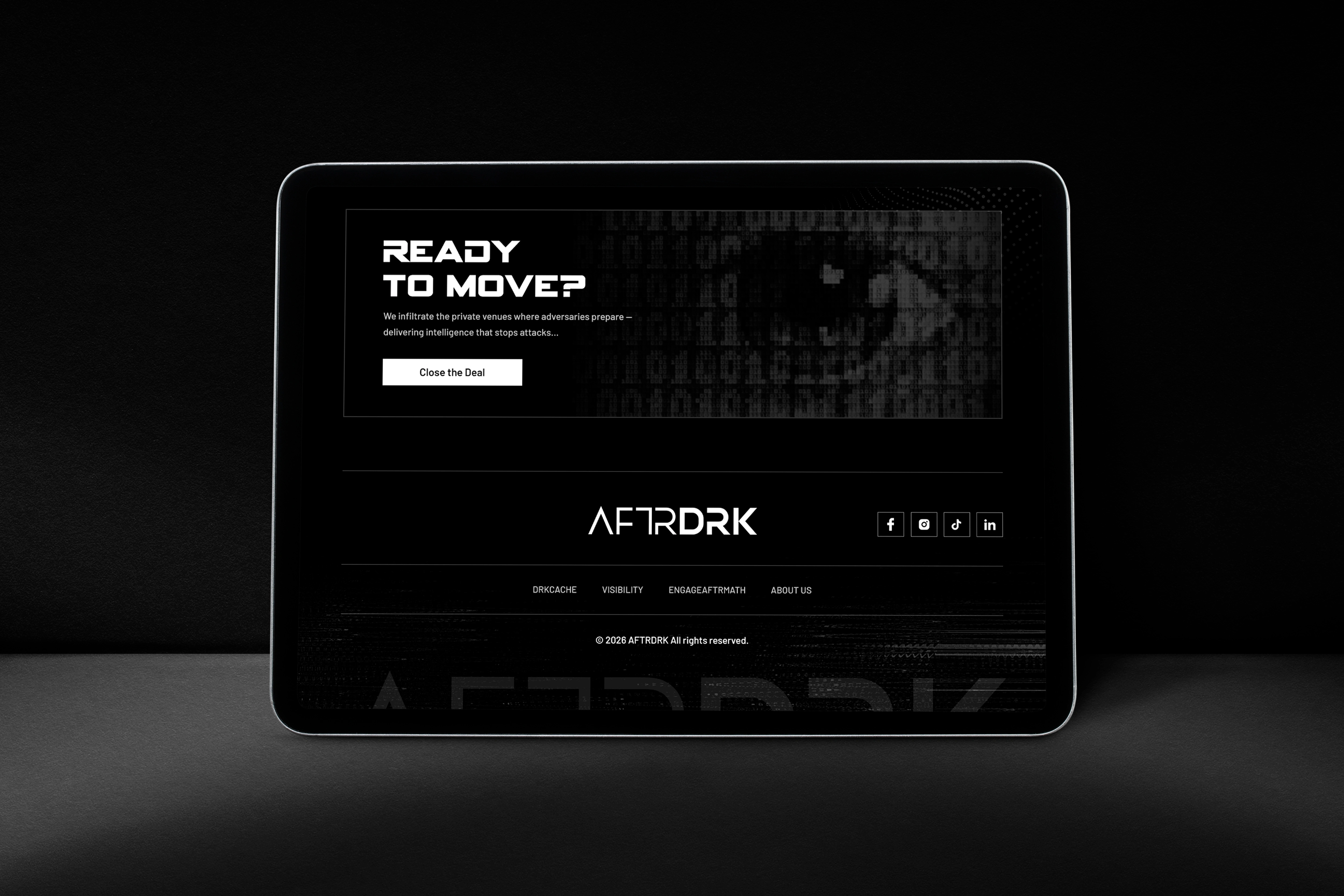
Dark, but never messy. Every section stays clean enough for a security team to trust.
Designers, honest question:
Should a cybersecurity brand look safe and reassuring, or a little dangerous?
0 likes · 0 views · Oct 10, 2026
Almost every cybersecurity website looks the same. Blue gradients, padlock icons, and a stock photo of a hacker in a hoodie. For my AFTRDRK concept, a threat...


