
S.M. Ali
UI/UX Designer for SaaS Startups & High-Converting Websites
Profile in progress
S.M. is building their profile!
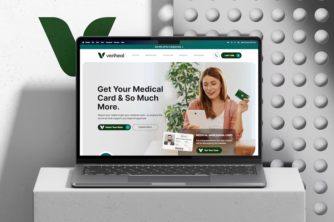
How do you make a medical marijuana website feel like healthcare, not a dispensary ad?
That was the challenge I set myself for my Veriheal design contest entry.
Cannabis still carries stigma. A lot of people landing on a site like this are nervous. They're unsure if they qualify, confused about their state's rules, and worried about doing something wrong. If the design feels edgy, they leave. If it feels cold and clinical, they don't trust it either
So I designed it like a modern health brand:
"Select Your State" is the main action, because the rules change state by state, and that's the first question every patient has
A real person holding the card in the hero, so getting approved feels normal and within reach
Deep green, clean white, and a calm layout, so it reads as medical and trustworthy, not trendy
Phone and "Let's Talk" right in the header, because first-timers want to know a real human is there
Designers, honest question:
When a product carries stigma, should the design own it or make it look as "normal" as possible?
1
14
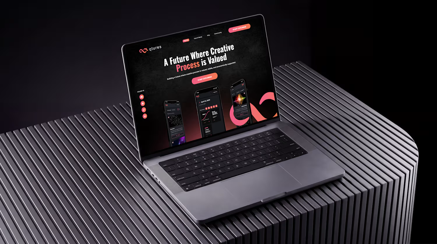
Most product websites explain features. The good ones explain why someone should care.
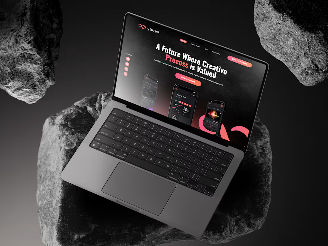
qtures is a concept for a creative-process app: a daily log where creatives save drafts, references, and the reasons behind their decisions.
The challenge with a product like this is that "process journaling" sounds abstract. So the landing page had to make it click in seconds:
→ One clear promise in the headline, before any feature talk
→ Real app screens in the hero, so visitors see the product instead of reading about it
→ One action, repeated: Start Exploring. No competing buttons
→ A dark, quiet look that feels premium and lets the product stand out
The goal: a visitor understands what it is, who it's for and what to do next, without scrolling.
If you're building an app or SaaS product and your website isn't turning visitors into sign-ups, I design landing pages and app UI that make your product easy to understand and easy to start.
Let's talk. Send me a message 👋
1
41
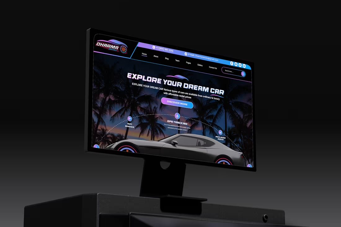
Dharma Rentals | Luxury Car Rental Website | Miami
A car rental website concept for Miami that puts booking first. Dates and location are in the hero, the fleet is easy to browse, and the brand feels like Miami at night.
Introduction
Dharma Rentals is a car rental concept for Miami-Dade and Broward County. The fleet covers everything from economy cars to luxury models. The brief I set myself was a website that feels as premium as the cars, but still lets someone book a rental in under a minute.
The Challenge
Most car rental websites get two things wrong.
First, they make you work before you can book. You land on a big banner, scroll past promotions, and eventually find a booking form halfway down the page. But someone renting a car almost always arrives knowing when and where they need it. Making them hunt for the form is how rental sites lose people.
Second, they hide the local details. A rental is a physical thing you have to go and collect. People want to know where the car is, when the office is open, and whether pickup is close to them. Many sites put all of that in the footer.
The opposite risk is just as real. Luxury rental sites often go so heavy on mood and imagery that they forget to work as a booking tool. I wanted the page to do both jobs.
The Approach
Booking in the hero. The pickup and drop-off search bar sits right in the first screen, on top of the hero image. A returning customer can enter dates and search without scrolling at all. Everything else on the page is there for people who aren't ready to book yet.
Location near the top. Directly below the top-rated cars, there's a map with the pickup route, the address, and business hours for weekdays, weekends and public holidays. For a local business, that information builds trust, so it belongs where people decide, not at the bottom of the page.
A fleet you can filter. Cars are grouped into SUV, Luxury and Economy tabs. Each card shows the price per day, the rating, and the features people compare: GPS tracking, Bluetooth, seats and mileage. Visitors can narrow the fleet to what they need instead of scrolling through everything.
Answering doubts in order. The lower half of the page follows the questions a first-time renter usually has: how does it work (a three-step process along a winding road), why choose this company, what if something goes wrong (insurance and support), what do other customers say (a 4.7 rating with category scores), and what else do I need to know (FAQ). Each section deals with one hesitation before the next booking prompt.
Visual Direction
The brand is built around Miami at night: a black sports car with pink rims, palm trees against a dark sky, and neon pink-to-violet gradients. Wide, all-caps display type gives the headings a fast, motorsport feel. The dark background makes the car photos stand out and keeps the page feeling exclusive rather than budget.
The challenge was keeping that mood from overwhelming the functional parts. The booking bar, car cards and FAQ use clean light surfaces and simple layouts, so the neon stays in the atmosphere and doesn't get in the way of the content people need to read.
Outcome
The result is a rental website that feels premium without making booking harder. Someone who knows what they want can book from the first screen. Someone who's still deciding gets the fleet, the location, the process and the reviews in the order they're likely to ask about them.::
1
77