
Most trading websites look like one of two things: a scam or a bank.
Lambos and "get rich fast" on one side. Grey, cold and forgettable on the other. Neither makes a smart person want to learn from you.
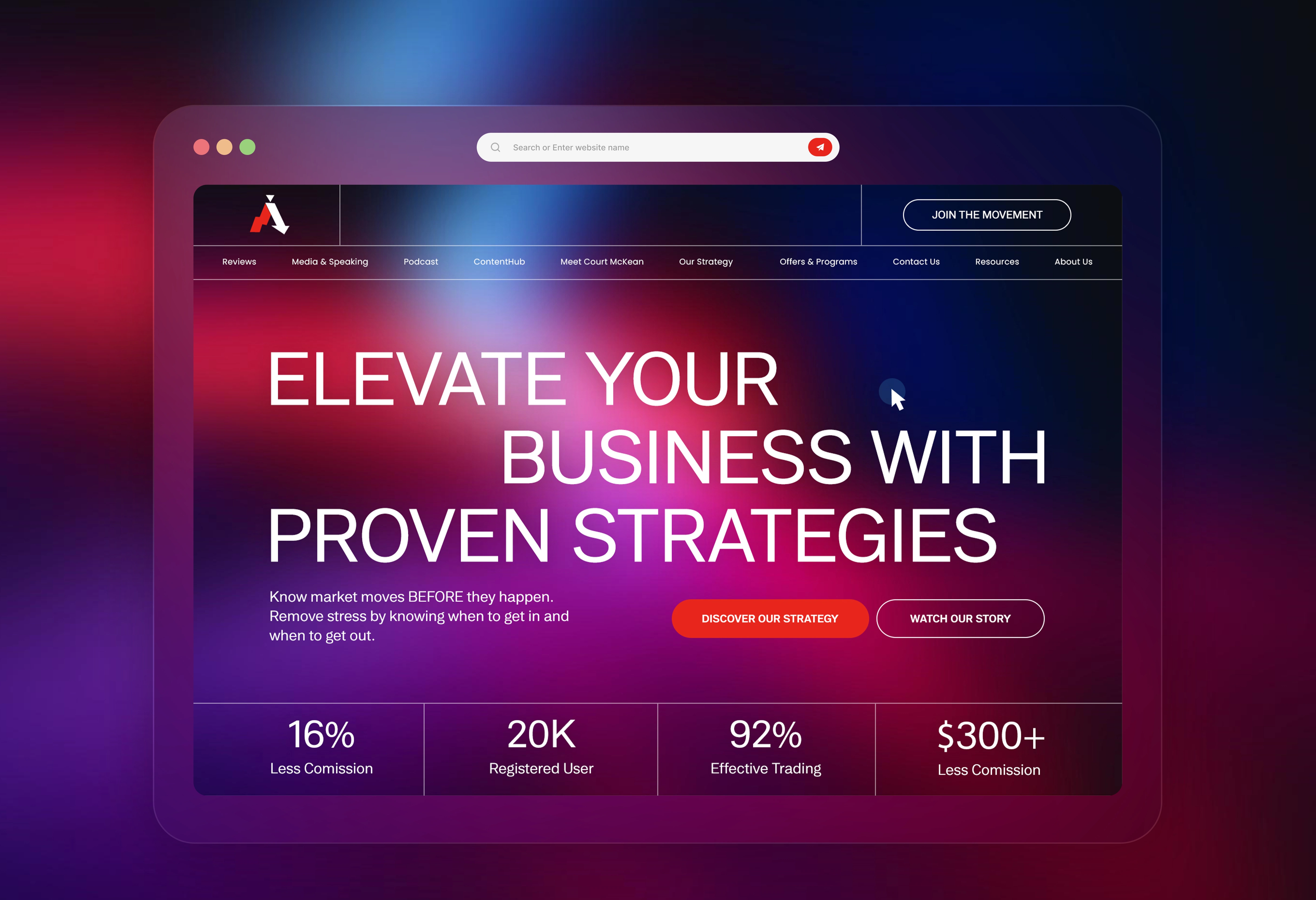
For my Simple FX System concept, a forex trading education brand, I aimed for the space in between: ambitious, but credible.
1) A bold, staggered headline across the full width, so the first impression is confidence.
2) A subline that speaks to the real fear every trader has: knowing when to get in and when to get out
3) One strong red action, with "Watch Our Story" as the softer second option.
4) Key numbers right under the hero, so proof shows up before any pitch.
5) A deep red, purple and blue gradient that feels like a trading screen at night, without the gimmicks
Designers, honest question:
In finance, does a bold, energetic design build trust, or does it make people more suspicious?
0 likes · 0 views · Oct 6, 2026
Most trading websites look like one of two things: a scam or a bank. Lambos and "get rich fast" on one side. Grey, cold and forgettable on the other. Neither...


