Social Media Design Launch Kit for Borro

Francis Adediran


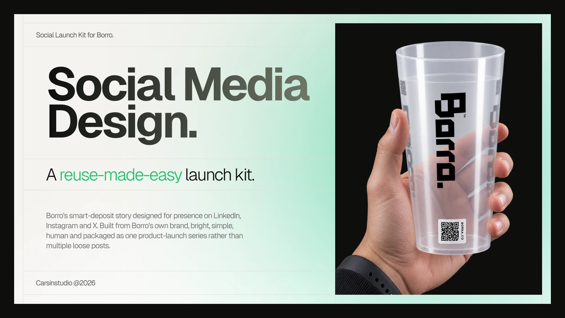
Project title: Borro - Social Media Launch Kit
Role: Brand & Social Design (concept, art direction, copy, layout)
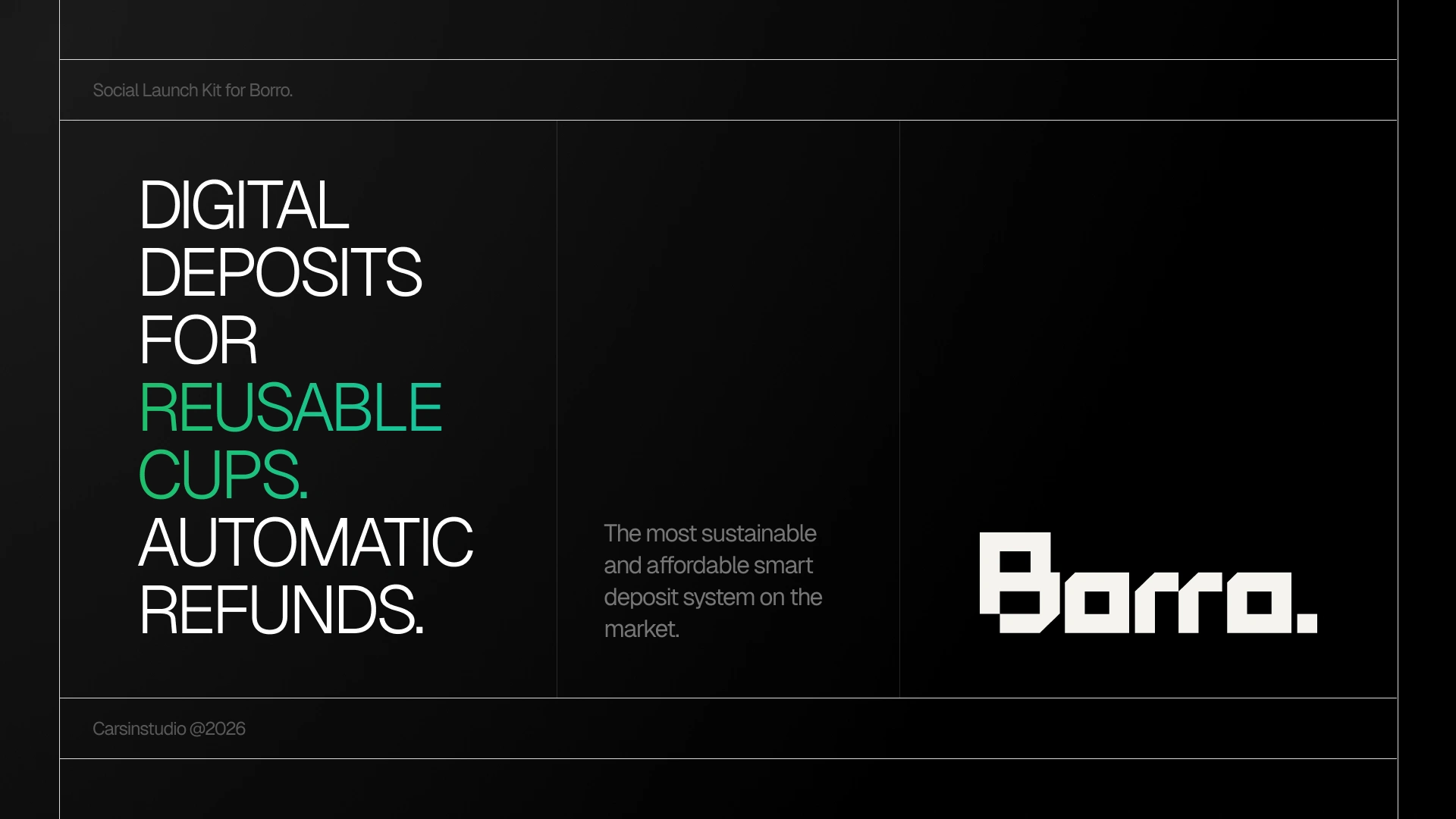
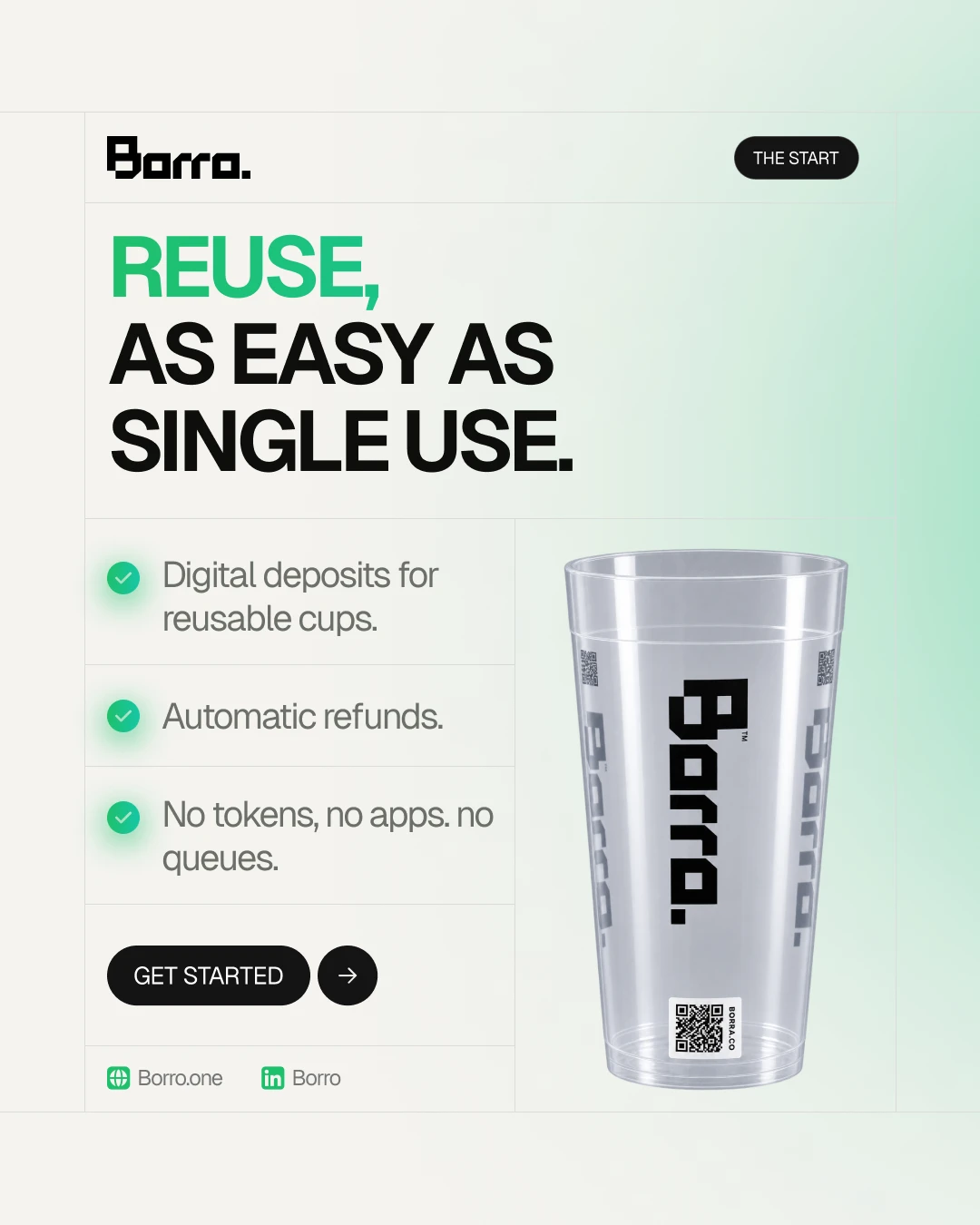
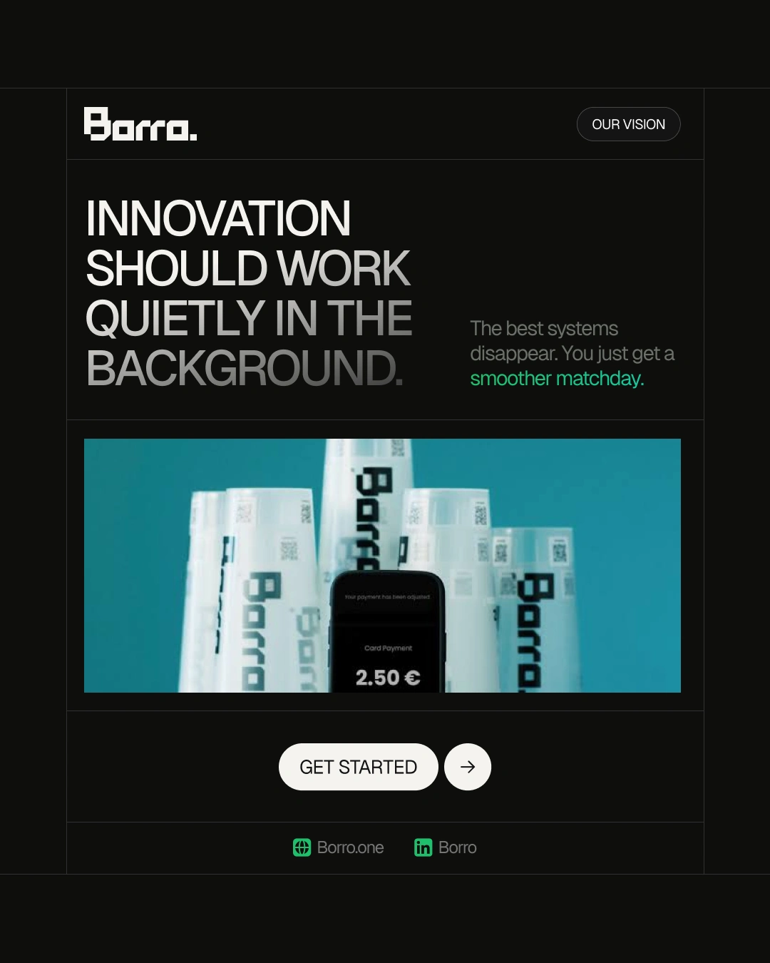
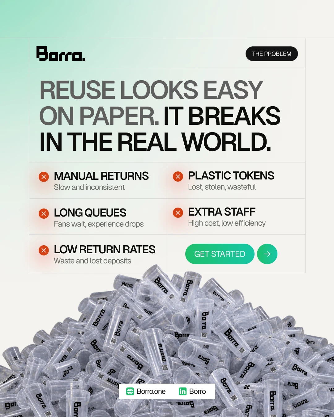
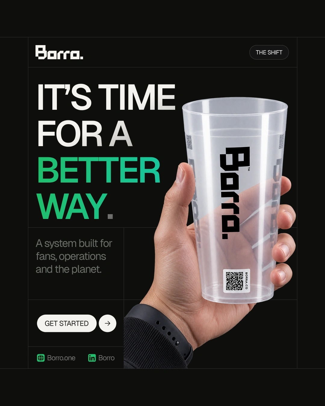
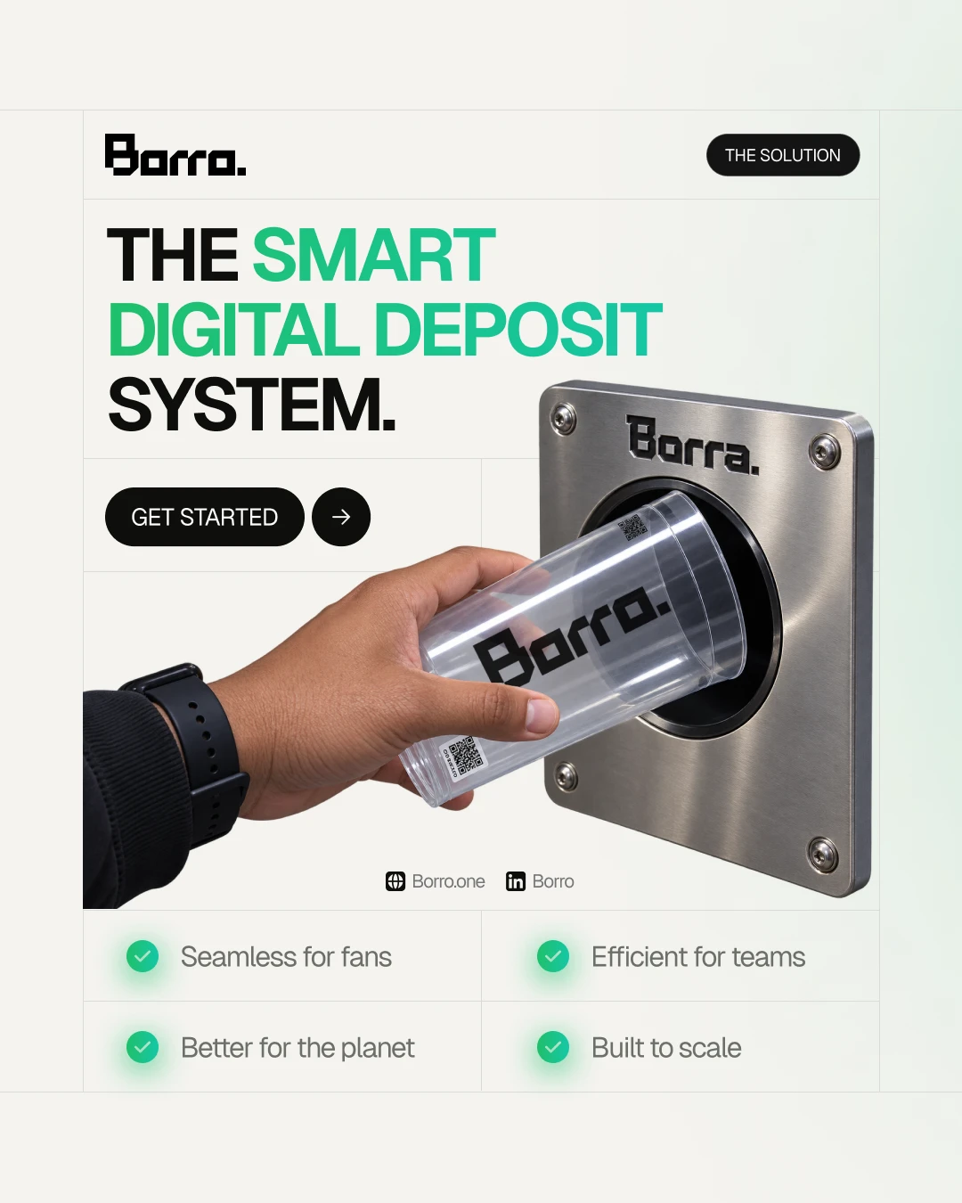
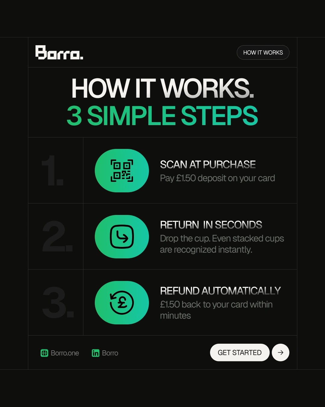
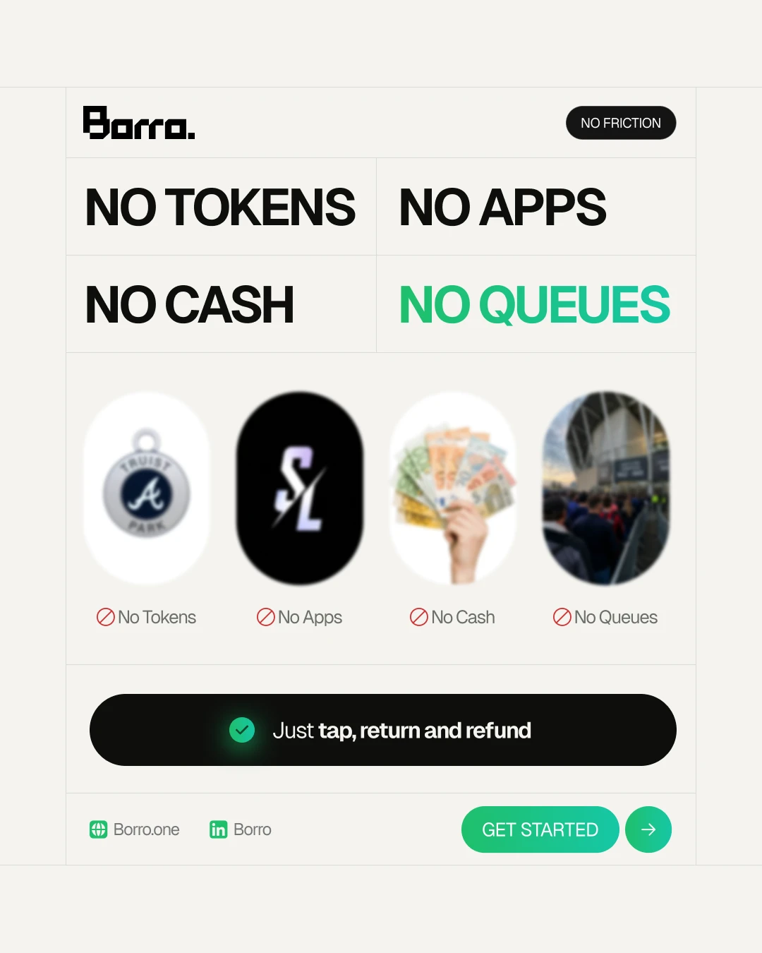
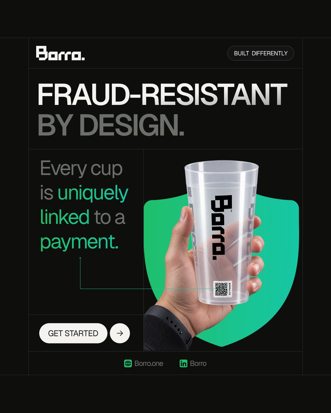
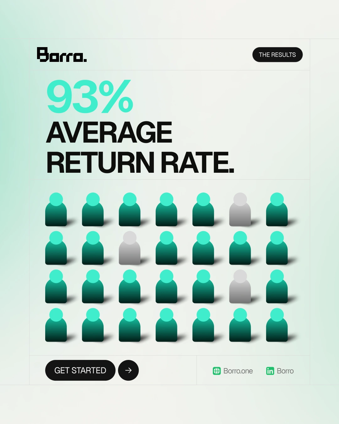
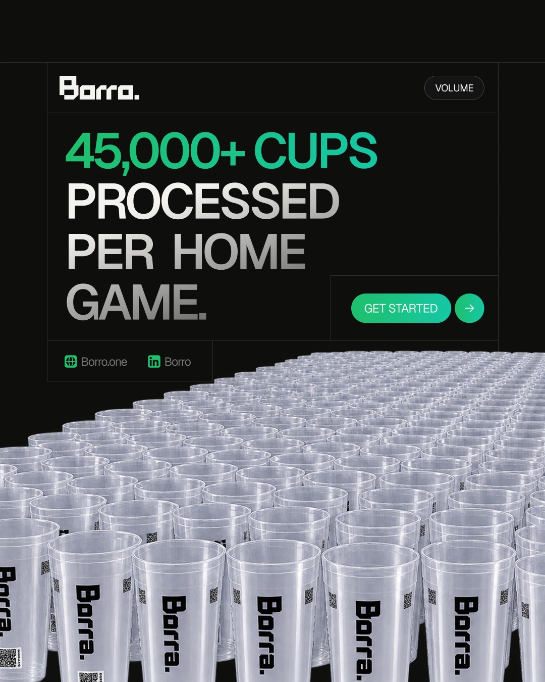
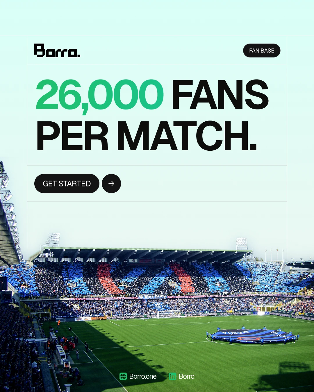
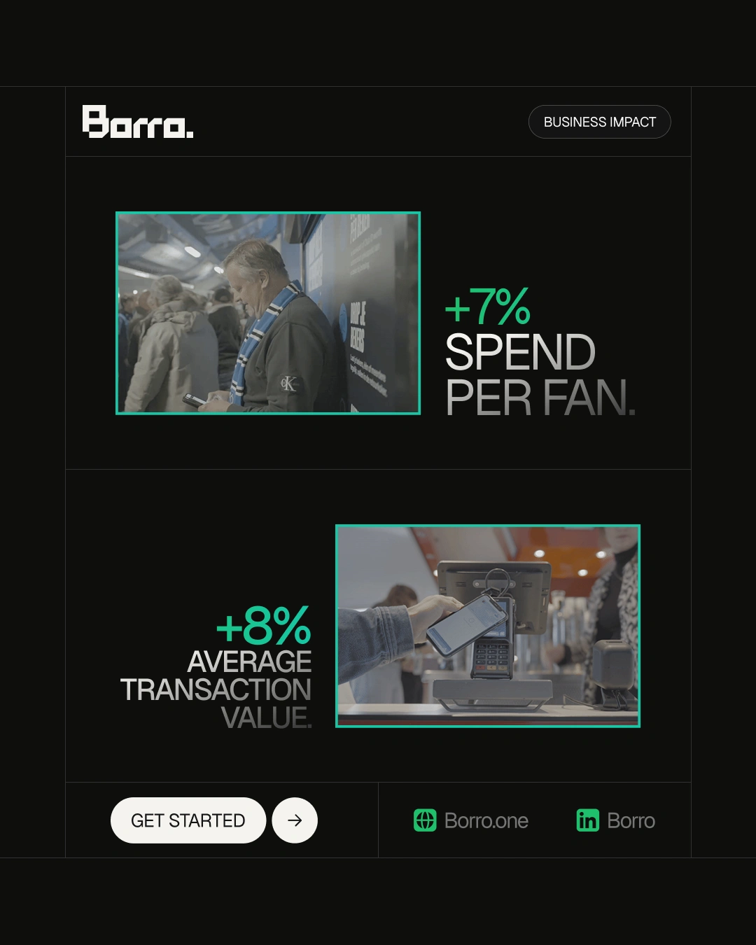
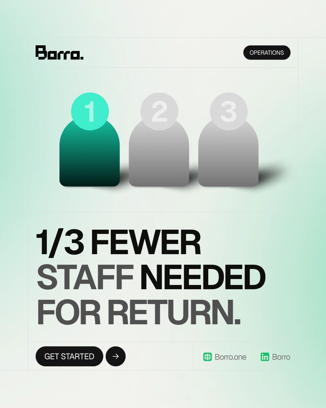
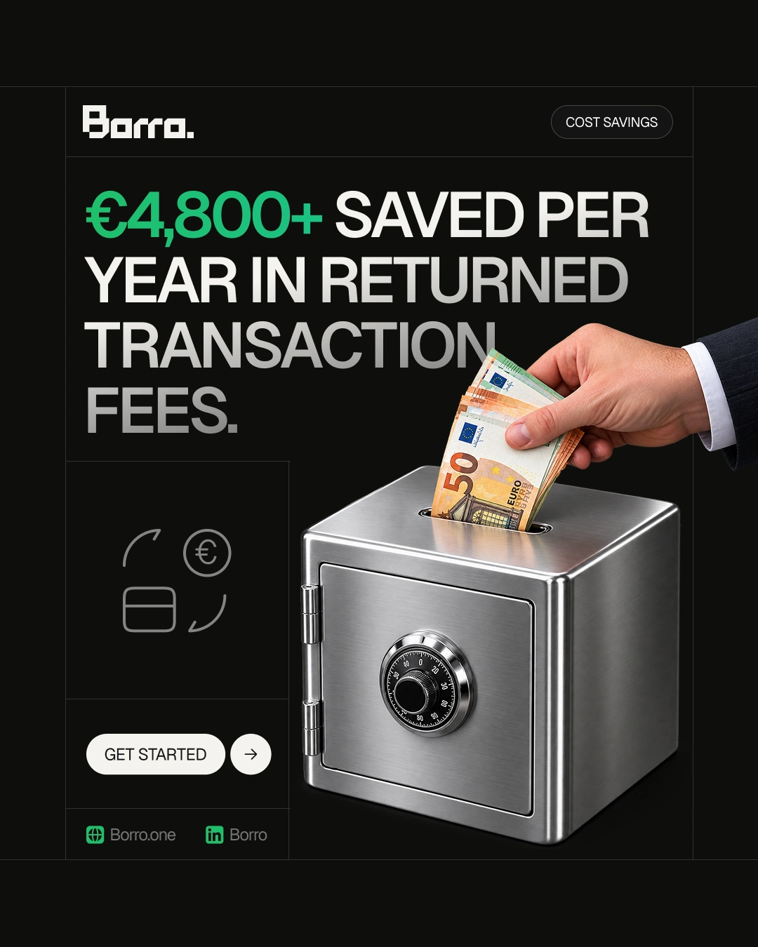
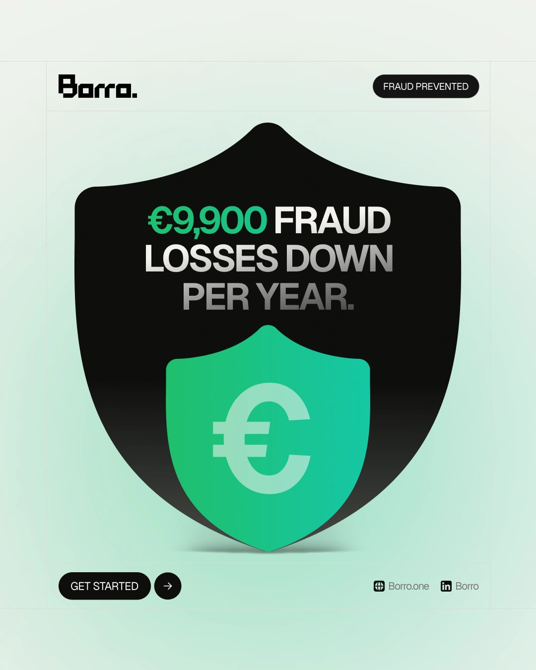
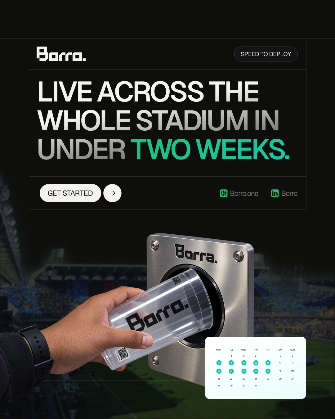
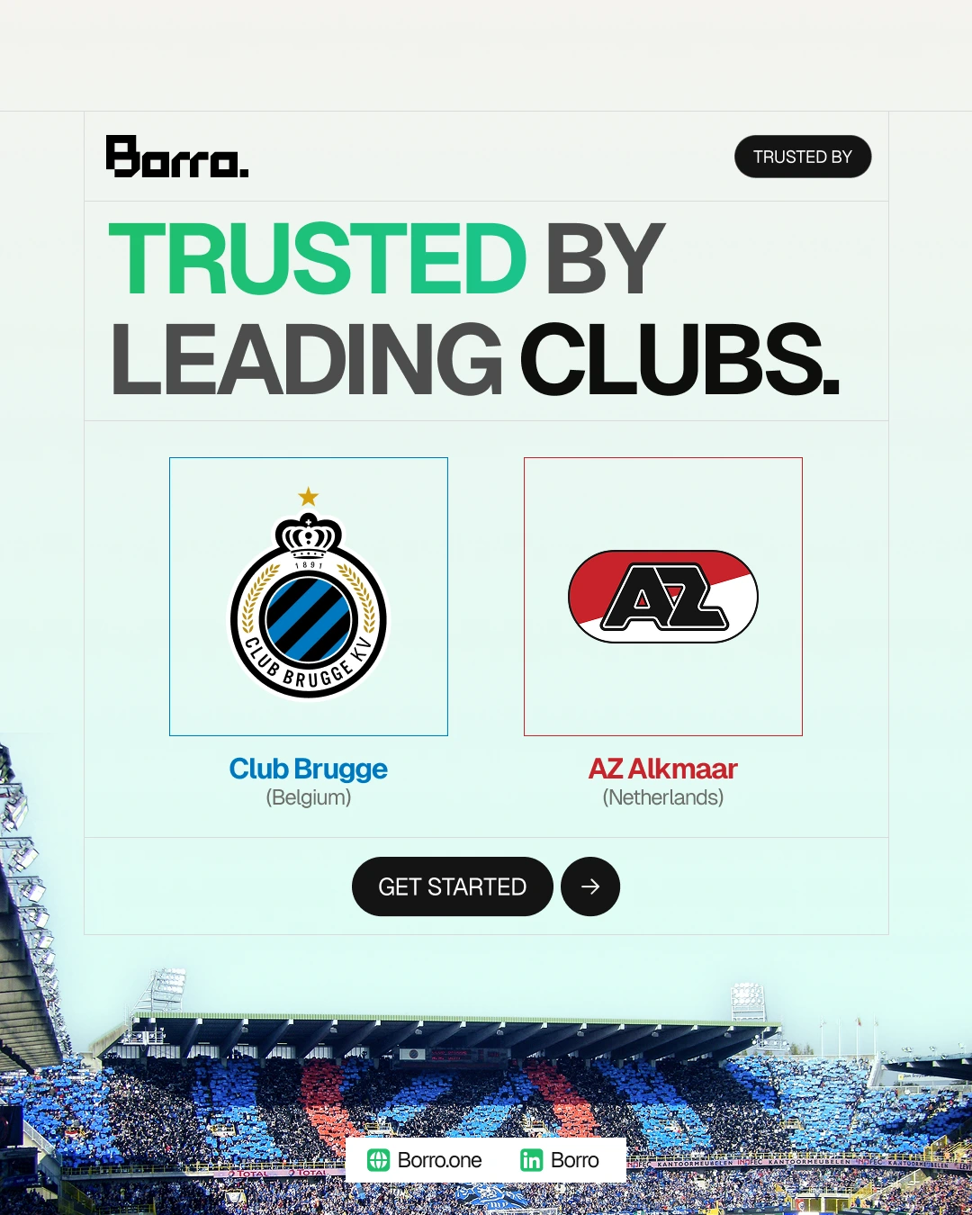
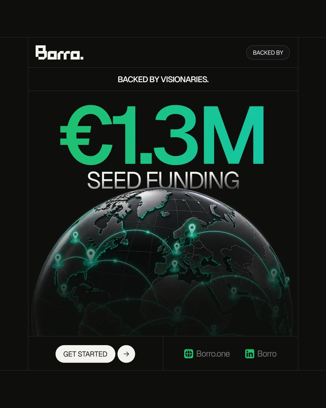
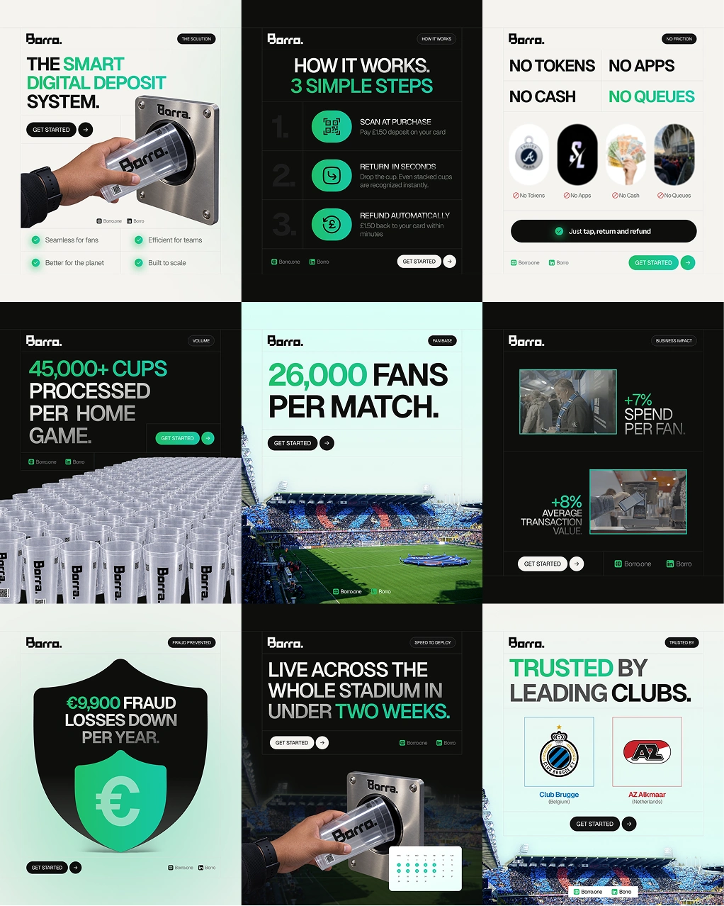
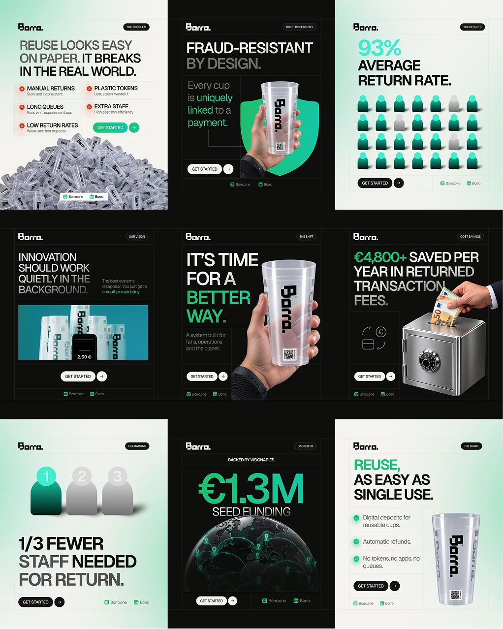
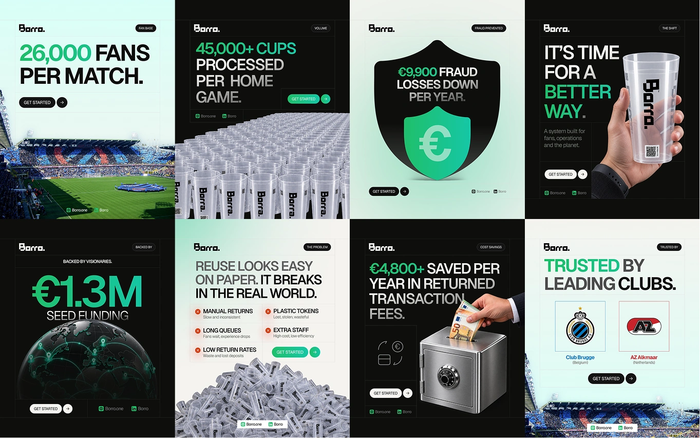
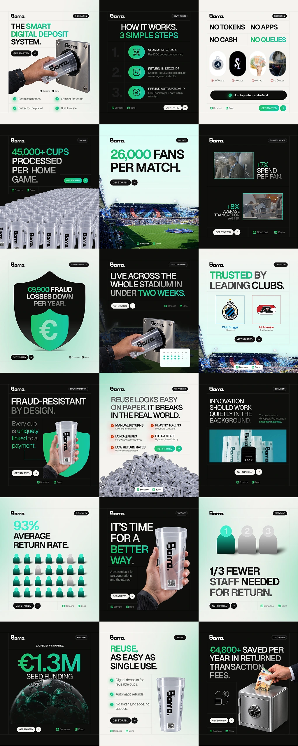
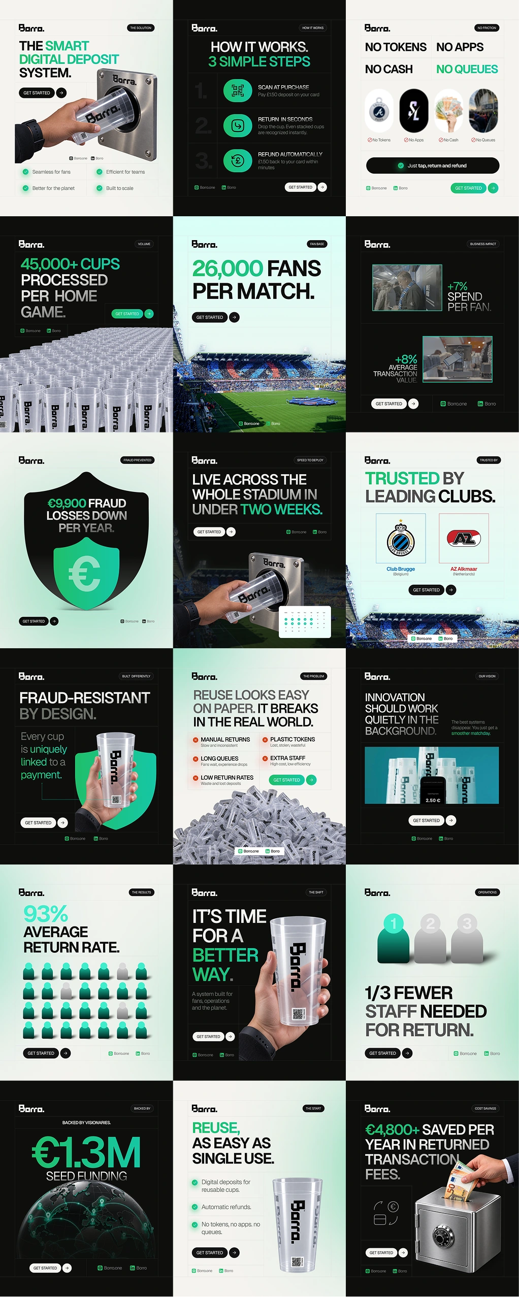
Short description: A social launch kit for Borro, a sustainability and events-technology company making reusable cup deposits easier for stadiums, festivals, and high-volume venues. I built 18 portrait tiles and 5 motion ads (GIFs) that turn Borro's product, value proposition, and proof points into a cohesive campaign for LinkedIn, Instagram, and X.
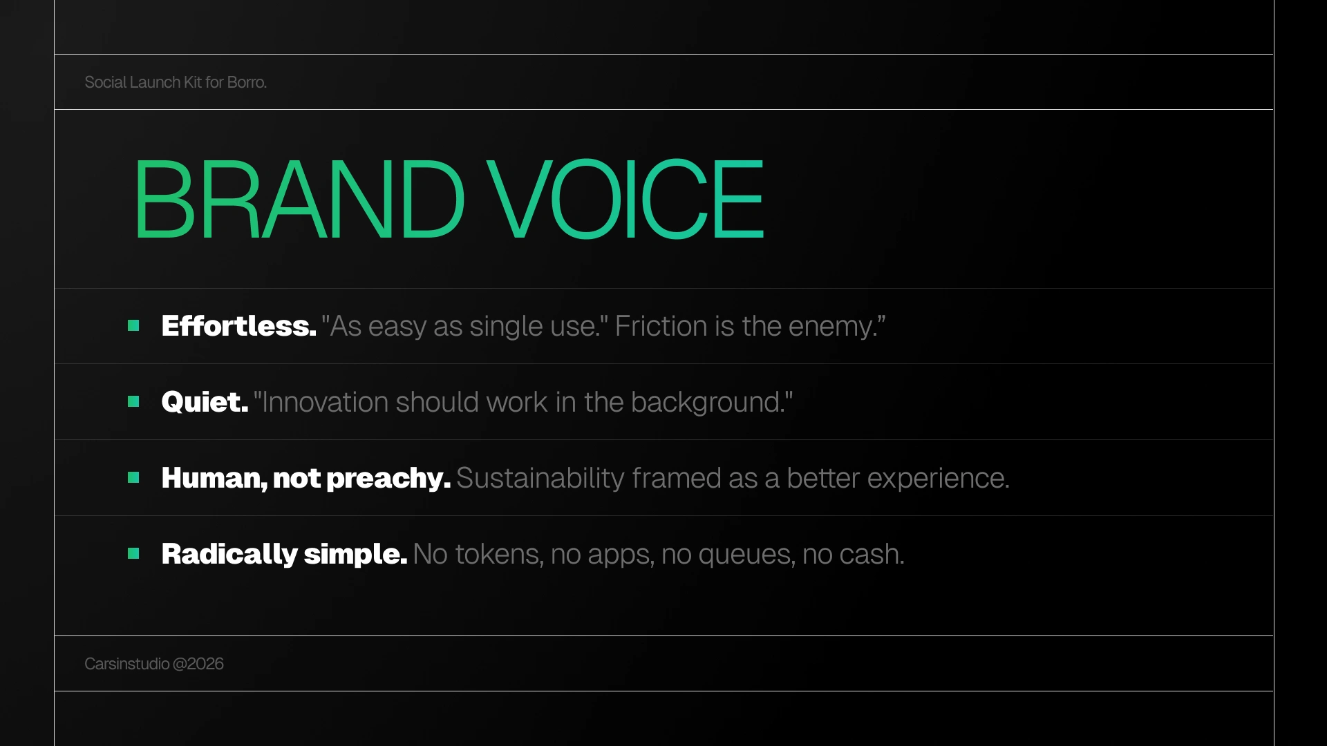
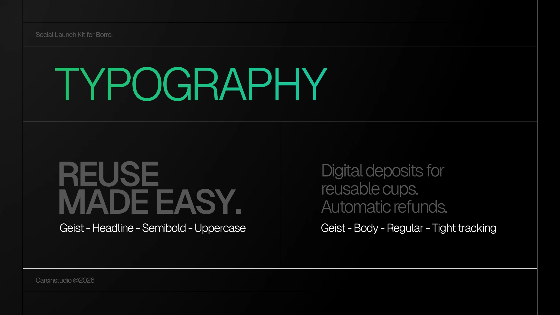
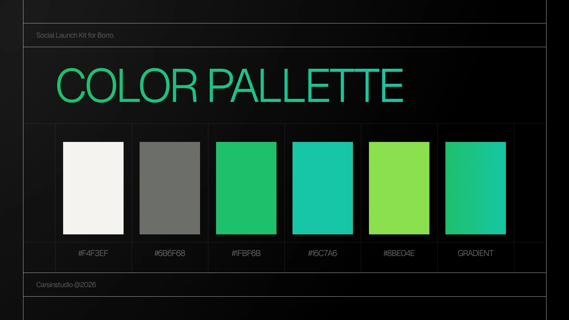
I extracted Borro's visual direction into a clean system built around an off-white canvas, near-black typography, a green-to-teal accent, generous whitespace, rounded UI elements, and reusable-cup motifs. The content is organized around the problem, how the system works, visitor experience, operational value, sustainability, customer proof, and key business results. The 5 motion ads extend the same visual language into short-form animated creatives, creating a consistent bridge between the static social content and paid/social advertising.
Deliverables: 18 social tiles (1080×1350) · 5 motion ads (GIFs) · visual system · content structure · presentation-ready campaign · reusable design system
Like this project
Posted Aug 26, 2026
A social launch kit for Borro, a sustainability and events-technology company making reusable cup deposits easier for stadiums, festivals & high-volume venues.
Likes
1
Views
11
Timeline
Aug 19, 2026 - Aug 26, 2026