Social Media Designs rollout for LeanSpring
Francis Adediran
Building LeanSpring
Creating a wellness brand that feels supportive, not judgmental
Role: Brand Strategist & Social Media Designer
Industry: Health & Wellness
Deliverables: Brand Identity, Social Media Rollout, Launch Campaign Assets
Overview
LeanSpring approached me with a simple but important challenge:
Most weight-loss brands focus heavily on results. Before-and-after photos, aggressive messaging, unrealistic expectations, and pressure-driven marketing dominate the industry.
The founders wanted something different.
They wanted a brand that felt calm, encouraging, and human. A brand that could help people pursue healthier lifestyles without shame, pressure, or unrealistic promises.
My role was to translate that vision into a complete visual identity and social media rollout system.
The Challenge
The wellness industry is crowded with brands that compete for attention through intensity.
The problem was that this approach often alienates the very people looking for support.
LeanSpring needed to:
Build trust immediately
Differentiate from traditional weight-loss brands
Create an emotional connection with their audience
Launch with a recognizable and scalable visual identity
The challenge wasn't simply designing social media posts.
It was creating a brand people could emotionally connect with.
Strategic Insight
Before designing anything, I identified the emotional tension at the center of the brand.
People want to lose weight but they don't want to feel judged.
They want guidance but they don't want noise.
They want structure but they still want control over their journey.
This insight became the foundation of the entire visual direction.
Instead of building a brand around pressure and transformation, I built it around empathy, clarity, and calm progress.
Brand Strategy
The visual system was designed around three core ideas:
Empathy
Every touchpoint needed to feel supportive rather than demanding.
Clarity
Information should feel simple, digestible, and easy to trust.
Sustainable Progress
The brand should celebrate consistency instead of extreme transformation.
These principles informed every design decision moving forward.
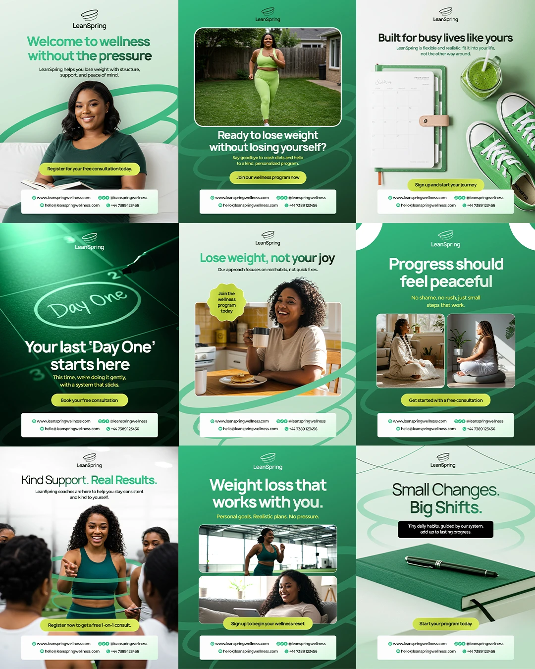
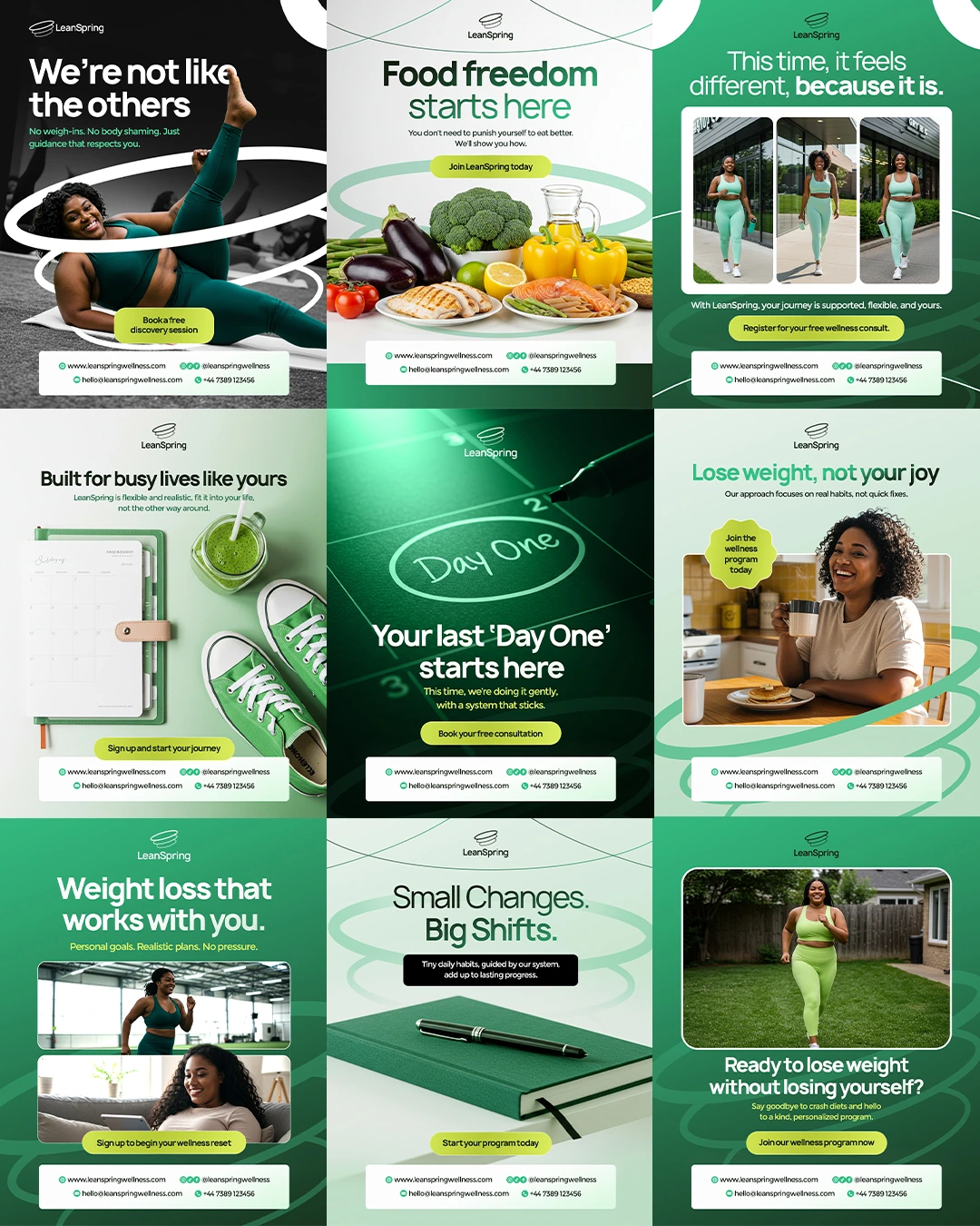
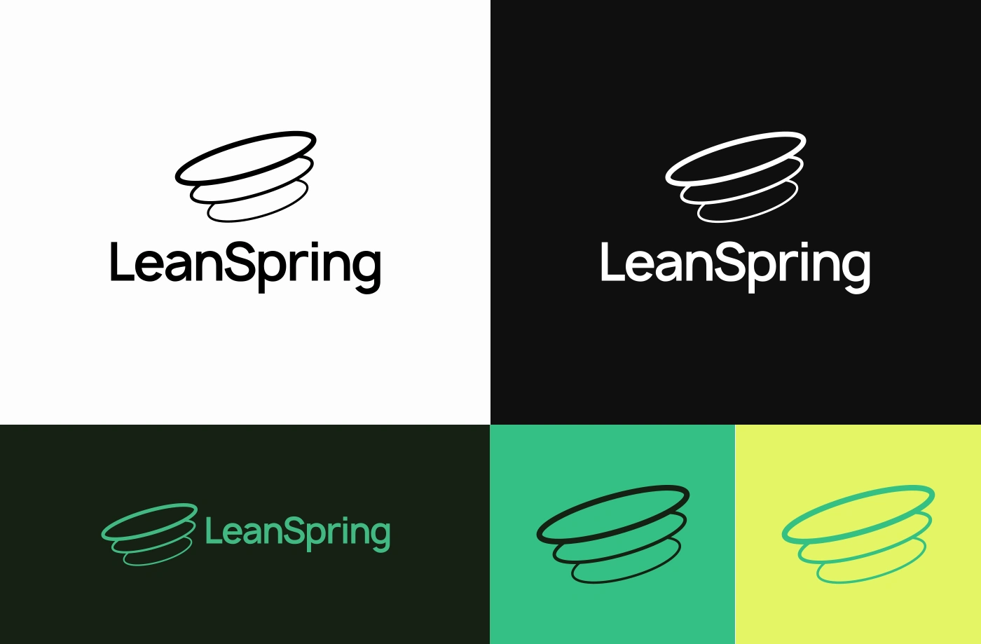
Visual Identity System
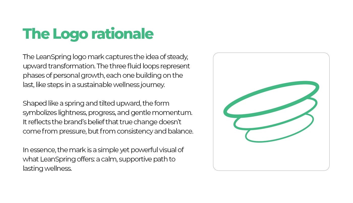
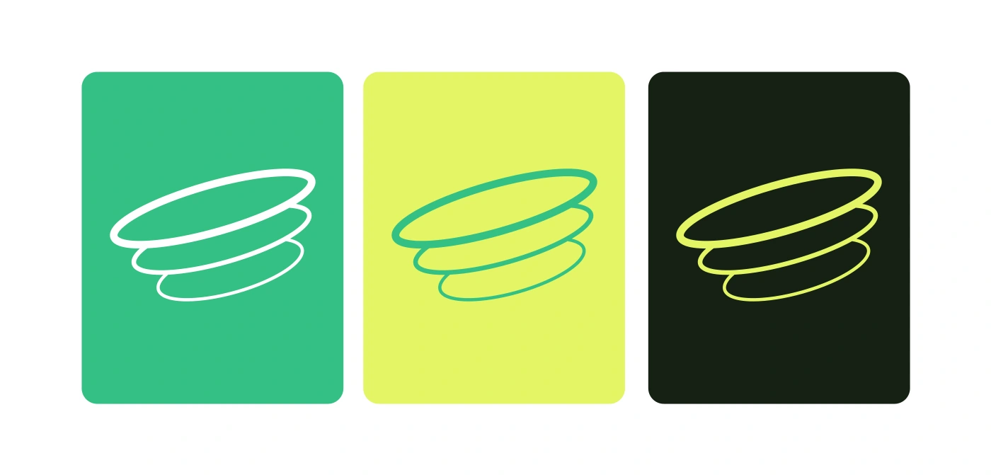
Logo Concept
The LeanSpring symbol was designed to represent steady upward transformation.
The three fluid loops represent stages of personal growth, each building upon the last.
The spring-like form symbolizes:
• Progress
• Momentum
• Balance
• Sustainable change
The mark reinforces the idea that meaningful transformation comes from consistency, not pressure.


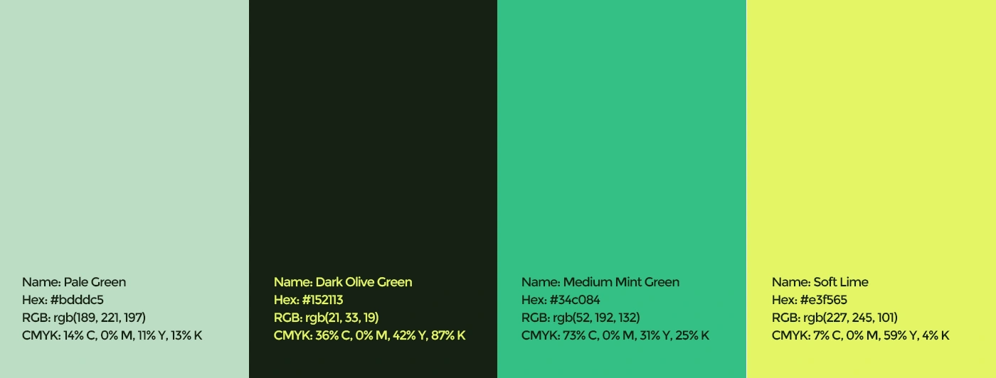
Color System
The palette was intentionally selected to create emotional contrast against the aggressive visual language commonly seen in fitness brands.
Pale Green
Creates feelings of calmness and safety.
Dark Olive Green
Adds credibility, depth, and professionalism.
Medium Mint Green
Introduces freshness, optimism, and energy.
Soft Lime
Creates visual emphasis while maintaining warmth.
Together, the palette communicates wellness, trust, and growth.
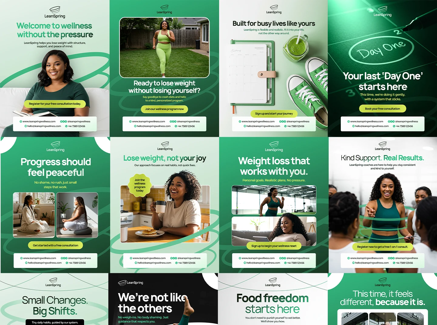
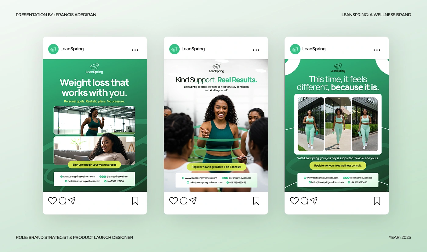
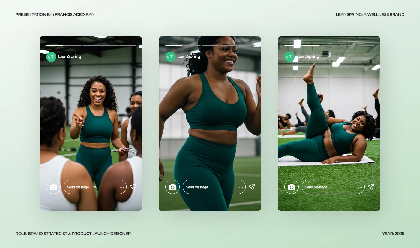
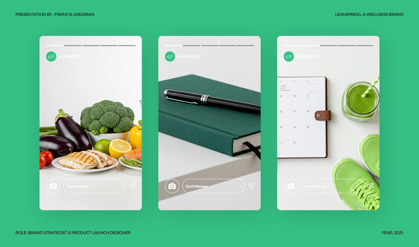
Design Rollout
The launch system included:
• Social media feed designs
• Promotional content
• Educational content
• Awareness campaigns
• Story templates
• Brand launch assets
The goal was to create consistency without repetition.
Each post feels connected to the same visual system while serving a different communication objective.

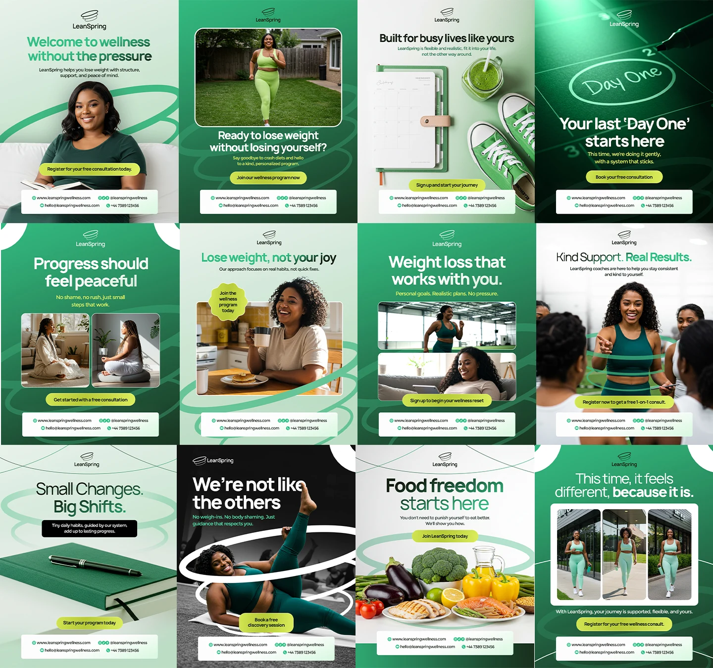
The Solution
The final rollout combined:
✓ A distinctive visual identity
✓ A scalable content system
✓ Consistent brand recognition
✓ Clear messaging hierarchy
✓ Emotionally driven design principles
Rather than creating individual graphics, the focus was on building a system the brand could continue using long after launch.
Impact
This project helped LeanSpring establish a stronger and more memorable visual presence.
The brand launched with:
• A cohesive identity
• Clear differentiation from competitors
• Stronger visual consistency
• Increased credibility and trust
Most importantly, the brand now communicates wellness through support rather than pressure.
As a designer, this project is one of my favorites because it demonstrates how design can shape perception, not just appearance.
Key Takeaway
Good design doesn't just make a brand look better.
It helps people understand what the brand stands for.
For LeanSpring, that meant creating a visual identity that feels calm, human, and supportive in an industry that often feels overwhelming.
Looking for a social media designer who can help your brand build trust visually?
Let's create a visual system that makes people take your brand seriously from the first impression.
Like this project
Posted Jun 1, 2026
Designed a strategic social media rollout that improved brand perception, visual consistency, and audience trust for LeanSpring.
Likes
1
Views
2
Timeline
Jun 19, 2025 - Jul 9, 2025