Logo Design for a Cloud Storage App | CloudSave

Francis Adediran


CloudSave | Logo & Brand Identity for a Cloud Storage App
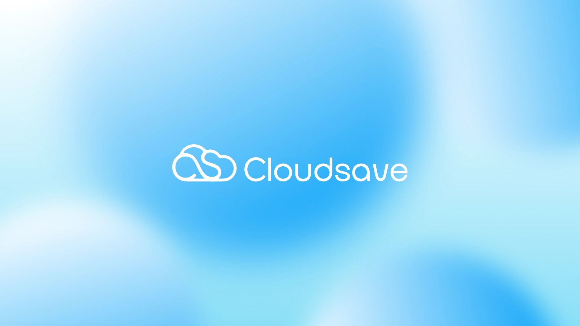
CloudSave is a conceptual branding project created for a modern cloud storage application focused on secure, accessible, and effortless file management. The objective was to design a visual identity that instantly communicates cloud technology while remaining simple, memorable, and scalable across digital platforms.
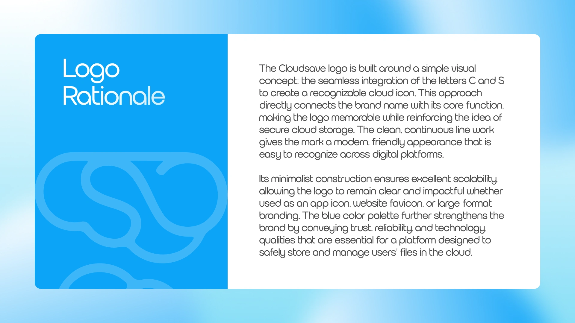
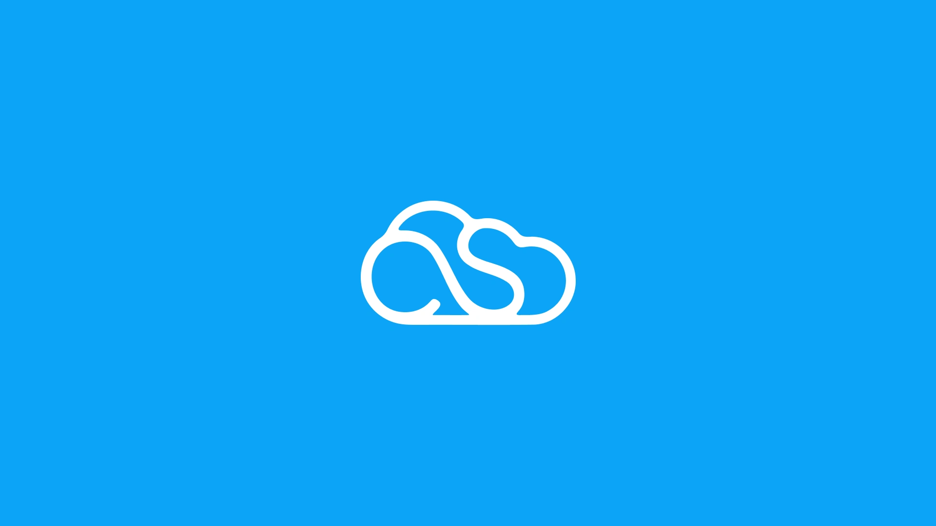
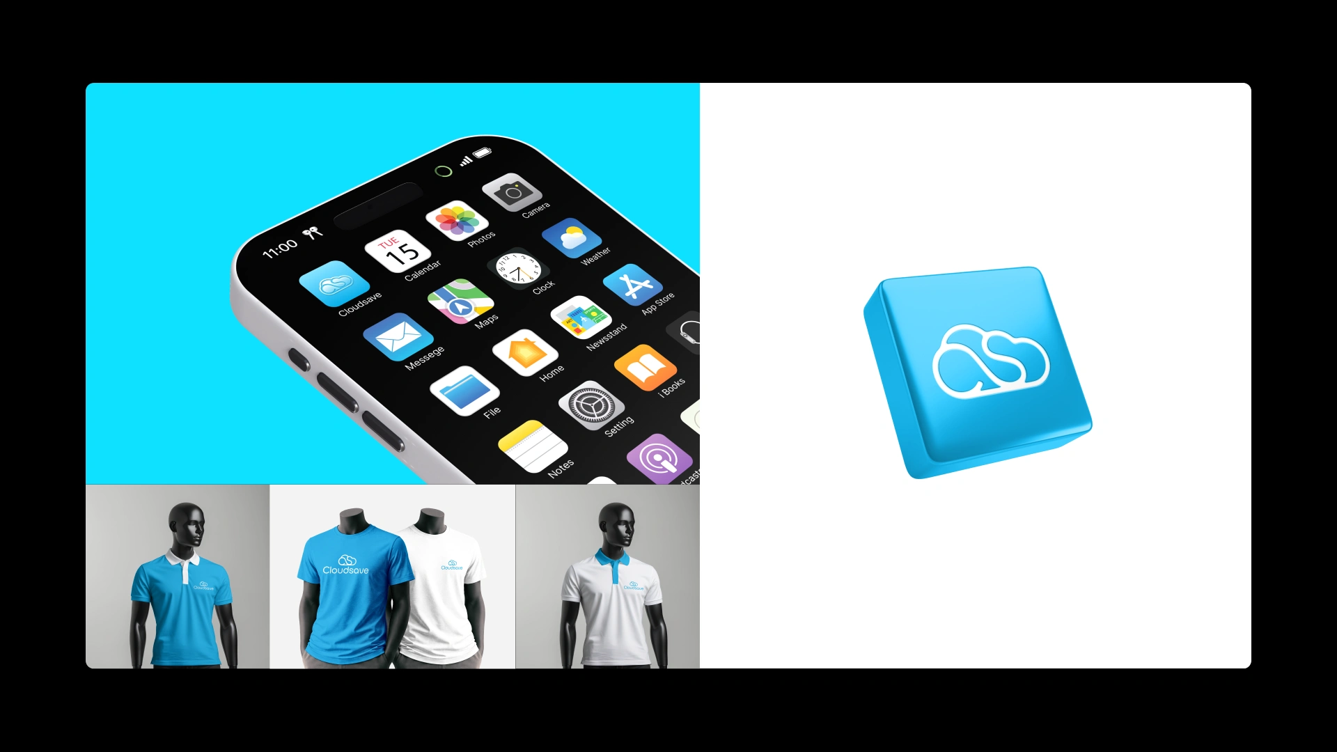
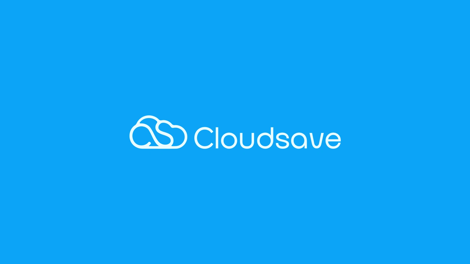
The centerpiece of the identity is a custom logo that integrates the letters C and S into a unified cloud symbol. Rather than relying on a generic cloud icon, the mark creates a distinctive brand asset that strengthens recognition while directly connecting to the product's name and purpose. Every curve was refined to achieve balance, clarity, and a friendly, modern appearance.
Design Goals
Create a unique cloud-inspired logo
Build a memorable symbol from the initials "C" and "S"
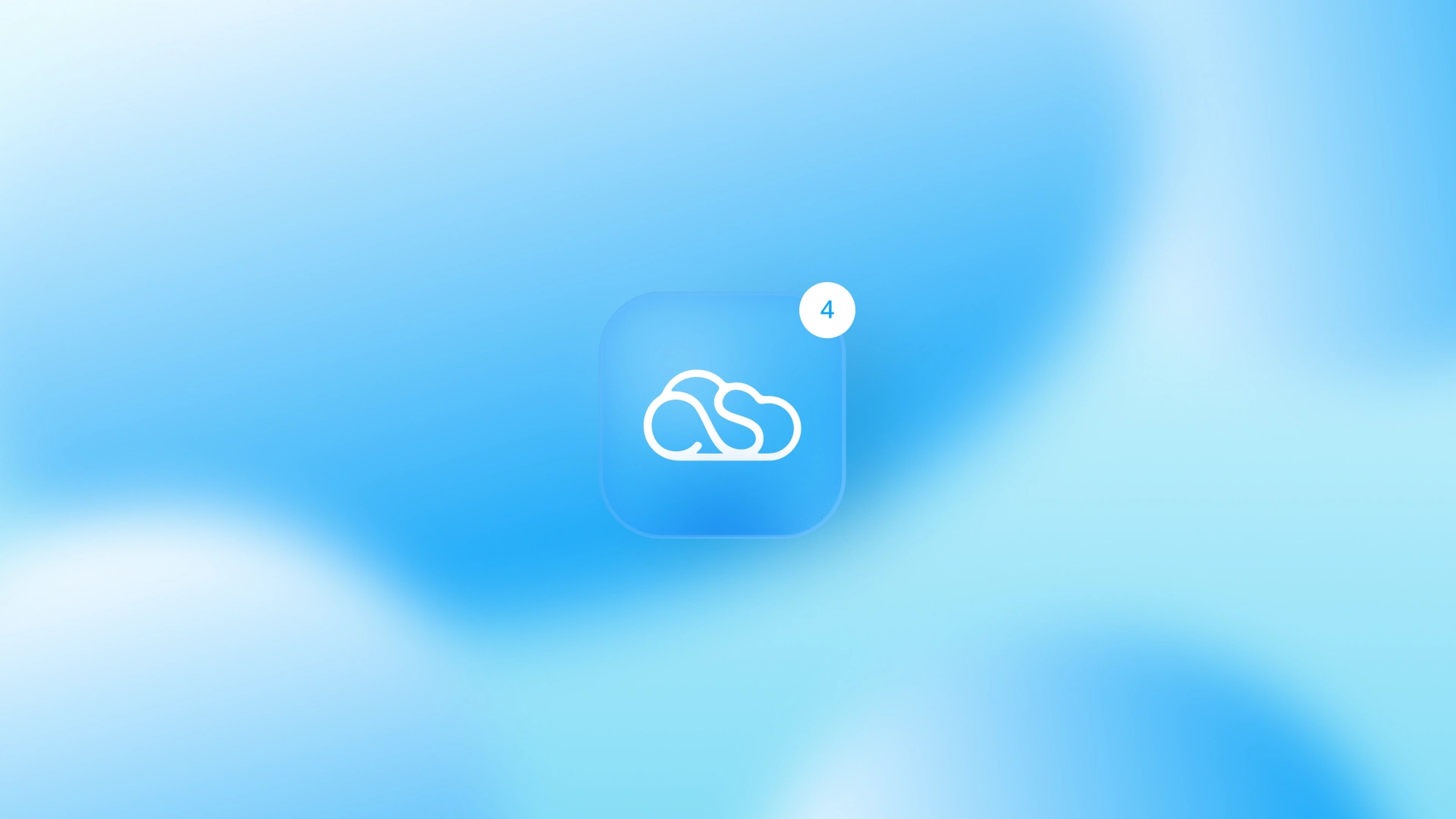
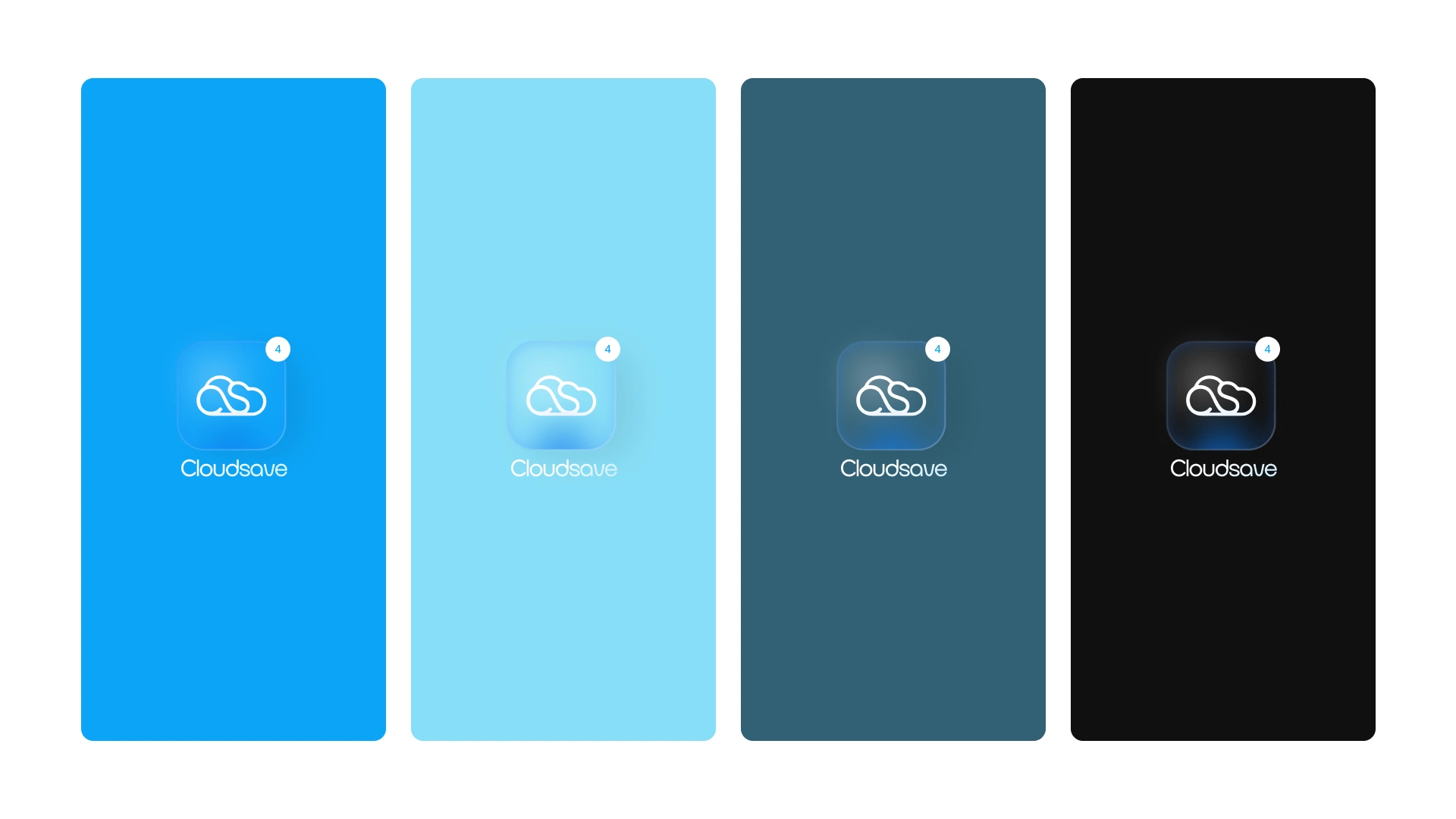
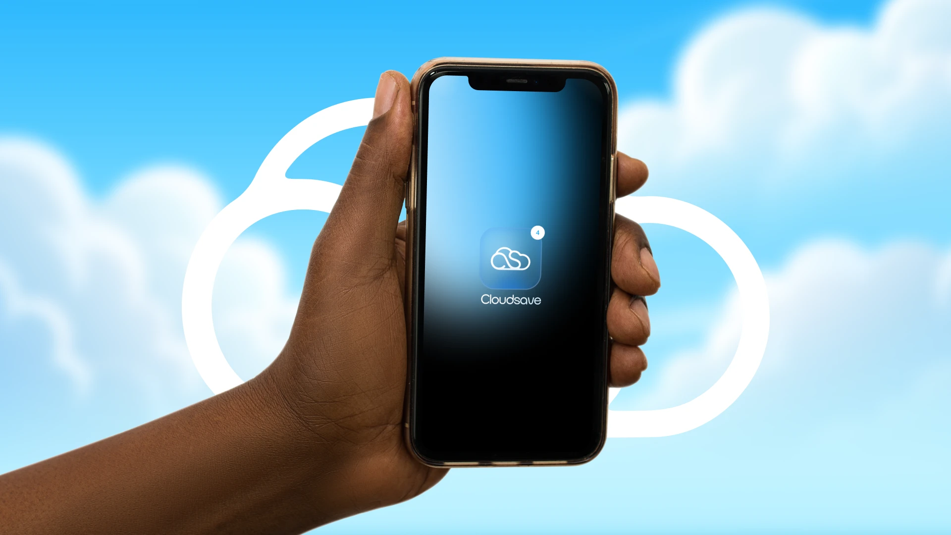
Design an icon suitable for mobile applications
Develop a clean, technology-focused visual identity
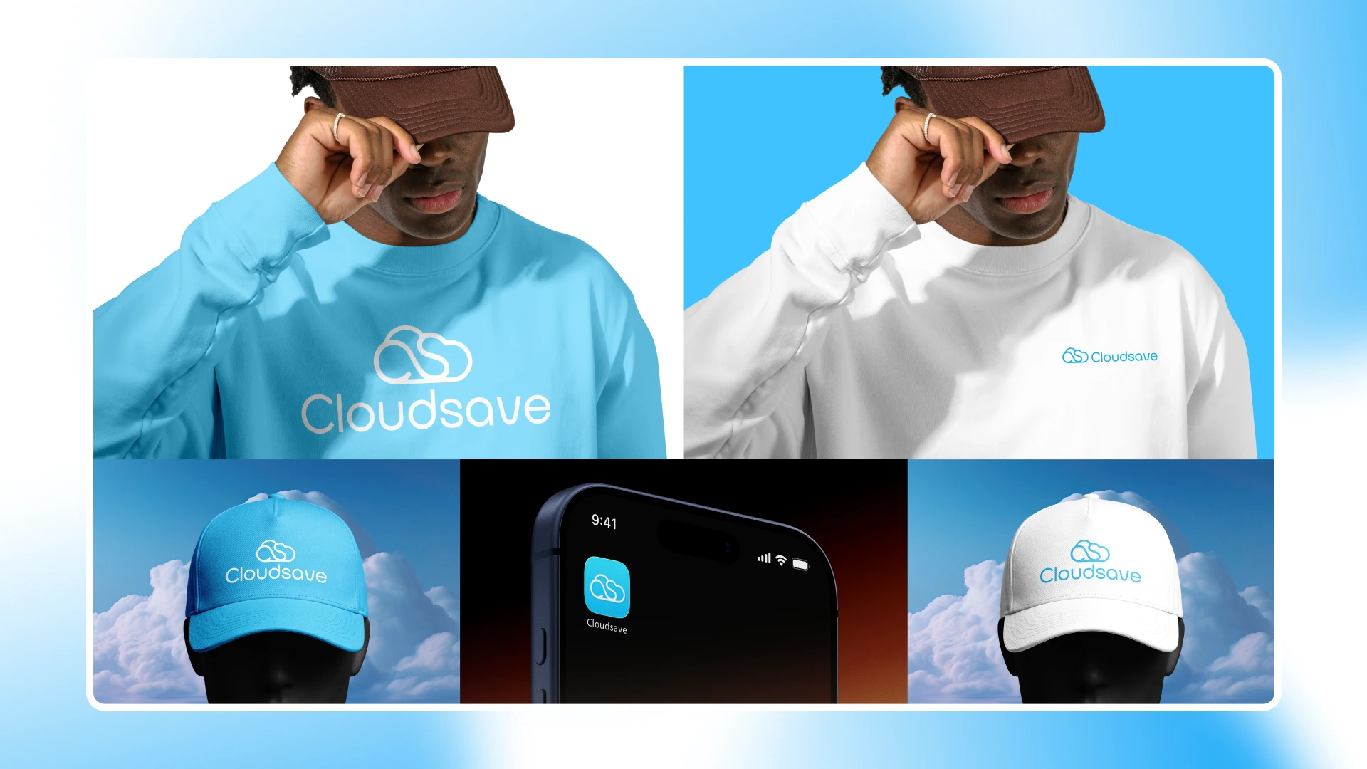
Ensure scalability across digital and print applications
Brand Personality
CloudSave is designed to feel:
Modern
Reliable
Secure
Simple
Friendly
Professional
Design Process
The identity began with exploring how the initials C and S could naturally merge into the silhouette of a cloud. The final mark uses continuous line work to create a smooth, approachable icon that remains recognizable even at small sizes, making it ideal for app icons, websites, and product interfaces. Supporting elements such as typography, color palette, and application mockups were developed to create a cohesive visual system.




Deliverables
Logo Design
App Icon Design
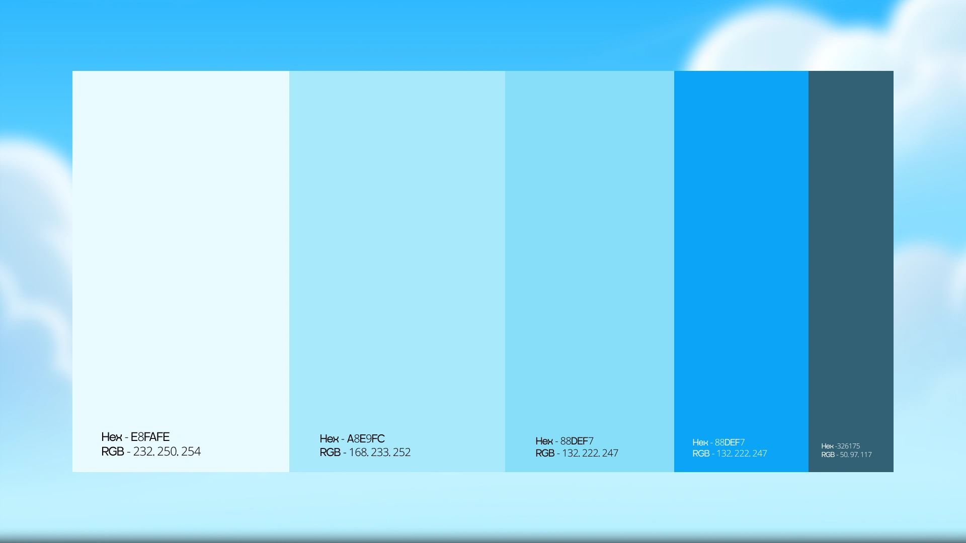
Color Palette
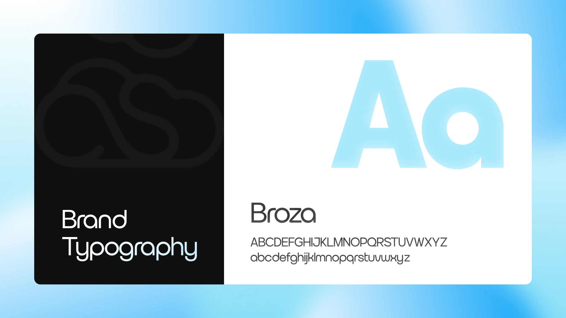
Typography Selection
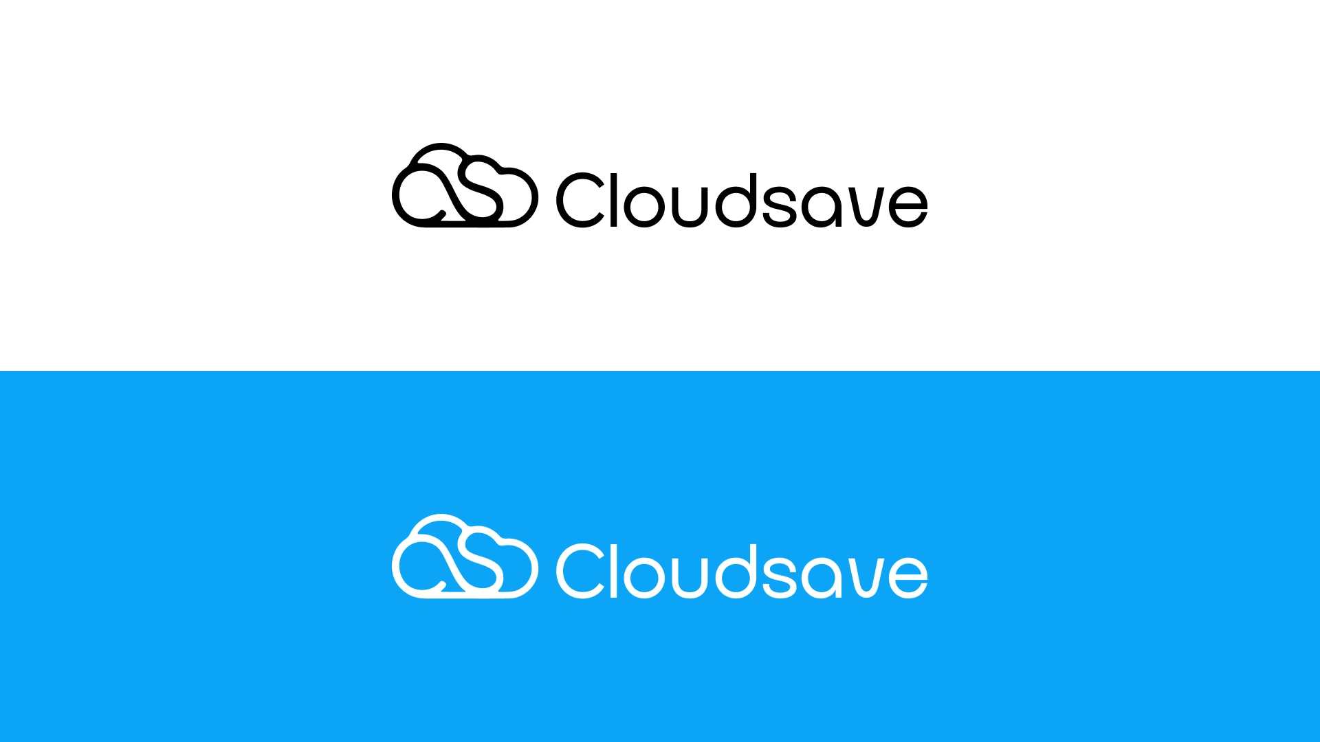
Logo Variations
Brand Presentation
Mobile App Mockups
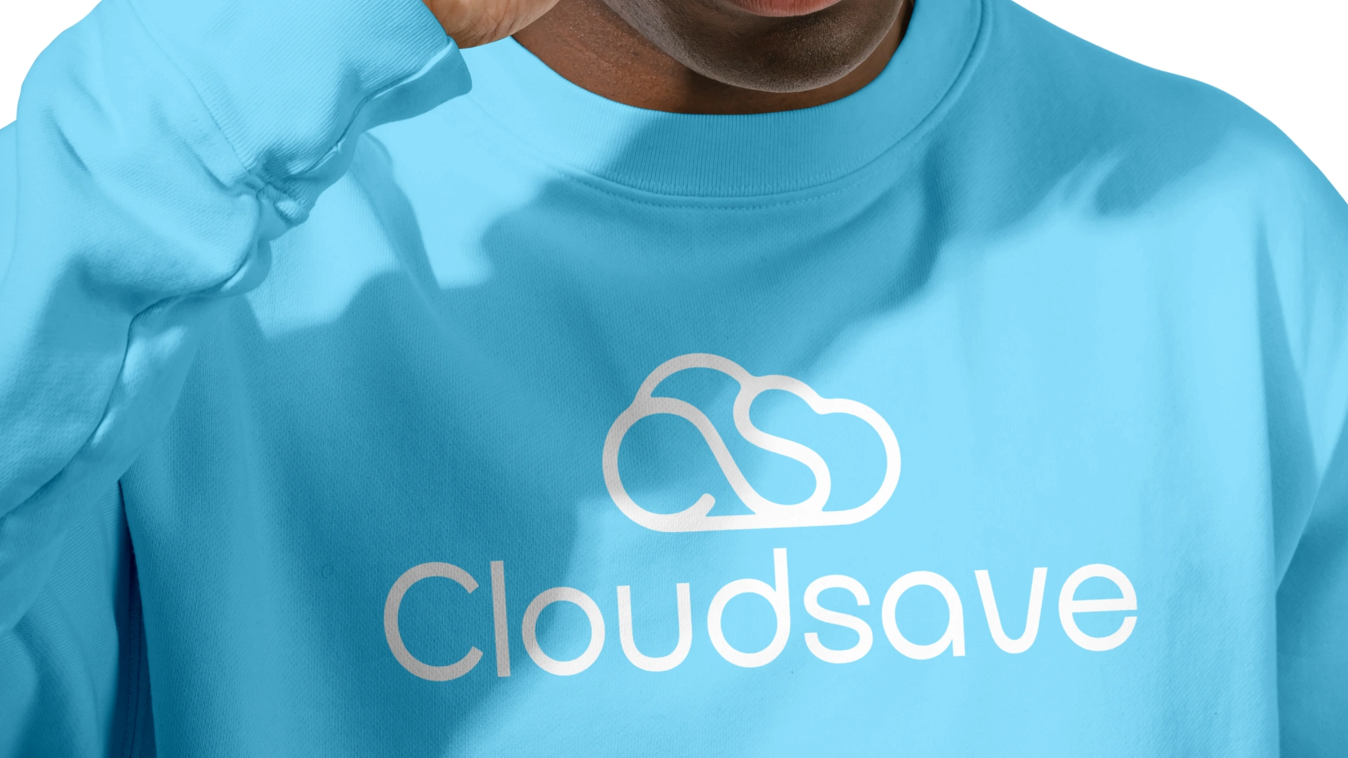
Merchandise Applications
Brand Identity Showcase
Tools Used
Adobe Illustrator
Adobe Photoshop
Like this project
Posted Jul 21, 2026
A modern logo and brand identity for CloudSave, designed to reflect secure, simple, and accessible cloud file storage.
Likes
1
Views
13
Timeline
Jul 2, 2026 - Jul 6, 2026