Legal Advisor Mobile App
Challenge Analysis
The challenge of developing a legal app centers on blending intuitive design with multifunctionality. Clients need to manage cases, upload documents, sign digitally, and communicate with legal representatives, all within a clear and modern interface. This intricate task requires balancing complex requirements with adaptability and a keen understanding of legal UX design principles.
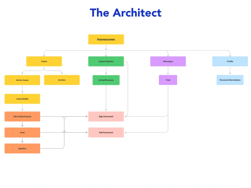
The Architect
The architecture of the legal app is designed for a cohesive user experience, integrating intuitive dashboards, specialized interfaces, and clear communication channels. Features like document uploading, e-signing, and real-time updates are seamlessly woven into the design. The app's structure balances usability and engagement with a modern aesthetic, aligning form and function.
Screens
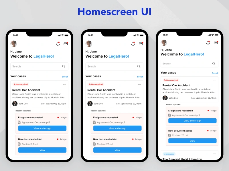
1. Homescreen
Upon opening the app, clients are greeted with an intuitive dashboard displaying their recent cases, complete with titles, descriptions, and statuses. Key features such as messages, notifications, a profile avatar, and a search bar are strategically placed to enhance user engagement and accessibility.
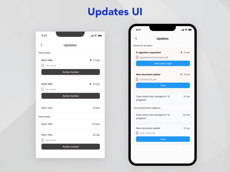
2. Updates
The Updates screen is designed to keep clients informed about crucial updates related to their cases. Whether it's a request for an e-signature, a change in case status, or new documents added by the lawyer, each notification is crafted to be clear and actionable.
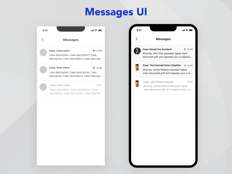
3. Messages
The Messages interface allows clients to view chats related to their cases, organized by both case name and lawyer avatar. Recognizing that a lawyer may handle multiple cases for the same client, this design ensures that communication is streamlined and contextually relevant.
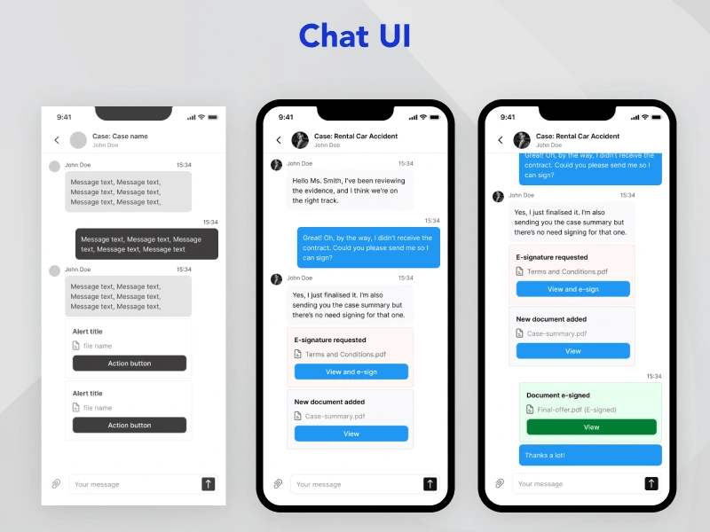
4. Chat
The Chat screen fosters a dynamic conversation between the lawyer/representative and the client. Both parties can exchange documents or images, with special features allowing lawyers to request e-signatures and archive important documents within the chat history. This design prioritizes collaboration and record-keeping.
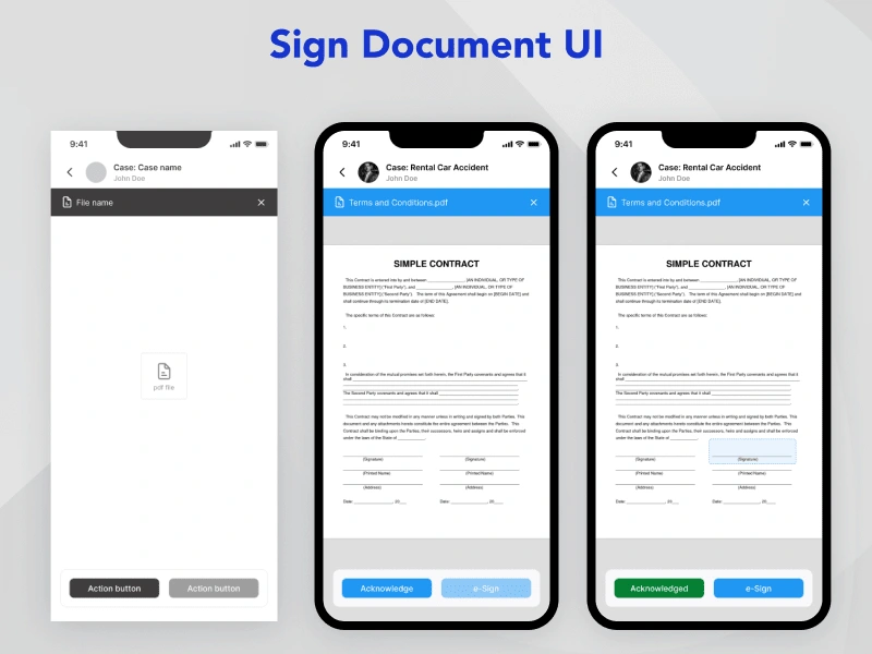
5. Sign Document
The Sign Document interface guides clients through the e-signing process with a two-step authentication. First, clients must tap the "Acknowledge" button, activating the e-sign feature. This design choice ensures a deliberate and secure signing experience, reflecting the legal importance of the documents at hand.
6. Case Details
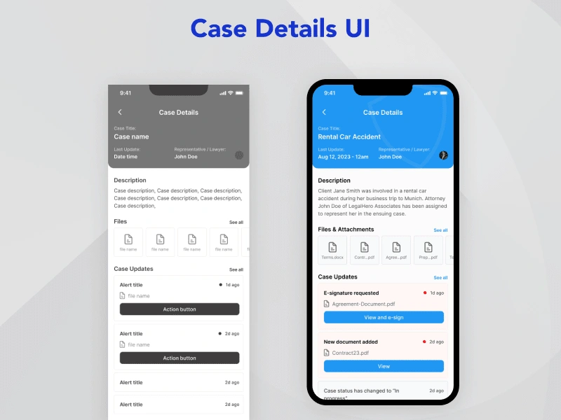
The Case Details screen offers a comprehensive view of a specific case, including the title, description, files & attachments, and real-time updates. The layout is crafted to present information in a digestible format, enabling clients to quickly grasp the essentials of their case.
Like this project
Posted Mar 21, 2024
The architecture of the legal app is designed for a cohesive user experience, integrating intuitive dashboards, specialized interfaces, and clear communication
Likes
0
Views
17

