Brand Identity of Lim Coffee
yolaine codjovi

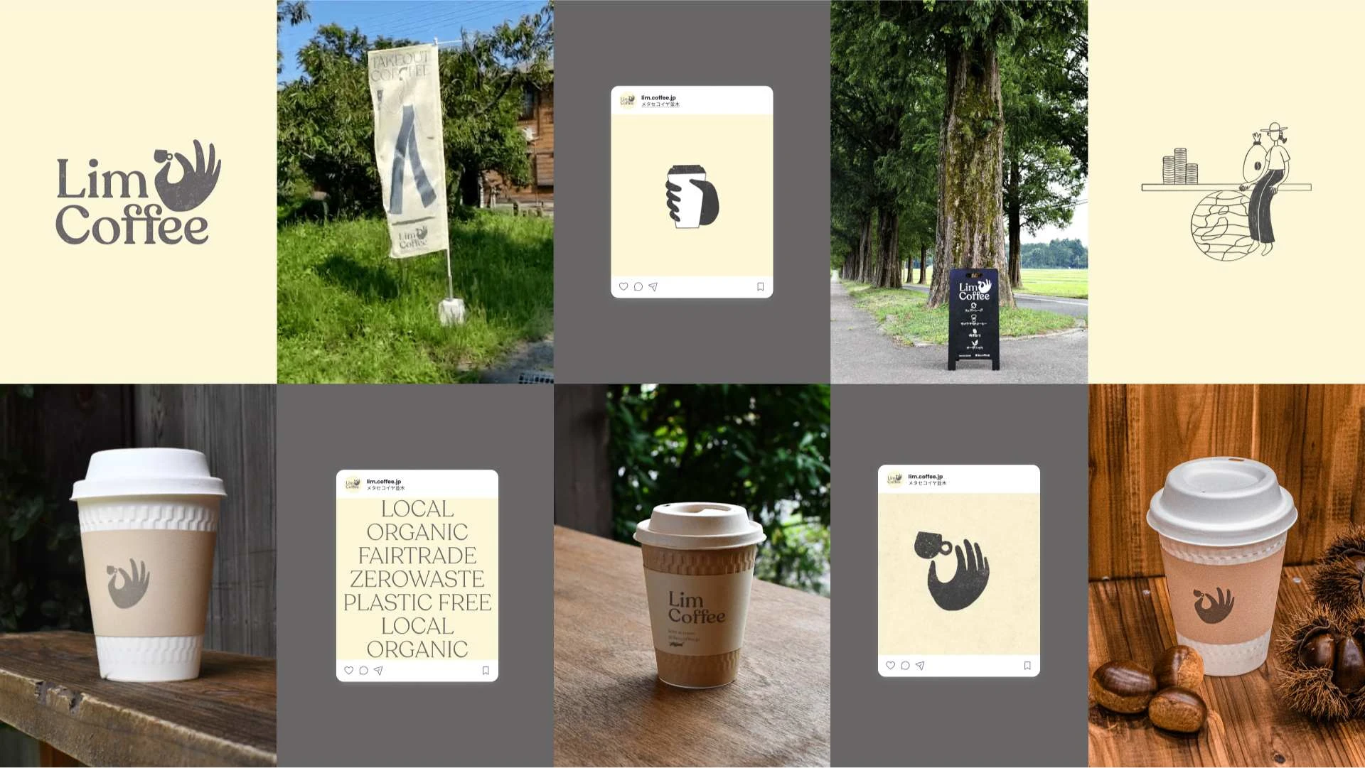
Lim Coffee is a small, seasonal pop-up coffee stand in rural Japan that embodies the philosophy of “less is more.” Rooted in sustainability, every aspect of the brand was designed to reflect eco-conscious values. From fully biodegradable cups and recycled-paper stamped labels to promoting the use of personal cups, the initiative prioritized reducing its environmental footprint.
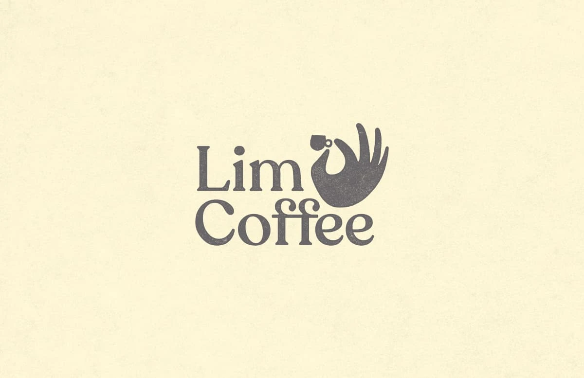
The logo features a hand delicately holding a tiny coffee cup between thumb and index finger, symbolizing care, effort, and the promotion of thoughtful, small-scale consumption. The warm, friendly logotype, paired with a textured, two-color design, emphasizes authenticity and simplicity while aligning with the stand's minimalist ethos.
In addition to crafting the visual identity, I provided remote art direction for Lim Coffee’s Instagram presence. I guided the client in creating consistent, inviting visuals that were easy for them to manage independently, ensuring the brand remained cohesive across all touchpoints.
Despite a modest budget, Lim Coffee was a successful project that sparked conversations about sustainability and small-scale initiatives. The thoughtfully designed identity empowered the client to manage and sustain their branding while fostering meaningful engagement within the local community.

Like this project
Posted Mar 25, 2025
Lim Coffee was successful, that sparked conversations about sustainability and small-scale initiatives. It fostered engagement within the local community.