
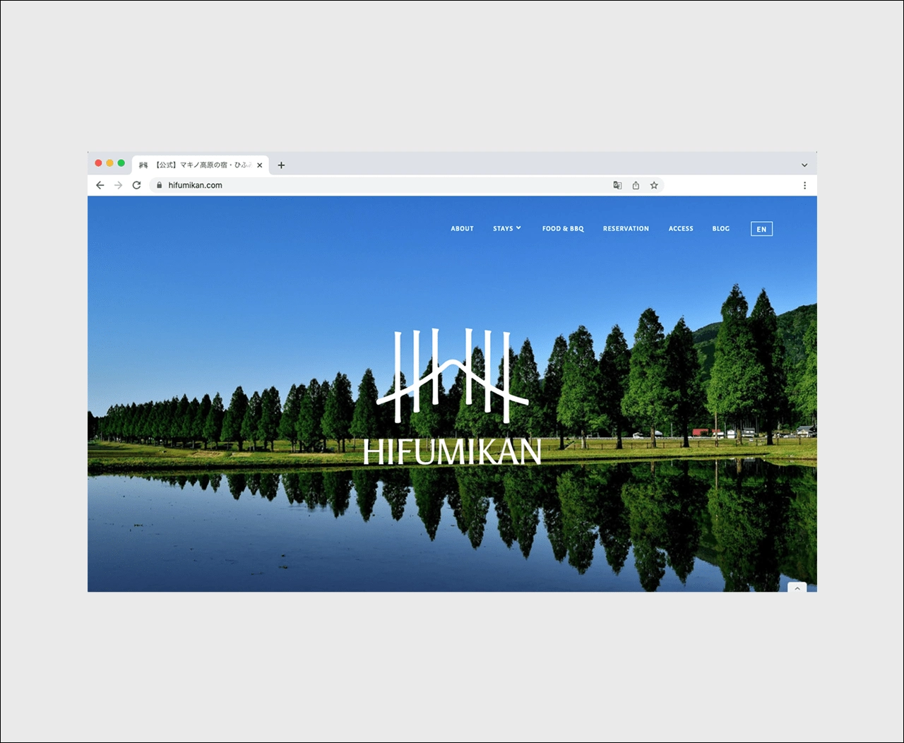
Branding and Webdesign for Hifumikan, Guesthouse in Rural Japan
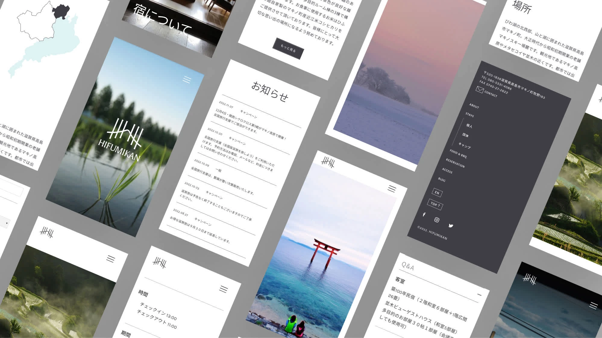
Hifumikan is a family-owned guesthouse located in rural Shiga, Japan. In the will to appeal new guests, the owner wanted to revamp their website showcasing the beauty of Shiga countryside. Part of the mandate was to design the Logo.
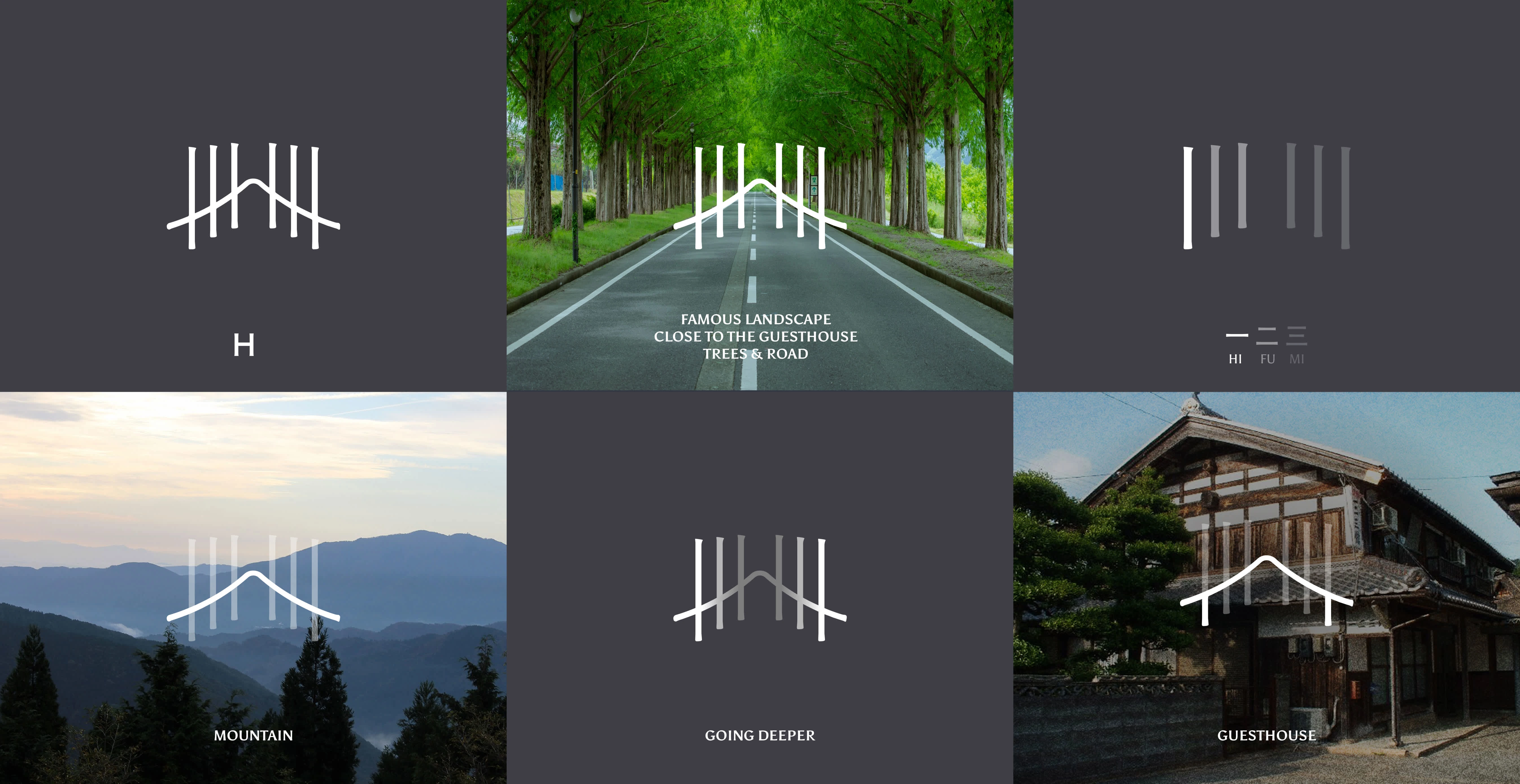
The logo encompasses with simplicity, uniqueness and style the essence of the inn, from the H of Hifumikan, to the meaning of the name, passing by the notable landscape surrounding the guesthouse.
Scroll down to deepdive in the creation of the symbol.
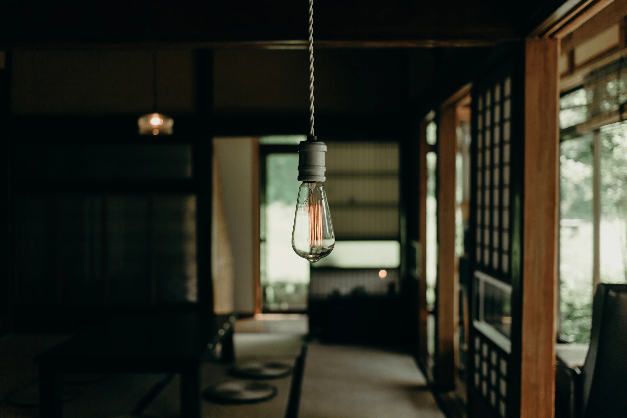
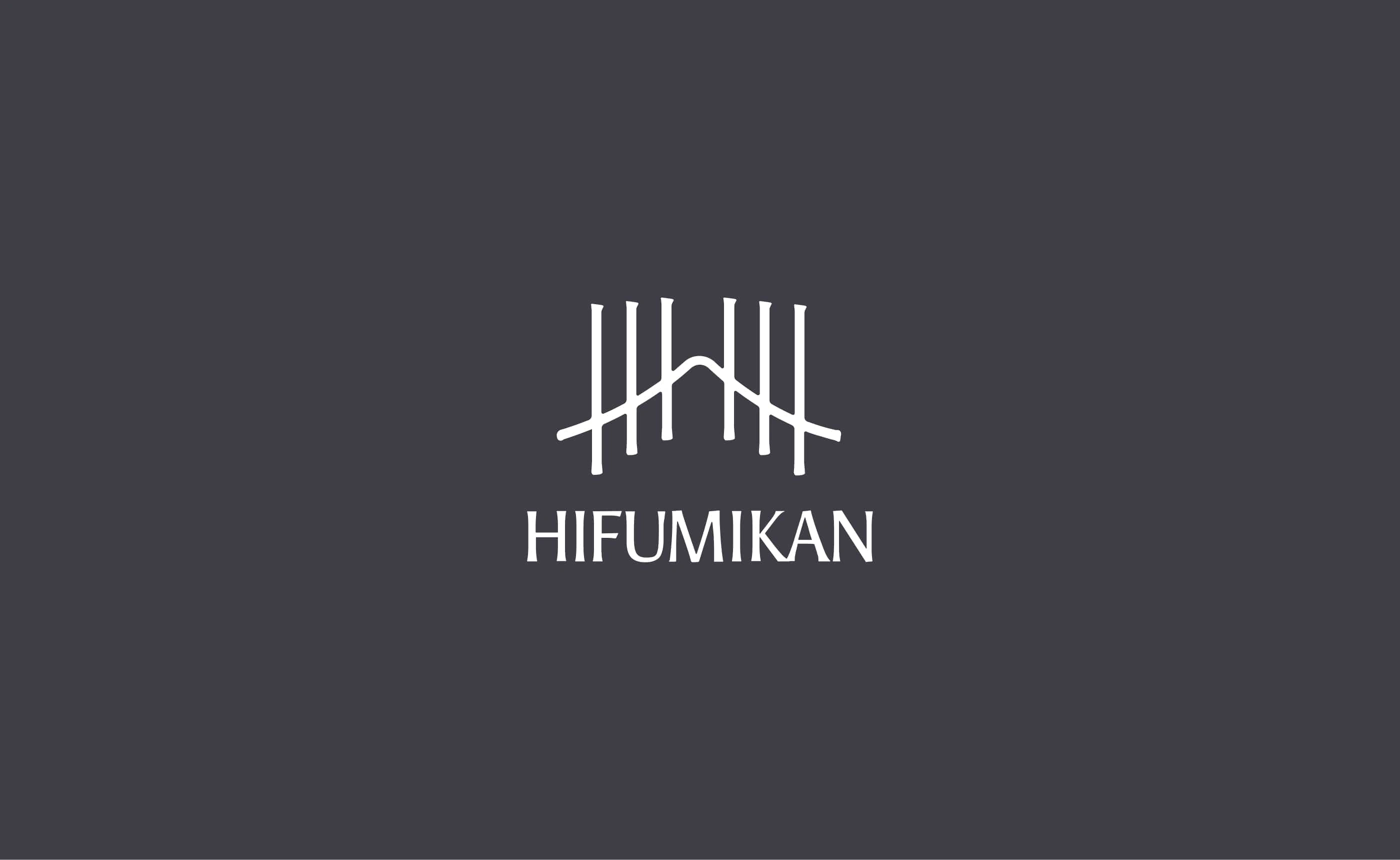
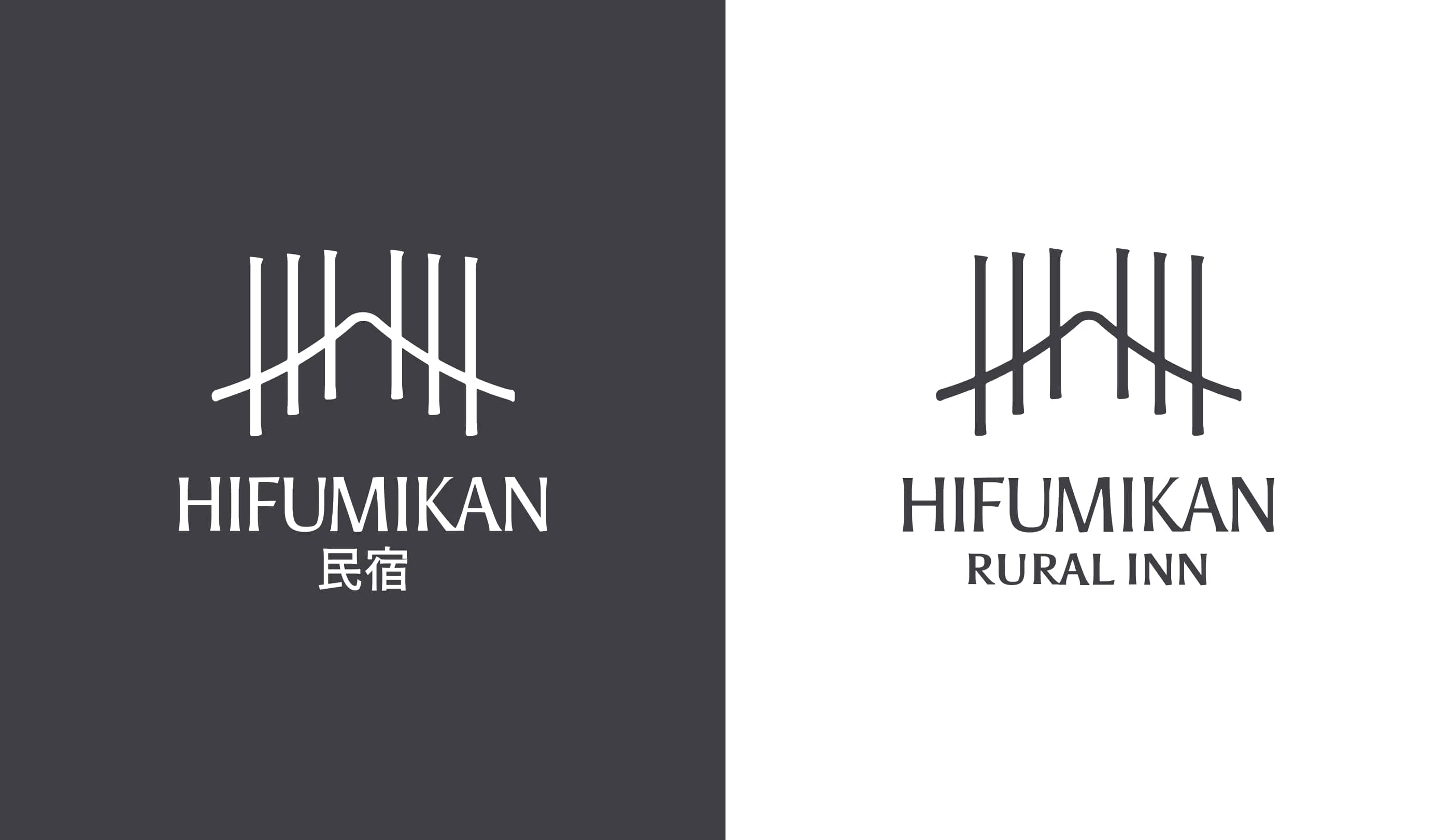
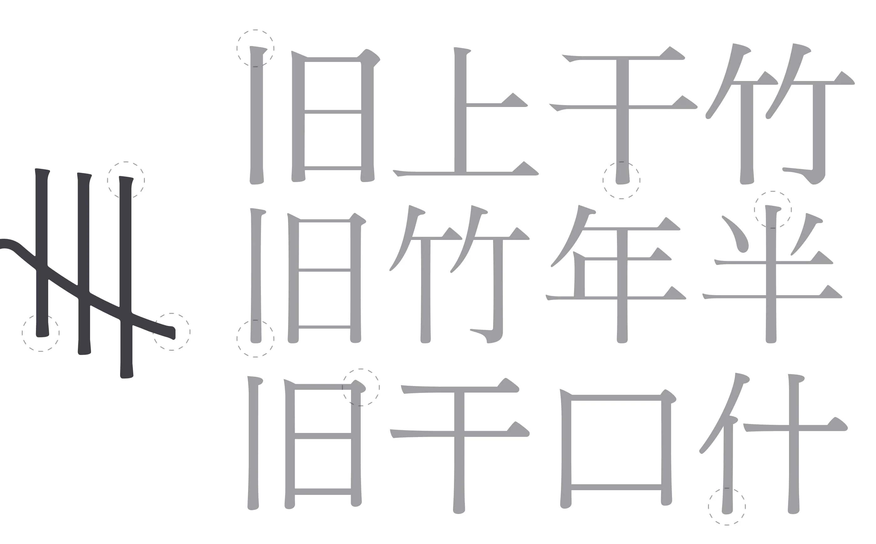
Japanese writting system has its own rules, typographically too. The logo is designed based on it. Each vertical stroke takes the details of the one that can be found in a Mincho (serif) Kanji (sinogram). Worked with more subtilities to not be too aggressive. As a lot of Japanese character, the logo is not perfectly symetrical.
0 likes · 10 views · Mar 17, 2025
Boost credibility, enhance guest experience, increase direct bookings, improve SEO, build trust, and create a unique identity to stand out from competitors.
Timeline
Jan 15, 2022 - Mar 17, 2022


