NSI Real Estate
yolaine codjovi
NSI Real Estate was a Montreal-based real estate investment firm specializing in Non-Speculative Investments (NSI). Structured as a Limited Partnership, the company aimed to attract high-net-worth investors by emphasizing stability, integrity, and long-term value over market speculation.
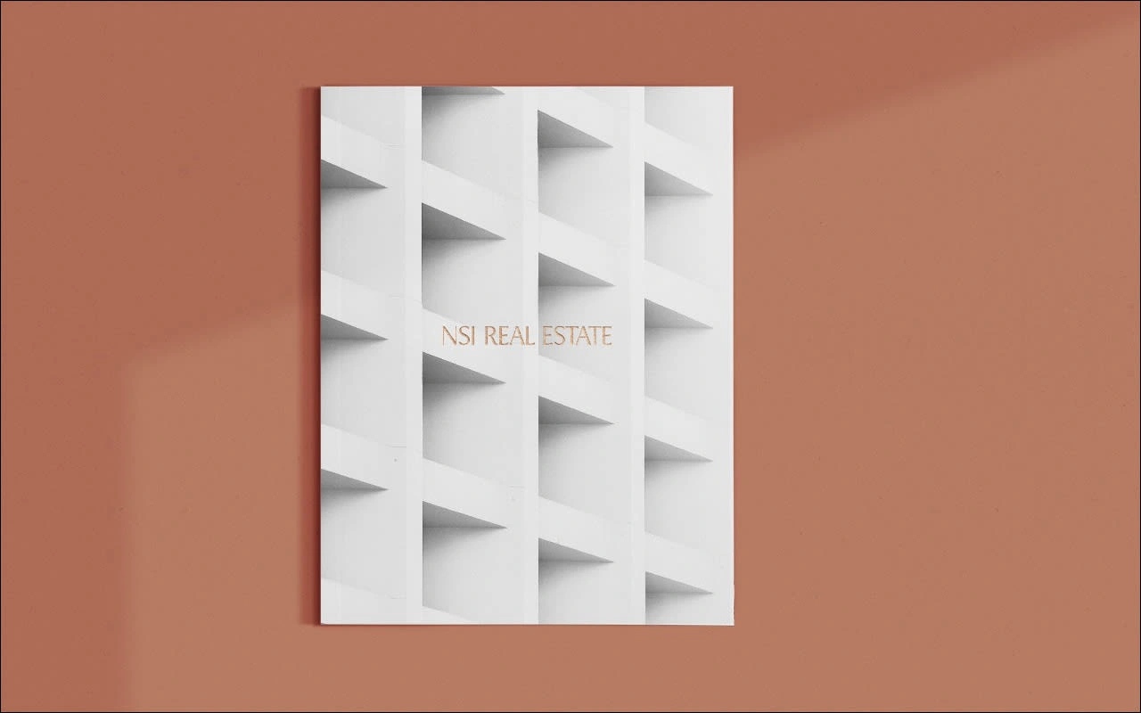
The objective was to develop a strong, refined visual identity that would position NSI Real Estate as a trusted leader in premium, high-standard investments. The branding needed to instill confidence, exude professionalism, and convey exclusivity, appealing to an audience of seasoned investors aged 50–60.
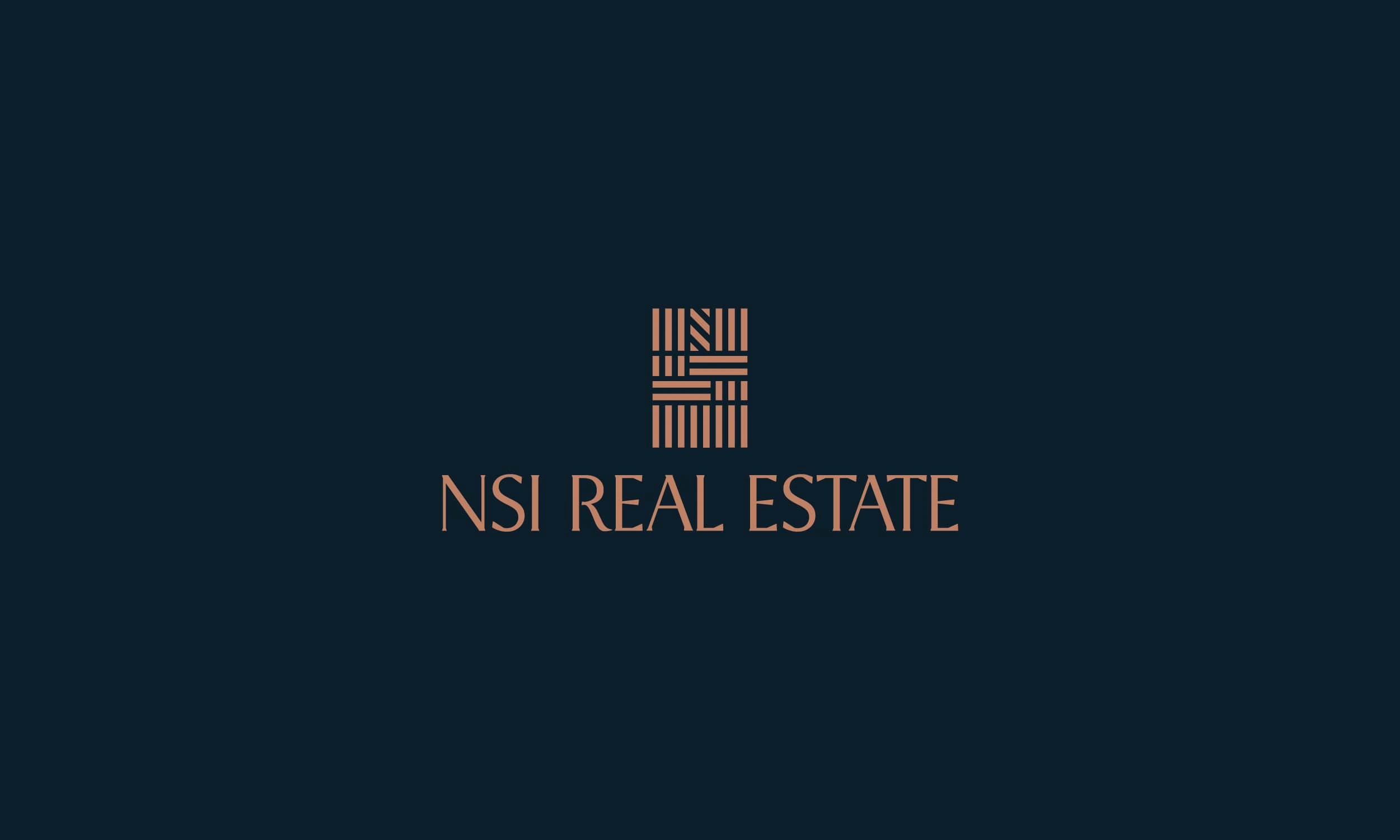
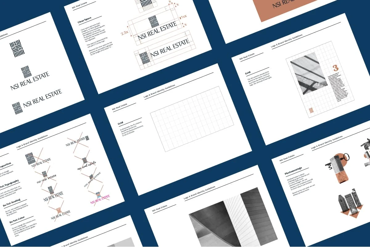
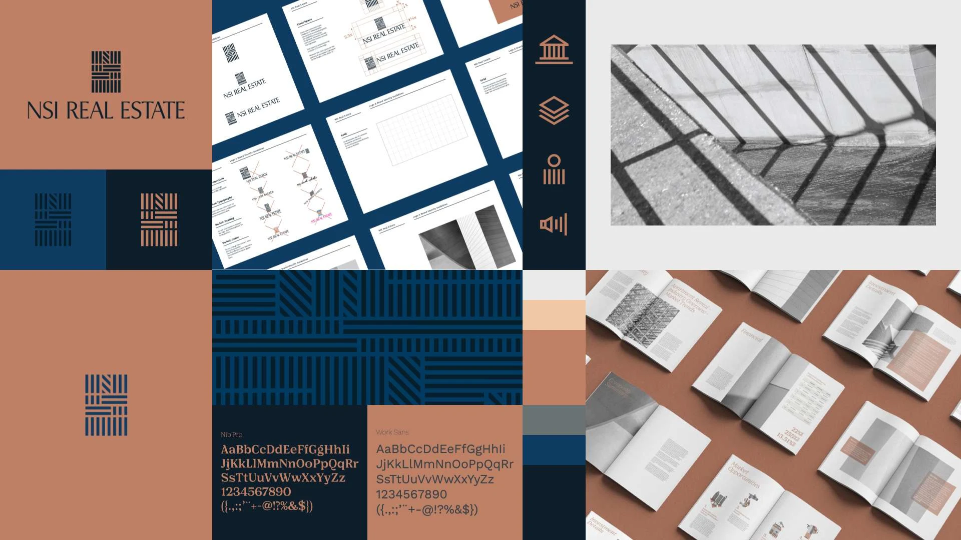
The logomark integrates the letters "NSI" into a structured, architectural form, subtly representing a building, reinforcing the company’s core focus on real estate. The logotype is based on a humanist font, which was meticulously redesigned into a serif typeface, adding stability, sophistication, and timeless appeal. Refined angular cuts preserve modernity while reinforcing a premium and established aesthetic.
While the full visual identity was developed and delivered, it is not currently in use. However, the project remains a strong example of strategic branding in the real estate sector, demonstrating how design can convey trust, prestige, and long-term vision.


Like this project
Posted Mar 25, 2025
A Montreal firm specializing in stable, high-value investments. Trusted, premium branding with a refined, architectural identity. The logo is a building & NSI