Samourai Wallet - A Sovereign Bitcoin Wallet Redesigned
Cody Carter
Samourai Wallet: A Mobile Redesign
Why should privacy be ugly?
Overview
Samourai Wallet has long been my go-to for private Bitcoin transactions. As a Ronin Dojo node operator, I appreciate the team’s relentless commitment to financial privacy. However, while the wallet excels in security and anonymity, its UI leaves much to be desired. I saw an opportunity to modernize its design—enhancing usability while staying true to its cypherpunk roots.
Approach
Samourai Wallet’s interface prioritizes function over form, but I’ve always wondered: What if privacy didn’t have to look so clunky? Inspired by Strike’s sleek, intuitive design, I set out to blend Samourai’s powerful toolset with a more refined aesthetic. The challenge? Merging modern UX principles with the wallet’s deep-rooted commitment to decentralization and privacy.
I started by analyzing Samourai’s existing UI, pinpointing friction points where users might struggle. From there, I sketched wireframes, carefully balancing a cleaner look without diluting the wallet’s essential features.
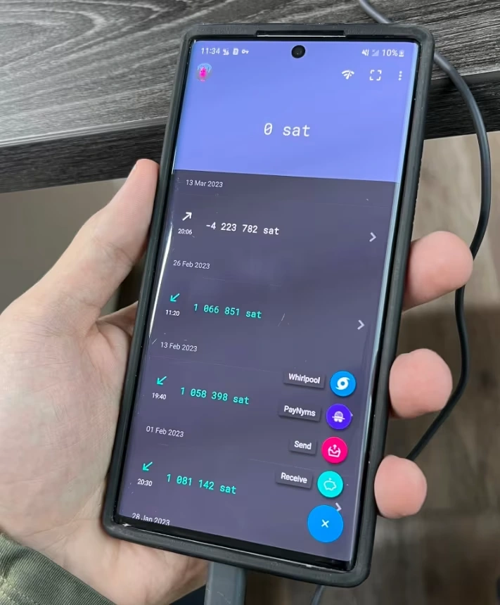
Here's a look at the current Samourai Wallet UI. As you can see, the interface uses a very rudimentary design and could benefit from an updated look.
Ideas
PayNyms over traditional profiles: Strike uses a standard user profile system, but Samourai users need privacy-preserving identity solutions. By highlighting PayNyms, I ensured that anonymity remained a key design principle.
Dark mode with purpose: Rather than a purely utilitarian aesthetic, I reimagined Samourai’s dark UI to be visually appealing while reinforcing its cypherpunk identity.
Feature transparency without overwhelm: Privacy tools can be intimidating. My design emphasized clarity, ensuring that critical features (e.g., Whirlpool, Ricochet, STONEWALL) remained prominent without cluttering the experience.
Questions
How do we retain Samourai’s core privacy features while modernizing its UI?
What design choices can reduce the learning curve for new users seeking financial privacy?
Can a streamlined interface coexist with a feature-rich wallet without sacrificing usability?
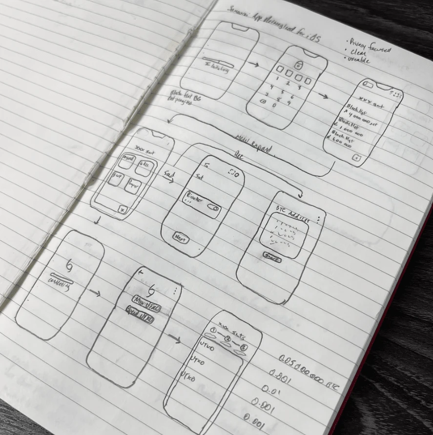
Rudimentary wireframing.
Result
After hours in Penpot, I arrived at a redesign that felt both familiar and fresh. The new UI maintained the essence of Samourai Wallet while making it more approachable for users at all experience levels.
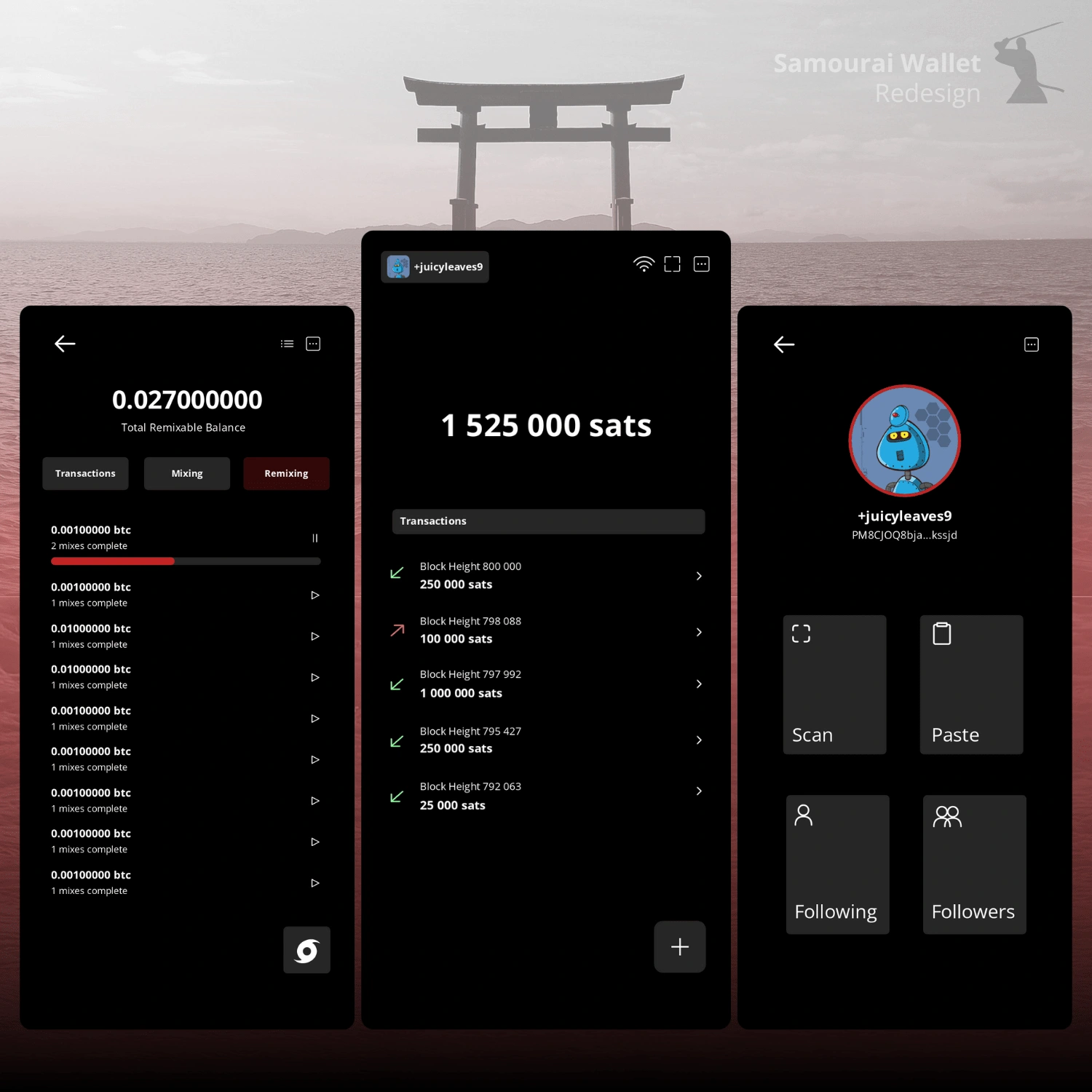
New and improved Samourai Wallet UI.
I shared my work on X (formerly Twitter) and Nostr, expecting some constructive feedback, but what I got was even better. The community loved it. Users engaged with the redesign, and to my surprise, even the official Samourai account took notice.
This project reinforced a core belief of mine: Privacy-first design doesn’t have to be intimidating or ugly. With thoughtful UI improvements, we can make powerful tools more accessible without compromising what makes them special.
Like this project
Posted Feb 17, 2025
Samourai Wallet is great for privacy, but its UI? Not so much. I redesigned it to prove privacy can be sleek, not clunky without sacrificing function.